Table of Contents
- Home
- content hub
- The Definitive Guide to Table Tent Specs for Perfect Printing
The Definitive Guide to Table Tent Specs for Perfect Printing
Jan 27, 2026411 views
Jan 27, 2026411 views
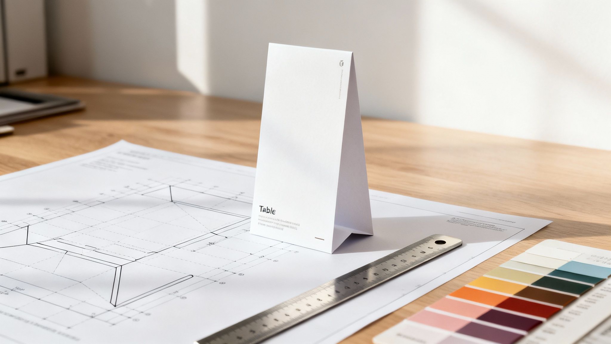
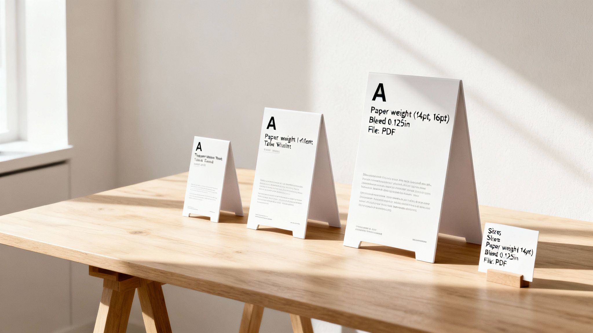
When you hear "table tent specs," what we're really talking about are the foundational details for printing them correctly: the standard dimensions, paper weight, and the technical setup for your design files. The most common sizes you'll see are 4" x 6" and 5" x 7", which refers to the size of the front display panel. To make sure they stand up properly on their own, they're almost always printed on a sturdy 14pt or 16pt cardstock.
Understanding Key Table Tent Specifications
At their core, table tents are self-standing, three-dimensional prints designed for tabletop promotions and information. Think of them as miniature billboards, perfectly placed to catch a customer's eye, whether they're showcasing restaurant specials or listing event schedules. Their direct line-of-sight marketing power is undeniable.
In fact, their effectiveness is fueling some serious market growth. The global table tents market is projected to double from USD 2.2 billion in 2025 to USD 4.4 billion by 2035, all thanks to high demand from businesses and event organizers who count on these compact displays.
Getting a handle on the basic table tent specs is the first step to creating professional, error-free marketing materials. It's what ensures your digital design translates perfectly to a physical product, helping you sidestep common print headaches like blurry images, unexpected color shifts, or critical text getting trimmed off.
Key Table Tent Specifications at a Glance
This guide will walk you through every technical detail you'll need. But first, here’s a quick-reference table summarizing the most critical specifications. Use this as a checklist to make sure your design settings are good to go before diving into the more detailed sections.
| Specification | Industry Standard | 4OVER4 Recommendation |
|---|---|---|
| Common Sizes | 4" x 6", 5" x 7", 4.25" x 5.5" | 4" x 6" for concise messaging, 5" x 7" for more detailed content. |
| Paper Weight | 12pt - 16pt Cardstock | 14pt or 16pt C2S for superior durability and a premium feel. |
| File Bleed | 0.125" (1/8 inch) on all sides | A non-negotiable 0.125" bleed is required to prevent white edges. |
| File Formats | PDF, AI, PSD, JPG | High-resolution PDF is strongly preferred for accurate printing. |
| Color Profile | CMYK | Always design and export files in CMYK to avoid color shifts. |
This table covers the essentials for standard table tents. Getting these specs right is the foundation for a flawless print run.
And if you find yourself needing something larger and even more prominent for a countertop display, you might want to check out the specifications for counter cards.
Choosing the Right Paper Stocks and Finishes
Getting the paper right is the first real decision you'll make when spec'ing out your table tents. It's foundational. This choice directly affects everything from durability and appearance to the simple tactile feel of the finished piece. The paper’s weight, or thickness, is what determines how well your tent will actually stand up to being handled and just sitting on a table. For pretty much any application, a sturdy cardstock isn't just a suggestion—it's essential for stability.
In the world of print, two industry-standard weights have really become the go-to for their reliability and premium feel. These options give you the rigidity needed to prevent that sad sagging or toppling over, keeping your message upright and visible where it belongs.
Understanding Common Paper Stocks
Paper stock thickness for table tents is measured in points (pt), where one point is just one-thousandth of an inch. A bigger point value means a thicker, more durable paper. Simple as that.
14pt Cardstock: This is the workhorse of the industry. It’s a hugely popular and versatile choice that hits the sweet spot between sturdiness and cost-effectiveness. It's noticeably more substantial than regular paper and has a professional feel that works great for corporate events, trade shows, and general promotions.
16pt Cardstock: When you need maximum durability and want to make a more luxurious impression, 16pt cardstock is the way to go. That extra thickness provides superior rigidity, making it the ideal choice for high-traffic environments like restaurants and bars where table tents get passed around and handled constantly.
Table tents have come a long way from the simple 'menu cards' of the 19th century, and these standards have evolved with them. Today, a beefy 16pt stock is often the default choice for longevity, especially if you're pairing it with a protective coating. Plus, some data suggests that adding premium finishes like foil stamping to these thick stocks can boost brand recall by as much as 30%, turning a simple material choice into a strategic one. You can dig deeper into these production trends and their market impact on print technology shifts at rocsoft.com.
Selecting the Perfect Finish
Once you've locked in your paper stock, the finish is your next critical decision. A finish, or coating, is applied after the ink is down, and it does two very important jobs: it protects the print from moisture, scuffs, and fading, and it seriously enhances your visual design.
Pro Tip: Your finish should be a deliberate choice that reflects both your brand's personality and the environment where the table tent will live. A high-gloss finish might be perfect for a vibrant, modern brand, while a matte finish often conveys a more subtle, elegant vibe.
Here’s a breakdown of the most common finishes and where they shine:
Glossy UV: This is a high-shine, reflective coating that makes colors pop with incredible vibrancy and saturation. It’s a fantastic choice for designs heavy on bold graphics and photography. The UV coating also adds a tough, protective layer that's easy to wipe clean—a lifesaver for restaurant menus.
Matte: For a non-reflective, smooth, and elegant look, matte is your best bet. It’s perfect for designs that are text-heavy or aiming for a sophisticated, modern aesthetic. While it offers solid protection, it can be more prone to showing fingerprints than its glossy counterpart.
Uncoated: An uncoated stock has no finish applied at all, giving it a natural, raw paper texture that you can feel. This option is spot-on for a rustic or organic brand identity. It’s also the only finish that’s easy to write on, making it super useful for interactive promotions or event sign-in tables.
For yet another layer of protection and a unique sensory feel, you might also consider lamination. You can learn all about the benefits and different options in our guide to custom laminating services.
Understanding Dielines, Folds, and Scores
The structural backbone of any table tent is its dieline. Think of it as the blueprint for your print file, a critical part of the table tent specs. This template layer is essential because it shows our production team exactly where to make cuts, where to create folds (scores), and where to add any perforations.
Getting a handle on this template is the first step to avoiding common design mistakes. Your artwork needs to sit perfectly within the boundaries set by the dieline. This is the only way to guarantee the final, assembled product looks exactly like you planned. It’s the guide that separates a professional piece from a misaligned mess.
The Role of Score Lines in Professional Folds
Score lines are simply indentations pressed into the paper right where it needs to bend. Their main job is to create a clean, crisp fold without cracking or damaging the paper fibers. This becomes incredibly important when you're working with thicker, more substantial materials like 14pt and 16pt cardstock.
If you try to fold heavy cardstock without a proper score, you’ll likely see the paper crack and the ink flake off along the crease. The result is an unprofessional, damaged-looking finish. This one simple step ensures every fold is precise and keeps your design looking sharp.
The journey from selecting your paper stock and finish to the final, perfectly folded table tent is a connected one, as you can see below.
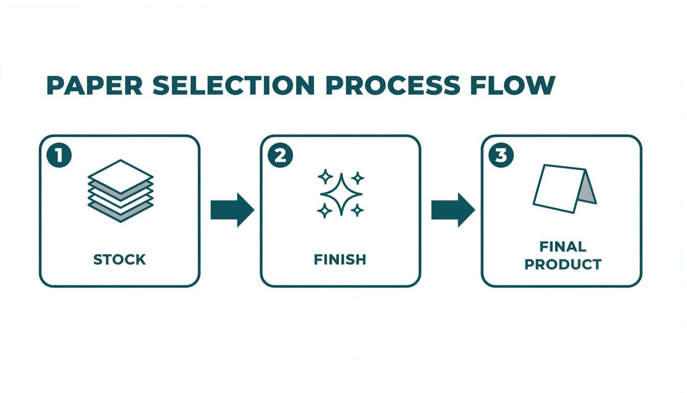
This process really highlights how those foundational choices in paper and finish directly influence the quality of the final folded piece.
Dieline Complexity: A-Frame vs. Interlocking
Table tent dielines can be simple or complex, depending on how they're built. The two most common types each come with their own design challenges that you'll need to account for when setting up your artwork.
- A-Frame Tents: These are the most straightforward. They're usually made with just a single score line down the center. Designing for them is pretty simple—you place your artwork on the two main panels that will face out when folded.
- Interlocking Tents: These get a bit more complex, featuring a base with tabs or slits that lock together. The dieline will show multiple score lines and specific cutouts that allow the base to assemble for greater stability. Artwork placement here is more intricate; you have to be mindful of the bottom tabs and make sure no critical design elements end up in those areas.
A very common mistake we see is placing text or a key part of an image directly over a score line. Once folded, that element will be distorted or split, which can ruin your message. Always keep your critical content well within the safe zones shown on the template, far away from any fold lines.
Understanding how materials behave is key for more than just table tents. It's just as crucial when designing the best golf scorecard for a tournament or creating any other folded print item. The same principles of clean folds and durable stock apply. If you want to dive deeper into the technical side of creating custom shapes and folds, take a look at our guide on die-cutting.
Mastering Bleed, Safety Margins, and Trim
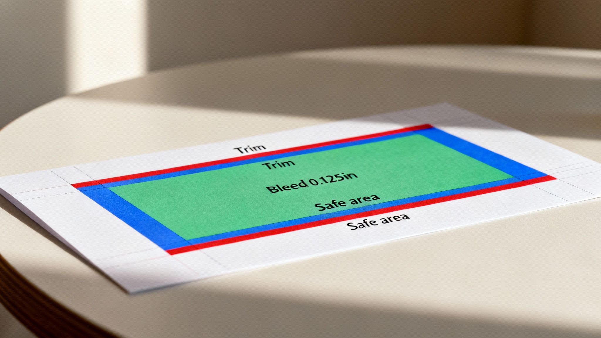
To get a truly professional-looking table tent, you have to get three parts of your design file right: the bleed, the trim line, and the safety margin. Getting these specs right isn't just a suggestion—it's the only way to avoid common print headaches like weird white borders or clipped text.
Think of these margins as a buffer zone. They exist to account for tiny mechanical shifts that happen during the printing and cutting process. No machine is perfect down to the micrometer, so building in these guides is how we protect your design’s integrity and deliver a flawless final product.
Defining the Bleed Area
The bleed is the part of your design that extends past the final cut edge of your table tent. Any background colors, patterns, or images that you want to run right to the edge must stretch all the way out to this bleed line.
The industry standard, and what we require for our presses, is a 0.125-inch (or 1/8 inch) bleed on all four sides. Missing this is easily one of the most common—and preventable—design mistakes we see.
What happens if you don't add a bleed? If your background stops right at the trim line, even the slightest shift during cutting will expose a thin, unprofessional-looking white sliver along the edge. It's a small detail that can instantly make your table tent look cheap.
Understanding the Trim Line
The trim line is exactly what it sounds like: it shows the final, finished size of your table tent panel after it’s been cut from the larger sheet. So, if you're designing a 4" x 6" panel, your trim line is the 4" x 6" rectangle.
This is the line where the blade is supposed to cut. But since a hair's breadth of variation is always possible, the bleed and safety areas are your insurance policy for a clean result every time.
Protecting Content with the Safe Area
The safe area, also known as the safety margin, is an inner boundary set inside the trim line. You absolutely must keep all your critical content—logos, text, and key parts of images—tucked neatly inside this zone. This is your content's best defense against getting sliced off.
- Standard Margin: Just like the bleed, the safe area is typically set 0.125 inches inside the trim line.
- Critical Content Placement: By keeping your essential elements within this boundary, you guarantee they won’t be affected by the trimming process, even if the cut isn't perfectly on the line.
Here's the simple way to think about it: background elements go past the trim line into the bleed, while your important foreground elements stay inside the safe area. Getting this placement right is a fundamental part of nailing your table tent specs.
Preparing Your Artwork Files for Print
Getting your artwork file ready for the press is the final, and arguably most critical, step in the whole process. This is where your design specs truly come to life, and a little attention to detail here ensures everything translates perfectly from your screen to the finished table tent. Think of it as a preflight check; it guarantees fonts, images, and colors render exactly as you planned, saving everyone from the headache of reprints and delays.
The absolute best format to send us is a high-resolution PDF. Unlike other file types, a PDF is a neat, self-contained package. It embeds your fonts, images, vector graphics, and color information all into one reliable file. This simple choice eliminates a ton of common problems, like fonts not showing up correctly or images going missing. What you see on your screen is exactly what we’ll see on ours.
Choosing the Correct Color Mode
One of the most common hiccups we see in print design is the color mode. It is absolutely essential to design and save your files using the CMYK color model, which stands for Cyan, Magenta, Yellow, and Key (Black). This is the universal standard for professional printing.
Here’s a quick breakdown of why it matters:
- CMYK for Print: This is what’s called a "subtractive" color model. Physical ink is applied to paper, and the combination of these four colors subtracts brightness from the white paper to create the full spectrum of colors you see on the finished product.
- RGB for Screens: Your computer monitor and phone use an "additive" color model: Red, Green, and Blue. Tiny points of light are added together to create the colors you see on screen.
If you design in RGB and then convert to CMYK for printing, you’re likely in for a surprise. This conversion can cause noticeable and often disappointing color shifts. Those super-vibrant blues and greens you perfected in RGB can look much duller or muted in CMYK. To avoid this, always start your design project in CMYK from the very beginning to ensure color accuracy.
The table below breaks down our specific recommendations for file formats and color modes to get the best possible print results.
File Format and Color Mode Comparison
| Attribute | Recommended for Print (4OVER4) | Avoid for Print | Reasoning |
|---|---|---|---|
| File Format | High-Resolution PDF (PDF/X-1a) | JPEG, PNG, GIF, DOCX, PPTX | PDF is a universal standard that embeds fonts, images, and vectors, ensuring nothing gets lost or changed. Other formats can cause resolution, font, and color issues. |
| Color Mode | CMYK | RGB, Pantone (unless specified) | CMYK is the 4-color process used by all professional printers. RGB is for screens and will cause major color shifts when converted for print. |
| Resolution | 300 DPI (or higher) | 72 DPI, 150 DPI | 300 DPI is the industry standard for sharp, crisp printing. Lower resolutions, common on the web, will result in blurry, pixelated images. |
| Fonts | Embedded or Outlined | Live/Active Fonts | Embedding or converting fonts to outlines (curves) turns the text into a vector shape, preventing any font substitution issues if we don't have the exact font file. |
Sticking to these recommendations is the surest way to get a final product that looks exactly like your original design.
Ensuring High Image Resolution
For your logos, photos, and graphics to look sharp and professional, they need to have a high enough resolution. The industry benchmark for print quality is 300 DPI (dots per inch) calculated at the final print size. If you pull an image from a website, it's likely a low-resolution file, often 72 DPI. Using an image like that will result in a blurry, pixelated mess.
Always try to use original, high-quality image files. If you have a logo or graphic in a vector format—like .AI, .EPS, or .SVG—that’s always the best choice. Vector graphics are built with mathematical equations instead of pixels, which means they can be scaled to any size imaginable without losing a shred of quality. They’re perfect for print. For a deeper dive into achieving top-tier results, check out our guide on digital printing services.
Common Design Pitfalls and a Preflight Checklist
Even the sharpest design can hit a snag with a few common, totally preventable mistakes. Think of this section as your final quality check—the last stop to catch those little errors before they turn into a costly reprint. Getting a handle on these pitfalls is a big part of mastering your table tent specs.
A lot of the time, problems pop up when we forget we're designing something that will exist in the real world. A flat design has to fold into a 3D object, and a digital image needs enough data to look crisp on paper. Let's walk through the most frequent design blunders and how to sidestep them.
Top 5 Design Mistakes to Avoid
Before you hit that upload button, give this list a quick once-over. A few minutes here can save you hours of headaches and the hassle of a do-over.
- Forgetting Bleed: We've said it before, but it’s the number one issue we see. Failing to extend your background artwork 0.125 inches beyond the final trim line will almost certainly leave you with thin, unprofessional-looking white edges after cutting.
- Low-Resolution Images: Grabbing images from the web is tempting, but they're almost always low-resolution (typically 72 DPI). When printed, they'll look fuzzy and pixelated. For a sharp, professional finish, every raster image in your file must be at least 300 DPI at its final printed size.
- Text Too Close to the Edge: It's easy to let a phone number or logo creep too close to the edge. If it falls outside the safe area (usually 0.125 inches inside the trim line), it's in danger of getting sliced off during trimming. Keep all your critical elements tucked safely inside this margin.
- Incorrect Panel Orientation: This one’s especially sneaky on interlocking or three-sided tents. In your flat dieline file, it’s surprisingly easy to place artwork for one panel upside down. Always take a moment to visualize how the piece will fold and assemble to make sure every panel faces the right way.
- Font Issues: This is a classic print problem. If your fonts aren't embedded in the PDF or converted to outlines, our system might substitute them with a default font. This can completely throw off your entire design, changing the look and feel you worked so hard to create.
A Quick Fix for Fonts: In Adobe Illustrator, just select all your text (Ctrl+A or Cmd+A), then head to Type > Create Outlines (Shift+Ctrl+O or Shift+Cmd+O). This simple step converts your text into vector shapes, locking them in place so they print exactly as you see them on screen.
Your Essential Preflight Checklist
Use this checklist as your final safety net. Running through these points ensures your table tent specs are dialed in and your file is ready to fly through production.
Document Setup
- Correct Dimensions: Is your document sized to the final flat dimensions of the table tent, including all panels?
- Bleed Included: Does your artwork extend 0.125" past the trim line on all sides?
- Safe Margins Respected: Is all your important text and imagery safely inside the designated safe zone?
- Dieline on Separate Layer: Is the dieline template on its own non-printing layer, or has it been removed completely from the final print file?
Color and Resolution
- CMYK Color Mode: Have you converted your entire document to CMYK, not RGB?
- 300 DPI Resolution: Are all placed images high-resolution (300 DPI)?
- Rich Black Values Correct: For large areas of black, did you use a rich black build (like C=60, M=40, Y=40, K=100) instead of just 100% K for a deeper, more solid color?
Content and File Export
- Fonts Outlined or Embedded: Have you converted all fonts to outlines or made sure they are properly embedded in your PDF?
- Spelling and Grammar Checked: Has everything been proofread one last time for typos?
- File Format is Correct: Are you exporting as a high-quality, print-ready PDF?
Checking off these items is the best way to guarantee your file moves smoothly through our system, giving you a perfect table tent that gets your message across without a hitch.
Frequently Asked Questions About Table Tent Specs
When you're dealing with a three-dimensional product like a table tent, a few specific questions always pop up. It's only natural. Getting the specs right is the difference between a project that works and one that doesn't. This section tackles the most common queries we hear from designers and marketers, giving you clear, straightforward answers.
Think of this as your final check-in. We'll reinforce the key ideas from this guide and help you sidestep those little practical challenges that can trip up a project. From achieving perfect color to ensuring your tent survives a busy Saturday night, we've got you covered.
What Is the Most Durable Paper for a Restaurant Table Tent?
For a high-traffic spot like a restaurant, durability is everything. You need a table tent that can handle spills, constant handling, and frequent wipe-downs without falling apart. The best choice, hands down, is a heavy cardstock—specifically 16pt C2S (Coated 2 Sides). It provides excellent stability and has that premium feel you want.
To really maximize its lifespan, you’ll want to pair that sturdy stock with a Glossy UV coating. This finish isn't just for making your colors pop; it creates a protective, water-resistant layer. This barrier makes the table tent easy to clean, extending its usability and keeping it looking sharp long after it hits the table.
Can I Design a Three-Sided Table Tent with Different Information?
Absolutely. Three-sided table tents—sometimes called triangle or Toblerone-style tents—are fantastic for organizing information. You could dedicate one panel to daily specials, a second to the drink menu, and the third to a QR code for online ordering. It's a powerful way to deliver multiple messages in one compact footprint.
The non-negotiable part of this is using the correct dieline template. The template is your blueprint, showing you the exact orientation and placement for each of the three panels. Following it is the only way to guarantee all your content appears upright and correctly aligned once the tent is folded. Pay close attention to how the panels are ordered in the flat layout to avoid any surprises.
Key Takeaway: A dieline template isn't just a guide; it's the map for a successful multi-panel design. It ensures that what you create flat will fold perfectly into its final 3D form, preventing upside-down text or misaligned graphics.
Why Does My Logo Look Blurry on the Proof?
If you see a blurry logo or image on a print proof, it’s almost always a resolution issue. For professional printing, any raster artwork (like a JPEG or PNG) must have a resolution of at least 300 DPI (dots per inch) at its final printed size. Most images pulled from websites are optimized for screens at 72 DPI and simply won't cut it for print.
To fix this, you have to swap out the low-resolution file for a high-quality version. The ideal solution, especially for logos, is to use a vector file format like .AI, .EPS, or .SVG. Because vector graphics are built from mathematical paths instead of pixels, they can be scaled to any size without losing a shred of quality, guaranteeing a perfectly crisp result every time. For a closer look at file requirements, you can explore the different types of table tents we offer and see their specific needs.
How Do I Ensure My Brand Colors Print Correctly?
Getting accurate color reproduction comes down to a two-step process in your file setup. First and foremost, you have to design and export your file in CMYK color mode, not RGB. If you design in RGB, you’re setting yourself up for significant and often disappointing color shifts when the file is converted for printing.
Second, if your brand has very specific colors, referencing their Pantone (PMS) value is a great starting point to find the closest, most accurate CMYK equivalent. For projects where color is absolutely critical, we always recommend ordering a hard copy proof. This lets you see the final printed colors on your chosen paper stock before you commit to the full run—it's the ultimate peace of mind.
At 4OVER4, we specialize in turning your precise designs into high-quality printed materials. Ready to create a table tent that stands out? Explore our options and start your project today at https://www.4over4.com.
More from

13
When you’re ready to invest in an A-frame sign, the first question you'll ask is, "What size do I need?" It usually comes down
![]() Emma Davis
Emma Davis
Mar 13, 2026

113
The real secret to mastering your direct mail budget isn't complicated. It comes down to one simple fact: a standard 4" x 6&q
![]() Emma Davis
Emma Davis
Mar 12, 2026

62
Tear-off flyers are a classic for a reason. They’re a tangible marketing tool, designed with perforated, removable tabs at the bottom. Each
![]() Emma Davis
Emma Davis
Mar 11, 2026

110
Printing stickers at home is a seriously fun and rewarding project. It boils down to four main parts: designing your image, picking the right
![]() Emma Davis
Emma Davis
Mar 10, 2026

103
Ever seen a logo that seems to float right on the glass of a jar or bottle? That’s the work of transparent label stickers.
![]() Emma Davis
Emma Davis
Mar 9, 2026

59
Picture this: your product’s beautiful label gets smudged and runny during shipping, or a gorgeous event banner fades to nothing after just
![]() Emma Davis
Emma Davis
Mar 8, 2026

58
In a sea of options, your product's packaging and labeling are its first, and often only, chance to make a real connectio
![]() Emma Davis
Emma Davis
Mar 7, 2026

89
Ever tried to print a hundred high-quality flyers on your home office printer? You probably ran out of ink, dealt with paper jams, and ended u
![]() Emma Davis
Emma Davis
Mar 6, 2026