Table of Contents
- Home
- content hub
- Standard Business Card: Dimensions & Design Guide for 2026
Standard Business Card: Dimensions & Design Guide for 2026
Apr 9, 202611 views
Apr 9, 202611 views
You have probably had this happen at an event or client meeting. Someone hands you a business card that feels flimsy, the text is cramped, and the logo looks a little blurry. You may not say anything out loud, but your brain notices. If the card feels careless, people often assume the business might be careless too.
The opposite happens just as fast. A clean, well-printed standard business card feels organized, credible, and easy to keep. It slips into a wallet, a card holder, or a desk tray without friction. That small moment matters more than many first-time buyers realize.
A lot of business card confusion starts with one word: “standard.” People hear it and think plain. In print, standard business card usually means proven, practical, and built to work in practice. It is a familiar format that gives you enough room to communicate who you are without forcing the recipient to decode an overdesigned mini-poster.
The Enduring Power of a Standard Business Card
A business card still does one job remarkably well. It creates a physical reminder that survives after the conversation ends.
That matters because many networking moments are noisy and fast. You shake hands, trade names, mention one service, then move on. A card helps the other person remember which conversation was yours.
The format has stayed relevant for practical reasons. A standard business card is easy to carry, easy to file, and easy to read when designed well. It is also tied to measurable business outcomes. Even though 88% of business cards are thrown out within a week, the ones that are kept matter. For every 2,000 cards passed out, a company’s sales increase by an average of 2.5%, according to Wave’s business card statistics.
That number surprises many first-time buyers. They assume digital contact sharing replaced print. In practice, both can work together. A printed card gives people something immediate and tangible to hold onto.
If you want to sharpen the in-person side of your outreach, Mastering Networking for Businesses offers useful context on how people build relationships face to face. Your card is not the entire strategy, but it often becomes the follow-up trigger that keeps the relationship moving.
A strong card also supports the rest of your brand toolkit. For many small businesses, it sits alongside postcards, brochures, flyers, and other marketing essentials that need to look consistent from one touchpoint to the next.
Key takeaway: A standard business card is not old-fashioned. It is a compact brand asset that works because people can keep it, revisit it, and act on it later.
The Anatomy of a Professional Business Card
Most production mistakes happen before printing starts. They happen in the file.
A professional card does not begin with color or typography. It begins with the correct canvas. If your file is built wrong, no paper stock or finish can fully rescue it.

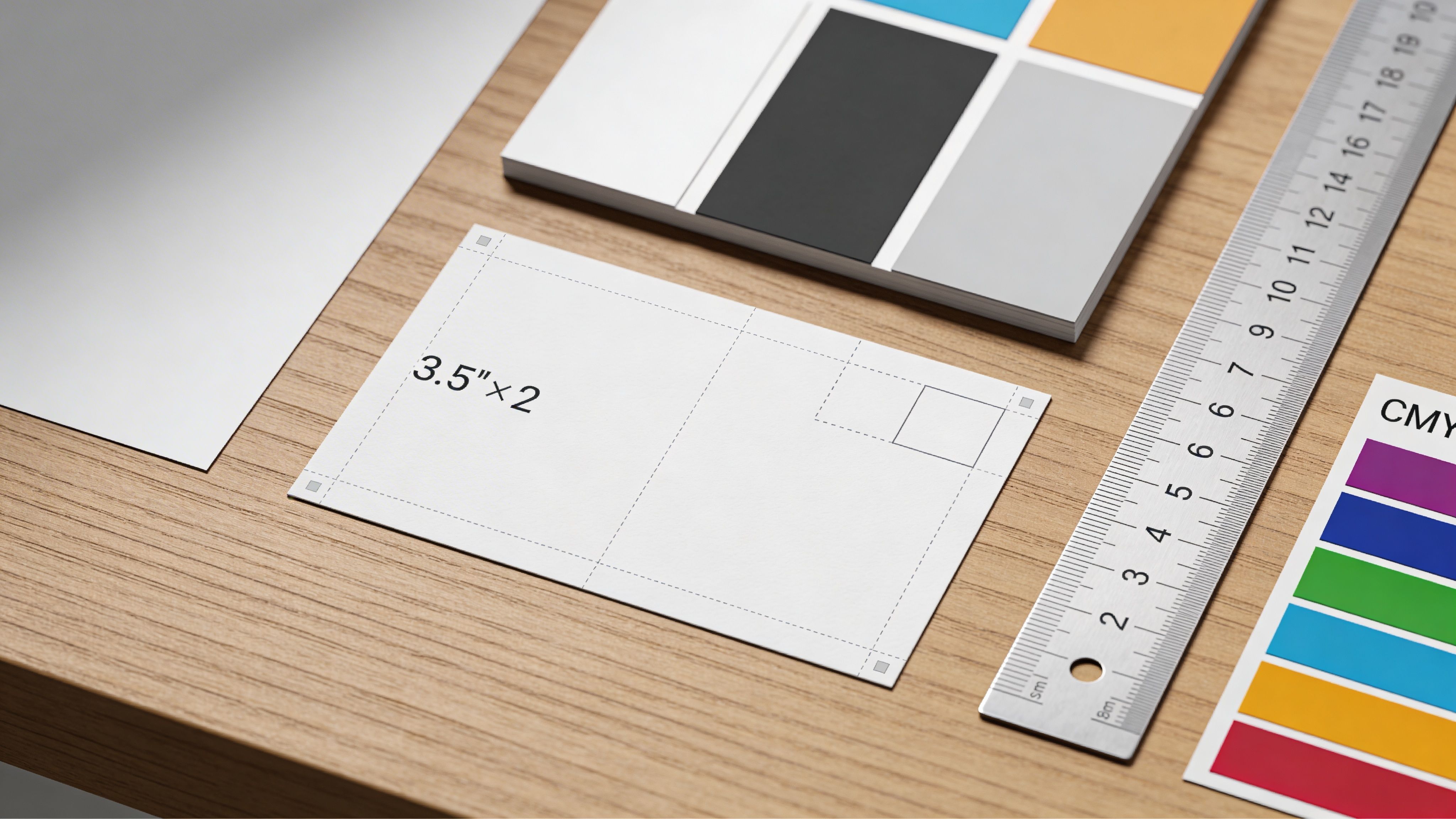
The finished size
In the United States and Canada, the standard business card finishes at 3.5" x 2".
That finished size is what you hold in your hand. It is not always the same size as the design file you upload, because print files need extra room for trimming.
According to Vistaprint’s business card dimensions guide, a standard business card file should be 1050 x 600 pixels at 300 DPI. If you include full bleed, the file should be 1083 x 633 pixels, and critical text and logos should stay within the 1008 x 558 pixel safe area.
Bleed, trim, and safe area
The easiest way to understand these terms is to think of a picture frame.
- Bleed is the extra image area that extends past the final edge. If your background color or photo reaches the edge of the card, it should keep going into the bleed so you do not get thin white slivers after trimming.
- Trim line is where the finished card is cut.
- Safe area is the inner zone where your important content belongs. Your name, phone number, website, and logo should stay inside it so they do not get clipped.
Here is the relationship in a simple table:
| Area | What it means | Why it matters |
|---|---|---|
| Bleed | Extra artwork beyond the edge | Prevents white borders after cutting |
| Trim line | Final cut size | Defines the card you receive |
| Safe area | Inner protection zone | Keeps key text and logos from being trimmed |
A common beginner mistake is placing text too close to the edge because it “looks balanced” on screen. Screens are forgiving. Guillotine cutters are not. Small production shifts are normal, so your layout needs margin for practical trimming.
Why 300 DPI matters
Resolution affects how sharp the printed card looks.
At 300 DPI, text stays crisp and logos hold their edges. If you build the file too small and enlarge it later, images can soften and type can lose clarity. That is especially noticeable on business cards because the format is small and everything is viewed up close.
If you are building a branded layout for the first time, Your Guide to Company Brand Design is a helpful companion read. It connects visual consistency to brand recognition, which is useful before you start placing logos, colors, and type into such a compact format.
Production details people often miss
Once the file size is right, check these items before upload:
- Backgrounds that touch the edge should extend into the bleed.
- Names, titles, and contact details should sit comfortably inside the safe area.
- Logos should be high resolution. A fuzzy logo becomes obvious fast on a small card.
- Decorative effects should support readability, not fight it.
If you want tactile detail, specialty print treatments such as embossing can add raised texture to a logo or name. That works best when the underlying layout is already clean and structurally sound.
Practical rule: Build the file for print first, then design within those boundaries. New buyers often reverse that order and end up fixing avoidable problems at proof stage.
Standard Business Card Sizes Around the World
“Standard” depends on where the card will be used.
That catches many small businesses off guard. A card that feels perfectly normal in New York can feel slightly off in London or Tokyo. Not dramatically wrong, but wrong enough to signal that the sender did not account for local norms.

The core issue is fit and familiarity. People expect cards to slide neatly into holders, wallets, desk organizers, and event badge sleeves designed around local sizes. When they do not, the card can feel improvised.
Common regional sizes
According to Namecheap’s guide to standard business card size, the main regional standards include:
| Region | Standard size |
|---|---|
| US and Canada | 3.5" x 2" (89mm x 51mm) |
| Europe | 85mm x 55mm |
| Japan | 91mm x 55mm |
Other Asia-Pacific markets often use similar but distinct dimensions, including 90mm x 54mm in places such as China, Singapore, Malaysia, and Hong Kong, as noted in the verified data.
Why this matters in practice
A local size does more than satisfy a technical spec. It acts like business etiquette.
If you meet Japanese partners and hand over a US-size card, the information may still be readable, but the card can feel unfamiliar in a market where presentation details carry weight. In Europe, a slightly taller card may fit local holders more naturally and feel more aligned with what recipients expect.
For an SMB, the practical questions are simple:
- Are you networking mostly in North America?
- Are you mailing cards to clients in multiple countries?
- Do your sales reps travel internationally?
- Does one team need more than one version?
If the answer is yes to cross-border use, plan for multiple files instead of one universal design. That means adjusting dimensions, checking text reflow, and sometimes shifting logo placement to suit a taller or wider format.
A good working approach
You do not need to create five completely different brand identities. You need one brand system that adapts cleanly.
Keep these elements consistent:
- Logo use
- Brand colors
- Typography
- Core contact details
Then resize the layout for each target region. Think of it as tailoring a suit to local fit standards instead of changing the suit entirely.
Tip: If your customer base is mostly domestic, stay with your local standard business card size. If your team regularly meets buyers abroad, create region-specific files before the event season starts. That saves last-minute redesign stress and avoids costly reprints.
Choosing Your Paper Stock and Finish
Once the file is correct, the next big decision is physical feel. Many first-time buyers hesitate here because paper terms can sound technical. The easiest way to think about stock and finish is clothing. Different fabrics can all make a good jacket, but each one sends a different signal.

How stock changes perception
Paper stock is the base material of the card. Thicker stock usually feels more substantial in the hand. Thinner stock can still look good, but the impression is lighter and more utilitarian.
That does not mean “thickest wins.” The better question is whether the card matches your brand.
A freelance designer may want a card that feels sleek and modern. A law office may prefer something more reserved. A retail brand may want a stock that works well with a vivid, image-heavy front.
Three common finish families
These are the finishes most new buyers compare first.
Matte
Matte feels smooth and non-reflective. It tends to look calm and controlled.
This finish suits brands that want a modern, understated look. It also helps keep text easy to read under bright indoor lighting because there is less glare.
Glossy
Glossy reflects more light and makes colors feel punchier.
If your card relies on strong imagery, bold color blocks, or product photography, gloss can help the visuals pop. The tradeoff is that glare can be more noticeable, and some people read small text less comfortably on very shiny surfaces.
Uncoated
Uncoated stock feels more natural, a bit like fine stationery.
It often works well for businesses that want warmth, tradition, or an artisanal feel. If your brand leans handmade, editorial, or classic, uncoated stock can support that tone nicely.
Specialty finishes and when they make sense
Some cards benefit from more tactile or premium treatments. Soft-touch surfaces feel velvety. Silk-style finishes add polish. Thick layered cards create weight and drama before the recipient reads a single word.
Those options work best when they reinforce the brand rather than compensate for a weak design. If the layout is cluttered, a luxury finish will not solve the problem.
For brands that want a heavier feel, ultra-thick business card options are worth exploring because thickness itself can become part of the experience.
A simple way to choose
Use the brand personality as your filter.
- Professional and conservative: Matte or uncoated usually feels appropriate.
- Visual and product-driven: Glossy often supports the design better.
- Boutique or premium: Soft-touch, silk-style, or thicker stock can add distinction.
- High-volume handouts: Choose a durable, readable option that stays practical.
Here is a quick comparison:
| Option | Best fit | Watch out for |
|---|---|---|
| Matte | Clean, modern brands | Colors may feel less flashy |
| Glossy | Bold visuals, vibrant designs | Glare can affect readability |
| Uncoated | Natural, classic, tactile brands | Some colors appear softer |
| Soft-touch or silk-style | Premium, design-led brands | Best used with simple layouts |
Some buyers choose based on what they personally like to touch. That is a start, but not the whole answer. The stronger choice is to ask, “What should this card say about us before anyone reads it?”
Design Tips for a Print-Ready Business Card
A strong card is easy to scan in about two seconds.
People do not study business cards the way they read brochures. They glance, decide what matters, and either keep the card or lose interest. Your design needs to guide that quick scan.
Start with hierarchy
Hierarchy means showing people where to look first, second, and third.
Usually, the order is simple:
- Brand or logo
- Person’s name
- Role or company
- Best contact method
- Website or next step
If every element is the same size, nothing stands out. If five things compete for attention, the card feels noisy. Let one element lead.
For example, if personal relationships drive your sales process, your name may deserve the strongest emphasis. If the company brand leads the sale, the logo or company name may take that role instead.
Keep the message lean
A standard business card is small. Trying to include every channel you use often weakens the card.
You usually do not need every social profile, two phone numbers, a long slogan, a full service list, and a dense address block. Pick the contact path you most want people to use and make that information obvious.
Good cards feel edited. That is not a limitation. It is clarity.
Use print-friendly color choices
Designing for screen and designing for print are different experiences.
Colors that look bright on a monitor can print differently on paper. That is why many designers prepare print files in CMYK rather than relying on RGB screen color. Even if you are using an online template or design tool, it helps to review a proof carefully and expect small differences between backlit screens and printed ink.
Also watch contrast. Light gray text on a pale background may look stylish on a large display, but on a business card it can become hard to read fast.
Choose fonts for legibility first
Small cards punish fussy typography.
Decorative fonts can work for a logo, but contact details should be clear at a glance. If a recipient has to squint to decipher your email address, the design failed its most basic job.
Check these points before approval:
- Use a readable typeface for body details
- Avoid shrinking text just to fit more information
- Leave breathing room between lines
- Make sure letters and numbers are easy to distinguish
This is especially important for email addresses, websites, and phone numbers, where one misread character breaks the connection.
Think in front and back, not just front
Many first-time buyers try to fit everything on one side. That creates crowding.
Using both sides gives the layout room to breathe. One side can carry the logo, a visual, or a bold brand field. The other can focus on contact details. The result often looks calmer and more deliberate.
If you want a more distinctive shape or silhouette, die-cutting options can change the card’s outline or create custom windows and edges. That works best after the basic layout already functions well in a standard format.
Expert tip: A memorable card is not the card with the most elements. It is the card someone can understand instantly and find later without effort.
A practical preflight checklist
Before you send the file, run through this list:
- Dimensions checked: Your document matches the required print setup.
- Bleed included: Backgrounds extend fully beyond the trim.
- Safe area respected: No critical text is hugging the edge.
- Logo quality verified: The file is sharp, not pulled from a website screenshot.
- Fonts reviewed: Small text remains easy to read.
- Spelling checked twice: Names, titles, URLs, and phone numbers are correct.
- Front and back aligned logically: The two sides feel connected, not unrelated.
- Proof viewed at actual size: Zooming out on screen is not enough. Print a rough copy on office paper if needed.
Common mistakes that cause rework
These show up again and again with first orders:
| Mistake | What happens |
|---|---|
| Low-resolution artwork | Logos and images print soft or pixelated |
| Text too close to the edge | Important details risk trimming |
| Too much information | Card feels cramped and hard to scan |
| Weak contrast | Contact info becomes hard to read |
| No final proofreading | Errors get locked into the full run |
One more point matters. Design trends move quickly. Networking habits move more slowly. A business card should not chase every visual fad if that makes the card harder to keep, read, or remember.
Exploring Variations Beyond the Standard Rectangle
The standard rectangle earns its place because it works. Still, there are times when a variation supports the message better.
The important question is not “How can I make this different?” It is “What kind of difference helps my brand and my use case?”

Rounded corners
Rounded corners tend to feel softer and more contemporary. They can make a minimal design feel friendlier and a colorful design feel less rigid.
But looks are only part of the choice. According to Vistaprint’s rounded corner business card page, classic square corners offer greater structural integrity and resist deformation from stacking or wallet pressure, which makes them a practical choice for high-contact industries and busy trade show environments.
That means the better option depends on how the card will live in the world. A creative studio may benefit from the softer feel of rounded corners. A field sales rep who keeps cards in a pocket all day may prefer square corners for durability.
Vertical orientation
Turning the card portrait-style can create a fresh layout without abandoning standard sizing.
This format often works well when you have a strong logo, a tall mark, or a minimalist design with just a few key details. It can feel modern without making the card difficult to store.
The caution is readability. A vertical layout should still guide the eye naturally. If people have to rotate the card several times to figure it out, the novelty starts working against you.
Mini cards and specialty shapes
Smaller or uniquely shaped cards can be memorable in the right context.
They often suit product tags, boutique brands, creatives, or businesses that want a compact leave-behind. But the further you move from the standard business card format, the more you need to test practicality. Will it fit in a wallet? Will it get lost in a pile? Will the unusual shape make contact details harder to scan?
A useful decision filter
Ask these three questions before choosing a variation:
- Will this make the card easier or harder to keep?
- Does the format fit my industry tone?
- Is the difference functional, or only decorative?
When the answer is functional, a variation can be smart branding. When the answer is only decorative, the standard rectangle often wins.
How to Order Your Business Cards with 4OVER4
Once you know your size, stock, finish, and file setup, ordering gets much easier.
That matters because the market is crowded. In the United States alone, approximately 10 billion business cards are printed each year, or more than 27 million every day, according to Vistaprint’s history and innovation overview. In that volume, details decide whether your card blends in or stands out.
Start with the right product category
If you need a familiar format for general networking, begin with a standard business card product rather than a specialty shape.
On 4OVER4, the most direct path is the standard business cards printing page, where you can compare common configurations and choose the format that matches the file and material decisions you already made.
Choose your build path
Different buyers need different workflows.
If you already have a print-ready file, upload it and check that it matches the dimensions and safe-area rules covered earlier. If you do not have a finished file, use a template or online design tool to build within the right boundaries from the start.
That choice alone can save time. A clean template reduces the chance of accidental edge violations, uneven spacing, or poor text hierarchy.
Confirm the physical specs
Before you add the job to cart, review the production choices carefully:
- Size: Confirm the regional standard you need.
- Paper stock: Match it to the brand feel and intended use.
- Finish: Choose based on readability, durability, and visual tone.
- Corners and orientation: Only vary these if they support the purpose.
This is also the moment to decide whether you are printing a general company card, a personal rep card, or multiple employee versions with the same brand system.
Review proofs like a printer would
Do not rush the final review.
Check names, titles, websites, and phone numbers. Make sure logos are sharp. Look at both sides as a pair. If a proof tool shows trim boundaries, use them. Tiny issues feel much larger after the full run arrives.
Match turnaround to your deadline
Turnaround time means production speed. Shipping time is separate.
If your cards are needed for an event, client meeting, or launch kit, count backward from the date you need them in hand. Give yourself room for proofing and delivery. Buyers often focus on the print date and forget transit time.
A calm ordering process usually produces better results than a rushed one. When you give yourself a little cushion, you are more likely to catch the small mistakes that cause expensive reorders.
A well-made business card should feel simple because the thinking behind it was careful. If you are ready to turn your design into a print-ready order, 4OVER4 offers templates, online design tools, and standard business card production options that can help you move from idea to finished cards with fewer production surprises.
More from

33
You’ve probably had this happen already. A happy client tells you their sister needs a cleaner, or a neighbor asks who handled the move-out
![]() Emma Davis
Emma Davis
Apr 8, 2026

60
You need a card by today. Maybe it is a client thank-you, a holiday insert for outgoing orders, or a simple folded handout for an event table.
![]() Emma Davis
Emma Davis
Apr 7, 2026

276
In a world of fleeting digital ads, a physical brochure can make a lasting impression. But getting that perfect, professional fold isn’t as
![]() Emma Davis
Emma Davis
Apr 6, 2026

104
Walk into any stationery store, and you'll see it: the classic 5" x 7" greeting card. It’s the undisputed cha
![]() Emma Davis
Emma Davis
Apr 5, 2026

63
Think of your company car or van for what it really is: a billboard on wheels. Every time it hits the road, it's advertising your business
![]() Emma Davis
Emma Davis
Apr 4, 2026

69
In a world buzzing with digital property listings and endless social media ads, it’s easy to think the classic 'For sale' sign has g
![]() Emma Davis
Emma Davis
Apr 3, 2026

193
Picture this: you need a massive, eye-catching banner for your grand opening next week. Not too long ago, that meant several trips to a local
![]() Emma Davis
Emma Davis
Apr 2, 2026

117
At its core, 10 pt cardstock is a versatile, lightweight paper perfect for a huge range of professional printing projects. Th
![]() Emma Davis
Emma Davis
Apr 1, 2026