What You Need to Know About Standard Brochure Sizes
Standard brochure sizes fall into a handful of proven dimensions - Letter (8.5" x 11"), Legal (8.5" x 14"), Tabloid (11" x 17"), A4, and several smaller formats. Each size pairs with specific fold types to create different panel counts and layouts. Choosing the right size affects your content capacity, mailing costs, and how people physically interact with your brochure. 4OVER4.COM offers 60+ paper types across all standard brochure sizes, backed by 25+ years of printing experience since 1999.
Picking the Right Brochure Size Starts Here
A standard brochure sizes guide saves you from the most expensive mistake in print marketing - designing something beautiful that doesn't fit your message, your budget, or your reader's pocket. The dimensions you choose dictate everything. How many panels you get. How much white space you can work with. Whether it qualifies for standard postal rates or costs extra to mail.
4OVER4.COM has printed over 10 billion+ cards and marketing materials for 150,000+ businesses, and brochures remain one of the most requested products. Before you jump into design, check out the Online Designer to see how your content fits different dimensions. You can also save on your next print run through Daily Deals or earn points toward future orders with the Loyalty Program.
Let's walk through every standard brochure size, what each one does best, and how to match the right dimensions to your project.
Every Standard Brochure Size Explained - Dimensions, Folds, and Best Uses
Standard brochure sizes aren't random. They evolved from standard paper sheet sizes and postal regulations. Each dimension creates a different number of panels when folded, and those panels determine how you organize your content. Here's a complete breakdown of every size you'll encounter in 2026.
Letter Size Brochures (8.5" x 11")
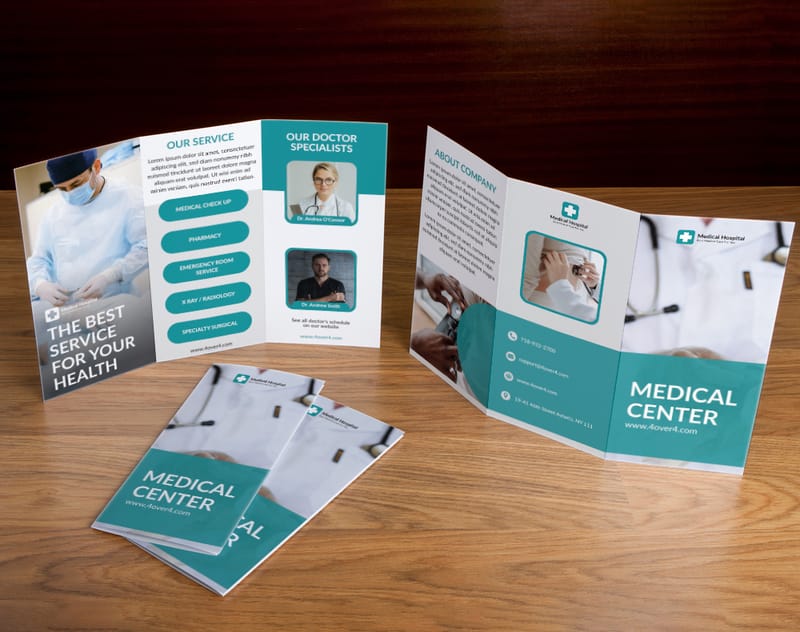
The Letter size brochure is the workhorse of North American print marketing. At 8.5" x 11", it's the most widely used brochure dimension for one simple reason - it's built around the standard paper size that every printer, every envelope, and every filing cabinet already accommodates.
When you tri-fold a Letter size sheet, you get six panels, each roughly 3.67" x 8.5". That's enough room for a front cover, an introduction panel, three content sections, and a back panel with your contact information. It's the classic layout you've seen at doctor's offices, real estate open houses, and hotel lobbies.
Letter size brochures also work with bi-fold (four panels), Z-fold, and gate fold configurations. If you're new to folding options, our guide on How To Fold A Brochure covers every technique with visual examples.
Best for: General marketing, service overviews, welcome packets, real estate listings, healthcare information sheets.
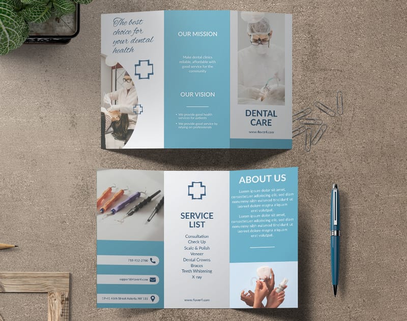
Legal Size Brochures (8.5" x 14")
Add three inches to the Letter format and you get the Legal size brochure at 8.5" x 14". Those extra inches aren't just padding. They give you roughly 27% more printable area than a Letter brochure, which translates to more room for detailed pricing tables, longer service descriptions, or larger images.
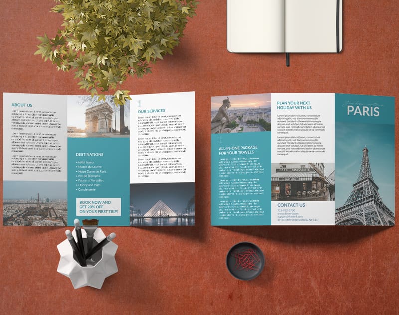
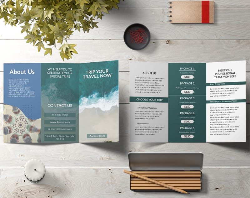
Tri-folded, a Legal brochure creates panels that are about 4.67" x 8.5" - noticeably taller than Letter panels. Restaurants love this size for menus. Law firms use it for practice area breakdowns. Travel companies pick it for itinerary brochures where they need to list destinations, dates, and pricing without cramping the layout.
One thing to keep in mind: Legal size brochures don't fit standard #10 envelopes. You'll need a #10 policy envelope or a 6" x 9" envelope for mailing. If you're creating custom envelopes for your brochures, check out How To Make Envelopes for sizing guidance.
Best for: Restaurant menus, detailed service catalogs, travel itineraries, legal service brochures, event programs.
Tabloid Size Brochures (11" x 17")
The Tabloid brochure is the big one. At 11" x 17", it's exactly double the Letter size, which means a single bi-fold gives you four Letter-sized panels. That's a lot of real estate.
Tabloid brochures make a physical impression the moment someone picks one up. They feel big. They look premium. And they give designers room to use large photography, infographics, and detailed maps without shrinking everything down to microscopic proportions.
Tri-folded, a Tabloid creates panels roughly 5.67" x 11" - each panel is nearly the size of a half-sheet flyer on its own. If you're comparing this to standalone flyer formats, our resource on How To Make Flyers breaks down when a flyer makes more sense than a brochure.
Best for: Product catalogs, campus maps, trade show handouts, nonprofit annual reports, tourism guides, conference programs.
A4 Size Brochures (8.3" x 11.7")
A4 is the international standard. At 8.3" x 11.7", it's slightly narrower and taller than the North American Letter size. If your business operates internationally - or if you're printing for a client outside the U.S. - A4 is the expected format.
The difference between A4 and Letter is small but real. A4 panels in a tri-fold measure about 3.9" x 8.3", compared to Letter's 3.67" x 8.5". A4 gives you a bit more height, Letter gives you a bit more width. For most designs, the distinction won't change your layout dramatically. But if you're repurposing a design between U.S. and international markets, you'll need to adjust margins and bleeds.
Best for: International marketing materials, global corporate communications, multilingual brochures, export product sheets.
Half-Letter Size Brochures (5.5" x 8.5")
Cut a Letter sheet in half and you get the Half-Letter brochure at 5.5" x 8.5". It's compact, portable, and surprisingly versatile. This size works well as a single bi-fold (four panels at 4.25" x 5.5") or as an unfolded booklet-style piece.
Half-Letter brochures are popular at trade shows and events where people are collecting multiple handouts. They fit easily into a tote bag, a jacket pocket, or a conference folder. They also cost less to print and mail than full-size brochures.
"We switched from Letter to Half-Letter brochures for our trade show booth and noticed people actually kept them instead of tossing them in the trash at the exit. The smaller size felt less like junk mail and more like something worth reading."
- Derek L., Marketing Director
Best for: Trade show handouts, event programs, quick-reference guides, retail product inserts, appointment reminders.
DL Size Brochures (3.9" x 8.3")
DL stands for "Dimension Lengthwise," and at 3.9" x 8.3", this size is designed to fit perfectly into a standard DL envelope. It's the most common brochure size in Europe and Australia, and it's gaining traction in North America for direct mail campaigns.
A DL brochure is essentially one-third of an A4 sheet. It's tall and narrow, which creates a distinctive look that stands out in a stack of Letter-sized mail. The slim profile also makes it easy to display in brochure racks and countertop holders.
Best for: Direct mail campaigns, rack cards, hotel and tourism information, salon service menus, loyalty program inserts.
Square Brochures (8" x 8" or 8.5" x 8.5")
Square brochures break the rectangular mold and grab attention through geometry alone. At 8" x 8" or 8.5" x 8.5", they feel modern and creative. The equal dimensions create a balanced canvas that works beautifully for image-heavy designs.
The downside? Square brochures cost more to mail because they don't qualify for standard letter rates with USPS. They also don't fit standard envelopes. But for hand-distribution at events, in-store displays, or inclusion in welcome kits, the visual impact is worth the trade-off.
Best for: Portfolio pieces, photography showcases, luxury brand marketing, art galleries, boutique retail, high-end real estate.
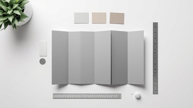
How Fold Type Changes Your Effective Size
The flat sheet size is only half the equation. Your fold type determines the final folded dimensions - which is what your reader actually holds in their hand.
A Letter-size tri-fold finishes at approximately 3.67" x 8.5". The same Letter sheet with a bi-fold finishes at 5.5" x 8.5". A Z-fold on a Legal sheet creates an accordion effect at 4.67" x 8.5". Gate folds, roll folds, and accordion folds each produce different panel sizes from the same starting sheet.
Your fold choice affects more than aesthetics. It determines how information reveals itself to the reader. A tri-fold guides the eye in a specific sequence. A Z-fold lets everything unfold at once. A gate fold creates a dramatic reveal moment when the two outer panels swing open.
Choosing the Right Size for Your Project
Match your brochure size to three factors: content volume, distribution method, and budget.
Content volume: If you have a paragraph of text and a few images, Half-Letter or DL will do. If you're explaining 12 services with pricing, go Legal or Tabloid.
Distribution method: Mailing? Stick with Letter, DL, or Half-Letter to keep postage costs down. Handing out at events? Any size works, but smaller formats get kept more often. Displaying in a rack? DL and Half-Letter fit standard holders.
Budget: Smaller sizes use less paper and ink. A Half-Letter brochure costs roughly half as much per unit as a Tabloid. But printing in bulk reduces per-unit costs across all sizes.
For more printing guides covering everything from promotional items to stationery, browse the full Faq Hub. You'll find resources on topics like Custom Magnets Faq and How To Clean Rubber Stamps alongside detailed brochure printing advice.
Setting Up Your Brochure File for Print
Regardless of which standard brochure size you pick, your print file needs three things: the correct flat dimensions, proper bleed (typically 0.125" on all sides), and a safe zone that keeps critical text at least 0.125" inside the trim line.
For a Letter tri-fold, your flat file should be 8.75" x 11.25" (including bleed). Set your fold lines at the correct panel widths - and remember that the panel that folds in first is usually about 1/16" narrower than the other two panels so it tucks cleanly.
4OVER4.COM provides ready-to-use templates for every standard brochure size and fold type. Download one before you start designing, and you'll avoid the most common file setup headaches. Here are templates to get you started:
Blank Templates
Brochure Size Mistakes That Cost You Money
Even experienced designers trip up on brochure sizing. Here are the errors 4OVER4.COM's prepress team catches most often.
Ignoring the fold panel width difference. On a tri-fold, the inner panel must be slightly narrower (about 1/16") than the outer panels. Skip this, and your brochure won't fold flat. It'll buckle and look sloppy.
Designing at the folded size instead of the flat size. Your file needs to be the full unfolded dimensions with bleed. If you design at 3.67" x 8.5" thinking that's your tri-fold panel, you'll end up with a brochure one-third the size you wanted.
Choosing a size that doesn't fit standard envelopes. If you're mailing brochures, check envelope compatibility before you commit to a size. A beautiful 8" x 8" square brochure is useless for a direct mail campaign if you haven't budgeted for custom envelopes and non-standard postage.
Forgetting about paper weight and fold cracking. Heavier paper stocks (16pt and above) can crack along the fold line if not scored first. Always request scoring for thick brochure stocks. 4OVER4.COM includes scoring on heavy paper brochures as standard practice.
Print Your Brochures with 4OVER4.COM
Now that you know which standard brochure size fits your project, it's time to bring your design to life. 4OVER4.COM prints Custom Brochures in every size covered in this guide - from compact DL formats to large-format Tabloid spreads. With 60+ paper types, multiple fold options, and a 99.8% on-time delivery rate, your brochures arrive exactly how you designed them and exactly when you need them.
Here's a closer look at the available specifications, paper options, and what other customers have to say about their brochure orders:
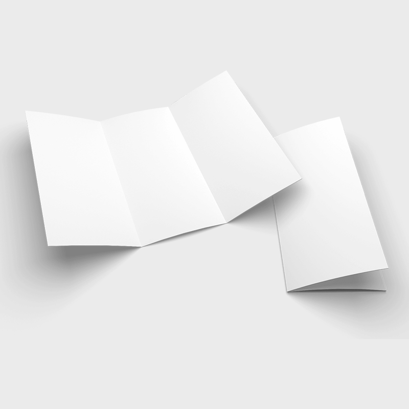
Free Brochure Sizes And Folds Templates
- Letter (8.5" x 11"): This is the go-to size in the U.S. and Canada. It’s practically built for tri-fold designs that let you organize your information into neat, digestible sections.
- Legal (8.5" x 14"): That extra three inches of length makes a huge difference. It’s a favorite for menus or detailed service lists that need just a bit more breathing room than a Letter-sized sheet can offer.
- Tabloid (11" x 17"): When you need to make a statement, this is your size. Folded in half, it creates a beefy 8.5" x 11" four-panel brochure that’s perfect for high-impact presentations or visual-heavy lookbooks.
- A4 (210mm x 297mm): This is the global standard. It's a touch taller and narrower than US Letter, ensuring your marketing materials have a professional, consistent look no matter where in the world they land.
- Legal: A bit longer at 8.5 x 14 inches, Legal size is perfect when you need to pack in more information, like detailed price lists or expansive restaurant menus.
- Tabloid: Measuring 11 x 17 inches, this size is often folded in half to create a beefy four-panel brochure. It's a great choice for product catalogs or presentations that need to make a statement.
- For Domestic Campaigns: Stick with ANSI sizes like Letter (8.5" x 11"). It guarantees smooth printing and distribution within North America.
- For International Campaigns: Design your materials in ISO sizes like A4 (210mm x 297mm) from the very start. They’ll look professional and be easy to print anywhere in the world.
- For Global Brands: Many companies play it smart and create two versions of their key marketing materials, one in Letter for North America, and an A4 version for everyone else. This keeps the brand looking sharp and consistent, no matter the region.
- Product Catalogs: Showcasing new collections with big, beautiful images.
- Event Programs: Laying out schedules, speakers, and venue maps clearly.
- Real Estate Listings: Featuring stunning property photography that sells.
- Company Introductions: Presenting a clean and concise brand overview.
- Best for: Displaying large graphics, creating step-by-step guides, or designing menus.
- Key Advantage: It allows for a continuous design to flow across multiple panels without interruption.
- Gate Fold: Two side panels fold inward to meet in the middle, just like a set of double doors. Opening them reveals a large, impactful center panel. This is perfect for dramatic product launches or special event invitations where you want to build a little suspense.
- French Fold: Also known as a right-angle fold, this involves folding a sheet in half horizontally, and then in half again vertically. It creates a compact four-panel piece that unfolds into a much larger sheet, almost like a mini-poster.
- 70-80 lb Text (105-120 gsm): This is a solid starting point. It's noticeably thicker than copy paper, making it great for high-volume handouts or basic informational brochures. It’s cost-effective, but it doesn't quite have that premium feel.
- 100 lb Text (150 gsm): For many projects, this is the sweet spot. It offers a clear step up in quality, feels substantial in hand, and holds its folds beautifully without being too stiff. It’s the perfect balance of quality and cost.
- 80-100 lb Cover (215-270 gsm): Now we’re getting into cardstock territory. This heavy, durable stock is ideal for bi-fold brochures or the covers of small booklets. It sends a message of importance and is built to last.
- Gloss: This finish has a shiny, reflective surface that makes images and colors pop. It’s perfect for photo-heavy designs, like travel or automotive brochures. The only downside is that it can create glare under direct light, which might make text a bit harder to read.
- Matte: A matte finish offers a smooth, non-reflective surface for a more subtle, elegant, and professional look. Colors still look sharp, but without the shine, making it an excellent choice for text-heavy brochures where readability is the top priority.
- Silk/Satin: This is the happy medium between gloss and matte. It has a low-level sheen that adds a touch of vibrancy without the high glare of a full gloss. It feels sophisticated and modern.
- Trim Line: This is the finish line, the final edge of your brochure. It’s the line where the massive industrial cutters will slice the paper to its final size, like 8.5" x 11" for a standard letter brochure.
- Bleed Area: This is your safety net. It's a small margin of extra artwork that extends beyond the trim line, usually 0.125 inches (or 3mm) on every side. Because printing cutters aren't always perfect down to the micrometer, the bleed ensures no ugly, unprinted white edges appear if the cut is just slightly off.
- Safe Zone: This is the "safe space" inside the trim line, typically another 0.125 inches in from the edge. All of your must-have content, we’re talking text, logos, and important parts of images, needs to stay inside this zone to avoid getting accidentally chopped off.
- High-impact product announcements
- Event programs with maps or schedules
- Real estate flyers with stunning property photos
- Best For: Travel agencies, car dealerships, real estate, or any brand that wants to project a modern, high-energy feel.
- Keep in Mind: It can pick up fingerprints and create a glare under bright lights, which can sometimes make text-heavy sections a little tricky to read.
- Best For: Luxury brands, financial advisors, non-profits, or any business aiming for an elegant, trustworthy aesthetic.
- The Big Advantage: Its understated texture feels fantastic to the touch and signals quality without having to shout for attention.
Your Brochure Size Questions, Answered
What is the most common standard brochure size?
The most common standard brochure size in North America is Letter (8.5" x 11"). When tri-folded, it creates six panels at approximately 3.67" x 8.5" each. This size fits standard #10 envelopes, works with most brochure racks, and offers a balanced amount of space for text and images. Internationally, A4 (8.3" x 11.7") holds the same dominant position.
What size should I choose for a mailed brochure?
For mailed brochures, stick with Letter (8.5" x 11") tri-fold or Half-Letter (5.5" x 8.5") bi-fold. Both fit standard envelope sizes and qualify for regular postage rates. DL size (3.9" x 8.3") also works well for direct mail. Avoid square or Tabloid sizes for mailing - they require non-standard envelopes and higher postage.
How much bleed do I need for a standard brochure?
Standard bleed for brochures is 0.125" (1/8 inch) on all four sides of the flat, unfolded sheet. This means a Letter-size brochure file should be 8.75" x 11.25" total. Keep all critical text and logos at least 0.125" inside the trim line to prevent anything important from being cut off during finishing.
Can I print a brochure in a non-standard custom size?
Yes. While this standard brochure sizes guide covers the most popular dimensions, 4OVER4.COM prints custom sizes as well. Custom dimensions may affect pricing and turnaround time since they require non-standard cutting. Contact 4OVER4.COM's support team to confirm feasibility and get a quote for any non-standard brochure dimensions.
What paper weight works best for brochures?
For most brochures, 100lb Gloss Text or 100lb Matte Text provides a professional feel without being too stiff to fold. If you want a sturdier, more premium brochure, 14pt or 16pt cardstock works - but make sure to request scoring along fold lines to prevent cracking. Thinner 80lb Text is budget-friendly for high-volume handouts.
What's the difference between a brochure and a pamphlet size?
In printing, "brochure" and "pamphlet" are often used interchangeably. Both typically start as Letter or A4 sheets and get folded. The distinction is more about content than size. Brochures tend to be marketing-focused with images and calls to action. Pamphlets lean informational or educational. The standard sizes are identical for both.