Table of Contents
- Home
- content hub
- Rack Card Design That Gets Noticed
Rack Card Design That Gets Noticed
Oct 25, 20256399 views
Oct 25, 20256399 views
A truly effective rack card design is more art than science. It's about crafting a small, powerful marketing tool that can stop someone in their tracks. It has to do more than just look pretty; a great design marries sharp visuals with tight, punchy messaging to create instant interest and push for a single, clear action. That's how a casual glance turns into a genuine lead.
Why a Strategic Rack Card Design Matters
Before you even think about firing up your design software, we need to talk strategy. A rack card is your silent salesperson, fighting for attention in a sea of competitors. Its only job is to cut through the noise and deliver a powerful message in a heartbeat.
Imagine a local tour company with cards sitting in a hotel lobby. That design has to be compelling enough to convince a tired traveler to book an impromptu excursion.
This is where having a solid plan pays off. The difference between a card that gets snatched up and one that gathers dust is almost always the strategic thinking that happened before anyone picked a font or color. Your strategy is the blueprint that makes sure your final product is a hard-working marketing asset, not just a forgotten piece of paper.
Define Your Core Objective
What’s the one thing you want someone to do after they pick up your card? If you don't have a clear goal, your design will feel scattered and ineffective. Don't try to cram everything onto one small card; just pick one primary objective and build around it.
- Drive Website Visits: Slap a QR code on there that sends people to a specific landing page with a killer offer.
- Increase Foot Traffic: Make your physical address and a simple map impossible to miss. An in-store-only coupon is even better.
- Generate Phone Calls: Is your goal to get the phone ringing for bookings or quotes? Then your phone number needs to be big and bold.
- Promote an Event: The date, time, and location should be front and center, with a super simple way to RSVP.
A strong visual identity is key across all your promotional materials, and this is especially true for events. Many of the same principles in these top event branding ideas to make your event stand out apply directly to creating a rack card that commands attention.
The best rack cards have a single, undeniable purpose. If you try to make it a menu, a company history, and a coupon all at once, you'll just create confusion. And a confused mind always says no.
Know Your Audience and Location
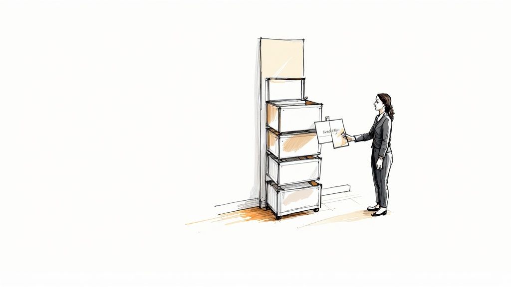
Rack cards, typically sized at a standard 4 inches by 9 inches, have become a go-to for industries like tourism and local services. Why? Because they're perfectly designed to fit into display racks in high-traffic places like hotel lobbies, visitor centers, and checkout counters. They are some of the most effective https://www.4over4.com/printing/category/marketing-materials you can invest in.
Because of this, your design absolutely must speak to the people in that specific environment. A design for a luxury spa placed in a five-star hotel should have a completely different vibe than one for a family-friendly pizza joint at a community rec center. This context is everything—it shapes your tone of voice, your imagery, and the offer you present.
Before diving into the nuts and bolts of design, it's helpful to lay out the strategic foundation. This simple table can guide your thinking and ensure all the core elements are aligned.
Core Elements of an Effective Rack Card Strategy
| Element | Key Consideration | Example |
|---|---|---|
| Primary Goal | What is the single most important action? | Drive sign-ups for a free trial. |
| Target Audience | Who are you trying to reach? | Tourists aged 25-45 looking for adventure. |
| Location Context | Where will the card be displayed? | At the front desk of partner hotels. |
| Key Message | What is the core value proposition in one sentence? | "The city's #1 rated food tour. Book now!" |
| Call to Action (CTA) | What is the specific instruction? | "Scan the QR code to see today's tour times." |
Thinking through these points first will make the entire design process smoother and ensure the final product is perfectly tailored to do its job. It transforms your rack card from a simple piece of paper into a strategic marketing tool.
Crafting a Layout That Guides the Eye
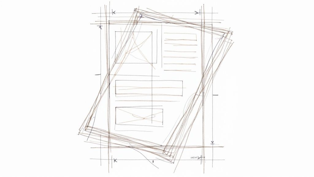
Think of your rack card's layout as its silent director. It's the unseen force that tells a potential customer exactly where to look and in what order. A powerful layout doesn't happen by accident; it's a deliberate strategy to guide their eye from the initial hook right down to the final call to action. Without that clear path, you risk losing your audience in a jumble of text and images.
The most important job of your layout is to establish a strong visual hierarchy. This just means making sure the most important parts of your message stand out the most. Your headline should be the very first thing anyone sees, even from a distance. Use a large, bold font and stick it in the top third of the card—that’s the part that peeks out above the holder.
Structuring Your Content Flow
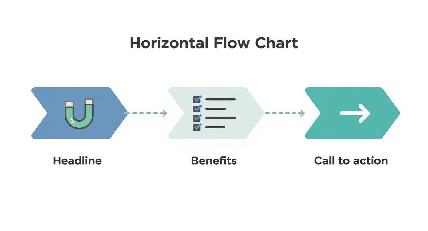
Your rack card is essentially a tiny billboard telling a quick story. You have to organize the information logically to keep someone reading. A messy, confusing layout is an instant turn-off and frankly, it just looks unprofessional.
A proven structure that works for almost any rack card is the classic problem-solution format. First, you hook them with a question or a relatable problem. Then, you present your service or product as the obvious, simple solution.
Here’s a simple flow I’ve seen work time and time again:
- Top Third: This is for your attention-grabbing headline. Make it count.
- Middle Section: Use a few concise bullet points to explain the benefits or key features. Keep it scannable.
- Bottom Third: This is where you put your compelling call-to-action (CTA), all your contact details, and your logo.
This structure is so effective because it’s intuitive. It follows how people naturally scan information, making your message incredibly easy to absorb in just a few seconds. For simpler messages, a single-column layout is perfect. If you have a bit more to say, a clean two-column grid can work wonders.
White space isn't just empty space—it's an active design element. Using it well creates breathing room, makes your text easier to read, and gives your rack card a clean, high-end feel. A cluttered design just overwhelms the eye and is almost guaranteed to be ignored.
Placing Key Elements for Maximum Impact
Where you place each component on the card matters immensely. Your logo, for instance, should reinforce your brand identity without overpowering the main message. I usually find that placing it subtly at the bottom near the contact information is a smart move.
Your contact details—website, phone number, social handles, or address—must be crystal clear and effortless to find. Don't make people hunt for it. The same goes for your CTA, which should be the final, unmissable instruction at the bottom of the card. A great trick is to frame your CTA with a contrasting color block or place it right next to a QR code to boost its effectiveness.
These layout principles are fundamental to almost all marketing materials. For example, a well-structured design is just as critical for an effective flyer. You can find more inspiration by looking into high-quality flyer printing for your business. The goal is always the same: guide the reader’s journey from curiosity to action. By mastering your layout, you turn a simple piece of paper into a powerful conversion tool.
Choosing Imagery and Fonts That Connect
Let's be honest, people judge a book by its cover—and a rack card by its design. Long before anyone reads a single word, they’ve already made a snap judgment based on your images, colors, and fonts. These aren't just decorative elements; they're the heart and soul of your card, working together to create an emotional gut reaction and communicate your brand's personality in a blink.
Your imagery has a heavy lift. It needs to do more than just fill space; it has to tell a story. Steer clear of those generic stock photos that scream "I gave up." Instead, pick high-resolution images that actually reflect the experience you’re selling. If you run a spa, show a client looking utterly blissed out. If you're a real estate agent, a stunning, professional shot of a drool-worthy property will always beat a generic house graphic.
The whole game with rack cards is to stand out and get someone to actually pick it up from a crowded display. A killer headline paired with a compelling image is your one-two punch to communicate your value instantly. For a deeper dive into making designs that don't just sit there, check out these insights on designing effective rack cards.
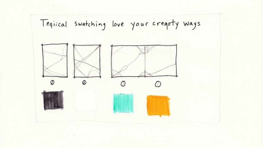
Finding the Right Color Palette
Color is a psychological shortcut. It can make your brand feel energetic, trustworthy, or luxurious without you saying a word. When picking colors for your rack card, you're balancing brand consistency with sheer, unadulterated visibility.
- Stick to Your Brand: Your colors should feel like a natural extension of your brand identity. If your logo is a cool blue and gray, throwing in neon pink is going to cause some serious whiplash.
- Contrast is King: Make sure people can actually read what you wrote. Dark text on a light background is a timeless, foolproof choice for a reason.
- Pop Off the Rack: Picture your card sitting in a holder with dozens of others. What's going to make it jump out? Sometimes a bold, vibrant color is all you need to cut through the noise.
If you’re featuring a person in your imagery, like a real estate agent or a consultant, your colors need to play nicely with their photo. A top-notch printing job here can make all the difference. You can explore professional options for printing headshots that make an impact to see what a difference quality makes.
Your color palette sets the mood before a single word is read. A bright, energetic scheme is great for a kids' play zone, while a sophisticated, muted palette works better for a high-end law firm. Get this right, and you've already won half the battle.
Making Your Typography Work for You
Typography is all about making your words easy and enjoyable to read. On a rack card, you have just seconds to capture attention, so your font choices are absolutely critical. My golden rule? Stick to two or three fonts, max. Any more and you're heading straight into cluttered, amateur-hour territory.
A great approach that works almost every time is pairing a bold, attention-grabbing font for your main headline with a clean, simple sans-serif for your body text.
A Simple Font Pairing That Works:
| Role | Font Style | Example | Purpose |
|---|---|---|---|
| Headline | Bold, Display (e.g., Oswald) | Book Your Tour Today! | Grabs attention from a distance. |
| Body Copy | Clean, Sans-Serif (e.g., Lato) | Discover the hidden gems... | Ensures the details are easy to read. |
This kind of combination creates a natural visual hierarchy, telling the reader’s eye exactly where to look first. When your images, colors, and fonts are all working together in harmony, your rack card design doesn't just look professional—it creates an instant, powerful connection with your audience.
Writing Copy That Actually Converts
A slick design might get someone to pick up your rack card, but it's the words that will actually get them to do something. Your copy does all the heavy lifting—it persuades, informs, and nudges a potential customer toward taking that next step. Without solid, compelling copy, even the most beautiful rack card design is just a pretty piece of paper. The name of the game is clarity, brevity, and a laser focus on what your reader wants.
Your headline is your first—and maybe your only—shot to make an impression. It needs to be a magnet, latching onto a customer's problem or desire instantly. Forget trying to be clever. Focus on a clear benefit. A headline like "Relax and Recharge" is nice, but "Escape City Stress With a 60-Minute Massage" speaks directly to a need, making it way more powerful.
Crafting Benefit-Focused Body Copy
Once that headline hooks them, the body copy needs to deliver on the promise. And fast. People don’t read rack cards; they scan them. This means long, dense paragraphs are your worst enemy. Break down your key selling points into a short, scannable format that someone can digest in just a few seconds.
Bullet points are perfect for highlighting the real-world benefits of what you offer. The trick is to frame every single point from the customer’s perspective.
- Instead of: "We use fresh, organic ingredients."
- Try: "Enjoy healthier, more flavorful meals made fresh daily."
See the difference? That small shift from talking about features to talking about benefits makes your message infinitely more persuasive. While the general writing principles are similar for rack cards and postcards, the tall, skinny format of a rack card demands even tighter messaging. For a deeper dive into writing persuasive print copy, our guide to effective postcards printing for direct mail has some great complementary insights.
Every single word on your rack card should help answer the reader's unspoken question: "What's in it for me?" If it doesn't help answer that, cut it.
Creating an Irresistible Call to Action
The final—and most important—piece of your copy is the call to action, or CTA. This is where you have to be completely direct and tell the reader exactly what to do next. A weak, vague CTA like "Learn More" is a total waste of space. You need something specific, urgent, and crystal clear.
Think about the one thing you want someone to do. Book a tour? Visit your store? Claim a special offer? Make that the entire focus of your CTA and kick it off with a strong, actionable verb.
A great CTA, for example, might be "Scan Here for 20% Off Your First Visit!" This is the perfect spot to bridge the gap between your physical card and your digital world. In fact, a smart rack card design often acts as a gateway to digital engagement, promoting things like modern digital loyalty cards. This simple strategy turns a piece of paper into an interactive tool, connecting your physical and online marketing in a seamless way.
Preparing Your Design File for Printing
Alright, you’ve put in the hard work and your rack card design looks fantastic on screen. But we're not quite at the finish line yet. The final, and arguably most critical, step is making sure the file you send to the printer is technically perfect.
Trust me, this is where a beautiful design can go sideways fast. A small oversight here can lead to frustrating mistakes, costly reprints, and a final product that just doesn't live up to your vision. Getting your file print-ready is all about a few key concepts—they aren't complicated, but they are non-negotiable for a professional result.
Think of it as giving your printer the perfect blueprint. A little prep work now saves a world of headaches later.
Understanding Bleed and Safety Margins
First things first, let's nail down the print-specific terms you absolutely need to know. Getting these right prevents those amateur-looking thin white borders that can ruin an otherwise great design.
- Bleed: This is a small extra margin—usually 0.125 inches—that extends beyond the final cut edge of your card. Printers print on large sheets and then trim them down to size. Since the cutting process isn't always microscopically precise, the bleed ensures your background color or image goes all the way to the edge, even if the blade is a fraction of a millimeter off.
- Trim Line: This is the line where the card will actually be cut. For a standard rack card, this is your final 4" x 9" dimension.
- Safety Margin: This is an inner boundary, also typically 0.125 inches, inside the trim line. All your crucial text, logos, and important details must stay within this zone.
Think of the safety margin as a "no-go zone" for anything you can't afford to lose. If it’s outside that line, it's at risk of getting chopped off. Always, always double-check that your key message is tucked safely inside.
Setting the Correct Color and Resolution
Next up are color and resolution. What you see on your screen isn't what a printer produces without the right settings.
Your monitor uses an RGB (Red, Green, Blue) color model, which is based on light. Professional printers, however, use a CMYK (Cyan, Magenta, Yellow, Key/Black) model, which is based on ink. If you send an RGB file, the colors will get converted automatically, and you might not like the results—they often come out looking dull or off-brand. To avoid any surprises, always set your design file’s color mode to CMYK from the very beginning.
Equally important is the resolution, measured in DPI (dots per inch). For print, you need crisp, sharp images. A low-resolution photo that looks fine on a website will look blurry and pixelated on paper. To avoid this, make sure every image in your design is at least 300 DPI at its final print size.
Finally, you'll need to send your printer the right kind of file. A print-ready PDF is the industry standard because it embeds all your fonts and images, ensuring nothing gets shifted or substituted when someone else opens it.
To give your cards that extra touch of durability and a premium feel, especially for high-traffic areas, consider finishing them with a protective coating. You can explore different laminating options for your printed materials to find the perfect match.
Print-Ready File Checklist
Before you hit "send" on that email to your printer, run through this final checklist. It’s a simple way to catch any last-minute issues and ensure a smooth printing process.
| Check Item | Specification | Why It's Important |
|---|---|---|
| Color Mode | CMYK (not RGB) | Prevents unexpected color shifts during printing. |
| Resolution | 300 DPI for all images | Ensures images are crisp and not pixelated. |
| Bleed | 0.125" on all sides | Avoids white edges after trimming. |
| Safety Margin | 0.125" inside trim line | Protects key text and logos from being cut off. |
| File Format | Print-Ready PDF | Embeds fonts and images for consistent results. |
| Fonts | Outlined or Embedded | Prevents font substitution issues at the printer. |
| Proofread | Final check for typos | Catches any spelling or grammar mistakes before printing. |
Going through these steps might seem tedious, but taking a few extra minutes to prep your file correctly is the difference between a professional-grade rack card and a costly mistake. It’s the final polish that ensures all your creative work pays off.
Common Rack Card Design Questions
Even the most buttoned-up design plan can hit a few snags. When you're in the weeds of designing a rack card, little questions about size, paper, and features always seem to pop up. Getting these details right is the difference between a card that looks professional and one that just looks… off.
Let's walk through some of the most common questions we hear from designers and business owners alike. Think of this as your final checklist before sending your masterpiece off to the printer.
What Is the Standard Size for a Rack Card?
The industry-standard size for a rack card is 4 inches by 9 inches. This isn't just a random measurement; it's specifically designed to fit perfectly into the display racks you see in hotels, visitor centers, tourist traps, and checkout counters everywhere.
You could technically create a custom-sized card, but I'd strongly advise against it. If it's too wide, it won't fit. Too short, and it'll disappear behind the other cards. Sticking to the 4x9 inch format is the simplest way to make sure your card actually gets seen.
Should I Put a QR Code on My Rack Card?
Yes. Absolutely, one hundred percent. A QR code is a simple, brilliant tool that connects your physical marketing directly to your digital world. It gives someone who’s interested an instant, zero-effort way to act—whether that’s to visit your website, check out a menu, or grab a special discount.
A rack card with a QR code is no longer just a piece of paper; it becomes an interactive gateway. You're turning a moment of passive interest into active engagement by making it ridiculously easy for someone to take the next step.
For it to work well, make sure your QR code is big enough for a phone camera to scan it easily. I always recommend placing it right next to your main call to action—that visual connection reinforces what you want them to do and really boosts response rates.
What Is the Best Paper for Rack Cards?
The right paper really depends on the vibe you're going for with your brand. Both glossy and matte finishes have their place, but the most important thing is to choose a nice, heavy paper stock.
- Glossy Finish: This coating makes colors and photos incredibly vibrant and punchy. It’s a fantastic choice for a bold, high-energy rack card design. The only potential downside is that it can catch a glare under bright lights.
- Matte Finish: This gives you a more subtle, modern, and high-end feel. There's zero glare, which makes text super easy to read. It's my go-to for more sophisticated or minimalist designs.
No matter which finish you choose, go for a heavier cardstock like 14pt or 16pt. A flimsy card feels cheap and gets beat up quickly in a busy display rack. A thicker, sturdier card just feels more professional and valuable when someone picks it up.
Ready to bring your standout rack card design to life? At 4OVER4, we offer premium printing on a variety of high-quality paper stocks and finishes to ensure your message gets noticed. Explore our professional rack card printing options and get started today!
More from

13
When you’re ready to invest in an A-frame sign, the first question you'll ask is, "What size do I need?" It usually comes down
![]() Emma Davis
Emma Davis
Mar 13, 2026

113
The real secret to mastering your direct mail budget isn't complicated. It comes down to one simple fact: a standard 4" x 6&q
![]() Emma Davis
Emma Davis
Mar 12, 2026

63
Tear-off flyers are a classic for a reason. They’re a tangible marketing tool, designed with perforated, removable tabs at the bottom. Each
![]() Emma Davis
Emma Davis
Mar 11, 2026

112
Printing stickers at home is a seriously fun and rewarding project. It boils down to four main parts: designing your image, picking the right
![]() Emma Davis
Emma Davis
Mar 10, 2026

103
Ever seen a logo that seems to float right on the glass of a jar or bottle? That’s the work of transparent label stickers.
![]() Emma Davis
Emma Davis
Mar 9, 2026

59
Picture this: your product’s beautiful label gets smudged and runny during shipping, or a gorgeous event banner fades to nothing after just
![]() Emma Davis
Emma Davis
Mar 8, 2026

58
In a sea of options, your product's packaging and labeling are its first, and often only, chance to make a real connectio
![]() Emma Davis
Emma Davis
Mar 7, 2026

89
Ever tried to print a hundred high-quality flyers on your home office printer? You probably ran out of ink, dealt with paper jams, and ended u
![]() Emma Davis
Emma Davis
Mar 6, 2026