Table of Contents
- Home
- content hub
- 6 Postcard Design Sample Ideas for 2025
6 Postcard Design Sample Ideas for 2025
Jul 21, 20251076 views
Jul 21, 20251076 views
In a world saturated with digital messages, the tangible impact of a well-designed postcard remains a powerful marketing tool. A simple piece of cardstock can forge a direct, physical connection with your audience, cutting through online noise to deliver a memorable brand experience. However, its effectiveness hinges entirely on its design. A generic, uninspired postcard is destined for the recycling bin, but a compelling one can drive sales, boost event attendance, and build lasting brand loyalty.
This article moves beyond basic templates to dissect what makes a truly effective postcard design sample. We have curated a collection of standout examples, each chosen to illustrate a specific strategic approach. For every design, we will break down the core elements, analyze the underlying strategy, and provide actionable takeaways you can apply directly to your own projects. You will learn not just what these designs look like, but why they work and how you can replicate their success. From vintage-inspired layouts to interactive QR code integrations, this guide will equip you with the insights needed to create postcards that command attention and deliver measurable results. Prepare to unlock the full potential of this classic marketing format.
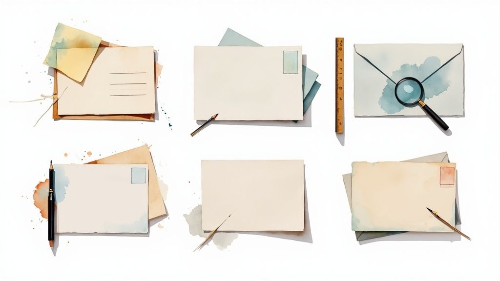
1. Vintage Travel Postcard Design
The vintage travel postcard design is a timeless approach that taps into the powerful emotions of nostalgia and wanderlust. It recreates the aesthetic of mid-20th century travel advertisements, using specific visual cues to transport the recipient to another time and place. This style is not merely about making something look old; it's a strategic choice to build an emotional connection and associate a brand or destination with classic adventure and authenticity.
At its core, this design relies on a specific combination of retro typography, muted color palettes, and stylized imagery. Think of the iconic WPA (Works Progress Administration) National Park posters from the 1930s and 40s. Their bold, illustrative style and distinctive lettering defined a generation of design and continue to influence artists like the Anderson Design Group today.
Strategic Breakdown
This style is exceptionally effective for businesses in the travel, hospitality, and heritage sectors. Boutique hotels, Airbnb hosts, and museum gift shops often use this postcard design sample to create memorable keepsakes that feel more like art than advertising. The goal is to create something a recipient wants to keep, display, and perhaps even share.
Key Strategy: The power of the vintage travel style lies in its ability to create perceived value and permanence. By evoking a sense of history, the design suggests that the destination or experience being promoted is established, authentic, and worthy of being remembered.
Actionable Takeaways
To replicate this style successfully, focus on authenticity and quality.
- Typography: Use period-appropriate fonts. Sturdy slab serifs like Clarendon or geometric sans-serifs like Futura were popular and lend immediate historical credibility.
- Textures: Apply subtle, high-resolution texture overlays. A light paper grain or a faint, simulated screen-print texture can add a layer of aged realism without compromising legibility.
- Imagery: Commission illustrations or use photography that aligns with the era. Images should feature classic compositions focusing on iconic landmarks or romanticized scenes, avoiding overtly modern elements.
To help you visualize the core components, this summary box breaks down the three essential characteristics of a convincing vintage travel design.
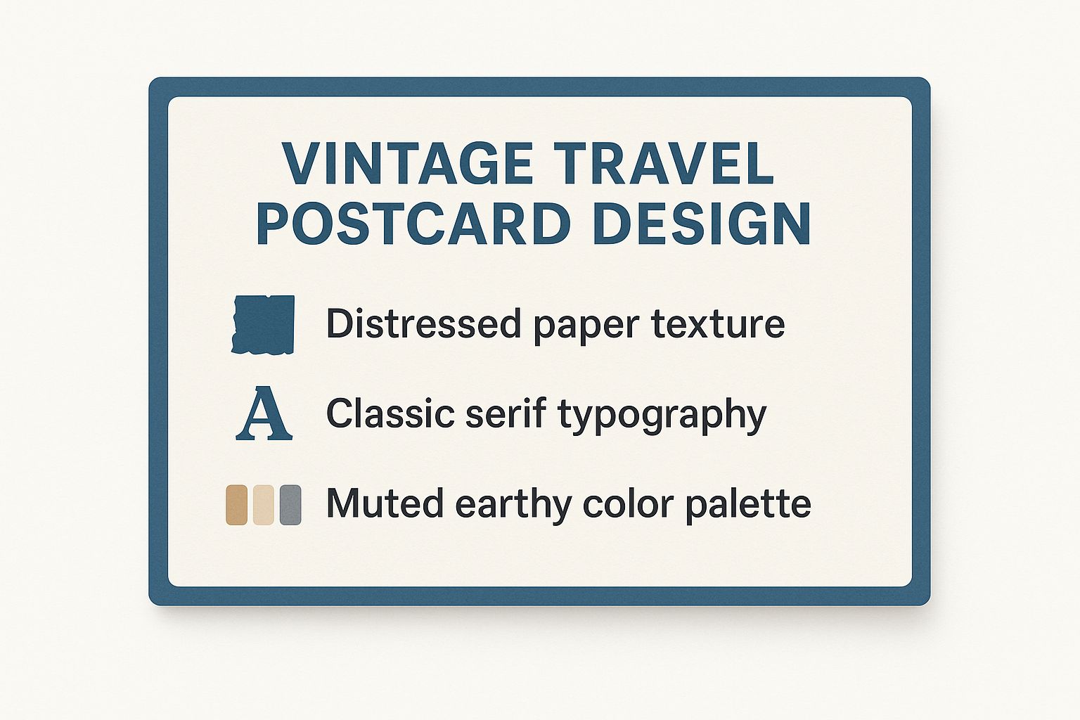
As the graphic illustrates, mastering the combination of texture, typography, and color is crucial for creating an authentic and impactful vintage design. These elements work together to build a cohesive and emotionally resonant aesthetic that instantly communicates a sense of classic adventure.
2. Minimalist Modern Postcard Design
The minimalist modern postcard design embraces the "less is more" philosophy, creating impact through precision, clarity, and sophistication. This contemporary approach strips away non-essential elements, focusing on clean lines, generous white space, and a highly curated use of typography and imagery. It communicates confidence and elegance, suggesting that the message is so compelling it doesn't need embellishment.
This style's roots can be traced to influential movements like the Swiss International Typographic Style and the principles of designers like Dieter Rams. Its power lies in its discipline. Every element has a purpose, from a single, striking photograph to a concise line of text. Modern brands like Apple have masterfully used this aesthetic in product announcements and tech event invitations to convey innovation and premium quality.
Strategic Breakdown
This style is exceptionally powerful for tech companies, modern art galleries, architectural firms, and high-end fashion or lifestyle brands. The clean, uncluttered look aligns perfectly with products and services that prioritize function, quality, and contemporary design. This postcard design sample is designed to cut through the noise of traditional, busy marketing materials and make a sharp, memorable impression.
Key Strategy: The minimalist modern style uses negative space as an active design element. This space directs the viewer's eye to a single focal point, whether it's a call-to-action or a stunning product image, ensuring the primary message is absorbed without distraction.
Actionable Takeaways
To execute a minimalist design effectively, every choice must be deliberate and precise.
- Typography: Select a single, strong sans-serif font family like Helvetica, Univers, or Akzidenz-Grotesk. Use variations in weight (light, regular, bold) and size to create hierarchy instead of introducing new fonts.
- Layout: Adhere to a strict grid system. Use the rule of thirds for placing your focal point and maintain consistent, generous margins to create a feeling of openness and order.
- Color Palette: Limit your palette to two or three colors at most. A monochromatic scheme (shades of one color) or a neutral base (white, grey, black) with a single, bold accent color often works best.
The effectiveness of this design often hinges on high-quality printing, as imperfections are more noticeable in a sparse layout. Exploring professional options for materials that complement this style, such as those found with flyer printing and related services, can elevate the final product. By focusing on these core principles of typography, layout, and color, you can create a postcard that is both visually stunning and strategically effective.
3. Bold Typography Postcard Design
The bold typography postcard design is a powerful, modern approach that prioritizes text as the main artistic element. Instead of relying on photos or illustrations to capture attention, this style uses oversized, impactful fonts and creative text layouts to deliver a message with confidence and clarity. The design philosophy here is that the message itself, when presented artfully, becomes the image.
This technique was heavily influenced by pioneers like Saul Bass and Paula Scher, whose work demonstrated that typography could be expressive, emotional, and visually dominant. From the raw energy of Swiss punk posters to modern festival announcements, using type as the hero element creates an immediate and uncluttered impact. It communicates a strong, direct message perfect for promotions, events, or brand statements.
Strategic Breakdown
This style is exceptionally effective for event-based marketing, brand announcements, and campaigns where a single, powerful message is paramount. Think of a concert poster with the band's name in giant letters or a political mailer with a single-word slogan. This postcard design sample is designed to be absorbed in a split second, making it ideal for cutting through mailbox clutter.
Key Strategy: The power of bold typography lies in its ability to create an immediate and unambiguous focal point. By stripping away competing visual noise, the design forces the recipient to engage directly with the core message, making it more memorable and impactful.
Actionable Takeaways
To execute this style effectively, your focus must be on precision, hierarchy, and font selection.
- Font Pairing: Limit your design to a maximum of two or three font families to avoid visual chaos. A strong, bold sans-serif for headlines paired with a clean, legible serif or sans-serif for supporting text works well.
- Visual Hierarchy: Use size, weight, and color to guide the viewer's eye. The most important information should be the largest and most prominent, with secondary details in smaller sizes.
- Legibility is Key: Always test your design at its intended postcard size. What looks great on a large monitor may become illegible when printed. Pay close attention to letter spacing (kerning) and line height (leading) to ensure readability.
This approach proves that great design doesn't always need complex imagery. For businesses looking to extend this bold branding to other materials, exploring how typographic principles apply across different formats is a logical next step. You can discover more about applying these concepts to smaller-scale items like custom business cards for a cohesive brand identity.
4. Photo-Centric Postcard Design
The photo-centric postcard design is a powerful, modern approach that prioritizes high-impact photography to do the heavy lifting. Instead of relying on complex graphics or extensive text, this style uses a single, compelling image as the primary messenger. The philosophy is simple: a picture is worth a thousand words, and a stunning photograph can evoke emotion, tell a story, and capture attention far more effectively than copy alone.
This design style is all about visual purity and letting the image speak for itself. It has been popularized by platforms like Instagram and lifestyle brands that understand the power of a strong visual narrative. From breathtaking travel landscapes to delicious-looking culinary creations, the photograph becomes the core of the message, with minimal text serving only to provide essential context or a call to action.

Strategic Breakdown
This style is a go-to for industries where aesthetics are paramount. Real estate agents use high-resolution images of properties to create an immediate sense of desire, while tourism boards use vibrant destination shots to inspire travel. This postcard design sample is also highly effective for restaurants showcasing a signature dish or fashion brands launching a new collection. The primary goal is to create an instant emotional connection through a visually arresting image.
Key Strategy: The power of the photo-centric design lies in its immediacy and clarity. It cuts through the noise of traditional marketing by delivering a clean, confident, and visually appealing message that is easy to digest in seconds.
Actionable Takeaways
To execute this style effectively, the quality of the photography is non-negotiable.
- Image Quality: Invest in professional photography or premium stock images. The image must be high-resolution (300 DPI for print) to avoid looking pixelated or amateurish.
- Text Placement: Overlay text on areas of the image with negative space or consistent color tones. If necessary, apply a subtle color overlay or drop shadow to the text to ensure it remains legible without distracting from the photo.
- Composition: Choose an image with a strong focal point. The composition should naturally guide the viewer's eye toward the most important part of the image, and subsequently, to your message. Explore more about how professional photography can elevate your marketing materials with resources on media and photography printing.
5. Illustrated Artistic Postcard Design
The illustrated artistic postcard design elevates marketing material into a piece of custom art. This approach centers on unique, hand-drawn elements or sophisticated digital illustrations as the main visual draw, offering a powerful way to express a brand's personality. From whimsical characters to elegant botanical drawings, this style moves beyond stock photography to create something truly memorable and personal. It communicates a high level of care, creativity, and attention to detail.
This design philosophy is championed by independent artists, creative agencies, and brands that want to stand out. The work of influential artists like Mary Blair, whose concept art defined the style of many classic Disney films, showcases how illustration can evoke emotion and tell a story. Today, boutique businesses and creative studios use custom artwork to build a distinct and ownable visual identity that resonates deeply with their target audience.
Strategic Breakdown
This style is a strategic choice for brands that want to foster a strong emotional connection and appear more human and approachable. Children's event announcements, art gallery invitations, and creative agency self-promotions use this postcard design sample to create a sense of exclusivity and craftsmanship. The artwork itself becomes the message, conveying brand values like creativity, quality, and originality.
Key Strategy: The power of the illustrated artistic style lies in its uniqueness. Custom artwork cannot be easily replicated by competitors, giving the brand a distinct visual asset that strengthens brand recall and fosters a perception of premium quality.
Actionable Takeaways
To execute this style effectively, a clear artistic vision and collaboration are essential.
- Define the Style: Before commissioning an artist, clearly define the desired aesthetic. Create a mood board with examples of styles you like, whether they are minimalist line art, detailed watercolors, or bold, graphic illustrations.
- Brand Alignment: Ensure the illustration's tone and subject matter align perfectly with your brand's personality. A playful, cartoonish style might be perfect for a children's brand but would feel out of place for a high-end financial consultant.
- Budget Accordingly: Custom illustration is an investment. Factor the cost of professional artwork into your project budget, as quality art is crucial for the design's success. This approach often works well for materials like custom greeting cards, where the perceived value justifies the expense.
By focusing on a distinct artistic direction that reflects your brand, you can create a postcard that is not just a marketing tool but a keepsake. This method transforms a simple piece of mail into a memorable brand experience.
6. Interactive QR Code Postcard Design
The interactive QR code postcard design merges the tangible appeal of print with the limitless potential of digital engagement. This modern approach embeds a QR (Quick Response) code directly into the postcard's visual layout, creating a seamless bridge between a physical mailer and an online experience. It transforms a static piece of marketing into a dynamic, trackable tool that can launch videos, open registration forms, or provide exclusive content with a simple smartphone scan.
This design style gained significant traction with the widespread adoption of mobile technology and was accelerated by the need for contactless solutions during the COVID-19 pandemic. Restaurants used it for menu access, and real estate agents offered virtual tours. The QR code is no longer just a functional element; it's a central design feature that signals innovation and offers immediate value to the recipient.
Strategic Breakdown
This style is highly effective for businesses aiming to drive measurable online actions from an offline campaign. Real estate agencies, event promoters, e-commerce stores, and service-based businesses use this postcard design sample to shorten the customer journey. Instead of asking a recipient to type a long URL, a quick scan can lead them directly to a high-converting landing page, a product demonstration video, or a virtual tour.
Key Strategy: The power of the interactive QR code design lies in its ability to minimize friction and capture immediate user intent. It converts passive interest into active engagement by providing an instant, low-effort pathway to a specific digital destination, making it easier to track ROI and gather data.
Actionable Takeaways
To execute this style effectively, the focus must be on a flawless user experience from scan to landing page.
- Clarity and Call-to-Action: Frame the QR code with clear instructions. Use simple text like "Scan to Watch the Tour" or "Scan for a 20% Discount" so users know exactly what to expect.
- Mobile-First Landing Page: The destination URL must be fully optimized for mobile devices. It should load quickly and present information cleanly on a small screen to prevent user drop-off.
- Thorough Testing: Test the QR code extensively across different devices (iOS and Android) and scanning apps before printing. A non-functioning code is worse than no code at all.
This approach is not limited to just postcards. By integrating QR codes into various print materials, businesses can create a cohesive interactive marketing strategy. For instance, you can apply the same principles to other direct-to-consumer items; learn more about using interactive elements on printed doorhangers to expand your campaign's reach.
Postcard Design Style Comparison
| Design Style | Implementation Complexity 🔄 | Resource Requirements 💡 | Expected Outcomes 📊 | Ideal Use Cases 💡 | Key Advantages ⭐ |
|---|---|---|---|---|---|
| Vintage Travel Postcard Design | Medium 🔄🔄 | Moderate (vintage fonts, textures) | Nostalgic, timeless appeal 📊 | Tourism, hospitality, museums | Emotional connection, timelessness ⭐⭐ |
| Minimalist Modern Postcard Design | Low 🔄 | Low (limited colors, clean layouts) | Sophisticated, professional look 📊 | Tech, corporate, modern art galleries | Readability, cost-effective, versatility ⭐⭐ |
| Bold Typography Postcard Design | Medium 🔄🔄 | Low (focus on fonts, layout) | High impact, attention-grabbing 📊 | Events, campaigns, promotions | Strong messaging, memorable ⭐⭐ |
| Photo-Centric Postcard Design | Medium-High 🔄🔄🔄 | High (professional photography) | Emotional impact, visual storytelling 📊 | Travel, lifestyle, real estate | Emotional connection, universal appeal ⭐⭐⭐ |
| Illustrated Artistic Postcard Design | High 🔄🔄🔄🔄 | High (custom illustration/artwork) | Unique, memorable, artistic expression 📊 | Creative events, art galleries, boutique branding | Unique personality, no copyright issues ⭐⭐⭐ |
| Interactive QR Code Postcard Design | Medium 🔄🔄 | Moderate to High (tech setup) | Measurable engagement, digital integration 📊 | Restaurants, real estate, events, product demos | Measurable ROI, tech engagement ⭐⭐⭐ |
Your Next Masterpiece: Bringing Your Postcard Design to Life
We've journeyed through a diverse gallery of postcard design sample options, from the nostalgic allure of vintage travel motifs to the sleek, engaging potential of interactive QR codes. Each example serves as more than just inspiration; it's a strategic blueprint for capturing attention and driving action in a crowded marketplace. The power of a physical mailer in a digital-first world cannot be overstated, and a well-executed design is your key to unlocking that potential.
The core lesson from these examples is that successful postcard design is a delicate balance of art and science. It’s about merging compelling visuals with a clear, strategic purpose.
Core Strategies for Standout Postcards
Let's distill the most crucial takeaways from the designs we analyzed:
- Clarity is King: Whether using bold typography or a minimalist layout, your message must be instantly understandable. The recipient should grasp the "what" and "why" within seconds.
- Visual Hierarchy Guides the Eye: A strong photo-centric design uses a powerful image to anchor the message, while an illustrated piece uses artistic flow to lead the viewer toward the call to action. You are the director of your audience's attention.
- Context Dictates Style: The rustic charm of a vintage postcard is perfect for a boutique hotel but might feel out of place for a tech startup, where a modern, minimalist approach would resonate more effectively. Always design with your specific audience and industry in mind.
- Functionality Drives Engagement: The QR code postcard is the ultimate example of this. It bridges the physical and digital worlds, providing a seamless path from holding your card to visiting your website or social media.
Actionable Next Steps to Create Your Own
Feeling inspired? The next step is to translate that inspiration into a tangible asset for your brand. Start by defining your primary objective. Is it to announce a sale, drive event registrations, or simply build brand awareness? Your goal will inform every design choice you make, from color palette to copywriting.
Once you have a clear objective, revisit the postcard design sample that most closely aligns with your goal. Analyze its components: the font choices, the use of negative space, the call to action's placement. Don't just copy it; deconstruct its success and apply those principles to your unique brand identity. As you develop your concepts, think about how you might present them. For great ideas on showcasing your work, exploring a range of digital marketing portfolio examples can offer valuable insights into effective presentation and creative storytelling.
Ultimately, mastering the art of postcard design means becoming a strategic communicator. It's about understanding that this small piece of cardstock is a powerful tool for connection, a direct line to your customer that bypasses the noise of digital inboxes. By applying these strategic insights, you're not just creating another piece of marketing material; you're crafting a memorable brand experience, one postcard at a time.
Ready to turn your design concepts into stunning, high-quality reality? 4OVER4 offers premium postcard printing services with a wide range of paper stocks, finishes, and custom options to make your design truly shine. Bring your masterpiece to life by visiting 4OVER4 and see how easy it is to create professionally printed postcards that get results.
More from

13
When you’re ready to invest in an A-frame sign, the first question you'll ask is, "What size do I need?" It usually comes down
![]() Emma Davis
Emma Davis
Mar 13, 2026

113
The real secret to mastering your direct mail budget isn't complicated. It comes down to one simple fact: a standard 4" x 6&q
![]() Emma Davis
Emma Davis
Mar 12, 2026

63
Tear-off flyers are a classic for a reason. They’re a tangible marketing tool, designed with perforated, removable tabs at the bottom. Each
![]() Emma Davis
Emma Davis
Mar 11, 2026

110
Printing stickers at home is a seriously fun and rewarding project. It boils down to four main parts: designing your image, picking the right
![]() Emma Davis
Emma Davis
Mar 10, 2026

103
Ever seen a logo that seems to float right on the glass of a jar or bottle? That’s the work of transparent label stickers.
![]() Emma Davis
Emma Davis
Mar 9, 2026

59
Picture this: your product’s beautiful label gets smudged and runny during shipping, or a gorgeous event banner fades to nothing after just
![]() Emma Davis
Emma Davis
Mar 8, 2026

58
In a sea of options, your product's packaging and labeling are its first, and often only, chance to make a real connectio
![]() Emma Davis
Emma Davis
Mar 7, 2026

89
Ever tried to print a hundred high-quality flyers on your home office printer? You probably ran out of ink, dealt with paper jams, and ended u
![]() Emma Davis
Emma Davis
Mar 6, 2026