Table of Contents
- Home
- content hub
- Design Your Own Flyers: Expert Tips for Stunning Results
Design Your Own Flyers: Expert Tips for Stunning Results
Mar 24, 20269 views
Mar 24, 20269 views
To design your own flyers effectively, you need to focus on a few key things: a strong visual hierarchy, a call-to-action that people can't ignore, and top-notch printing. It’s how you turn a simple piece of paper into a marketing tool that actually gets results. Using a platform like 4OVER4 gives you the professional tools, templates, and printing options you need to make sure your design grabs attention and drives business.
Why Flyers Are Your Secret Marketing Weapon in 2026

In a world where we’re all drowning in digital notifications and ads that disappear in a blink, a physical flyer just hits different. It cuts right through the noise, offering something your audience can actually hold and touch. This physical presence creates a connection that digital channels often can't quite match.
When you design your own flyers, you're basically creating a handheld brand ambassador. It speaks directly to potential customers in a specific location, whether that's a local coffee shop, a community event, or right in their mailbox.
The Tangible Advantage of Print
A well-crafted flyer does so much more than just announce a sale—it tells your brand’s story. The feel of the paper, the pop of the colors, and the clarity of your message all come together to shape how people see your business. A thick, matte-finish flyer for a law firm feels serious and trustworthy, while a bright, glossy one for a music festival just screams energy and fun.
This tactile experience has a surprisingly powerful effect. Research shows that an incredible 59% of recipients make a purchase after receiving a flyer. It's not just a fluke; 71% of business owners agree that flyers are crucial for connecting with customers. In fact, one survey found that 34% of consumers discovered a new local business simply because of a flyer.
A flyer isn't just information; it's an experience. It bridges the gap between the digital and physical worlds, inviting someone to take a real-world action based on something they can physically hold.
To give you a clearer picture, here’s a quick rundown of why flyers are still a marketing powerhouse.
Why Flyers Are Still a Marketing Powerhouse
| Benefit | Impact for Your Business |
|---|---|
| High Trust Factor | Consumers generally trust print advertising more than digital ads, making your message more credible. |
| Hyper-Local Targeting | You can reach a highly specific audience in a defined geographic area with almost zero waste. |
| Cost-Effective | Flyers offer a high return on investment, especially when printed in bulk for large-scale distribution. |
| Measurable Results | By using unique discount codes or QR codes, you can easily track how effective your campaign is. |
These benefits show just how much of a punch a well-designed flyer can pack, even in our digital-first world.
Integrating Flyers Into a Modern Strategy
Don't think of flyers as some outdated relic. They're a vital part of any smart, modern marketing plan. They work wonders where digital can sometimes fall short, like reaching audiences who aren't glued to their screens or for super-focused local campaigns.
The best results often come from a balanced approach. While digital gets most of the hype, effective offline strategies are just as important. For a deeper look at how these two worlds work together, it’s worth exploring the comparison between Traditional Marketing vs Digital marketing.
By combining your flyers with your digital efforts—say, putting a QR code on the flyer that leads to a special offer on your website—you create a seamless customer journey that sparks interest and drives sales. With the right strategy and a great printing partner, your flyers become powerful tools for growth. You can explore a whole range of professionally printed marketing materials to round out your campaigns and really make your brand shine.
Before you even think about dropping in a logo or a picture, let's talk about the groundwork. A truly effective flyer isn't just a piece of paper with information; it's a strategic tool. The decisions we make right now are what separate a flyer that gets results from one that ends up in the trash.
When you design your own flyers, every little choice adds up to tell a bigger story. Think about it: the very first thing someone experiences is the feel of the paper in their hand. It’s an instant, physical handshake with your brand.
Choose Paper That Tells a Story
The paper you pick from 4OVER4 isn't just a backdrop for your design—it's part of the message. What kind of vibe are you going for?
- Glossy Finishes: Got a high-energy promotion? A glossy flyer for a nightclub opening or a flashy new product launch makes your colors absolutely scream with excitement. That reflective sheen just naturally pulls the eye in.
- Matte Finishes: A nice, thick matte paper feels expensive and serious. It’s the perfect choice for a law firm, a luxury spa, or an art gallery event. It has a certain weight to it, suggesting the information is important and worth paying attention to.
- Uncoated Stock: This one feels natural and down-to-earth. It’s a fantastic fit for eco-friendly brands, farm-to-table restaurants, or any business that wants to feel authentic and approachable.
Honestly, the right paper makes your message more credible before anyone even reads a word. It sets the stage and reinforces your brand’s personality in a powerful, subconscious way.
Create a Clear Visual Hierarchy
Once someone has your flyer, where do you want their eyes to land first? And then second? You get to direct that entire journey with something called visual hierarchy. It's the art of arranging your design elements to pull the reader through the content in order of importance.
Without a clear hierarchy, your flyer will just look like a jumbled mess. Your most critical piece of information—maybe a killer headline or an irresistible offer—needs to be the biggest, boldest thing on the page. From there, you guide them down to the supporting details and, finally, to your call to action.
To really nail this, it helps to understand the core principles of graphic design that make any visual communication effective.
The goal isn’t to make everything stand out. When everything is bold, nothing is. Effective visual hierarchy creates a clear path, making your flyer easy to scan and understand in seconds.
For example, imagine a flyer for a local concert. The band's name should be huge. The date and venue come next in size, followed by the ticket price and where to buy them. This flow feels natural and makes sure the most important info gets absorbed instantly.
Master the Art of Typography
The fonts you choose have personality, and they can completely change how your message is received. Bad font choices can make a flyer hard to read or, worse, give off the totally wrong vibe. The trick is to strike a balance between character and clarity.
A classic mistake I see all the time is using way too many fonts. It just creates visual chaos. A good rule of thumb is to stick to two, or at the absolute most three, fonts that work well together. Think one for headlines, one for the main body text, and maybe a third for small accents.
Here’s a font pairing I might use for a new cafe's grand opening flyer:
| Font Role | Example Font Choice | Why It Works |
|---|---|---|
| Headline | Playfair Display (Serif) | It’s elegant and commands attention, giving off a vibe of quality and craft. |
| Body Text | Lato (Sans-Serif) | This font is clean, modern, and super easy to read, perfect for the details. |
This combination is a winner because the decorative headline font pulls you in, while the simple body font does its job of delivering information without any fuss. The contrast between a serif and a sans-serif is a time-tested technique for a reason—it looks professional and balanced. Just make sure your fonts are big enough to be read easily, especially for critical info like dates and phone numbers.
Getting into the Weeds of Print Design
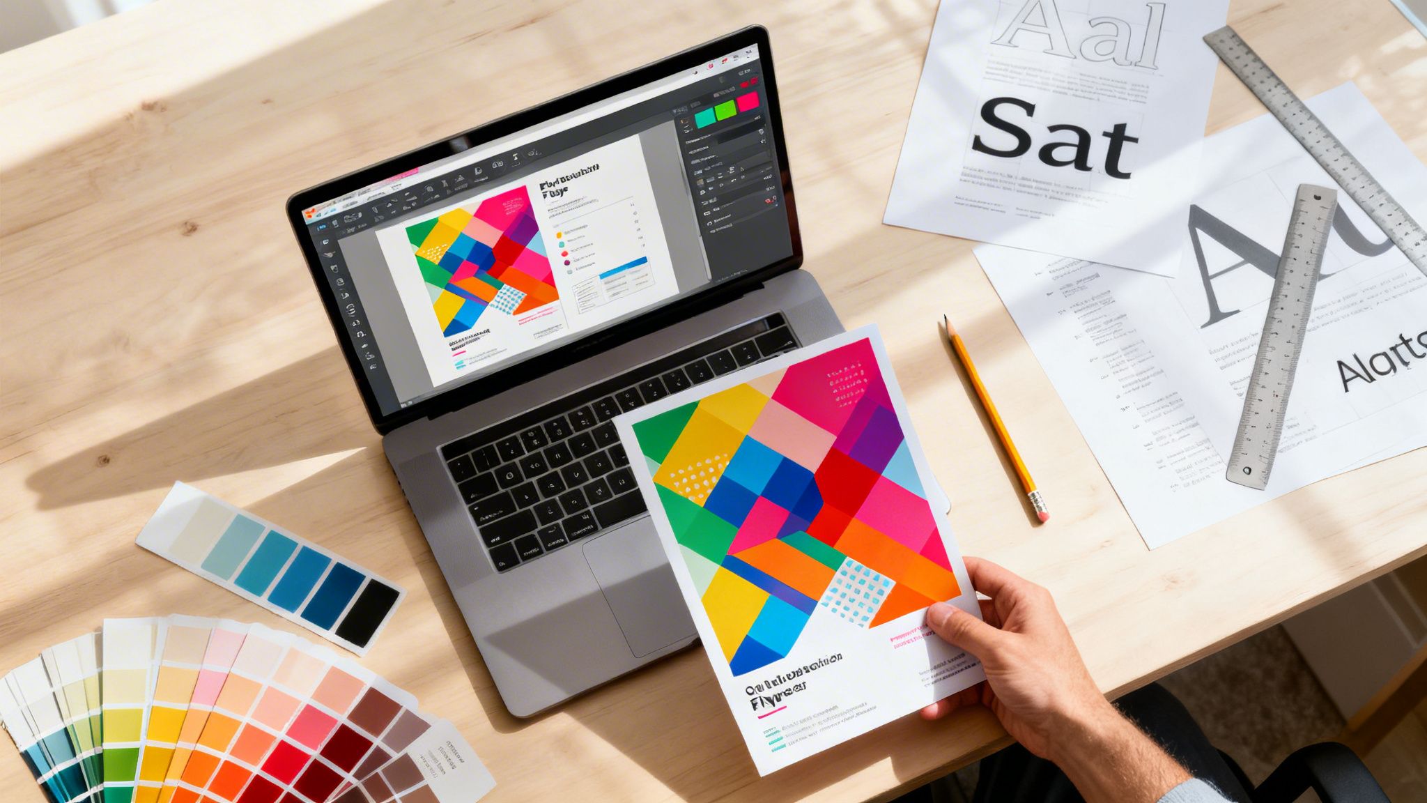
The difference between a flyer that looks homemade and one that looks truly professional often comes down to the technical details. When you design your own flyers, getting these behind-the-scenes specs right is what ensures the design on your screen translates perfectly to paper. Let's walk through these print production essentials so your final flyer comes out looking sharp, vibrant, and exactly as you pictured it.
This infographic breaks down the core elements you need to nail for a solid flyer design, from paper and layout to the fonts you choose.
 Getting these fundamentals right from the start makes all the technical setup that follows much more straightforward.
Understanding Bleed, Trim, and Safety Zones
Ever see a printed flyer with a weird, thin white edge where the color was supposed to run off the page? That's a classic sign of a design missing a proper bleed. Printing is a physical process, and the massive cutter that trims stacks of paper can shift by a tiny fraction of an inch. A bleed accounts for that.
A bleed is simply a small margin of your background color or image that extends beyond where the flyer will actually be cut. By stretching your design out by 1/8th of an inch (0.125") on every side, you give the printer a small cushion. If the cut is a millimeter off, your color will still go to the absolute edge of the paper.
To get this right every time, you need to think in three zones:
- Safety Zone: This is your "safe space." All your critical information—phone numbers, dates, logos, and key text—must live inside this area to ensure it doesn't get accidentally trimmed off.
- Trim Line: This is the final dimension of your flyer. An 8.5" x 11" flyer will be cut right along this line. Anything outside of it is gone.
- Bleed Area: This is the outermost part of your design file that extends past the trim line. It should only contain background elements, as it's designed to be cut away.
Think of the safety zone as the main stage. The trim line is the edge of the stage, and the bleed is the backstage area. Your main act has to stay on stage, but the backstage ensures the audience never sees an empty, unfinished wing.
The Non-Negotiable 300 DPI Standard
Image resolution is another area where many DIY designs go wrong. DPI, or dots per inch, is a measure of how many ink dots a printer will place within a square inch of paper. For web and screen use, 72 DPI is fine. For print, it's a recipe for a blurry, pixelated mess.
All your images and graphics must have a resolution of at least 300 DPI. This is a hard rule in professional printing. An image you pulled from a website might look sharp on your monitor, but it will look fuzzy and cheap when it comes off the press.
Always start your project by setting your design canvas to 300 DPI in whatever software you're using. If you're working with photos, make sure they're high-resolution files from the start. You can't magically add more dots to a low-res image; it's like trying to blow up a tiny photo into a poster—it just gets distorted and unusable.
Why CMYK Is a Must for Print
The last piece of the technical puzzle is color. Your computer monitor uses the RGB (Red, Green, Blue) color model, which creates color by adding light. Professional printers use the CMYK (Cyan, Magenta, Yellow, Key/Black) model, which works by subtracting light as inks are layered on paper.
These two models are fundamentally different. That brilliant, electric blue you perfected in RGB might look surprisingly dull and flat once it's converted to CMYK for printing. Designing in RGB and hoping for the best is one of the most common mistakes out there, and it almost always leads to disappointing color shifts.
To get predictable, accurate color, always set your document's color mode to CMYK from the very beginning. This ensures you're working within the range of colors a commercial press can actually reproduce. If you're exploring different printing methods, understanding the details of digital printing can give you even more insight into how these specs directly affect your final product.
Choosing Your Design Path: Tools vs. Templates
When you're ready to create a new flyer, the first big question you’ll face is where to begin. Should you start with a completely blank canvas and build your vision from the ground up? Or should you grab a professionally designed template and make it your own? Both are great options, but they serve different needs, timelines, and creative styles.
Let's break down how to pick the right path for your project.
Designing from Scratch
Starting with a blank canvas gives you absolute, total creative freedom. This is where a tool like 4OVER4’s intuitive online designer really shines. It’s built for drag-and-drop simplicity, so you don't need to be a Adobe Photoshop wizard to make something compelling.
This path is perfect if you have a very specific vision that a template just can't nail. Say you're launching an artisan bakery with a unique, hand-drawn brand identity. A generic "Grand Opening" template might feel too stiff or corporate. By starting fresh, you can upload your custom logo, use your brand’s exact color palette, and arrange everything in a way that truly reflects your shop's personality.
Starting from a blank canvas is about more than just control; it’s about infusing your flyer with an authenticity that is 100% yours. It ensures your final product is a true original.
Of course, this freedom means you're in the driver's seat. You’ll be making all the design decisions, from visual hierarchy to font pairings. It can take a bit more time, but the payoff is a design that is undeniably, uniquely yours.
The Power of Templates
On the other hand, maybe you need a stunning flyer, and you need it yesterday. This is where 4OVER4’s massive library of customizable templates becomes your secret weapon. Think of a template not as a set of rules, but as a creative springboard. You get a professionally structured layout, so the fundamentals of good design are already handled for you.
The real trick is to avoid that generic "template look." A great template is just the starting point. The magic happens when you make it yours.
- Swap Out All Stock Images: This is the fastest way to make a template feel unique. Replace generic photos with high-quality images of your actual products, team, or location.
- Use Your Brand Colors: Don’t stick with the default color scheme. Use your brand's primary and secondary colors to instantly connect the flyer to your other marketing materials.
- Change the Fonts: The template's fonts look good, but they might not match your brand’s voice. Swap them out for your own brand fonts for a consistent, professional look.
For example, a real estate agent can grab a "Just Listed" template, replace the stock house photo with a professional shot of their actual listing, and update the colors and fonts to match their agency's branding. In just a few minutes, a generic design is transformed into a powerful, personalized marketing tool.
And if you’re looking for even more inspiration, you can explore a wide variety of ready-made products that can be quickly customized for any campaign.
Design Approach Comparison
So, how do you decide which path is right for you? It really comes down to your priorities. This table breaks down the key differences to help you choose.
| Feature | Designing from Scratch | Using a 4OVER4 Template |
|---|---|---|
| Speed | Slower, more deliberate | Much Faster |
| Control | Total Creative Freedom | Guided Customization |
| Ease of Use | Requires basic design sense | Extremely Beginner-Friendly |
| Best For | Highly unique brands | Quick turnarounds, inspiration |
Ultimately, there’s no wrong answer here. Whether you build from scratch or customize a template, the goal is the same: to create a flyer that grabs attention, communicates your message clearly, and gets people to act.
Getting Your Design Ready For A Flawless Print

Your design looks fantastic, the copy is perfect, and you’re itching to hit that "send" button. But wait just a minute. The handful of steps you take right before uploading your file are some of the most important in the whole process. This is the moment you ensure the masterpiece on your screen becomes a flawless physical print.
Think of it as the final pre-flight check. Getting this part right saves you from the headache of frustrating delays or, even worse, expensive reprints. When you design your own flyers, this last mile protects all the hard work you’ve already invested.
The Ultimate File Export Checklist
Before you export that final file, let's run through a quick but crucial checklist. You've already double-checked that your document is in CMYK at 300 DPI and that your bleed is set up correctly. Now, it's all about the export settings to guarantee a smooth handoff to us.
One of the most common hangups is fonts. The simple fix? Outline your fonts. This little trick converts your text from editable type into fixed vector shapes. If we don’t have the exact font file you used, our system will swap it for a default—and that can completely derail your layout. Outlining embeds the font shapes directly into your file, so they look perfect no matter who opens it.
Next, give your file a clear, logical name. A filename like Cafe_GrandOpening_Flyer_4x6_Final.pdf is infinitely better than flyer_v3_final_final.pdf. It helps everyone on the production team instantly identify the project, which minimizes any chance of confusion.
The whole point of prepping your file is to take all the guesswork out of it for the printing press. A perfectly prepared file sails right through production. A file with issues gets flagged for a manual review, and that means delays.
For the file format itself, the gold standard is PDF/X-1a. This isn't just any PDF; it’s a special format designed specifically for professional printing. It automatically flattens transparencies and embeds all the necessary info, creating a single, self-contained, print-ready document. It’s the safest bet for ensuring what you see on screen is exactly what you get in your hands.
Make Your Flyer Stand Out with Finishing Options
With the technical prep out of the way, we get to the fun part: choosing the final touches that make your flyer not just seen, but felt. These finishing options are what separate a decent flyer from a truly unforgettable one. They add a tactile and visual punch that practically forces people to pay attention.
Consider a few of these popular choices to really make your design pop:
- UV Coating: A high-gloss UV coat makes your colors explode with vibrancy. It also adds a tough, protective layer, which is perfect for flyers with bold photos or graphics that need to command attention.
- Rounded Corners: A simple die-cut for rounded corners can instantly give your flyer a modern, approachable, and more polished feel. It's a subtle signal of quality and care.
- Strategic Folding: Folding turns a simple sheet of paper into a small, interactive experience. A classic tri-fold, for instance, can work like a mini-brochure, letting you guide the reader through information step-by-step.
These options do more than just look good; they change how people physically interact with your flyer. A unique finish might make someone pause, feel the texture, and spend just a few extra seconds with your message. Those few seconds can make all the difference.
You can see how different finishes work with all kinds of projects by exploring the options for custom flyer printing. The final touches you choose are the exclamation point on your design, reinforcing your brand's personality before a single word is read.
Common Questions About Designing Your Own Flyers
Even with a killer design concept ready to go, a few nagging questions can pop up right before you’re ready to hit print. When you design your own flyers, you're the creative director and production manager all rolled into one. We get it. Here are some answers to the most common questions we hear, designed to give you that final boost of confidence to get your project over the finish line.
What Are the Most Common Mistakes to Avoid?
By far, the biggest mistake we see is overcrowding the design. It's so tempting to cram every last bit of information onto the page, but that just creates a visual jumble that people are hardwired to ignore. The best advice? Focus on one single, powerful message and give it plenty of white space to breathe.
Another classic pitfall is using low-resolution images. A picture that looks sharp on your monitor can turn into a blurry, pixelated mess in print, which immediately screams unprofessional. Always, always make sure every image is set to 300 DPI. This guarantees a crisp, clean print every single time.
From a strategic standpoint, a few other missteps can sink your campaign before it even starts:
- A Weak Headline: Your headline has one job: grab attention and promise a benefit. If it doesn't do that in about three seconds, the rest of your flyer is invisible.
- No Clear CTA: You have to tell people exactly what you want them to do. "Visit our website," "Scan for 20% off," or "Call for a free quote" are direct, simple, and they work.
- Ignoring the Technical Stuff: Forgetting to add a bleed or designing in RGB instead of CMYK will absolutely cause printing errors and disappointing color shifts. It's a technical detail that makes all the difference.
A flyer with too much text and no clear call-to-action is just noise. The most successful designs are simple, direct, and make it incredibly easy for the reader to take the next step.
How Can I Make My Flyer Stand Out?
To create a flyer that people actually hold onto, you need to hit three marks: a bold visual concept, a truly irresistible offer, and a premium, tactile feel. Forget a generic headline like "New Cafe Open." Go for something that speaks directly to a benefit, like "Your Morning Just Got Better. First Coffee Is On Us." An offer with immediate value is incredibly hard to pass up.
Then, think about the physical experience. Choosing a unique paper stock from 4OVER4, like a thick, satisfyingly heavy uncoated paper or one with a sleek high-gloss finish, instantly makes your flyer feel more important. Special finishes are where you can really take it to the next level.
Consider adding one of these impactful touches:
- Spot UV: Applying a glossy finish to just your logo or a key graphic creates a stunning visual and textural contrast that people can't help but touch.
- Foil Stamping: A bit of metallic foil adds a touch of luxury and sophistication, catching the light and the eye.
- Die-Cutting: A custom-shaped flyer is impossible to ignore in a stack of standard rectangular mail.
What Information Is Absolutely Essential?
While every flyer's message is unique, there are a few non-negotiable elements that have to be there for it to do its job. Think of this as your pre-print checklist. Without these, your flyer is just a pretty piece of paper.
- Your Brand Identity: Your logo and brand name need to be instantly recognizable. People have to know who the message is from.
- A Powerful Headline: This is the most critical piece of copy on the entire flyer. It’s the hook.
- The Core Offer: What’s in it for them? State the primary benefit or value you're providing, loud and clear.
- A Clear Call-to-Action (CTA): Tell them what to do next. Make this element visually distinct so it can't be missed.
- Actionable Contact Details: Give them the tools to complete the CTA—whether it's a website, QR code, phone number, or physical address.
How Can I Track if My Flyers Are Working?
Figuring out the return on investment (ROI) from a flyer campaign is much easier than most people think. The secret is to build a unique, trackable element into the flyer itself. This lets you directly connect sales, calls, or web traffic back to your print efforts. For example, if you're targeting a specific neighborhood, you can learn more about how Every Door Direct Mail can help you measure local impact and see exactly what's working.
Here are the easiest ways to track your results:
- Unique Promo Codes: Offer a special discount with a code that’s only on the flyer, like
FLYER15. - Dedicated QR Codes: Create a QR code that sends people to a special landing page on your website built just for this campaign.
- Custom URLs: Print a simple, memorable URL like
yoursite.com/dealthat doesn’t appear anywhere else.
By watching how many times that code is used or how much traffic hits that unique page, you get a clear, data-backed picture of how your flyers are performing in the real world.
More from

22
Let’s get one thing straight about CMYK and RGB: one is for screens, the other is for print. Your monitor mixes red, green,
![]() Emma Davis
Emma Davis
Mar 23, 2026

21
Printing a high-quality business envelope is simpler than you might think. It all starts with a solid design file using CMYK color settings, y
![]() Emma Davis
Emma Davis
Mar 22, 2026

67
You might think sending an email or a text is all that matters these days, but don't underestimate the power of physical mail. It carries
![]() Emma Davis
Emma Davis
Mar 21, 2026

75
Picture this: your business has a silent, tireless salesperson working for you 24/7 on the busiest street in town. That’s t
![]() Emma Davis
Emma Davis
Mar 20, 2026

64
Printing on ribbon is the art of transferring your custom design, logo, or text onto a roll of fabric. It’s what transforms a simple decorat
![]() Emma Davis
Emma Davis
Mar 19, 2026

164
If you've ever wondered about the standard gift card dimensions, there’s one number you need to know: CR80
![]() Emma Davis
Emma Davis
Mar 17, 2026

66
When you’re launching a product, your bottle label is often the first thing a customer sees. Think of it as your silent salesperson
![]() Emma Davis
Emma Davis
Mar 16, 2026

251
When you're brainstorming ideas for landscaping business cards, it helps to think beyond just contact information. Your c
![]() Emma Davis
Emma Davis
Mar 15, 2026