How to Make Trading Cards from Design to Print
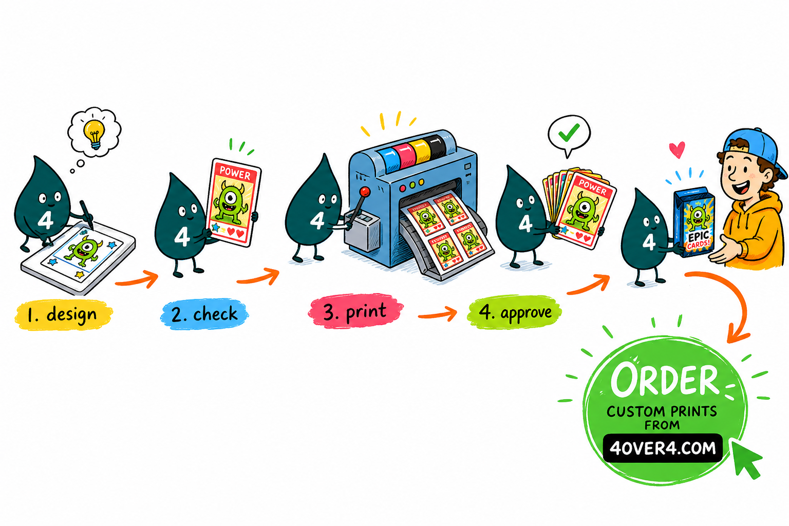
Start with a clear concept, design the front and back at 300 DPI in CMYK, print on the right stock and finish, then read the proof once. Here is the full path from a first idea to a collectible set.
To make trading cards, work in three stages: lock a concept and audience, design a front and back at the standard 2.5 x 3.5 inch size with a 0.125 inch bleed, then print at 300 DPI in CMYK on a stock and finish that fits your theme. Review the free proof before the run, and a small first batch lets you check color and feel before you scale up.
Quick tips
Quick tips for making trading cards
Design your trading cards at 2.5 x 3.5 inches with a 0.125 inch bleed, work at 300 DPI in CMYK, and choose a stock and finish that matches your theme. Gloss lamination pops color, silk feels smooth and premium, and kraft brings a natural texture. Always review the free digital proof before the full run. Order a small first batch to check color and feel, then scale up once it looks right.
Why custom trading cards are worth making

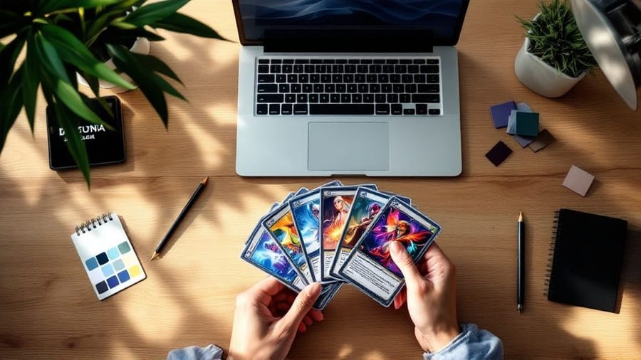
Trading cards are not just for baseball fans and Pokemon collectors anymore. Artists, small businesses, game designers, teachers, and event planners all use custom trading cards to tell a story, promote a brand, and build a little community around a set. The format is compact, collectible, and far more flexible than most people expect.
Learning how to make trading cards comes down to three moves: a strong concept, smart front and back design, and the right stock and finish. Get those right and a stack of cards feels like a real collectible instead of a printout. This guide walks through every step, from the first idea to the finished set in your hands.
If you want to see the full range of stocks first, browse trading cards printing at 4OVER4.COM, or keep reading and we will build the whole thing from scratch.
Step 1: Define your concept and audience
Every good trading card starts with a clear idea. Before you open any design software, answer a few questions. Who is going to hold these cards? What do they care about? Are you making a game with rules and stats, a promotional series for your brand, or an art collection? Your concept drives every decision after this.
A trading card game needs consistent stat layouts and clean typography. A promotional card for a brewery might lean on photography and bold color. An artist series can break the rules on purpose, and that is fine as long as it is intentional. Write down your theme, the number of cards in the set, and exactly what goes on each card. The front usually carries the main image and the card name, and the back holds stats, a bio, or branding.
Step 2: Choose your card size and bleed

The standard trading card size is 2.5 x 3.5 inches, the same as a classic baseball card or a Magic: The Gathering card. Stick with this size if your cards need to fit standard sleeves, binders, or deck boxes. Players expect game cards to fit the accessories they already own, so non-standard sizes can limit how people store and display a set.
When you set up the file, add 0.125 inches of bleed on all sides, so the document measures 2.75 x 3.75 inches. Keep every important word and graphic at least 0.125 inches inside the trim line. That safe zone stops anything critical from getting cut off during production. The same file setup ideas show up across print, and our guide on how to fold a brochure covers bleed and safe zones from another angle.
Step 3: Design a front that grabs attention
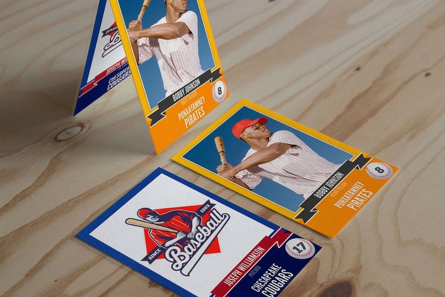
The front is your hero. It is what makes someone pick the card up. Lead with one dominant image or illustration instead of three competing visuals, and set the card name in a clear, readable font. Fancy script looks great until nobody can read it at 2.5 inches wide.
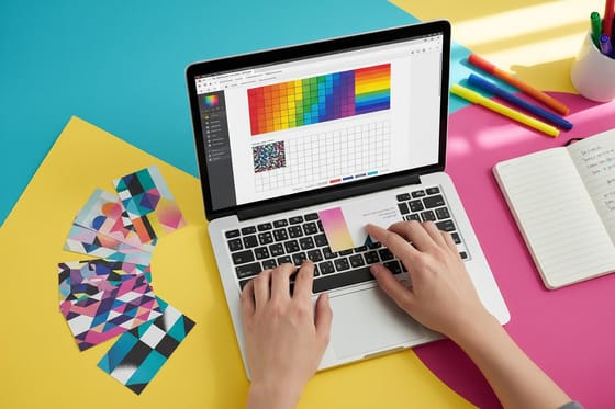
A consistent frame or border ties the whole set together, and even a thin colored line reads as one family across 20 or 100 cards. Match the color palette to the theme, dark and moody for a horror game, bright and saturated for a kids collectible, clean and minimal for a business promo. Use images at 300 DPI minimum and work in CMYK from the start, because RGB color shifts once it hits paper. For more layout inspiration across formats, browse the full 4OVER4 guide hub.
Step 4: Make the back do real work
Do not treat the back as an afterthought, because it is where a card delivers depth. For game cards, the back is usually a universal design that stays the same across the deck, so players cannot read cards face down. Think of the classic Pokemon back, which is simple, iconic, and consistent.
For collectible or promotional cards, each back can be unique with player stats, a character bio, product details, or trivia. Keep text readable at small sizes, 7pt minimum for body copy and 9pt or larger for headers. Add your logo or a small branded footer so the card keeps working as marketing. If you are printing flyers to launch the set, our guide on how to make flyers pairs well with this project.
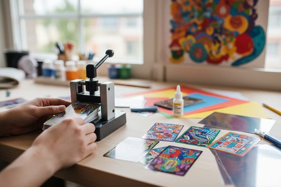
Step 5: Pick your paper stock and finish

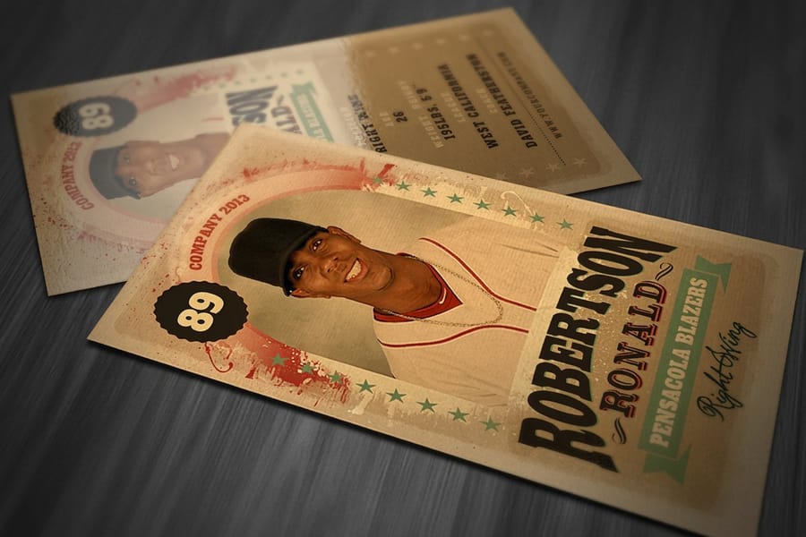
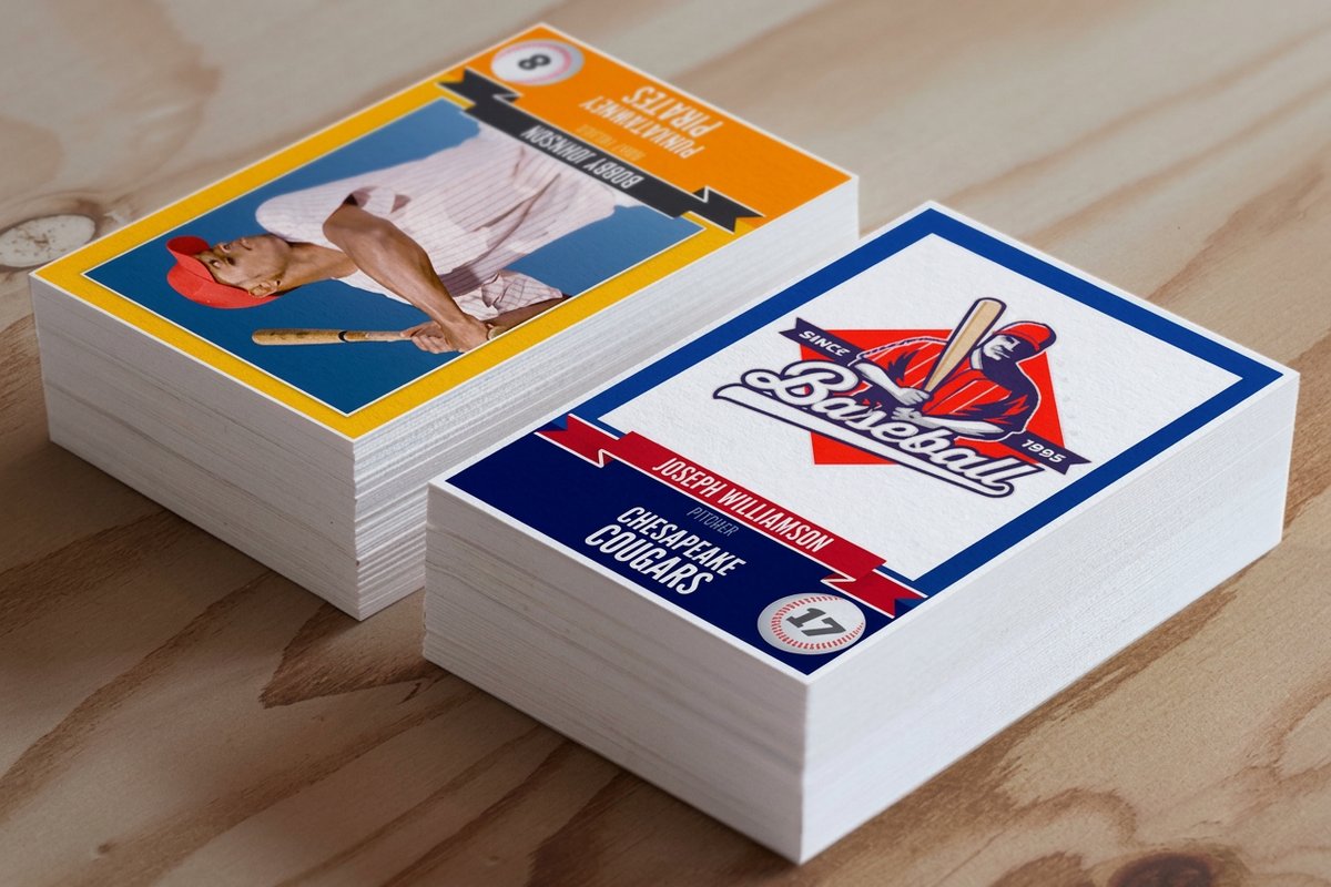
This is where a card goes from a nice design on screen to something that feels real. A 14pt cardstock is a solid standard weight, about as thick as a playing card and friendly on budget for larger runs. A 16pt stock adds noticeable heft and reads as premium, which is what you want for limited sets. Kraft stock is uncoated natural brown paper with a rustic, earthy feel that suits eco-minded brands.
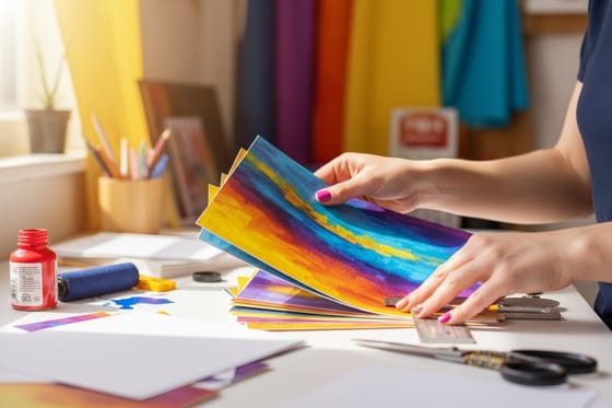
Finish changes the card just as much. Gloss lamination is shiny, bright, and fingerprint resistant, the classic trading card look. Silk lamination is smooth and slightly matte with a velvety hand, great for photography-heavy art. Uncoated leaves a writable surface for signatures and notes. 4OVER4.COM carries 60+ paper types, and if sustainability matters you can pair kraft stock with our green printing options. Want to feel the difference first? Order free samples and compare stocks side by side.
Step 6: Build a print-ready file

Getting the file right saves time and money. Export a high-quality PDF, which locks your fonts, colors, and layout in place. Keep the resolution at 300 DPI, set the color mode to CMYK, and hold the 0.125 inch bleed with a matching safe zone. Outline or embed every font so nothing gets substituted at the printer. TIFF also works as a lossless option, and a maximum-quality JPEG can do in a pinch.
Canva, Photoshop, Illustrator, and InDesign can all export print-ready PDFs, so the tool matters less than the settings. The most common mistake is exporting at 72 DPI screen resolution instead of 300 DPI. If you are adding hand-stamped touches to your cards, our guide on how to clean rubber stamps keeps those impressions crisp, and you can plan matching pieces with how to make custom magnets or how to make envelopes.
Step 7: Place your order and review the proof
Once the file is ready, upload it and choose your options: quantity, paper stock, finish, and turnaround. Then review the digital proof, because this is the last chance to catch a typo, a color issue, or a layout problem before ink hits paper. 4OVER4.COM includes a free proof with every order.
Read every word on the proof, check that art sits inside the trim and bleed lines, confirm front-to-back alignment, and remember that screen color is only an approximation of the final print. Five minutes here is far cheaper than reprinting 500 cards over one typo. The same print-ready habits carry to other projects, from free business cards you can use to test a stock to invitation runs like flat bridal shower invites.
Creative ways to use custom trading cards

Trading cards work for far more than games. A taco truck can print a 12-card set of its menu with photos and descriptions that customers collect. Real estate agents hand out property cards with photos, specs, and contact details that stick better than a flyer. Teachers turn vocabulary, historical figures, or science facts into cards kids actually want to collect.
Artists and illustrators sell mini portfolio packs at conventions or tuck them into online orders as a bonus. Companies print employee spotlight cards with fun facts and titles for onboarding and team building. If you want a deeper walkthrough focused on personalized sets, our guide on how to make custom trading cards goes further into design and personalization.
What affects trading card pricing

A few factors set the price of a run. Quantity is the biggest lever, because printing more cards drops the cost per card sharply, so a batch of 50 for a personal project costs far more per unit than 5,000 for a business. Cardstock matters too, and a premium 16pt costs a little more than a standard 14pt.
Finishes add both flair and cost, so a high-gloss UV coating or foil stamping raises the total while making the cards look richer. The surest way to lock in your numbers is to price the exact stock and finish you want. The live specs and pricing below pull straight from the 4OVER4.COM configurator, so you can read the whole ladder before you order.
Common mistakes
Mistakes that ruin trading cards
Even experienced designers trip on the same things when learning how to make trading cards. Dodge these six and your cards print clean the first time.
Skipping the bleed. No bleed means thin white edges after cutting, which reads as unfinished. Always extend the background 0.125 inches past the trim.
Using low-resolution images. A photo that looked great online is often 72 DPI and turns pixelated at 300 DPI on a small card. Source high-res files from the start.
Cramming the back with text. Space is limited, so edit hard. If a line does not add value, cut it and let the layout breathe.
Designing in RGB. Bright screen color prints dull in CMYK. Convert early and adjust so the neon on your monitor does not become a muddy olive.
Ignoring the proof. The free proof exists for a reason. Zoom in, read every word, and catch the mistake while it still costs nothing to fix.
Choosing the wrong finish. Gloss looks great but shows fingerprints on cards that get handled constantly. Silk or matte holds up better for game cards that get shuffled.
Specs and pricing
Custom trading card specs and pricing
Here is what a made-to-order trading card gives you at 4OVER4.COM, with live specs and price-per-unit pulled straight from the configurator.
| Quantity | Price Per Unit | Total |
|---|---|---|
| 25 | 45.0¢ | $11.25 |
| 50 | 33.0¢ | $16.48 |
| 100 | 24.2¢ | $24.16 |
| 200 | 15.9¢ | $31.86 |
| 300 | 12.8¢ | $38.45 |
| 400 | 11.3¢ | $45.04 |
| 500 | 10.3¢ | $51.62 |
| 600 | 9.89¢ | $59.31 |
Pick a finish
Order your trading cards at 4OVER4


Start faster
Trading card blank templates
Download a print-ready blank sized with the correct bleed and safe zone, drop in your art, and export. Each one matches a 4OVER4.COM stock and finish.


Wally lays out the trading card
Concept, design, and stock working as one
Wally treats a trading card like a tiny product launch: nail the concept, design a front that grabs and a back that informs, then print it on a stock that actually feels collectible. Build the file at 300 DPI in CMYK with a 0.125 inch bleed, read the proof once, and the whole set lands sharp. When your idea is ready, pick your stock and finish and print it at 4OVER4.
Order trading cards →Explore more
Where to go next

By the numbers
Printing you can count on at 4OVER4
Common Questions
Common questions about making trading cards
What's the standard size for custom trading cards?
The standard trading card size is 2.5 x 3.5 inches, which matches classic sports cards and most card game formats, so it fits standard sleeves, binder pages, and deck boxes. When you prepare the file, set the document to 2.75 x 3.75 inches to include the required 0.125 inch bleed on all sides.
What paper stock works best for trading cards?
It depends on the use case. Gloss laminated stock gives you the classic shiny, colorful look most people picture. Silk feels smooth and premium, which suits art and photography. Kraft adds a natural, rustic texture. 4OVER4.COM carries 60+ paper types across product lines, so you can match the stock to the personality of the set.
Can I make trading cards without design experience?
Yes. Tools like Canva, Adobe Express, and even PowerPoint let you build trading card layouts with drag and drop templates. Set the canvas to 2.5 x 3.5 inches at 300 DPI, work in CMYK color, and export as a PDF. 4OVER4.COM also provides blank templates you can download so the dimensions and bleed are already correct.
How many trading cards should I order for a first run?
Start with a smaller quantity, around 50 to 250 cards, to test your design, paper, and finish before committing to a large run. That lets you catch issues early and adjust. The per-unit cost drops as quantity climbs, so once you are happy with the result, scaling up saves money.
What file format should I use for printing trading cards?
PDF is the preferred format because it locks your fonts, colors, and layout so nothing shifts during production. Export at 300 DPI in CMYK color with a 0.125 inch bleed, and outline or embed all fonts to prevent substitution errors. Always review your digital proof before you approve the run.
Do trading cards come with a protective finish?
Laminated options like gloss and silk include a built-in protective layer that resists scratches, moisture, and fingerprints. Uncoated and kraft stocks skip the lamination for a more natural feel, with less protection for heavy handling. For game cards that get shuffled often, laminated finishes hold up much better over time.
Get Started
Ready to print your trading cards?
Pick a size, drop in your art or start from a free template, and we print sharp, collectible cards on premium stock and ship them on time.
Legal Disclaimer
Gold Standard guarantees apply to all standard orders placed through 4over4.com. Price match requires verifiable proof of a competitor's published price for an equivalent product with matching specifications and turnaround time. Satisfaction guarantee covers manufacturing defects and print quality issues. Contact support with order number and documentation. On-time delivery rate based on tracked orders 1999 to 2026. Individual results may vary based on shipping carrier performance.