Quick Flyer Design Takeaways Before You Start
Learning how to design flyers that actually work starts with strategy, not software. Define one clear goal. Know your audience. Write a single, punchy message with a strong call-to-action. Then pick the right layout, colors, and typography to make it pop. 4OVER4.COM has helped 150,000+ businesses bring their flyer designs to life across 1,000+ products. The steps below will walk you through every decision from first concept to final print.
What Goes Into a Flyer That People Actually Read?
Most flyers end up in the trash. That's not a design problem - it's a planning problem. A flyer that grabs attention and drives action starts with clear thinking long before you touch a single font or color swatch. You need a goal, an audience, a message, and a visual hierarchy that puts the important stuff where eyes naturally land.
Design Templates
We'll cover layout principles, typography, color psychology, imagery, and the print-ready specs that keep your flyer looking sharp off the press. If you've used Design Templates before, you know how much faster the process gets with a solid foundation. And if you prefer full creative control, the Online Designer gives you that flexibility without needing professional software.
Ink Color
Finish
Die Cutting
Proof Options
Ink Color
Finish
Scoring
Rounded Corners
Total Sets
Proof Options
Let's build something people won't throw away.
A Step-by-Step Approach to Flyer Design That Converts
Great flyer design follows a repeatable process. You don't need to be a graphic designer. You need a plan, the right tools, and an understanding of what makes people stop, read, and act. Here's the full breakdown.
Step 1: Define One Clear Goal
Every flyer needs a single purpose. Are you driving foot traffic to a grand opening? Promoting a 30% off weekend sale? Recruiting volunteers for a community event? Pick one objective and build everything around it.
When you try to cram multiple messages onto one flyer, nothing stands out. A flyer announcing a sale, introducing new products, AND sharing your company history ends up saying nothing at all. One goal keeps your message focused and your design clean.
Think of it this way: if someone glances at your flyer for three seconds, they should know exactly what you want them to do. That's the test. If your goal isn't obvious in three seconds, simplify.
Step 2: Know Exactly Who You're Talking To
A flyer for college students at a music festival looks nothing like a flyer for corporate professionals at a trade show. Your audience dictates your tone, your imagery, your colors, and even your paper choice.
Ask yourself: What does my audience care about? What problem am I solving for them? Where will they encounter this flyer - in a coffee shop, at a checkout counter, tucked under a windshield wiper? If you want to explore how other printed materials connect with audiences, check out our guide on How To Make Flyers for additional production tips.
Write down three things about your ideal reader: their age range, their primary concern, and where they'll see your flyer. These three details shape every design choice that follows.
Step 3: Write a Headline That Stops People
Your headline is the single most important piece of text on your flyer. It's the hook. If it doesn't grab attention, nothing else matters - nobody will read your body copy, notice your images, or follow your call-to-action.
Good headlines are specific and benefit-driven. "50% Off All Haircuts This Saturday" beats "Come Visit Our Salon" every time. Numbers work. Deadlines work. Direct benefits work. Vague invitations don't.
Keep your headline under 10 words. Make it the largest text on the page. And test it out loud - if it sounds boring when you say it, it'll look boring on paper. For more inspiration on print layout, our How To Fold A Brochure guide covers visual hierarchy principles that apply to flyers too.
Step 4: Build a Visual Hierarchy That Guides the Eye
Visual hierarchy is how you control what people see first, second, and third. Without it, your flyer is just a jumble of text and images competing for attention.
Here's a simple hierarchy that works for most flyers:
- Headline - largest text, top third of the flyer, immediately visible
- Supporting image or graphic - reinforces the headline, draws the eye
- Body copy - 2-3 short sentences explaining the offer or event details
- Call-to-action - bold, clear, impossible to miss ("Call Now," "Visit Us Saturday," "Scan This QR Code")
- Contact info and logo - bottom of the flyer, smaller but legible
White space is your friend. Don't fill every square inch. Breathing room between elements makes each piece of content easier to process. A flyer with generous margins and spacing looks more professional than one packed edge to edge.
"I used to cram everything onto one flyer and wonder why nobody responded. Once I stripped it down to a headline, one image, and a clear CTA, my response rate tripled."
Marcus L., Event Coordinator
Step 5: Choose Colors That Work Together (and Work for Your Brand)
Color isn't decoration. It's communication. Red creates urgency. Blue builds trust. Yellow grabs attention. Green signals health or nature. Pick 2-3 colors max and use them consistently.
Your primary color should match your brand or your message's emotion. Your secondary color creates contrast - especially for your CTA button or text. A third accent color can highlight specific details like dates or prices.
Contrast is non-negotiable. Dark text on a light background (or vice versa) ensures readability. If someone squints to read your flyer, they'll stop reading. Test your color combinations by printing a small proof before committing to a full run. For more creative print projects that rely on strong color choices, see our guide on Custom Magnets Faq.
Step 6: Pick Fonts That Are Readable, Not Just Pretty
Typography makes or breaks a flyer. Here are the rules that matter:
- Use two fonts maximum. One for headlines (can be bold or decorative), one for body text (clean and simple).
- Body text should be at least 10pt. Anything smaller and you're losing readers.
- Headlines should be 24pt or larger. They need to be visible from a few feet away.
- Avoid all-caps body text. It's harder to read and feels like shouting.
- Sans-serif fonts (like Helvetica, Open Sans, Montserrat) work well for modern, clean flyer designs.
Decorative or script fonts can work for headlines if they match your brand's personality. But never use them for body copy. Readability always wins over style. If you're also designing printed stationery, our How To Make Envelopes guide has typography tips that translate well to flyer layouts.
Step 7: Use One Strong Image (Not Five Weak Ones)
A single high-quality image beats a collage of mediocre photos every time. Your image should reinforce your headline and connect emotionally with your audience.
Use images that are at least 300 DPI (dots per inch) for print. Anything pulled from a website at 72 DPI will look blurry and pixelated on paper. Stock photos work if they feel authentic - avoid the obviously staged handshake photos. Real photos of your product, event space, or team are even better.
If you don't have great photography, consider using bold graphics, patterns, or illustrations instead. A well-designed graphic flyer can outperform a photo-based one when the photos aren't strong enough.
Step 8: Write a Call-to-Action That Actually Drives Action
Your CTA tells people what to do next. Make it specific, urgent, and easy to follow.
Weak CTA: "Learn More"
Strong CTA: "Text DEAL to 55555 for 20% Off"
The best CTAs include a verb, a benefit, and a deadline. "Reserve Your Spot by Friday" is clear and creates urgency. "Visit Our Website" is vague and forgettable. Include a QR code when possible - it removes friction between seeing the flyer and taking action.
For more print design guidance across different formats, visit the Faq Hub where 4OVER4.COM covers everything from business cards to banners.
Step 9: Set Up Your File for Print
This is where many DIY designers stumble. Your digital design needs specific settings to print correctly:
- Color mode: CMYK (not RGB). RGB is for screens. CMYK is for print. Colors will shift if you use the wrong mode.
- Resolution: 300 DPI minimum. This keeps text crisp and images sharp.
- Bleed: Add 0.125" bleed on all sides. This prevents white edges after trimming.
- Safe zone: Keep important text and logos at least 0.125" inside the trim line.
- File format: Export as a press-ready PDF with fonts embedded or outlined.
Don't skip the bleed. It's the most common file setup mistake, and it's the easiest to avoid. Download Blank Templates from 4OVER4.COM with bleed and safe zones already built in - they save time and prevent errors.
Blank Templates
Also worth noting: if you're working with specialty print items alongside your flyers, our guide on How To Clean Rubber Stamps covers maintenance for another popular branding tool.
Below you'll find real flyer designs from 4OVER4.COM customers, plus downloadable templates to get you started faster.
Flyer Design Mistakes That Kill Your Response Rate
Even solid designs fall apart when common errors sneak in. Here are the mistakes 4OVER4.COM sees most often when people learn how to design flyers - and how to dodge them.
- Too many messages on one flyer. One goal, one message, one CTA. That's it. Anything more creates confusion and drops engagement.
- Low-resolution images. If your photo looks fine on screen but fuzzy on paper, it's below 300 DPI. Always check before you print.
- No bleed or incorrect margins. Skipping the 0.125" bleed means white edges after trimming. Use templates with built-in bleed to avoid this entirely.
- Tiny or unreadable text. Body copy below 10pt is a gamble. Headlines below 24pt won't catch attention from a distance.
- Designing in RGB instead of CMYK. Your bright neon green on screen will print as a muddy olive. Always work in CMYK for print projects.
- Weak or missing call-to-action. If your flyer doesn't tell people what to do next, they won't do anything. Be specific and direct.
- Cluttered layout with no white space. Give your design room to breathe. Cramped flyers look unprofessional and overwhelm readers.
Avoiding these pitfalls puts you ahead of most DIY flyer designers. 4OVER4.COM's 150,000+ business customers have learned that clean, focused design consistently outperforms busy, overloaded layouts.
Flyer Products and Printing Options at 4OVER4.COM
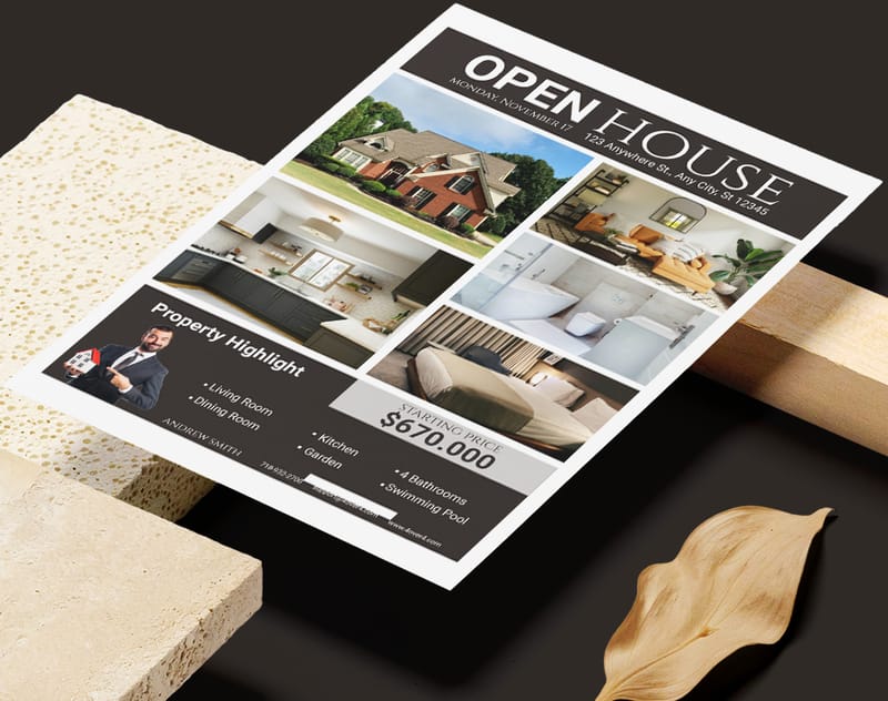
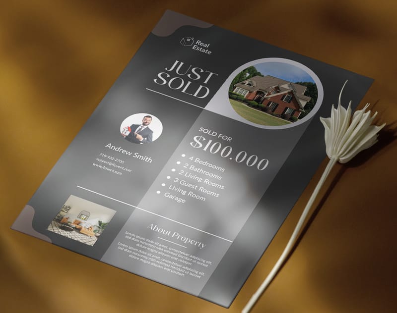
Once your design is ready, choosing the right flyer product makes all the difference. 4OVER4.COM offers Business Flyers, Circle Flyers, and Club Flyers - each suited to different use cases and audiences. Whether you need standard rectangular flyers for a real estate open house or die-cut circle flyers for a creative brand launch, there's a match.
If your campaign calls for more pages, Custom Booklets give you room to expand your message beyond a single sheet. 4OVER4.COM prints on 60+ paper types with multiple finish options, so your flyers feel as good as they look.
Here's a closer look at available specs, pricing, and what real customers have to say.
Free Design Templates
| Element | Recommended Size (Points) | Key Consideration |
|---|---|---|
| Main Headline | 36+ pt | Make it the largest text; it needs to grab attention. |
| Subheadings | 18-24 pt | Should be clearly smaller than the headline. |
| Body Text | 10-14 pt | Prioritize readability; avoid anything under 10 pt. |
| Contact Info | 8-10 pt | Can be smaller, but must remain clear and legible. |
| Line Spacing | 120-150% of font size | Gives text room to breathe and prevents crowding. |
- "Scan to Get 20% Off Your First Order"
- "Visit Our Grand Opening This Saturday at 10 AM"
- "Buy Your Tickets Now at [Website]"
- Top-Left (Point 1): This is the prime starting spot. Your logo or a major brand element fits perfectly here.
- Top-Right (Point 2): A great place for secondary info. Think of a snappy tagline or a quick detail that supports your main headline.
- Bottom-Left (Point 3): As the reader's eye travels down, this is where you can lay out the essential details, event info, key benefits, or bullet points.
- Bottom-Right (Point 4): This is your finish line. It’s the ideal location for your most powerful call-to-action (CTA) and contact details, making it the final, lasting impression.
- Headline Font: Go for something with personality. This is your hook, so a bold, attention-grabbing font is perfect for pulling people in.
- Body Font: Here, legibility is king. You can't go wrong with a classic sans-serif like Helvetica or Open Sans for smaller text.
- A Dominant Color: This is your primary brand color. It should be the most visible hue in the design.
- A Secondary Color: This one complements your dominant color and works well for subheadings or secondary info.
- An Accent Color: Use this one sparingly. It’s for the important stuff, like your call-to-action button, to make it pop right off the page.
- Your images must be at least 300 DPI. This is the non-negotiable industry standard for high-quality print.
- Pay attention to the physical size. An image that looks great as a tiny website icon will become a pixelated mess if you try to stretch it across half a flyer.
- Safe Zone: This is the "live area" of your flyer. Think of it as an inner margin where all your critical information, text, logos, key images, must live. Keep everything important inside this box, and you can be sure it won't get trimmed off.
- Trim Line: Pretty straightforward, this is the line where the printer's big cutting machine will slice the paper to give you the final flyer size. Anything right on this line is playing with fire.
- Bleed: This is probably the most important and misunderstood part. A bleed is an extra border of your background color or image that extends beyond the trim line, usually by 0.125 inches on every side. Because the cutting process isn't always 100% precise, the bleed gives the printer a small margin of error. It ensures that even if the cut is a hair off, you won’t get a thin, ugly white line along the edge of your flyer.
- A killer headline that makes people stop.
- The essential info: what, when, and where.
- One clear, unmissable call to action.
- Too many fonts and colors: It just looks chaotic and unprofessional. A good rule of thumb is to stick with two fonts and a simple three-color palette.
- Low-resolution images: Nothing undermines your credibility faster than a blurry, pixelated photo. For print, always use high-resolution images, that means 300 DPI (dots per inch).
- No clear visual hierarchy: If every element is screaming for attention, nothing gets heard. Guide the reader's eye by making the most important information the biggest and boldest.
- A weak or missing call to action: Don't make people guess. Tell them exactly what you want them to do next. "Visit Our Website," "Scan to RSVP," "Get 20% Off."
- A wall of text: This is an instant turn-off. If your flyer looks like a textbook page, it's going straight into the bin.
Your Flyer Design Questions, Answered
What file format should I use when submitting a flyer for printing?
Export your flyer as a press-ready PDF with all fonts embedded or converted to outlines. Use CMYK color mode at 300 DPI resolution. Include 0.125" bleed on all sides. 4OVER4.COM also accepts AI, PSD, and EPS files, but PDF is the safest option for consistent results across different design software.
How do I choose the right paper stock for my flyers?
It depends on the use case. Thinner stocks (like 100lb Gloss Text) work well for high-volume handouts at events. Thicker stocks (like 14pt or 16pt cardstock) feel more premium and hold up better in display racks. 4OVER4.COM offers 60+ paper types, so you can match the weight and finish to your flyer's purpose.
Can I design flyers without professional software?
Yes. 4OVER4.COM's Online Designer lets you build flyers directly in your browser with drag-and-drop tools. You can also start from pre-built design templates. Free tools like Canva work too, but make sure you export at 300 DPI in CMYK with proper bleed before uploading your file.
What's the difference between matte and gloss finish on flyers?
Gloss finish adds a shiny, reflective coating that makes colors pop - great for photo-heavy flyer designs. Matte finish has a smooth, non-reflective surface that's easier to read under bright lighting and feels more upscale. Both protect against fingerprints and minor scuffing.
How many fonts should I use on a flyer?
Stick to two fonts maximum. Use one bold or decorative font for your headline and one clean, readable font for body text. More than two fonts creates visual chaos and makes your flyer look unprofessional. Consistency in typography signals credibility.
What size flyer works best for most promotions?
The standard 8.5" x 11" size is the most versatile - it fits standard racks, is easy to hand out, and gives you plenty of design space. For nightclub or music promotions, 4.25" x 5.5" Club Flyers are popular because they're pocket-sized. Circle Flyers stand out in any setting due to their unique shape.