Table of Contents
- Home
- content hub
- How to Create Brand Guidelines for Your Business
How to Create Brand Guidelines for Your Business
Aug 6, 2025717 views
Aug 6, 2025717 views

Before you can even think about picking colors or fonts, you need to lay the groundwork. The most effective brand guidelines are built on a rock-solid strategic foundation. This isn't just fluffy marketing talk; it's the core of your brand's identity, the "why" that drives every single decision you'll make later.
Defining Your Brand's Strategic Foundation
Think of it like building a house. You wouldn't obsess over paint swatches before you have a blueprint and a poured foundation. Your brand’s strategic core—its purpose, vision, and values—is that blueprint. It dictates the entire structure and ensures every part of your brand, from a tweet to a trade show banner, works together.
Uncovering Your Brand's Core Purpose
Your purpose is your reason for being, and it goes way beyond just making money. What positive change are you trying to create? Patagonia, for example, is famous for its purpose: "use business to protect nature." That one powerful idea shapes everything they do, from product design to activism.
To get to your own purpose, you have to ask some tough questions:
- What problem did we originally set out to solve?
- If our brand vanished tomorrow, what would the world lose?
- What is the legacy we want to leave behind?
This isn’t about writing a stuffy mission statement for your "About Us" page. It’s about finding a genuine truth that energizes your team and resonates deeply with your audience.
A strong brand purpose is your North Star. When you're at a crossroads—whether in marketing, product development, or customer service—you can simply ask, "Does this decision align with our purpose?" It’s the ultimate filter for consistency.
Articulating a Clear Vision and Values
If your purpose is your "why," your vision is your "where"—the future you're actively building. Your values are the "how"—the non-negotiable principles that guide your actions on that journey. These elements have to be clear, concise, and most importantly, actionable.
Ditch the generic values like "innovation" or "integrity." They’re meaningless without context. Instead, define what they look like in the real world. If a value is "customer obsession," what does that actually mean? Does it translate to 24/7 support, a no-questions-asked return policy, or proactive check-ins? Get specific.
To tie this all together, it's incredibly helpful to build a powerful brand positioning framework that clearly defines your unique value and where you stand in the market. This framework is what separates you from the noise.
Before moving on to the visual and verbal elements, it's crucial to have these foundational components clearly defined. They are the strategic bedrock of your entire brand identity.
Core Brand Foundation Components
| Component | Description | Key Question to Answer |
|---|---|---|
| Purpose | Your fundamental reason for existing beyond profit. | Why do we do what we do? |
| Vision | The long-term future your brand is working to create. | Where are we going? |
| Values | The core principles guiding your behavior and decisions. | How do we act on our journey? |
| Positioning | Your unique place in the market relative to competitors. | How do we want to be perceived? |
| Audience | A deep understanding of who you are serving. | Who are we talking to? |
Having these answers documented provides the clarity needed to create guidelines that are both meaningful and effective.
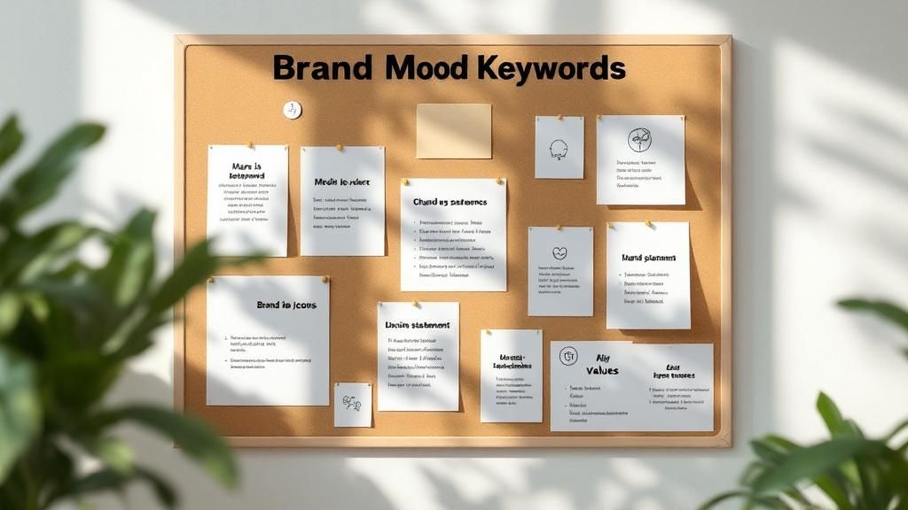
Defining Your Ideal Audience
The final piece of your strategic puzzle is knowing exactly who you're talking to. Don't just stop at basic demographics like age and location. You need to dig into their psychographics—their motivations, fears, dreams, and how they communicate.
Create detailed user personas to make this abstract audience feel real. Give them a name, a job, a backstory. What are their daily headaches? Where do they hang out online? What other brands do they love? When you have this level of understanding, your messaging and visuals will connect on a much deeper level, making your brand feel like it was made just for them.
This strategic groundwork has a very real financial impact. One study found that 32% of companies reported that consistent messaging increased their brand revenue by over 20%. Despite this, a shocking 15% of companies still don't have any formal brand guidelines, leaving a massive opportunity for growth on the table.
Defining Your Brand Voice and Core Messaging
While your logo and colors grab attention, your brand’s voice is what truly builds a lasting connection. The way your brand sounds—the personality it projects through words—is every bit as vital as its visual identity.
So, who are you? Are you the witty, clever friend who’s always ready with a sharp comeback, like Wendy's on Twitter? Or are you the inspiring, authoritative coach, like Nike, pushing your audience toward greatness? Getting this right is about so much more than picking a few vague adjectives.
Go Beyond Adjectives to Create Actionable Rules
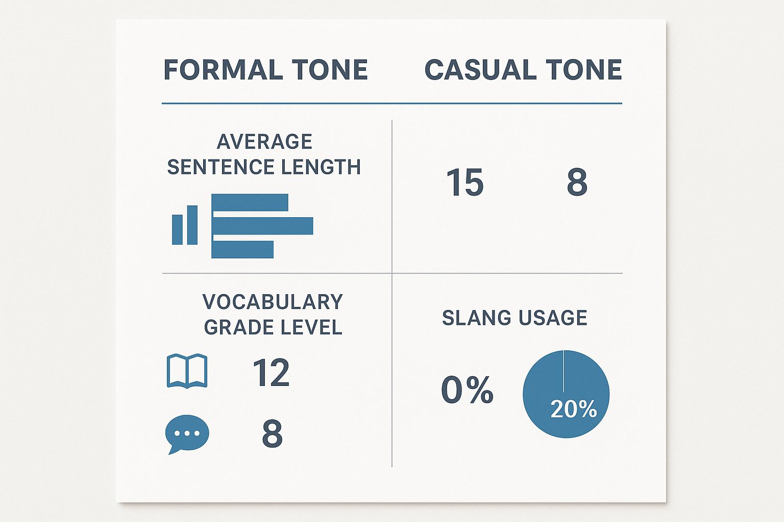
Simply saying your brand is "bold" or "friendly" isn't enough to guide a writer. What does "bold" actually sound like in a blog post or an email? The real magic happens when you translate those abstract traits into concrete, actionable rules.
This is about creating clear guardrails for anyone creating content for your brand.
A "Playful" brand voice, for instance, needs more than just the label. You need to define the specifics:
- Do: Use lighthearted humor, relevant emojis, and pop culture references.
- Don't: Make jokes at a customer's expense or treat serious topics flippantly.
An "Authoritative" voice would have a completely different set of rules:
- Do: Write with confidence, using direct language supported by data and evidence.
- Don't: Use slang, overly casual phrasing, or hesitant words like "we think" or "maybe."
These do's and don'ts remove the guesswork, ensuring consistency across the board. If you're looking for inspiration on how different companies pull this off, check out these inspiring brand voice examples to see how the pros do it.
My Two Cents: Your brand voice isn't just what you say, but how you say it. The secret to consistency is moving from fuzzy descriptors to a practical list of do's and don'ts.
What Are Your Messaging Pillars?
Once you've nailed down how you'll speak, it's time to decide what you'll consistently talk about. Enter messaging pillars. These are the three to five core themes you want to own in your audience's mind. Think of them as the foundational ideas that every piece of content you create should reinforce.
Your pillars are the main chapters of your brand’s story. They should flow directly from your mission and the unique value you deliver to your customers.
For a B2B software company, these pillars might look something like this:
- Effortless Efficiency: Always highlighting how the product saves time and eliminates friction.
- Scalable Growth: Focusing on how the tool supports businesses as they expand.
- Data-Driven Decisions: Emphasizing the features that deliver actionable insights.
Every blog post, case study, and ad campaign should connect back to at least one of these pillars. This approach keeps your messaging laser-focused and constantly reminds people why you're different.
Get Your Core Copy Down on Paper
With your voice and pillars locked in, you can now write the essential pieces of copy that will be used over and over again. Having these ready-made ensures everyone is telling the exact same story from day one.
- Tagline: A short, memorable phrase that captures your brand's essence. Think Nike’s “Just Do It” or Apple’s “Think Different.” It’s all about being catchy and evocative.
- Elevator Pitch: A tight, 30-second summary of what you do, who you help, and what makes you special. This is gold for sales teams, networking events, and onboarding new hires.
- Brand Story: A brief narrative—usually one to three paragraphs—explaining your origin, your mission, and the problem you exist to solve. This is perfect for your "About Us" page and other key brand materials.
Documenting this core copy in your brand guidelines gives your team a toolkit of perfectly on-brand assets. It saves a massive amount of time and stops inconsistent messaging before it even starts.
Building Your Visual Identity System
This is where the magic happens—where your brand’s strategy becomes something people can actually see and touch. If your mission and voice are the soul of your brand, consider your visual identity its body. It’s the collection of design elements that people will see everywhere, instantly recognizing and connecting them with you. A rock-solid visual system ensures every single touchpoint, from a business card to a billboard, feels like it came from the same source.
Don't think of these visual rules as limitations on creativity. They're quite the opposite. By setting clear standards, you empower your team and any outside partners to create work that is both inventive and perfectly on-brand. Let's break down the three pillars you need to build: your logo, color palette, and typography.
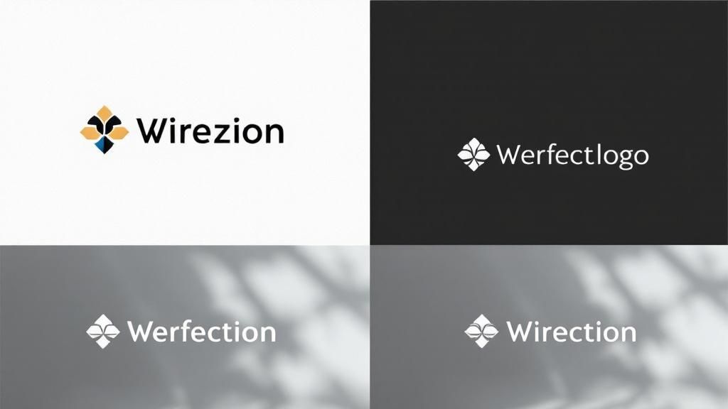
Your Logo Usage Rules
Your logo is the most concentrated version of your brand, so protecting its integrity is absolutely non-negotiable. Your guidelines must have explicit, easy-to-follow rules for how it should—and, just as importantly, should not—be used. Leaving this open to interpretation is a recipe for disaster. Before you know it, you'll see stretched, recolored, or obscured versions of your logo floating around, actively weakening your brand recognition.
Start by defining the absolutes:
- Clear Space: This is the mandatory "breathing room" around your logo. Think of it as a personal bubble that prevents other text or graphics from crowding it. A common pro move is to use a key element from the logo itself, like the height of a specific letter, to define this minimum clear space on all sides.
- Minimum Size: How small can your logo get before it turns into an unreadable smudge? You need to define this for both digital (in pixels) and print (in inches or millimeters). This simple rule prevents a blurry, unrecognizable mark on small items like social media avatars or promotional pens.
- Color Variations: Show every acceptable version of your logo. This almost always includes the full-color primary version, an all-white (or knockout) version for dark backgrounds, and an all-black version for simple, single-color printing.
Showing what not to do is often even more critical than explaining what to do. Visual examples of incorrect usage are far more powerful than just writing out a rule.
Pro Tip: Create a dedicated "logo misuse" or "don't do this" section in your guidelines. Show clear, visual examples of what to avoid, such as stretching the logo, changing its colors, adding cheesy drop shadows, or plastering it on a busy, low-contrast background. This visual guide is incredibly effective for preventing the most common mistakes I see in the wild.
Building a Strategic Color Palette
Color is one of the most powerful tools in your brand’s arsenal. It triggers emotion, communicates meaning without a single word, and dramatically boosts brand recognition. The right color palette creates visual harmony across all your materials and makes your brand instantly identifiable at a glance.
The data here is pretty compelling. A well-chosen signature color can boost brand recognition by a staggering 80%. In fact, research shows that 81% of consumers are more likely to recall a brand’s color than its name. When you consider that around 90% of snap judgments about products are based on color alone, you realize a strategic palette is a business imperative, not just an aesthetic choice. You can find more branding statistics that highlight the importance of this visual consistency.
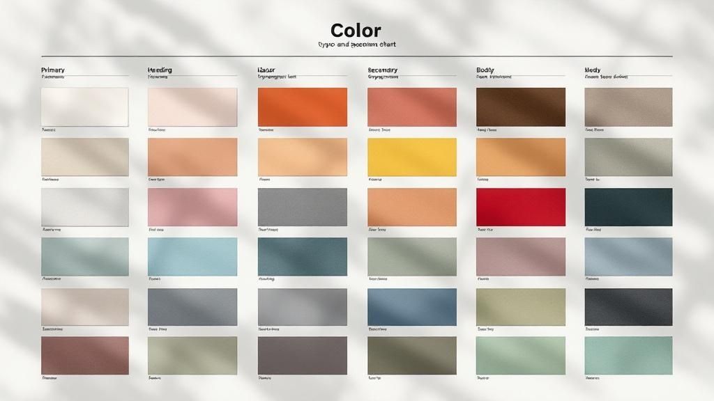
Your palette should always be organized into a clear hierarchy.
Primary and Secondary Colors
Your primary colors are the heart of your brand identity. This is usually a small, tight set of one to three colors that will be used most often. They should feel directly tied to your main logo and the personality you defined earlier.
Secondary colors are there to support and complement your primary palette. They’re used for accents, subheadings, charts, and other design elements that add depth and visual interest without overpowering your core identity.
For every single color in your palette, you must provide its specific color codes. This is the only way to ensure perfect reproduction across every possible medium.
| Color Space | Use Case | Example |
|---|---|---|
| HEX | For all digital applications like websites and apps. | #0066CC |
| RGB | For screens, like presentations and digital videos. | R:0 G:102 B:204 |
| CMYK | For all four-color process printing (e.g., brochures). | C:95 M:63 Y:0 K:0 |
| PMS | For spot color printing to ensure exact color matching. | Pantone 2145 C |
This level of detail eliminates all the guesswork for designers, developers, and print vendors. It guarantees that your brand’s blue looks identical on a website, a PowerPoint slide, and a printed flyer from a quality service like 4OVER4.
Establishing a Clear Typography Hierarchy
Typography is the art of making your words legible, readable, and appealing. In branding, it’s what gives your written voice its visual form, shaping how your audience actually experiences your messaging. A clear typographic system ensures everything is easy to read and creates a cohesive visual rhythm.
This process involves selecting specific typefaces (fonts) and defining strict rules for how they are used. Most brands I've worked with land on a primary typeface for headlines and a secondary typeface for body copy.
Your guidelines should specify:
- Headline Font: The font for all your H1, H2, and H3 headings. Define its weight (e.g., Bold, Semi-Bold) and recommended sizes.
- Body Copy Font: The font for paragraphs and longer text blocks. This must be highly legible, even at smaller sizes. Specify its weight (e.g., Regular) and an ideal size range.
- Accent Font: This is an optional font you can use for things like blockquotes, captions, or calls-to-action to inject a little extra personality.
Creating a clear hierarchy is absolutely crucial for usability. For example, your H1 heading might be set in your primary font at 48px Bold, while your body copy is set in your secondary font at 16px Regular. These rules ensure that a reader can easily scan a document and understand the structure of the information at a glance. Providing these detailed specifications is a cornerstone of learning how to create brand guidelines that actually work in the real world.
Setting Guidelines for Imagery and Media
Your brand’s story isn't just told with logos and colors. The photos, illustrations, and even the tiniest icons you use pack a serious punch, shaping how your audience feels about you. Without clear rules of the road, your visuals can quickly become a messy, confusing mix of styles, completely undermining the cohesive brand you’ve worked so hard to build.
This is why nailing down your media guidelines is a non-negotiable step. Every single visual asset, from a big hero image on your homepage to a quick graphic for social media, needs to feel like it came from the same creative mind.
Defining Your Photography Style
Photography is all about capturing a vibe. So, the first thing you have to do is decide what that vibe is. Do your brand photos need to feel energetic and candid, like you're capturing real moments as they happen? Or does a more composed, professional, and polished look better match your brand's personality?
There’s no single right answer here—only what’s right for your brand. A B2B software company might want crisp, bright photos of diverse teams collaborating in a modern office. A high-end artisan coffee brand, on the other hand, might go for moodier, artfully styled shots with deep shadows and a focus on texture.
Your guidelines should get specific about:
- Lighting and Mood: Are we talking bright, airy, and optimistic? Or something more dramatic with high contrast and deep shadows?
- Color Treatment: Should every photo have a consistent color grade? Maybe you prefer a warm, sun-kissed look or a slightly desaturated, cinematic feel. Providing a custom Lightroom preset is an absolute game-changer for consistency.
- Composition: Do you favor clean, centered, symmetrical shots? Or do you prefer more dynamic, off-center compositions that follow the rule of thirds?
Laying out these details gives any photographer or designer a clear roadmap to follow, whether they're shooting custom photos or digging through stock image sites. It’s how you keep your visual story straight.
Choosing Your Subject Matter
What you show in your photos is just as critical as how you show it. Your guidelines need to be explicit about the subjects that will tell your brand’s story most effectively.
Think about what you want your audience to see again and again.
- People: If you use people in your photos, who are they? Real customers? Diverse models who look like your target audience? Or your own team members? Showing genuine people can make a brand feel instantly more human and trustworthy.
- Products: Should products be shot in a pristine studio setting, isolated on a simple background? Or should they be captured "in the wild," being used in real-life situations that help customers imagine the product in their own lives?
- Abstract & Textural: Sometimes, a less literal approach works wonders. Abstract shots of architecture, natural textures, or blurred city lights can evoke a powerful mood without showing a specific person or product. These are perfect for backgrounds.
The whole point is to build a library of on-brand images your team can pull from with total confidence. Nail down the "what" (subject matter) and the "how" (photographic style) to eliminate the guesswork.
Curating a Unique Icon and Illustration Style
Icons and illustrations are brilliant for breaking down complex ideas and injecting a bit of personality. But a random grab-bag of styles just looks amateurish and disjointed. Your brand guidelines have to define a single, unified approach.
When it comes to iconography, you really have two solid options:
- Create a Custom Set: Honestly, this is the gold standard. It guarantees your icons are unique and perfectly aligned with your brand's look and feel. The key is to keep the line weight, corner style, and level of detail consistent across the entire set.
- Choose a Single Library: If a custom set isn't in the budget, the next best thing is to pick one high-quality icon library—like Feather Icons or Google's Material Symbols—and stick with it religiously.
The same thinking applies to illustrations. The rules need to be crystal clear.
- Style: Are your illustrations hand-drawn and organic, or are they clean, geometric vector art?
- Color Usage: Do they pull from your entire brand palette, or do they use a more limited, specific subset of colors?
- Complexity: How detailed should they be? Are we talking simple line art, or fully rendered scenes with rich shading and texture?
By setting these rules, you ensure that every visual element, from the smallest icon to the biggest illustration, is working together to reinforce your brand.
Putting Your Brand Guidelines into Practice
So you’ve poured all that hard work into creating a killer brand guide. That's a huge step, but the document itself is worthless if it just collects dust on a digital shelf. The real win comes from getting everyone to actually use it. This is where your guidelines stop being a static PDF and become a living, breathing part of your company culture.
The best way to get started? Make your guidelines impossible to ignore. A polished PDF is a decent starting point, but an interactive microsite or a dedicated hub on your company intranet is far better. Accessibility is everything. If a designer needs a hex code or a salesperson needs the right logo, they should be able to find it in under 30 seconds.
Empower Your Brand Champions
Let's be realistic—you can't be everywhere at once. That’s why one of the smartest things you can do is identify and empower a team of brand champions.
These people aren't the brand police. Think of them as enthusiastic evangelists from different corners of the company—marketing, sales, HR, even the product team—who genuinely get and believe in the brand.
Their job is to:
- Be the friendly, go-to person for brand questions within their department.
- Gently nudge colleagues toward correct usage in a supportive, helpful way.
- Funnel feedback to the core brand team about what’s working and what isn’t in the real world.
When you have champions, brand consistency becomes a shared responsibility, not some top-down mandate. They help humanize the rules and build a sense of collective pride in how your company shows up.
The gap between having brand guidelines and using them is staggering. While an incredible 95% of companies report having brand guidelines, research shows only about a quarter of them enforce them consistently. This creates a massive opportunity for brands that treat their guidelines as a serious business tool. You can dig into more of these branding statistics and their business impact.
Make It Easy with Practical Templates
Here’s the single most effective way to ensure people follow the rules: make the right way the easy way. Instead of just telling people how to design a presentation, give them a beautiful, on-brand template that’s ready to go. You’re removing all the friction. Suddenly, staying on-brand is the path of least resistance.
Start by building a library of essential, ready-to-use assets:
- Presentation Decks: A master template for Google Slides or PowerPoint with the correct logos, colors, and typography already baked in.
- Social Media Graphics: Pre-sized templates for platforms like Instagram and LinkedIn, complete with proper logo placement and font styles.
- Email Signatures: A standardized format everyone can copy and paste, ensuring every single email looks professional and unified.
- Document Templates: Branded headers and footers for Word documents or Google Docs.
By providing these tools, you aren’t just enforcing rules. You're actively helping your team work faster and more efficiently, all while maintaining a polished, consistent brand presence.
How Should You Share Your Guidelines?
Choosing the right format for your guidelines is crucial for adoption. A simple PDF might work for a small team, but a growing company might need something more robust. Each format has its own set of trade-offs.
Brand Guideline Format Comparison
| Format Type | Pros | Cons | Best For |
|---|---|---|---|
| PDF Document | Easy to create and share; universally accessible. | Static, hard to update, not interactive. | Small teams, freelancers, or as a quick-reference summary. |
| Internal Wiki/Intranet Page | Centrally located, easy to update, can link to other resources. | Can be visually bland; access is limited to internal teams. | Mid-to-large companies with an established internal knowledge base. |
| Interactive Microsite | Highly engaging, easy to navigate, can include videos and animations. | More complex and costly to build and maintain. | Larger brands that need to share guidelines with external partners. |
| Digital Asset Management (DAM) Platform | Combines guidelines with downloadable assets; excellent for version control. | Can be expensive; requires training and platform management. | Organizations with a high volume of creative assets and many stakeholders. |
Ultimately, the "best" format is the one your team will actually use. Consider your company’s size, budget, and technical resources before you commit. The goal is to make the guidelines a helpful, living resource, not a forgotten file.
Establish a Simple Review Process
For new or high-stakes materials, a light-touch review process can be a lifesaver. This isn't about creating a bureaucratic bottleneck. It’s a quick check-in to catch potential missteps before they go public.
This could be as simple as having one designated "brand reviewer" give a final once-over to a new ad campaign or a major annual report. Keep the process simple and fast—a dedicated Slack channel or a simple submission form can streamline everything and ensure feedback is timely.
This small step acts as a valuable safety net, protecting your brand's integrity without slowing your teams down. And remember, your guidelines are a living document. Plan to revisit and update them annually to reflect your brand's growth, ensuring they always stay relevant and useful.
Common Questions About Brand Guidelines
Even the most thorough plan for creating brand guidelines can leave you with some nagging practical questions. I've seen it time and time again. Working through these common sticking points is what separates a guide that gets used from one that just collects digital dust. Let's dig into a few of the questions I hear most often.
How Strict Should My Guidelines Be?
This is the big one. The classic tug-of-war between consistency and creativity. The honest answer? Your guidelines need to be firm, but not rigid.
Think of them as guardrails on a highway, not a creative straitjacket. Their job is to prevent you from driving off a cliff, not to dictate every single lane change.
For the absolute core of your brand—your logo, primary colors, and foundational voice—the rules need to be ironclad. These are the non-negotiables. But when it comes to things like secondary color palettes, illustration styles, or the tone on a specific social media channel, you can build in some wiggle room. You want to give your team a framework that empowers them to be creative within your brand's world.
The best brand guidelines I've ever worked with leave space for smart interpretation. They nail down the "what" and "why," but trust skilled creators to figure out the "how." A good target to aim for is making about 80% of the guide firm rules and leaving 20% as flexible principles.
How Often Should I Update My Brand Guidelines?
Your brand guide is a living document, not something you carve into a stone tablet. It has to grow and change right along with your business. While you probably don't need a top-to-bottom overhaul every single year, you should absolutely schedule a formal review and a minor refresh annually.
Certain business milestones should also trigger an immediate review. Things like:
- A major product launch: Does your messaging or visual style need to shift to support it?
- Entering a new market: Will your current voice and visuals connect with a totally new audience?
- A merger or acquisition: How are you going to blend two different brand identities without creating a mess?
Outside of those big moments, the annual check-in is your chance to see what's working, what isn't, and what just feels dated. It keeps your brand from going stale and ensures it remains one of your most powerful assets.
Do I Really Need Brand Guidelines If I'm a Small Business or Solopreneur?
Yes. Absolutely. In fact, I'd argue they're even more crucial for a small operation.
When you're a small team—or a team of one—every single thing you put out into the world carries immense weight. Your email signature, your social media posts, your invoices... they all have an outsized impact on how people see your brand.
Consistency is how you build trust, and for a small business, trust is everything. Even a simple one-page guide covering your logo rules, color codes, main font, and a few key voice principles is a game-changer. It sets a professional standard from day one and ensures that when you do start hiring freelancers or bringing on your first employee, your brand's integrity doesn't get lost in the shuffle. It's the foundation for growth.
Ready to bring your brand's visual identity to life with flawless execution? At 4OVER4, we specialize in high-quality printing that honors your brand guidelines down to the last detail. From business cards to banners, ensure every piece reflects your brand's quality and consistency. Explore our professional printing services today!
More from

13
When you’re ready to invest in an A-frame sign, the first question you'll ask is, "What size do I need?" It usually comes down
![]() Emma Davis
Emma Davis
Mar 13, 2026

114
The real secret to mastering your direct mail budget isn't complicated. It comes down to one simple fact: a standard 4" x 6&q
![]() Emma Davis
Emma Davis
Mar 12, 2026

64
Tear-off flyers are a classic for a reason. They’re a tangible marketing tool, designed with perforated, removable tabs at the bottom. Each
![]() Emma Davis
Emma Davis
Mar 11, 2026

116
Printing stickers at home is a seriously fun and rewarding project. It boils down to four main parts: designing your image, picking the right
![]() Emma Davis
Emma Davis
Mar 10, 2026

104
Ever seen a logo that seems to float right on the glass of a jar or bottle? That’s the work of transparent label stickers.
![]() Emma Davis
Emma Davis
Mar 9, 2026

61
Picture this: your product’s beautiful label gets smudged and runny during shipping, or a gorgeous event banner fades to nothing after just
![]() Emma Davis
Emma Davis
Mar 8, 2026

58
In a sea of options, your product's packaging and labeling are its first, and often only, chance to make a real connectio
![]() Emma Davis
Emma Davis
Mar 7, 2026

89
Ever tried to print a hundred high-quality flyers on your home office printer? You probably ran out of ink, dealt with paper jams, and ended u
![]() Emma Davis
Emma Davis
Mar 6, 2026