Table of Contents
- Home
- content hub
- A Glossary of Graphic Design Terminologies
 Share and earn
A Glossary of Graphic Design Terminologies
Sep 23, 2025498 views
Sep 23, 2025498 views
Welcome to the definitive glossary for the language of graphic design. This guide is for everyone—from aspiring designers just starting out to seasoned pros who need a quick reference. We're here to cut through the jargon and break down complex terms into clear, practical definitions.
Your Go-To Guide for Design Lingo
Getting a handle on design terminology is the bedrock of great visual communication. Think of this guide as your comprehensive translator, helping you move beyond just knowing the words to truly understanding how they work in the real world.
Whether you're trying to decipher client feedback, collaborating with your creative team, or just leveling up your own skills, this is the foundation you need. You'll learn to talk about design with the kind of confidence and precision that gets things done. A solid grasp of these concepts is also a must-have for producing top-notch print work. To see these terms in action, check out our wide selection of professionally printed marketing materials and see how they translate into real-world assets for your brand. This resource is all about bridging that gap between a great idea and a finished product.
Foundational Design Principles and Concepts
Before you can truly master the lingo of graphic design, you need a solid grip on the foundational principles that guide every visual project. Think of these as the universal rules of the road—they explain why some designs just work and feel right, while others look jumbled and confusing. They’re the secret sauce in every great composition.
The practice of arranging visuals to communicate an idea is older than any formal language. You can see primitive storytelling in cave paintings from 38,000 BCE in places like Lascaux, France. Later, Sumerian cuneiform from around 3,000 BCE started to bridge the gap between simple pictures and symbolic language, really laying the groundwork for what we do today.
Mastering Visual Arrangement
At their core, all these principles are about creating clarity and impact. Alignment, for instance, is just the simple act of placing elements along a common line. When you see text in a magazine perfectly lined up with a grid, that’s alignment in action. It instantly creates a sharp, organized feel that’s easy on the eyes.
Then there’s proximity, which is about grouping related things together. On a business card, your name, title, and phone number are all clustered together to signal that they’re one complete unit of information. It's a simple trick, but it cuts down on clutter and makes the information easier to digest.
- Repetition: This is where you reuse certain elements—like a font, color, or shape—throughout a design. Using the same style for all your headings is a perfect example. It creates a sense of rhythm and consistency that ties the whole piece together.
- Contrast: This is all about making different elements pop. Placing a bold, dark headline against a pale background is a classic use of contrast. It grabs your attention and tells you what’s important.
Guiding the Viewer's Eye
A great design isn't just a random assortment of elements; it's a carefully orchestrated journey for the viewer's eye. This is where visual hierarchy comes in. It's the art of arranging things in order of importance. A website’s main message might be in a huge, colorful font right at the top, while the less critical details are smaller and tucked away at the bottom.
Balance is another key concept, referring to how visual weight is distributed in your design. It can be symmetrical (a perfect mirror image), asymmetrical (balanced using different elements of varying "weight"), or even radial (arranged around a central point). Imagine a poster with a large photo on one side perfectly balanced by a block of text on the other—that’s asymmetrical balance creating a sense of harmony.
White Space (or Negative Space) isn’t just empty filler. It’s an active, powerful design element. It’s the breathing room you give to text and images so they don’t feel crowded. Using it well improves readability and gives your design a touch of class.
Getting these principles right is absolutely vital for creating visuals that don't just look pretty but actually work. A solid understanding is key to building strong brand awareness, because applying these rules consistently is what creates a professional and memorable identity.
The Complete Typography Terminology Guide
Typography is so much more than just choosing a pretty font. It’s the craft of arranging text in a way that’s not just legible and readable, but also visually appealing. Think of it as the unsung hero of graphic design; when it’s done well, it elevates a design from good to truly great, ensuring your message connects with your audience on a deeper level.
Let's clear up a common point of confusion right away. A typeface is the overall design of the lettering—it’s the entire family, like Helvetica or Times New Roman. A font, on the other hand, is just one specific style within that family, such as Helvetica Italic or Times New Roman Bold. Getting this right is the first step to talking like a pro.
Understanding Character Anatomy
To really get a handle on type, you need to know the basic building blocks of each letter. These little details might seem small, but they have a massive impact on the feel and readability of your text.
- Serif vs. Sans-Serif: This is the big one. Serifs are those little decorative feet or strokes you see at the ends of letters in typefaces like Garamond. Typefaces without them, like Arial, are called sans-serif (which literally means "without serif").
- Baseline: Picture an invisible line that all the letters are sitting on. That’s your baseline.
- Ascender and Descender: An ascender is the part of a lowercase letter that pokes up above the main body (the x-height), like the tall part of an 'h' or 'b'. A descender is the opposite, dropping below the baseline, like you see in a 'p' or 'g'.
Mastering Spacing and Layout
The space around your letters and lines is just as critical as the letters themselves. Getting the spacing right gives your work a clean, polished look that’s effortless to read. These are some of the most essential terms every designer should have in their back pocket.
Good typography is a lot like good manners. You don't notice it when it's there, but you sure do when it's not. It’s the silent partner in communication that makes everything clearer.
For instance, kerning is the art of tweaking the space between two specific letters to make them look balanced. In contrast, tracking is about adjusting the spacing uniformly across a whole word or block of text. And leading (pronounced like "ledding," a nod to the old days of lead type) is the vertical breathing room between lines of text, measured from one baseline to the next.
This quick-reference table breaks down these essential spacing terms to help you keep them straight.
Key Typography Terminology Explained
| Term | Definition | Primary Use |
|---|---|---|
| Kerning | Adjusting space between two specific characters | Fixing awkward gaps in logos or headlines |
| Tracking | Adjusting space across a range of characters | Improving readability of a whole paragraph |
| Leading | Adjusting the vertical space between text lines | Making body text easier to read and scan |
Understanding these concepts is non-negotiable when you're creating branded materials. Think about professional business stationery—mastering these typographic details is what makes it look sharp and credible. You can see great examples of this in high-quality https://www.4over4.com/printing/category/letterheads-printing, where typography is key to the brand's identity.
And since the tools of our trade are always evolving, it pays to stay on top of things like new presets and Google Fonts updates for design software. Knowing what's available can make achieving typographic perfection that much easier.
Understanding the Language of Color Theory
Color is easily one of the most powerful tools in any designer's arsenal. It can instantly set a mood, grab a user's attention, and guide their eye exactly where you want it to go. Getting a real handle on the language of color theory means you can stop guessing and start making intentional, effective choices that truly connect with your audience.
It all boils down to the three basic properties of any color, often called HSV:
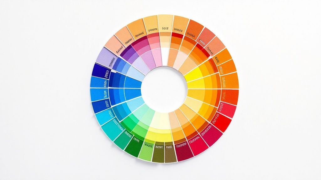
- Hue: This is what we typically think of as the color itself—the pure pigment on a color wheel, like a true red, a classic blue, or a sunny yellow.
- Saturation: Think of this as the intensity or purity of a color. A highly saturated color is rich and vibrant, while a desaturated one is more muted, looking like it has a bit of gray mixed in.
- Value: Also known as brightness, value is simply how light or dark a color is.
Color Models for Screen and Print
How a color gets made depends entirely on where it's going to end up. Different media need different color models to get the shades just right, and knowing the difference is key to avoiding those frustrating (and expensive) moments when your printed piece looks nothing like your on-screen mockup.
The two big ones you'll work with are RGB (Red, Green, Blue) and CMYK (Cyan, Magenta, Yellow, Key/Black). RGB is an additive model used for digital screens, where beams of light combine to create color. CMYK, on the other hand, is a subtractive model for print, where inks are layered on paper to absorb light.
For those projects that demand absolute color consistency—think brand logos—the Pantone Matching System (PMS) uses standardized, pre-mixed inks. If you're creating something special, like vibrant business cards with a unique finish, precise color management is non-negotiable. You can see how this plays out with options like metallic foil printing online.
Creating Harmony with Color Schemes
Putting colors together effectively is part art, part science. Color harmony is the term for pairing colors in a way that just works—it's visually pleasing and feels balanced.
Designers lean on a few tried-and-true schemes to build beautiful palettes:
- Complementary: These are colors sitting directly across from each other on the color wheel, like red and green or orange and blue. This combo creates a ton of contrast and visual energy.
- Analogous: This scheme uses colors that are neighbors on the color wheel—think blue, blue-green, and green. The result is always harmonious and creates a calm, comfortable feeling.
- Triadic: A triadic scheme involves three colors that are evenly spaced on the wheel, forming a perfect triangle. It offers strong visual contrast but keeps things feeling balanced and rich.
Digital and Print Production Terminology
Every designer eventually learns a hard lesson: a great idea is only as good as its execution. To bridge the gap between your creative concept and the final product, you need to speak the language of production. Whether you're handing files off to a web developer or a commercial printer, knowing these core graphic design terminologies is the key to a smooth, error-free delivery. It's what prevents costly reprints and ensures your vision comes to life exactly as you imagined it.
The history of our craft is tied directly to production. The term “graphic design” didn't even exist until 1922, when William Addison Dwiggins coined it in an essay, but the principles are ancient. The Industrial Revolution brought us technologies like lithography, which opened the door for complex, repeatable prints and blew the lid off what was possible with graphic reproduction. If you're curious about the full story, Canva.com has a great piece on its fascinating evolution.
Key Terms for Digital Design
When you're designing for screens, a few technical details make all the difference. The most fundamental concept to get your head around is the difference between raster and vector graphics. Think of raster images (like JPEGs or PNGs) as mosaics built from a grid of tiny squares, or pixels. If you try to make the mosaic bigger, the squares just get larger and the image looks blocky and blurry.
Vector graphics (like SVGs), on the other hand, are created with mathematical equations. This means you can scale them up to the size of a billboard or shrink them down to fit on a watch face, and they’ll stay perfectly crisp and sharp every single time.
This brings us right to the idea of resolution.
- PPI (Pixels Per Inch): This is all about pixel density on a digital screen. For web design, the long-standing standard is 72 PPI.
- DPI (Dots Per Inch): This one's for print, measuring the density of ink dots a printer lays down. For a sharp, high-quality printed image, 300 DPI is the magic number.
Getting these two mixed up is a classic rookie mistake. It can lead to blurry, pixelated prints or bloated, slow-loading files for the web.
Must-Know Print Production Vocabulary
Sending files to a commercial printer is a whole different ball game with its own set of rules. One of the absolute most critical concepts is the bleed. This is simply an extra margin of your design that extends past the final trim edge.
Bleed is your safety net. It guarantees that when the paper is cut down to its final size, you won't see any ugly, unprinted white slivers along the edge if the trim is just a fraction of a millimeter off. It’s essential for a professional finish.
A few other print terms go hand-in-hand with this:
- Trim Line: This is the line where the piece will actually be cut, representing the final dimensions of your project.
- Slug: This is an area outside the bleed where you can leave notes for the printer—things like file information or special instructions. It all gets trimmed off and thrown away after production.
Understanding these concepts is non-negotiable, especially for projects with custom shapes. For example, knowing how to set up your files correctly is crucial for specialized services like die-cutting, where precision is everything. A file prepared with the proper bleed and trim marks ensures the final product is cut perfectly and matches your exact specifications.
A Look at Key Design Styles and Movements
To really get a handle on graphic design, you have to look back. Understanding the major design styles and movements gives you a massive well of inspiration and context for your own work. Think of it as a visual shorthand—it helps you make deliberate choices and communicate your creative direction with total clarity. Knowing these core graphic design terminologies is key to framing your vision, whether you're briefing your team or presenting a concept to a client.
The story of design is a global one, shaped as much by cultural tides as by leaps in technology. We saw the intricate, decorative styles of the Victorian era (1837–1901) and the handmade focus of Arts & Crafts (1880–1910) eventually flow into the organic, curvy forms of Art Nouveau (1910–1920).
The 20th century really kicked things into high gear with disruptive movements like Futurism and the incredibly influential Bauhaus school (1919–1933). Post-war design was largely defined by the grid-based Swiss Style from the 1940s to the 1980s, which eventually paved the way for modern digital trends like Flat Design in the 2010s. For a deeper dive, this graphic design timeline offers a fantastic overview.
Defining Major Styles
Getting a feel for the signature traits of each movement is crucial. Every style has a distinct visual personality that was created to solve the communication challenges of its day.
- Minimalism: This style is all about subtraction. It strips everything down to the essentials, using extreme simplicity, generous negative space, and a tight color palette to create something clean, uncluttered, and highly functional.
- Art Deco: Popping up in the 1920s, Art Deco is pure glamour and luxury. You'll recognize it by its bold geometric shapes, sharp, clean lines, rich colors, and symmetrical patterns.
- Swiss Style (International Typographic Style): This mid-20th-century movement is built on a foundation of objectivity and clarity. Its trademarks are rigid grid-based layouts, clean sans-serif typography (hello, Helvetica), and an orderly, asymmetrical arrangement of elements.
You've probably seen Brutalism in web design lately. Its roots are actually in post-war architecture, and it's all about raw, exposed functionality. Think unstyled HTML, monochromatic color schemes, and a stark, almost "brutal" honesty in how it's presented.
The infographic below zeroes in on how key web design terms, in particular, have changed over time—from the very first lines of HTML to the rise of responsive design.
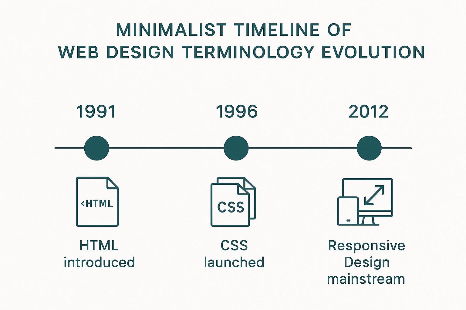
This timeline really drives home how technological breakthroughs have directly molded the visual language and the very possibilities of digital design over the past couple of decades. By understanding where these movements came from, you can start to borrow, combine, and reinvent their visual languages to create something entirely new and effective.
A Few Common Design Questions Answered
If you’ve ever felt like designers are speaking a different language, you’re not alone. Getting a handle on a few key terms can make a world of difference when you’re trying to communicate your vision. Let’s clear up some of the most common points of confusion.
Raster Versus Vector
So, what's the real story with raster vs. vector images? Think of it this way: raster graphics, like a JPEG or a photo from your phone, are made up of a finite grid of tiny squares called pixels. When you try to make them bigger, the image gets all blurry and pixelated because you’re just stretching those squares.
Vector graphics, like an SVG or an Adobe Illustrator file, are totally different. They’re built with mathematical paths and curves, not pixels. This means you can scale them up to the size of a billboard or shrink them down to fit on a pin, and they'll stay perfectly sharp and crisp every single time. That’s why your logo should always be a vector file.
DPI Versus PPI
Another mix-up we see all the time is DPI vs. PPI. While they sound similar, they live in two separate worlds: print and digital.
DPI stands for "dots per inch" and is all about printing. It measures the density of ink dots a printer puts on a piece of paper. For anything you want to look sharp and professional in print, 300 DPI is the gold standard.
PPI, or "pixels per inch," is for screens. It refers to the number of pixels packed into an inch of a digital display on your monitor, phone, or tablet.
UI Versus UX
Finally, let's untangle UI and UX. While they work together, they are two distinct disciplines.
User Interface (UI) design is what you see. It’s the visual side of things—the colors, the typography, the buttons, the layout, and all the aesthetic choices that make up the look and feel of a website or app.
User Experience (UX) design is what you feel. It’s the entire journey and overall feeling a person has while using a product. Is it easy to navigate? Is it intuitive? Does it solve their problem without causing frustration? That’s all UX.
Ready to put your design knowledge into practice? Create stunning, professionally printed materials with 4OVER4, your one-stop online print superstore. Start designing today at https://4over4.com.
More from

13
When you’re ready to invest in an A-frame sign, the first question you'll ask is, "What size do I need?" It usually comes down
 Emma Davis
Mar 13, 2026

113
The real secret to mastering your direct mail budget isn't complicated. It comes down to one simple fact: a standard 4" x 6&q
Emma Davis
Mar 12, 2026

62
Tear-off flyers are a classic for a reason. They’re a tangible marketing tool, designed with perforated, removable tabs at the bottom. Each
Emma Davis
Mar 11, 2026

110
Printing stickers at home is a seriously fun and rewarding project. It boils down to four main parts: designing your image, picking the right
Emma Davis
Mar 10, 2026

103
Ever seen a logo that seems to float right on the glass of a jar or bottle? That’s the work of transparent label stickers.
Emma Davis
Mar 9, 2026

59
Picture this: your product’s beautiful label gets smudged and runny during shipping, or a gorgeous event banner fades to nothing after just
Emma Davis
Mar 8, 2026

58
In a sea of options, your product's packaging and labeling are its first, and often only, chance to make a real connectio
Emma Davis
Mar 7, 2026

89
Ever tried to print a hundred high-quality flyers on your home office printer? You probably ran out of ink, dealt with paper jams, and ended u
Emma Davis
Mar 6, 2026