Table of Contents
- Home
- content hub
- Glossy vs Matte Which Finish Is Right for You
Glossy vs Matte Which Finish Is Right for You
Sep 2, 2025439 views
Sep 2, 2025439 views
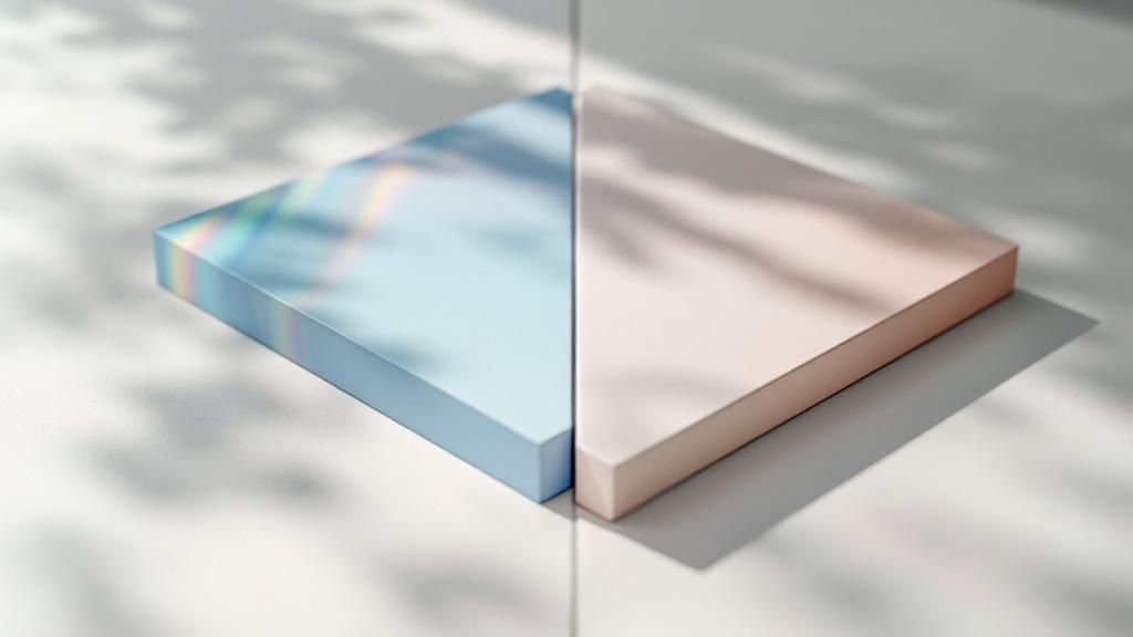
When you're standing at a crossroads in your print project, the choice between a glossy or matte finish often comes down to one key question: do you want vibrancy or subtlety? It's the classic showdown.
A glossy finish gives you that shiny, reflective surface that makes colors leap off the page and fine details look incredibly sharp. It’s designed to grab attention. A matte finish, on the other hand, delivers a non-reflective, soft look that speaks of sophistication and is much easier on the eyes, especially under bright lights.
Deciding Between Glossy and Matte Finishes
This isn't just a minor detail; picking between glossy and matte is one of the most fundamental decisions you'll make in print design. It directly affects how people perceive your brand, your photography, or your marketing materials. We're talking about function, feel, and the unspoken message you're sending.
So, what makes a finish glossy? It’s a smooth, shiny coating that bounces light right back at you. This reflection is what enhances color saturation, making images feel more dynamic and alive. It creates a modern, high-impact look that's perfect for promotional items like flyers and photo prints where you need to make a strong visual impression. Fast.
Matte finishes are the complete opposite. They use a non-reflective coating that absorbs light, which results in that muted, almost velvety appearance. The lack of glare makes text incredibly easy to read and lends an elegant, professional feel to any design. Plus, its natural resistance to fingerprints and smudges makes it a workhorse for items that get handled a lot, like business cards and restaurant menus.
The bottom line: The right finish depends entirely on your project's goal. Glossy is your go-to for capturing attention with stunning visuals. Matte is for communicating sophistication and making sure your message is read loud and clear.
To make the choice even clearer, let's break down the core differences in a simple table. This will give you a quick reference, but remember that a world of advanced techniques can add even more distinction to your project. You can see some of those options in our specialty printing collection.
Key Differences Between Glossy and Matte Finishes
Here's a side-by-side look at what truly sets these two popular finishes apart.
| Characteristic | Glossy Finish | Matte Finish |
|---|---|---|
| Visual Appeal | Shiny, vibrant, and high-contrast. Colors look richer and more saturated. | Muted, soft, and non-reflective. Offers a sophisticated, elegant feel. |
| Best For | Photo-heavy designs, marketing flyers, brochures, and promotional posters. | Text-heavy documents, fine art prints, and high-end professional branding. |
| Durability | More prone to showing fingerprints and can create glare under direct light. | Resistant to smudges, fingerprints, and minor scuffs. No glare. |
| Tactile Feel | Smooth and slick to the touch. | Velvety and soft, providing a more premium, tactile experience. |
Ultimately, this table highlights the trade-offs. You might sacrifice a bit of durability with glossy for that visual punch, or you might choose the tactile, smudge-proof nature of matte for a piece that's meant to be handled and read carefully.
The Impact of a Glossy Finish
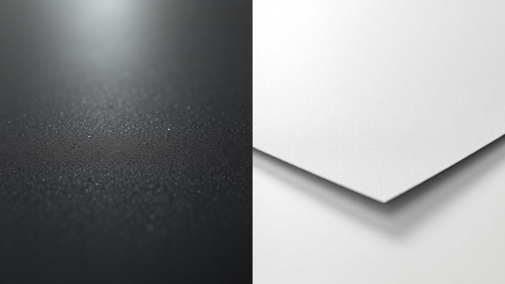
Glossy finishes are all about making a statement. Think of them as the extrovert of the paper world—they're built to grab your attention from across the room. The secret is their super-smooth, non-porous surface that reflects light like a mirror.
This reflectivity is what makes colors look so incredibly saturated and blacks appear richer and deeper. It creates a powerful visual contrast that gives any design a modern, often luxurious, vibe. When your main goal is to make your visuals leap off the page, glossy is almost always the answer.
Why It Makes Colors and Details Pop
The number one reason to choose a glossy finish is for its effect on color and detail. Because light bounces so cleanly off its slick surface, the ink underneath looks sharper, clearer, and more vibrant. This makes it an absolute showstopper for any design that relies heavily on photography.
Imagine a stunning landscape photo. Printed on glossy paper, the blues of the sky are more intense, the greens of the trees feel more alive, and the whole picture has a crispness that just draws you in. This is exactly why professional photo prints are so often glossy.
A glossy finish basically puts a protective, amplifying layer over the ink. It stops colors from looking flat or muted and gives the entire piece a dynamic, high-energy feel, turning a simple print into something truly eye-catching.
Key Strengths of a Glossy Finish
Beyond just looking good, a glossy finish serves a few very specific purposes. People choose it when making a strong visual first impression is the most important thing.
- Maximum Color Impact: It’s perfect for making your brand colors and images stand out, whether on a crowded retail shelf or in a stack of mail.
- A High-End Feel: That smooth, slick texture often signals quality to the person holding it, making it a great choice for premium marketing materials.
- Added Durability: While not indestructible, the coating on glossy paper offers a decent barrier against moisture, smudges, and fading.
The Downsides: Glare and Fingerprints
Of course, that reflective surface is also its biggest weakness. In a brightly lit room or under direct sunlight, it can create a serious glare. This reflection can make text a real pain to read and even wash out the details you wanted to highlight in your images.
The other big issue? Fingerprints. That same smooth surface that makes colors pop is also a perfect canvas for every single smudge and fingerprint. This can quickly make a beautiful print look messy, which is why it’s not always the best pick for things that get handled a lot, like business cards or restaurant menus. It's worth looking into the full range of gloss laminated printed products to see if a more durable option might work better for your project.
Exploring the Nuances of Matte Finishes
While a glossy finish is all about grabbing attention with a high-impact shine, a matte finish commands it with quiet confidence. Matte is defined by its non-reflective surface; it scatters light instead of bouncing it back directly. This diffusion is what creates that signature soft, muted look that completely eliminates glare.
Because there’s no shine getting in the way, matte is a phenomenal choice for anything with a lot of text. Think brochures, catalogs, or fine art prints. The readability is just fantastic, even under bright lights. Colors also take on a more natural, organic feel, which many people perceive as more authentic and grounded.
A Superior Feel and Everyday Durability
Beyond the visuals, a matte finish has a distinct tactile quality that glossy just can't match. The surface often feels smooth, almost velvety, to the touch. This sensory detail can make a business card, invitation, or premium packaging feel incredibly luxurious and memorable. The feel is just as important as the look.
That non-reflective texture also brings some serious practical advantages for items that get handled a lot.
- Fingerprint Resistance: Unlike glossy paper, which is a magnet for fingerprints, matte finishes are great at hiding smudges. Your prints stay looking clean and professional.
- Reduced Scuffing: The surface is also less likely to show minor scratches and scuffs from being passed around or tossed in a bag.
This blend of visual subtlety and real-world resilience is precisely why so many brands lean on matte for their most important marketing materials. It sends a message of established quality and thoughtful design that connects with a more discerning eye.
When to Choose Matte for Maximum Impact
Opting for a matte finish is a strategic decision that should align with what you're trying to achieve. It really shines when you want to project professionalism, elegance, and trustworthiness. For corporate branding where a non-distracting, high-end look is crucial, matte is often the default choice.
Picture an art gallery catalog. The focus needs to be entirely on the artwork, not the glare coming off the paper. Or imagine a menu at an upscale restaurant; a matte finish feels more refined and is much easier to read in the low, ambient lighting.
For an even more elevated tactile experience, many designers look to specialized options. You can explore a variety of soft touch printed products that take that velvety feel to a whole new level, adding another layer of perceived value.
Ultimately, picking matte is about choosing subtlety over shine. It’s for when you want your message and design to do the heavy lifting, supported by a finish that feels every bit as good as it looks.
How Finish Affects Color and Detail
The finish you choose—glossy or matte—does more than just add a protective layer; it fundamentally changes how we see the colors and details in a printed piece. It's a choice that can either make an image pop off the page or give it a subtle, sophisticated feel.
A glossy coating acts like a mirror, bouncing light back at the viewer. This intensifies highlights and makes shadows look deeper and richer. On the other hand, a matte coating diffuses that light, spreading it out softly to preserve the true color of the ink without any distracting reflections.
The Science Behind the Shine
Glossy paper is all about contrast. By reflecting more light directly into your eyes, it cranks up the visual punch. In fact, some lab tests on image clarity have shown this effect can boost perceived sharpness by as much as 15%.
The downside? That same reflectivity can create harsh glare, especially under direct light sources. What looks great in one setting might become an unreadable, shiny mess in another.
"Glossy finishes act like a lens, intensifying colors for maximum impact," notes a professional designer.
Think of it this way:
- The high reflectivity makes colors feel more saturated and vibrant.
- Sharp highlights give images a dynamic, almost three-dimensional quality.
- Shadows appear deeper, which really enhances the sense of depth.
The Understated Power of Matte
Matte surfaces do the exact opposite. Instead of reflecting light, they scatter it. This simple difference is a game-changer.
By diffusing the light, matte finishes eliminate those distracting hotspots and glare. This is why it's a go-to for anything with a lot of text, ensuring every word remains perfectly legible no matter the lighting. For art prints or high-end documents, it delivers a true-to-life feel without any shine getting in the way.
Here’s a quick breakdown of how they stack up:
| Attribute | Glossy Impact | Matte Impact |
|---|---|---|
| Color Saturation | High intensity and punchy | Natural and understated |
| Detail Perception | Appears crisper, more defined | Balanced clarity, no glare |
| Reflections | Prone to significant glare | Minimal to no reflections |
Imagine a professional portrait. A glossy finish will make the eyes sparkle and skin tones pop with life. But print that same image on matte stock, and it suddenly feels softer, more classic, and even timeless.
If you're digging into a project, it’s worth exploring the effect of finish on business card colors to get a deeper sense of how these choices play out.
In the real world, you'll see designers grabbing glossy stock for things like travel brochures and product catalogs where vibrant photos are the hero. Meanwhile, publishers often prefer matte for art books and annual reports to keep the focus on the content without annoying reflections.
Matching the Finish to Your Project
So, how do you decide? It really comes down to context.
- High-impact photography? Glossy is your friend. It makes colors jump off the page in a brochure or flyer.
- Text-heavy design? Go with matte. It prevents glare and ensures readability in long documents like reports or books.
- A mix of both? You could get creative with spot UV or varnish accents to add glossy highlights to a matte piece.
A well-chosen finish can reinforce brand identity by aligning visual tone with subject matter.
Pro-Tip: Always, always get a test print. Look at it under the real-world lighting conditions where it will be seen. A matte sample under harsh fluorescent office lights can instantly show you how you're dodging a readability bullet. A glossy proof held in natural daylight will reveal exactly where those hotspots will hit.
This one simple step can save you from a world of regret when the final order arrives.
Practical Examples
Let’s think about a promotional poster in a shop window.
The glossy version will grab attention from across the store with its vibrant colors, but it might completely wash out under the glare of a direct spotlight. A matte version, however, will remain clear and readable, whether it’s a sunny day or a dimly lit evening.
Consider these real-world results:
- One design agency saw a 28% increase in how long people looked at a travel brochure after switching to a glossy stock that made the photos irresistible.
- A museum that printed its exhibit guides on matte paper managed to cut visitor complaints about glare by a whopping 90%.
An Expert’s Take
"Matching finish to viewing conditions is crucial for maintaining visual integrity," says senior print specialist Maria Chen.
Her best advice? Request proof samples on the actual paper stock you plan to use before committing to the full production run. It’s the only way to prevent costly reprints and make sure what you envisioned is what you get.
Key Takeaways
- Glossy supercharges color vibrancy but can be a liability under bright lights due to glare.
- Matte offers a consistent, natural tone and is a winner for readability in almost any setting.
- Your final choice should always depend on three things: the lighting, the content, and how the piece will be handled.
Choosing The Right Finish For Your Project
Deciding between a glossy and matte finish isn't about finding a single "best" option. It's about picking the right tool for the job. The best choice always comes down to context—how your project will be used, where it will be seen, and who will be handling it.
Think about it this way: a glossy finish on a travel agency flyer makes a tropical ocean look irresistibly vibrant, creating an immediate emotional appeal. On the other hand, a law firm’s business cards printed on matte stock feel stable, professional, and serious. The finish is a silent messenger for your brand.
Aligning Finish With Function
The practical purpose of your printed piece should be your primary guide. A poster meant to be seen from a distance in a low-light venue will grab more attention with the high shine of a gloss finish. But what about a restaurant menu? It gets passed around all day and needs to be readable under bright lights. That’s where the smudge-resistance and glare-free surface of a matte finish really shines.
The right finish doesn’t just complement the design; it enhances its functionality. A beautiful brochure that’s impossible to read or a business card covered in smudges fails its core mission, no matter how good the artwork is.
To make things even clearer, this quick decision tree can point you in the right direction based on two key project needs: color vibrancy and viewing conditions.

As the visual guide shows, if you absolutely need your colors to pop, glossy is the way to go. But if you’re worried about glare getting in the way, matte is the clear winner.
Real-World Scenarios and Recommendations
Let's look at some common print projects and walk through why one finish might work better than the other.
- Business Cards: A glossy card can definitely make a logo stand out, but a matte finish is often the superior professional choice. It resists fingerprints after being handed around and has a more substantial, premium feel. To learn more about making that first impression count, explore our guide on https://www.4over4.com/printing/category/business-cards-printing.
- Photography Prints: This really depends on the photo's style and where it will be displayed. For high-contrast shots like vivid landscapes, glossy makes colors sing. For portraits or fine art prints going behind glass, matte is essential to prevent a distracting double-glare effect.
- Marketing Brochures and Flyers: If your piece is packed with photos and designed to make an instant impact (like a flash sale flyer), glossy is incredibly effective. For text-heavy informational brochures, matte ensures everything is easy to read.
- Product Packaging: On a crowded retail shelf, a glossy finish can help a product jump out at customers. But for luxury, organic, or artisanal products, a matte finish often signals sophistication and a more natural, high-end quality.
When making your final call, it's also worth thinking about how different printing methods can affect the final look. For instance, in the world of custom apparel, this helpful DTF vs DTG printing comparison shows how the technique influences the outcome. At the end of the day, your decision should always support the project’s main goal—whether that’s grabbing attention, conveying elegance, or simply being useful.
To make this even easier, here’s a quick-reference table matching common products with their ideal finish.
Recommended Finish by Product Type
| Product Type | Recommended Finish | Primary Reason |
|---|---|---|
| Business Cards | Matte | Resists fingerprints, feels more premium and professional. |
| Event Posters | Glossy | Maximizes visibility and color impact from a distance. |
| Fine Art Prints | Matte | Eliminates glare, especially when framed behind glass. |
| Product Lookbooks | Glossy | Makes product photos look sharp, vibrant, and appealing. |
| Restaurant Menus | Matte | Reduces glare for readability and hides smudges from handling. |
| Greeting Cards | Glossy (outside) | Creates an eye-catching cover design. |
| Wedding Invitations | Matte | Conveys elegance, sophistication, and a timeless feel. |
This table serves as a great starting point, but always remember to consider your specific design and audience before making a final decision. The perfect finish is the one that makes your project work better.
Emerging Trends in Surface Finishes

The old debate of glossy versus matte is getting a lot more interesting. As expectations shift in industries from automotive to cosmetics, the texture and feel of a product have become powerful brand statements. This has sparked a real demand for finishes that can deliver the best of both worlds.
The numbers back this up. The global market for these kinds of finishes, currently sitting at USD 5.2 billion, is expected to climb to USD 8.9 billion by 2033. This isn't just a niche trend; it's a clear signal that people want surfaces that are both beautiful and built to last.
The Rise of Hybrid Finishes
This is where hybrid options like satin and lustre are really starting to shine—quite literally. They strike a perfect balance, giving you a subtle sheen without the mirror-like reflection of a full gloss.
Take a satin finish, for instance. It offers a soft, gentle glow that makes colors pop but keeps glare to a minimum. It’s an incredibly versatile choice, working just as well for luxury packaging as it does for professional photo prints. It proves the future of print is all about nuance.
Diving into these fantastic finishes can unlock a whole new level of creativity for your projects. It just goes to show that sometimes, the perfect surface isn't at one extreme or the other, but somewhere in between.
Common Questions About Print Finishes
When you're trying to decide between glossy and matte, a few practical questions always seem to pop up. Getting these sorted out will help you lock in your choice with confidence, making sure the finish works for your design and its life out in the real world.
Is a Glossy or Matte Finish More Durable?
If you're printing something that's going to be handled a lot, matte is generally the more durable option. Its non-reflective surface is a champ at hiding fingerprints, smudges, and small scuffs, keeping your prints looking clean and professional over time.
That said, some glossy finishes come with a protective UV coating that can provide excellent resistance to moisture and prevent colors from fading over the long haul. The real question is, what's the bigger threat? Is it constant handling or is it exposure to the elements like sunlight?
Which Finish Is Better for Framing Photos?
This one is pretty clear-cut: a matte finish is almost always the best choice for photos you plan to frame behind glass. Think about it—the glass already provides a reflective, glossy layer. Putting a glossy photo behind it creates a double-glare nightmare that can make the image incredibly hard to see.
A matte print sidesteps this problem completely. The result is a clean, gallery-quality look where all the attention stays on your photo, not on distracting reflections from the lights in the room.
Does Glossy or Matte Cost More?
For most everyday print jobs—think business cards or flyers—the cost difference between a standard glossy and matte finish is pretty much a wash. You'll rarely see a price difference big enough to be a deciding factor.
Where the cost can change is when you start looking at premium options. Specialized finishes like a high-gloss UV coating or a really nice, heavyweight textured matte paper will definitely affect the final price. So, it's better to make your choice based on aesthetics and function first, rather than assuming one is always cheaper than the other for standard projects. Let the visual impact be your guide.
Ready to bring your project to life with the perfect finish? At 4OVER4, we offer a huge selection of high-quality printing options to match your vision. Explore our printing services today!
More from

13
When you’re ready to invest in an A-frame sign, the first question you'll ask is, "What size do I need?" It usually comes down
![]() Emma Davis
Emma Davis
Mar 13, 2026

113
The real secret to mastering your direct mail budget isn't complicated. It comes down to one simple fact: a standard 4" x 6&q
![]() Emma Davis
Emma Davis
Mar 12, 2026

64
Tear-off flyers are a classic for a reason. They’re a tangible marketing tool, designed with perforated, removable tabs at the bottom. Each
![]() Emma Davis
Emma Davis
Mar 11, 2026

112
Printing stickers at home is a seriously fun and rewarding project. It boils down to four main parts: designing your image, picking the right
![]() Emma Davis
Emma Davis
Mar 10, 2026

103
Ever seen a logo that seems to float right on the glass of a jar or bottle? That’s the work of transparent label stickers.
![]() Emma Davis
Emma Davis
Mar 9, 2026

60
Picture this: your product’s beautiful label gets smudged and runny during shipping, or a gorgeous event banner fades to nothing after just
![]() Emma Davis
Emma Davis
Mar 8, 2026

58
In a sea of options, your product's packaging and labeling are its first, and often only, chance to make a real connectio
![]() Emma Davis
Emma Davis
Mar 7, 2026

89
Ever tried to print a hundred high-quality flyers on your home office printer? You probably ran out of ink, dealt with paper jams, and ended u
![]() Emma Davis
Emma Davis
Mar 6, 2026