Table of Contents
- Home
- content hub
- Mastering the Foldable Card Template
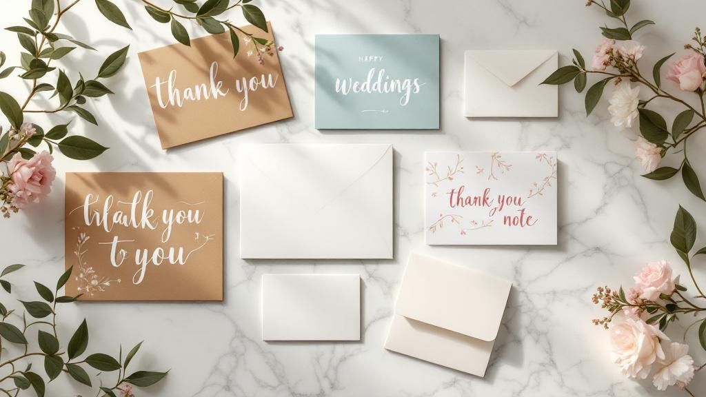
Mastering the Foldable Card Template
Aug 23, 2025418 views
Aug 23, 2025418 views
A foldable card template is really just the blueprint for your project. Think of it as the architectural plan that determines how the paper folds to create different panels. Getting this right before you even think about design is the secret to a professional-looking final piece.
Choosing the Right Foldable Card Template
Before you start dropping in logos or writing copy, your first and most critical decision is the fold. This isn't just a technical spec; the fold you choose sets the stage for the entire experience. It shapes how someone interacts with your card, turning a simple message into a story that unfolds panel by panel.
The classic half-fold (you might also hear it called a bi-fold) is your go-to for traditional greeting cards. It has that familiar, intimate feel—perfect for birthday cards, simple thank you notes, or personal announcements. You get a nice big cover for a bold visual and a spacious inside for your handwritten message.
Matching the Fold to Your Goal
But what if you need to pack in more information? That’s where a tri-fold or a Z-fold really shines. Let's say you're designing a small brochure for an open house. A Z-fold lets you guide the reader on a journey: the cover piques their interest, the first panel they open reveals key features, and the final panel shows off the floor plan. You just can't tell that kind of sequential story with a simple half-fold.
Then there's the gatefold, which is one of my personal favorites for making a big impression. It has two front panels that open from the middle like double doors, building a real sense of anticipation. It's fantastic for high-end event invitations, new product launches, or anything where you want the reveal to be part of the message itself.
Pro Tip: Think of the fold as the narrative structure for your design. A half-fold is like a short story, a tri-fold tells a three-act play, and a gatefold is all about the grand reveal. Pick the structure that helps tell your story best.
Here’s a quick visual breakdown of the most common fold types and what they're typically used for.
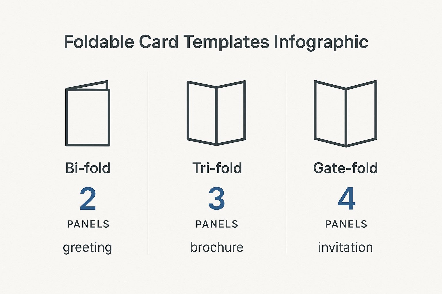
As you can see, just adding a panel or two completely changes the game, taking a card from a simple greeting to a detailed mini-brochure or a dramatic invitation.
Foldable Card Template Comparison
To make it even simpler, here’s a quick reference table to help you match the right fold to your project's goal. It's a handy cheat sheet I use when brainstorming new projects.
| Fold Type | Best For | Design Complexity | Common Use Case |
|---|---|---|---|
| Half-Fold | Simple, personal messages with a strong cover visual. | Low | Greeting cards, thank you notes, announcements. |
| Tri-Fold | Breaking down information into three distinct sections. | Medium | Brochures, menus, event programs. |
| Z-Fold | Sequential storytelling that reveals information step-by-step. | Medium | Direct mailers, trade show handouts, timelines. |
| Gatefold | Creating a dramatic reveal and a high-impact presentation. | High | Luxury invitations, product launches, portfolios. |
Choosing the right fold sets you up for a successful design that not only looks great but also functions exactly how you intended.
Why the Right Fold Matters
Picking the right template is a strategic move, not just an aesthetic one. The greeting card market is huge—projected to hit USD 28.91 billion—and a huge chunk of that is driven by things like birthday cards. This just goes to show how much people still value getting a real, tangible card in their hands.
When you choose a fold that truly complements your message, you’re tapping into that appreciation for thoughtful design. It ensures your card connects with someone from the moment they hold it. If you're curious, you can learn more about the greeting card market trends and see just how powerful a well-designed card can be.
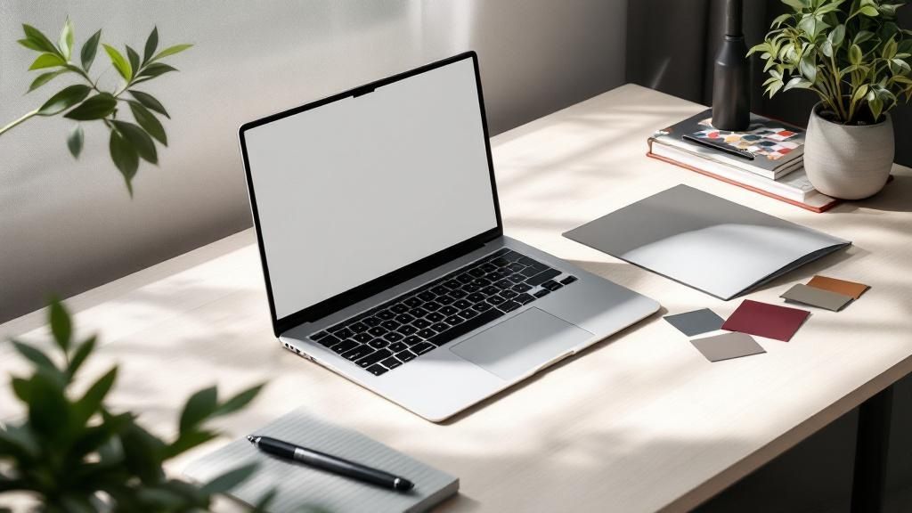
Bringing Your Vision to Life with Design Tools
So you've picked out the perfect foldable card template. That's a great start, but now for the fun part: turning that blank canvas into something that truly speaks for your brand or message. A good online design tool, like the one we've built at 4OVER4, is more than just a bunch of buttons. Think of it as your creative partner, helping you get your ideas from your head onto the page, ready for print.
The secret to a stress-free design process is getting a handle on a few key features. Let's start with layers. This is your best friend for organizing design elements. It lets you stack things like your background color, photos, and text boxes on top of each other without them getting tangled up. Need to nudge a photo to the left? With layers, you won't accidentally drag all your text with it. It’s a simple concept that prevents some major design headaches.
Mastering the Essentials of Your Workspace
Most quality design tools come equipped with guides and grids, and you should absolutely use them. Alignment guides, those little lines that pop up when you move things around, are crucial for a clean, professional finish. They help you snap elements into place, ensuring everything lines up perfectly. This is what gives your final card that intentional, well-balanced look instead of seeming like it was just thrown together.
Imagine you're designing a thank you card for your business. You can use the guides to perfectly center your logo on the front and then align your "Thank You" text right below it. That symmetry feels polished and professional—a tiny detail that makes a huge impact on how people perceive your brand.
A well-organized design communicates clarity and professionalism before a single word is read. Using layers and alignment tools is the easiest way to ensure your foldable card template looks polished and intentional from the start.
Another tool you shouldn't overlook is the built-in color palette. Instead of having to remember and re-type your brand’s specific hex codes every time, you can often save them right in the tool. This guarantees consistency across all your projects. And that’s a big deal. With 80% of brand recognition tied directly to color, you can't afford to get it wrong.
Visualizing Your Final Folded Card
A top-notch design tool won't make you guess how your card will look once it's actually folded. The 4OVER4 interface, for example, gives you a clear preview showing exactly where the fold lines will be and how your design sits on each panel.
This visual guide is invaluable. It helps you place your text and images confidently, making sure nothing important gets swallowed up by the crease. By staying within the designated safe zones, you can be sure that every part of your message comes across clearly and professionally. Taking a few minutes to get familiar with these previews is often the difference between a good idea and a truly great finished product.
Key Design Principles for Impactful Cards
Having a powerful design tool is one thing, but knowing how to use it to create a card that people actually remember? That's the real game-changer. The best designs aren't just pretty; they guide the eye, tell a little story, and feel purposeful from the moment someone picks them up. It all starts with visual hierarchy.
First Things First: Visual Hierarchy
Think of visual hierarchy as the art of telling your reader where to look first. On a wedding invitation, you want the couple's names and the date to pop. You can make that happen with a bigger, bolder font, a splash of a contrasting color, or simply by placing that info right in the center. Everything else—the venue, the RSVP details—should play a supporting role.
Don't see the fold in your card as a limitation. It’s a creative asset! A fold is your secret weapon for pacing and creating a reveal. A Z-fold card, for instance, can unfold a mini-narrative panel by panel. The front hooks them, the middle panel gives the details, and the final panel delivers the call to action. It’s a natural storytelling device.
Finding Your Design's Balance
Good design is all about balance, but that doesn't always mean perfect symmetry. It's more about distributing the "visual weight" of your photos, text, and colors so the whole thing feels stable. If you drop a big, bold photo on the left side of your card, you can balance it out with a solid block of text or a few smaller graphics on the right.
One of the most underrated tools you have is negative space. That's the empty, "white space" around your text and images. It’s tempting to cram every inch with information, but that just makes a design feel cluttered and overwhelming. Leaving some breathing room makes your key elements stand out and gives the entire piece a much more professional, high-end feel.
So many people fight the fold. My advice? Design with it. Use it to hide a surprise, separate different ideas, or build a sequence that pulls your reader through the experience, one panel at a time.
This idea of intentional, personalized design is catching on globally. The Asia-Pacific region is seeing massive growth, with China's greeting card market alone expected to hit almost USD 1.8 billion by 2030. This surge is largely thanks to a booming e-commerce scene, which just goes to show the worldwide demand for printed materials that feel special. If you're curious, you can learn more about the greeting card industry's global trends on GiftLips.com.
Choosing Fonts and Colors That Work
The fonts you choose say a lot before a single word is even read. A great rule of thumb is to stick with two, or at the absolute most, three fonts that complement each other. Try pairing a clean, modern sans-serif for your main text with a more decorative script for a headline. The contrast is both beautiful and highly readable.
A few quick tips to keep in mind for fonts and colors:
- Contrast is Everything: Make sure your text is easy to read. Dark text on a light background is a classic for a reason—it just works.
- Set the Mood with Color: Colors carry emotion. Warm reds and oranges can build excitement, while cooler blues and greens create a sense of calm or professionalism.
- Stay On-Brand: If your business has brand colors, stick with them. Consistency is key to building a recognizable identity across all your marketing.
When you put these principles together—hierarchy, balance, space, and smart typography—you stop making just a folded piece of paper. You create a powerful little communication tool that gets noticed and makes a genuine impression.
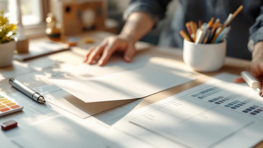
Prepping Your Design for Flawless Printing
Alright, you've poured your creativity into designing the perfect foldable card template. Now comes the moment of truth: turning that digital file into a tangible, professional-looking card. This is where a little technical prep goes a long way, and trust me, it’s the secret to avoiding those "oh no" moments when you open the box.
Getting these details right ensures the masterpiece on your screen looks just as impressive in your hands.
Let's quickly cut through some of that print-shop jargon you’ll see. Terms like bleed, trim, and safety margins aren't just suggestions—they are the guardrails that guarantee a perfect print.
The trim line is exactly what it sounds like: the line where we'll physically cut your card. But since paper cutters aren't microscopic lasers, we need a little wiggle room. That's where bleed comes in. It's a small border (usually 1/8th of an inch) of your background color or image that extends past the trim line. It’s your insurance policy against ugly white slivers appearing if the cut is a hair off-center.
Why Margins and Resolution Matter More Than You Think
Now, let's look inside the trim line. That’s your safety margin. Think of this as the "safe zone" for all your important stuff—your logo, your contact info, that killer headline. If any part of it strays outside this area, it’s at risk of getting chopped off. Keep the good stuff tucked safely inside.
Then there's resolution. This is a big one. For an image to look crisp in print, it needs to be at least 300 DPI (dots per inch). Most images you pull from the web are a mere 72 DPI, which looks fine on your monitor but will come out fuzzy and pixelated on paper. Double-checking this setting alone can save a world of disappointment.
My Pro Tip: I always tell people to think of it this way: bleed is your buffer on the outside, and the safety margin is your fortress on the inside. Master these two, and your cards will look professionally made every single time.
The RGB vs. CMYK Color Showdown
Here's another classic rookie mistake: designing in the wrong color mode. Your screen creates colors with light—mixing Red, Green, and Blue (RGB). It’s perfect for digital-only designs.
But printers don’t use light; they use ink. We mix Cyan, Magenta, Yellow, and Black (CMYK) to reproduce colors on paper.
If you send us an RGB file, the colors have to be converted. That vibrant, electric green you loved on screen? It might print as a much more subdued, earthy tone. The best practice is to start your design in CMYK mode from the get-go. It’s the only way to guarantee what you see is what you get.
Before you send that file off, it pays to do one last technical check. I've put together a simple table of the essentials I run through before hitting "print."
Your Pre-Print Technical Checklist
This quick rundown covers the absolute must-haves for a print-ready file. Confirming these settings will help you avoid the most common printing headaches.
| Setting | Recommended Specification | Reason |
|---|---|---|
| Color Mode | CMYK | Ensures the colors you see on screen will accurately translate to ink on paper. |
| Resolution | Minimum 300 DPI | Guarantees your images and graphics will be sharp and clear, not pixelated. |
| Bleed | 1/8th inch (0.125") on all sides | Prevents unwanted white edges by extending the design beyond the cut line. |
| Safety Margin | At least 1/8th inch (0.125") | Keeps your critical text and logos from being accidentally trimmed off. |
| File Format | High-quality PDF | Locks in all your fonts, images, and layout elements for consistent printing. |
Taking just a couple of minutes to review this list is the best thing you can do to ensure your final printed cards are flawless. It’s all about setting your design up for success from the start.
Selecting Paper and Finishes That Wow
Let's be honest: the way a card feels in someone's hands is just as important as how it looks. Get the paper and finish right, and you've instantly elevated your card from a simple piece of paper to a memorable, premium experience. This is where you communicate quality and a serious attention to detail before a single word is even read.
Think of the paper as the foundation. A thicker, heavier 16pt stock feels far more substantial than the standard 14pt. That little bit of extra heft gives it a sense of importance, making it an incredible choice for things like wedding invitations or high-end corporate announcements where you absolutely need to make an impression.
Choosing Between Glossy and Matte
Okay, you’ve picked your paper weight. Now for the finish—and this decision dramatically changes how your colors look and how the card feels.
Glossy Finish: This high-shine coating makes colors practically jump off the page. They look incredibly vibrant and saturated. It's a fantastic option for any photo-heavy design or when you want your bold graphics to do all the talking. Gloss also adds a little bit of protection against fingerprints and moisture, which is a nice bonus.
Matte Finish: For a more understated, sophisticated vibe, matte is your go-to. You get a smooth, non-reflective surface that just feels modern and elegant. It's a brilliant choice for designs heavy on text because it kills the glare and makes everything easier to read.
Think about it this way: a travel agency showing off stunning photos of the Maldives would want a glossy finish to make that blue water pop. On the other hand, an invitation to an art gallery opening just feels more refined with a soft-touch matte finish. It's no wonder the greeting cards market was valued at nearly USD 18 billion in 2021 and is expected to cross USD 20 billion by 2025—people still love getting something tangible. You can dive deeper into the greeting card market's growth on cognitivemarketresearch.com.
Adding Special Touches for Maximum Impact
If you really want to make a statement, special finishes add that custom, luxurious feel. These are the details that get people talking.
Pro Tip: Don't just think about what looks good; consider what your brand stands for. An eco-conscious company could make a powerful statement by choosing a recycled paper stock for their thank you cards, aligning the physical product with their core values.
Want to really push the boat out? Consider one of these premium touches:
- Spot UV: This is where you apply a glossy coating to specific areas of your design. Picture a matte black business card, but only the logo shines. That contrast creates a stunning tactile and visual effect that immediately draws the eye.
- Metallic Foil: For pure, unapologetic luxury, nothing beats adding metallic foil in gold, silver, or rose gold. It’s perfect for highlighting a company name or an event title and gives your card an instantly expensive feel.
By being deliberate about your paper and finishes, you're not just designing a card—you're curating an entire sensory experience. You’re creating something that feels just as thoughtful and professional as it looks, guaranteeing it won't just be seen, but remembered.
Your Foldable Card Questions, Answered
Even when you've got the perfect design idea, a few questions inevitably pop up right before you hit that "order" button. Trust me, I've been there. Getting these last-minute details sorted is what separates a good project from a great one, so let's tackle the common queries we see all the time.
What’s the Best File Format to Use?
This is probably the number one question we get. For the sharpest, most professional results, you absolutely want to use a vector-based PDF. It’s the gold standard for a reason. This format ensures your logos and text stay perfectly crisp, with no blurriness, no matter what.
If your design is more photo-heavy, a high-res JPEG or PNG (make sure it's at least 300 DPI) can do the job. But honestly, a print-ready PDF packages everything up so neatly that it’s always the most reliable bet for a flawless print.
How Do I Make Sure Everything Lines Up on the Fold?
Nobody wants a crooked fold throwing off their whole design. Your best friend here is the template guide right inside the design tool. These guides show you exactly where the fold line is, but more importantly, they mark the "safe area."
Think of the safe area as a buffer zone. Keep all your critical info—names, dates, logos, contact details—comfortably inside this zone. Before you finalize anything, always download the digital proof. It’s a preview of exactly how your card will look when printed and folded, giving you one last chance to spot any alignment problems.
A quick pro-tip: The fold is a physical crease. Anything you place right on top of that line will get distorted. I always recommend leaving a little breathing room around the fold to keep your design elements clean and easy to read.
A lot of people also wonder if they can print on the inside. Absolutely! Standard folded cards are made for printing on both sides. In the design tool, you’ll see different canvases for the outside (front/back) and the inside (left/right panels), so you have full control over the entire piece.
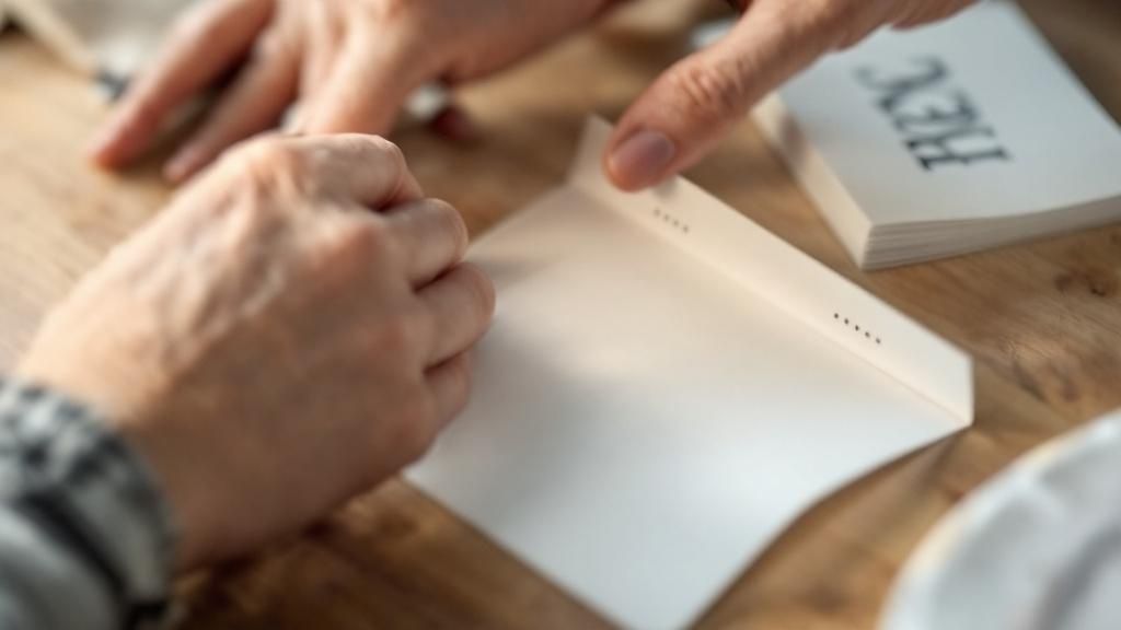
What's the Difference Between Scoring and Folding?
This one trips people up, but it's a crucial part of the printing process. They sound similar, but they’re two very different steps.
- Scoring: This is where we create a clean crease in the paper before it gets folded.
- Folding: This is simply the act of bending the card along that pre-made scored line.
So, why does scoring matter so much? It’s all about the paper. For thicker cardstocks, scoring prevents the paper fibers from cracking and looking messy along the fold. It’s what gives you that sharp, professional edge instead of a frayed, amateur one. Any quality printer will score your cards first to make sure they look polished and perfect.
Ready to turn your idea into a real, tangible card? Explore thousands of customizable templates and premium printing options with 4OVER4. Start designing your perfect folded card today!
More from

13
When you’re ready to invest in an A-frame sign, the first question you'll ask is, "What size do I need?" It usually comes down
![]() Emma Davis
Emma Davis
Mar 13, 2026

110
The real secret to mastering your direct mail budget isn't complicated. It comes down to one simple fact: a standard 4" x 6&q
![]() Emma Davis
Emma Davis
Mar 12, 2026

61
Tear-off flyers are a classic for a reason. They’re a tangible marketing tool, designed with perforated, removable tabs at the bottom. Each
![]() Emma Davis
Emma Davis
Mar 11, 2026

110
Printing stickers at home is a seriously fun and rewarding project. It boils down to four main parts: designing your image, picking the right
![]() Emma Davis
Emma Davis
Mar 10, 2026

97
Ever seen a logo that seems to float right on the glass of a jar or bottle? That’s the work of transparent label stickers.
![]() Emma Davis
Emma Davis
Mar 9, 2026

59
Picture this: your product’s beautiful label gets smudged and runny during shipping, or a gorgeous event banner fades to nothing after just
![]() Emma Davis
Emma Davis
Mar 8, 2026

58
In a sea of options, your product's packaging and labeling are its first, and often only, chance to make a real connectio
![]() Emma Davis
Emma Davis
Mar 7, 2026

89
Ever tried to print a hundred high-quality flyers on your home office printer? You probably ran out of ink, dealt with paper jams, and ended u
![]() Emma Davis
Emma Davis
Mar 6, 2026