TABLE OF CONTENTS
- Home
- content hub
- Your Guide to a High-Impact EDDM Mailer Template
Your Guide to a High-Impact EDDM Mailer Template
Dec 6, 2025422 views
Dec 6, 2025422 views
An EDDM mailer template is essentially a pre-designed file that’s already been formatted to meet all of the USPS's strict size and layout rules for Every Door Direct Mail. You can think of it as a blueprint for your design. It ensures your postcard has the right dimensions, bleed, and clear zones for postage, so it can be delivered to every single address on a mail route you choose—no mailing list needed. This makes it an incredibly powerful and budget-friendly tool for any local marketing campaign.
What Makes a Great EDDM Template
Before you even think about firing up your design software, it's really important to understand what separates a random graphic from a functional EDDM mailer template. This isn't just about making something look good; it's a strategic marketing tool built on a foundation of very specific USPS regulations. Its main job is to guarantee your mailer gets printed correctly and delivered without a hitch.
At its core, the template is your quality control checklist. It ensures you’re compliant from the very first pixel you place.
The physical size and structure of the template are non-negotiable. It has to conform to what the USPS calls "flat" mailpiece standards. If you stray from these dimensions, your campaign will be dead on arrival, leading to expensive reprints and frustrating delays.

Core Components of a Compliant Template
A properly built template always accounts for a few key elements that are absolutely critical for both the printing press and the mail sorting machines. Getting these wrong can derail an otherwise brilliant campaign.
- USPS-Approved Sizing: Your mailer has to meet specific minimum and maximum height and length requirements. You’ll often see popular sizes like 6.5" x 9" and 8.5" x 11" because they fit perfectly within these rules.
- Mandatory Clear Zones: The template reserves specific areas for the mailing address block and the postage indicia. These spots must be kept completely clear of your own text or any important design elements. No exceptions.
- Print-Ready Bleed Area: It also includes a small border, usually 0.125 inches, around the entire design that gets trimmed off after printing. This is what prevents those ugly white edges and makes sure your background color or image goes all the way to the edge of the finished piece.
To make things easier, here's a quick reference for the most common USPS-approved sizes. Sticking to one of these from the get-go is the surest way to avoid any compliance headaches later on.
USPS Approved EDDM Mailer Sizes
| Common Name | Minimum Dimensions (Inches) | Maximum Dimensions (Inches) | Best For |
|---|---|---|---|
| Postcard | 6.125" x 11.5" | 6.125" x 11.5" | Quick announcements, coupons, event promos |
| Oversized Postcard | 8.5" x 11" | 8.5" x 11" | Showcasing products, menus, detailed offers |
| Flyer / Small Menu | 4.25" x 11" | 6" x 11.5" | Takeout menus, service lists, local flyers |
| Large Postcard | 9" x 12" | 9" x 12" | High-impact visuals, real estate listings |
Choosing the right size really depends on your message and budget, but all of these are tried-and-true options that work seamlessly with EDDM.
The real power of an EDDM mailer template is that it completely removes the guesswork. It frees you up to focus on what really matters—crafting a compelling message for your local audience—while feeling confident that all the technical specs are already handled.
Strategic Advantages Beyond Compliance
But using a template isn't just about ticking boxes for the post office; it’s about unlocking the strategic power of direct mail. In a world where we’re all drowning in digital ads, a physical mailer creates a tangible connection with potential customers. It cuts right through the online noise and puts your brand directly into their hands—an advantage that digital marketing often struggles to match.
To get a better sense of where direct mail fits in today's marketing mix, it helps to see how it stands apart from other methods by exploring what EDM marketing entails. Our comprehensive https://www.4over4.com/printing/category/eddm are built on these expertly designed templates, helping businesses maximize both deliverability and local impact.
Getting the USPS EDDM Rules Right
Before you even think about design, you have to get the United States Postal Service (USPS) regulations down cold. This is, without a doubt, the most important part of creating a successful EDDM mailer template. Think of it as the blueprint for your entire campaign. If the technical specs are off, even the most amazing design is just expensive recycling.
Getting these details right from the start saves a ton of headaches and protects you from costly printing mistakes. The USPS runs on a highly automated system, and these rules are in place to make sure your mailpiece zips right through it without a hitch. Nail the specs, and you can focus your energy on what really matters: crafting a message that gets results.
EDDM Size and Thickness, Demystified
The very first thing the USPS looks at is the physical size of your mailer. They classify EDDM pieces as "flats," and these come with a non-negotiable set of size and thickness requirements. Your mailer absolutely must meet these criteria to qualify for the program.
So, what makes a "flat" a flat? Your piece needs to meet one of these dimension rules:
- It must be more than 10.5 inches long OR more than 6.125 inches high.
- The thickness has to be at least 0.007 inches thick but can't be more than 0.75 inches thick.
I know, it sounds super technical. But this is exactly why you see so many EDDM mailers in standard sizes like 6.5" x 9" and 8.5" x 11". These dimensions land comfortably in the approved zone, making them a safe bet for everything from real estate flyers to restaurant takeout menus. If you're exploring your options, our postcards printing page features a bunch of compliant sizes that work perfectly.

The USPS also cares about uniform thickness and a bit of flexibility. Their machinery needs to be able to handle the mailpiece smoothly, so an item that's lumpy or overly rigid is a no-go.
The Indicia and Address Format
Once you've locked in your mailer's size, it's time to tackle the postage and delivery info. With EDDM, you don't stick a stamp on every piece. Instead, you use a special postage box called an indicia. It's a pre-printed box that tells the post office you've already paid for postage.
The indicia has very specific placement and wording rules. It must be in the upper right-hand corner of the address side and include key phrases like "ECRWSS" (which stands for Extended Carrier Route Walking Sequence Saturation) and "U.S. POSTAGE PAID EDDM RETAIL."
EDDM also uses a brilliantly simple addressing format. Forget needing individual names and street addresses. You just use one of these approved lines:
- Postal Customer
- Residential Customer
- PO Box Holder
This is the magic of EDDM. It’s what lets you blanket an entire mail route without having to buy a pricey, and often outdated, mailing list.
Pro Tip: The indicia and simplified address are the heart of what makes EDDM work. Using a professionally designed EDDM mailer template is the easiest way to guarantee these elements are perfectly formatted and placed, so you don't risk your whole batch being rejected at the Post Office counter.
Don't Forget the Clear Zones
The last piece of the compliance puzzle is about what you don't put on your mailer. The USPS needs certain "clear zones" left empty for its own processing marks and barcodes. If your logo, a bit of text, or even a background pattern creeps into these areas, you could make the mailer unreadable for their sorting machines.
The main clear zone to watch out for is the barcode area, which is on the bottom right of the address side. You need to leave a blank space here—usually about 4 inches wide and 0.625 inches high from the bottom edge—for the USPS Intelligent Mail barcode.
The areas around the indicia and the "Postal Customer" address line also need to be kept clear so they remain legible. A good EDDM template will have these zones marked out for you, giving you a safe canvas to design on without worrying about crossing the lines. It might seem like a lot of rules, but they exist for a reason, and they enable a powerful marketing channel. In fact, direct mail marketing boasts a remarkable 161% ROI, with U.S. spending hitting $37 billion as 82% of enterprises beefed up their budgets for it.
Designing a Mailer That Actually Converts
Getting your EDDM mailer to meet USPS specs is the first hurdle, but that just guarantees it lands in the mailbox. Getting someone to actually read it and take action? That's a whole different ballgame. This is where smart design comes in, turning a simple piece of paper into a powerful sales tool.
A great mailer has to grab attention in a matter of seconds, show its value instantly, and make it ridiculously easy for the recipient to say "yes." It's part art, part science—blending eye-catching visuals with a little bit of sales psychology.
Crafting a Magnetic Headline and Offer
Let's be real: you've got about three seconds before your mailer hits the recycling bin. The first thing anyone sees is your headline, so it better count. It needs to be bold, focused on a real benefit, and speak directly to a local problem or desire.
Vague statements like "Local Landscaping Services" are a complete waste of ink. Instead, try hitting a nerve: "Tired of Weekend Yard Work? Get Your Saturdays Back!" Now you're talking. You’ve identified a pain point and promised a tangible solution, which is way more interesting.
Your offer is just as critical. It has to be compelling enough to make someone act now. A weak "10% Off" might get a glance, but a strong, time-sensitive offer creates genuine urgency.
- Be Specific: Instead of a generic discount, offer something concrete like, "Free Gutter Cleaning with Any Roof Repair This Month Only."
- Create Scarcity: Add a hard deadline or limit the deal to the "First 50 Customers" to light a fire under them.
- Offer Value, Not Just a Discount: Sometimes the best hook isn't a price cut. Think about a free consultation, a bonus service, or an exclusive upgrade.
A great offer feels like a special opportunity just for the recipient. If you run a restaurant or retail shop, putting a physical coupon right on the mailer can be a huge driver of foot traffic, instantly making it a valuable item worth keeping.
The Power of Visuals and Color Psychology
We're visual creatures. The images and colors you pick for your EDDM mailer template set the entire mood before a single word is even read. Using high-resolution, professional photos isn't optional—blurry or pixelated images scream "amateur" and kill your credibility on the spot.
Show the result, not just the service. A dentist shouldn’t just feature a photo of their office; they need to show a happy family with bright, healthy smiles. A local coffee shop should use a mouth-watering shot of their signature latte and pastry, not just a picture of their front door.
Color is your secret weapon for influencing perception and action.
- Reds and Oranges: These colors create a sense of urgency and excitement. They’re perfect for call-to-action buttons, sale announcements, or limited-time offers.
- Blues and Greens: These shades tend to build feelings of trust, calm, and reliability. They're a fantastic choice for healthcare providers, financial services, or eco-friendly brands.
- Yellows: Nothing grabs attention quite like yellow. It projects optimism and warmth, making it great for making a headline or key benefit pop right off the page.
Remember, your design's job is to guide the reader's eye. Create a clear visual hierarchy where the most important things—your headline, your main image, and your call-to-action—are the first things people see.
Typography and the Call to Action
Your font choices matter way more than you probably think. It’s tempting to get fancy with decorative fonts, but readability has to be your number one priority. Stick to clean, simple sans-serif fonts like Helvetica or Arial for your main text; they’re much easier for people to scan quickly.
Use a clear hierarchy with your type, too. Your headline should be the biggest and boldest. Your subheadings should be a little smaller, and your body copy should be the smallest (but still perfectly legible). This structure naturally pulls the reader's eye through your message in the right order.
Finally, every single design element should lead the reader to one place: your call-to-action (CTA). Your CTA needs to be impossible to miss. Make it stand out by putting it in a box, using a high-contrast color, or surrounding it with plenty of empty space. The language has to be direct and tell people exactly what to do.
- Weak CTA: "Learn more on our website."
- Strong CTA: "Scan the QR Code for 25% Off Your First Order!"
Interestingly, the principles for creating a killer direct mail piece often overlap with digital strategies. Many of the same tactics for grabbing attention and driving action are covered in guides for successful High Performance Email Marketing (EDM). It just goes to show that effective direct marketing, no matter the medium, is all about understanding what makes people tick.
This strategic design is what separates the campaigns that get results from the ones that flop. Direct mail is a massive $44 billion industry for a reason—response rates average around 3.09%, and the average return on investment is a staggering 1300%. With over 26 billion EDDM pieces delivered every year, a well-designed mailer is your ticket to claiming a piece of that success.
By thoughtfully combining a powerful headline, an irresistible offer, strategic visuals, and a crystal-clear CTA, you can turn that simple piece of paper into a customer-generating machine. And while postcards are a classic choice, remember these design principles work just as well for other formats, which you can explore in our wide selection of flyer printing options.
Getting Your Template File Ready for Print
A beautiful design on your screen is a fantastic start, but it's only half the battle. The trip from a digital file to a physical mailbox is paved with technical details that can either make or break your entire campaign. Nailing the print prep for your EDDM mailer template is that last, critical step. It’s what ensures the mailer your prospects hold in their hands looks exactly like the one you designed.
Think of it as the pre-flight check for your marketing. If you skip these steps, you're setting yourself up for expensive reprints, frustrating delays, and a final product that just looks unprofessional. Get it right, and your colors pop, your text is crisp, and your images are perfectly sharp.
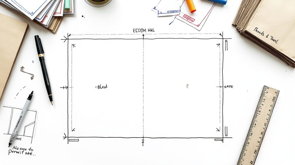
Understanding Bleed, Trim, and Safe Zones
One of the most common—and costly—mistakes I see beginners make is forgetting about the physical realities of printing and cutting. Printers don't run off individual postcard-sized sheets. They print on massive sheets of paper that are then trimmed down to size. That process isn't perfect, which is why we have three key concepts to give us a necessary margin for error.
- Bleed Area: This is a 0.125-inch border that pushes past the final cut edge of your mailer. If you have a background color or an image that's meant to go all the way to the edge, it must extend into this bleed area. This simple step prevents ugly white slivers from showing up if the cutting blade is off by even a fraction of a millimeter.
- Trim Line: This is pretty straightforward—it's the actual, final edge of your mailer. It's the line where the printer's guillotine will slice the paper.
- Safe Zone: Think of this as your design's safety net. It's an inner margin, usually 0.125 inches inside the trim line. All your irreplaceable content—logos, headlines, phone numbers, and your call-to-action—has to live inside this zone. If it creeps outside, it's at risk of getting chopped off.
These zones aren't just friendly suggestions; they're the ground rules for professional printing. A good EDDM mailer template will already have these guides built right in, making it much easier to keep your most important design elements safe and sound.
Color Mode and Image Resolution
Here’s something else many people don’t realize: the screen you're designing on and the printing press that will produce your mailers speak two completely different color languages. Your monitor uses RGB (Red, Green, Blue), which creates colors by adding light. Printers, on the other hand, use CMYK (Cyan, Magenta, Yellow, Key/Black), which creates color by subtracting light with ink on paper.
If you send your file in RGB, the printer’s software has to guess how to convert it to CMYK. The results can be unpredictable and, frankly, disappointing. Bright, vibrant screen colors often turn out dull and muddy in print. To keep your colors true, always set your design document's color mode to CMYK from the very beginning.
Image quality is just as non-negotiable. For a sharp, professional-looking print, every single image in your design needs a resolution of at least 300 DPI (dots per inch). Images you grab from a website are typically only 72 DPI and will look blurry and pixelated when printed. It’s an instant credibility killer for your brand.
This diagram breaks down the core journey of turning your design concept into a mailer that actually converts.

This simple flow—from a strong headline to a clear offer and CTA—is the engine that drives a successful direct mail campaign.
Exporting a Press-Ready PDF
Once your masterpiece is complete, you have to save it in a format that locks in all its quality and technical specs. The gold standard in the printing industry is a high-quality, press-ready PDF.
When you go to export from a tool like Adobe Illustrator or Canva, look for settings like "PDF/X-1a" or a "Press Quality" preset. Choosing one of these automatically handles many of the technical hurdles for you.
Here’s a quick final checklist for your export:
- Confirm CMYK Color Mode: Just one last check to make sure the entire file is in CMYK.
- Embed All Fonts: Or, even better, convert all your text to outlines (or curves). This completely eliminates any risk of font substitution issues at the printer.
- Include Bleed Marks: Make sure your export settings are configured to include the bleed area you designed.
- Export at 300 DPI: Don't let the software downsample your file's resolution during the export.
These technical steps are just part of the professional printing game. If you’d rather not get bogged down in complex software settings, exploring professional digital printing services can give you peace of mind. It means you can hand off your file knowing that experts are handling every little detail, from file prep to the final print.
Getting Your Mailers From the Print Shop to the Mailbox
Your mailers are designed, printed, and sitting in neat stacks. Now for the final leg of the journey: getting your campaign into the hands of potential customers. The last few steps in the EDDM process are all about organization and following the USPS playbook for a smooth handoff at the post office.
Don’t worry, this part isn't nearly as complicated as it sounds. With a clear plan, you can sidestep common frustrations and get your mailers on their way quickly. It all starts with how you prepare the physical mailpieces for the carrier.
Bundling Your Mailers the Right Way
Before you can drop off your campaign, the USPS requires everything to be sorted and bundled. It’s a mandatory step that makes the mail carrier's job much easier. All you need to do is stack your mailers into bundles of 50 to 100 pieces.
Keep the stacks neat, with all the mailers facing the same direction. Then, secure them with rubber bands or shrink wrap. The goal is to create manageable, uniform bundles that are easy for postal workers to handle.
Once bundled, you'll label each stack with a facing slip. This small piece of paper is incredibly important—it tells the USPS the specific carrier route the bundle belongs to, the total piece count in that bundle, and your company info.
Think of a correctly filled-out facing slip as your bundle's ticket to the right mailbag. Without it, the post office has no idea where your mailers are supposed to go. Always double-check that the carrier route number on the slip matches the one for the mailers in that specific bundle.
Using the USPS EDDM Online Portal
The USPS has an excellent online tool that handles much of the submission process. This portal is where you'll manage the logistics of your campaign, from picking routes to paying for postage. It’s an indispensable resource for planning and executing your drop.
Here’s a quick look at what the online portal lets you do:
- Select Carrier Routes: Its mapping tool lets you visually identify and select the exact mail routes you want to target. You can filter by ZIP code and even see demographic data like average household size and income.
- Get an Accurate Piece Count: The tool automatically calculates the number of residential and business mailboxes on your chosen routes, so you know precisely how many pieces to print.
- Pay for Postage Online: Forget waiting in line. You can pay for your entire campaign's postage with a credit card right through the portal.
- Print All Necessary Paperwork: After payment, the system generates all the required documentation for you, including your facing slips and the final mailing statement.
This portal is basically mission control for the final phase. Taking the time to use it correctly saves you from filling out forms by hand and makes your drop-off experience so much smoother. Many businesses find that combining this tool with full-service solutions makes the process even easier. You can learn more about how our direct mail services can handle these logistics for you.
Dropping Off Your Campaign
With your mailers bundled, facing slips attached, and paperwork in hand, you're ready to head to the post office. You’ll need to take everything to the specific post office that handles the carrier routes you selected—the USPS portal will tell you exactly which location to go to.
This final handoff is where all your prep work pays off. A well-organized submission makes for a quick, painless experience. It also taps into a growing trend: small and medium-sized businesses are turning back to direct mail for its proven results. In a recent survey, 23% of industry professionals named direct mail their top offline marketing channel, and a remarkable 87% plan to either maintain or increase their direct mail spending. You can find out more about this research on EDDM's expected growth. By following these steps, you’re setting your business up to capitalize on this powerful channel and ensure your message gets from your desk to your customer's door.
A Few Common Questions About EDDM Templates
Diving into direct mail can feel like navigating a maze of rules and specs, especially when you’re trying to perfect your EDDM mailer template. Getting a small detail wrong can be a costly headache, but a little bit of know-how upfront makes all the difference. This section is all about tackling the most common questions we get, giving you clear, no-nonsense answers so you can design and mail with total confidence.
Think of this as your go-to guide for sidestepping common pitfalls and making the smart choices that will really help your campaign land. From rookie design mistakes to picking the right paper, these answers should clear up any final questions you have.
What Are the Most Common Mistakes to Avoid?
From my experience, the most frequent slip-ups usually fall into three buckets: getting the size wrong, ignoring the clear zones, and messing up the file setup. It’s surprisingly common for someone to design a gorgeous mailer that, unfortunately, is just a fraction of an inch outside the USPS-approved dimensions for "flats." That one tiny error can get an entire print run rejected—an expensive and totally avoidable mistake.
Another classic issue is crowding the edges. People often place important text or logos way too close to the trim line (outside the safe zone) or let their design creep into the areas the USPS needs for postage and addressing. The post office's automated sorting machines need those clear zones to work properly.
Lastly, the technical file setup trips a lot of people up. Forgetting to add a 0.125-inch bleed is a big one; without it, you'll likely see ugly white slivers along the edges after the mailers are cut. Submitting files in RGB instead of CMYK is another all-too-common error that leads to major color shifts in printing, leaving your carefully selected brand colors looking dull or just plain wrong.
Can I Use My Own Design Software?
Of course. You can absolutely use professional design software like Adobe InDesign, Illustrator, Photoshop, or even more user-friendly tools like Canva. The program you use isn't nearly as important as how you set up your document before you even start designing.
Whichever tool you're comfortable with, just make sure you nail the setup:
- Lock in the correct dimensions for an approved EDDM size.
- Add a 0.125-inch bleed around the entire canvas.
- Work in CMYK color mode from the very beginning, not RGB.
- Check that all your images are high-resolution, at least 300 DPI.
Honestly, the easiest way to get this right is to just start with a pre-made template. Most professional printers offer free, downloadable templates that already have all the guides and specs built in. Just open it in your favorite software and you're good to go.
How Do I Choose the Right Paper?
Picking the right paper really comes down to balancing your budget, your brand's vibe, and how durable you need the mailer to be. For EDDM, the USPS has a minimum thickness requirement of 0.007 inches. A solid, budget-friendly choice that easily meets this spec is a 100 lb. gloss book or an 80 lb. gloss cover stock.
If you're aiming for a more premium, substantial feel that really stands out, you might want to step up to a thicker 14 pt. or 16 pt. cardstock. A glossy finish will make your colors and images pop, which is perfect for visually-driven designs. On the other hand, a matte finish gives off a more modern, elegant look and is much easier to write on if your mailer has a form or coupon.
Ready to create an EDDM campaign that actually gets noticed? With thousands of professionally designed templates and an easy-to-use online designer, 4OVER4 makes it simple to build a mailer that meets every USPS requirement and drives real results for your business. Start designing your perfect mailer today at https://4over4.com.
More from

729
Full bleed printing is a simple but game-changing technique. It's how you get your artwork—whether it’s a photo, a background color, o
![]() Emma Davis
Emma Davis
Feb 3, 2026

336
Even though we live in a digital world, the humble business card is still a powerhouse networking tool. But here's something most people d
![]() Emma Davis
Emma Davis
Feb 2, 2026

1307
Staring at a wall of banner dimensions can feel a little overwhelming. But while there's no single "typical banner size" that wo
![]() Emma Davis
Emma Davis
Feb 1, 2026

397
Stretching your marketing budget doesn't mean you have to settle for flimsy, forgettable brochures. The real secret to low cost br
![]() Emma Davis
Emma Davis
Jan 31, 2026

387
Advertising magnets are one of those marketing tools that are so simple, you might overlook their power. They’re tangible, they last for age
![]() Emma Davis
Emma Davis
Jan 30, 2026

198
Tired of fighting with torn paper and sticky residue? We’ve all been there. The best way to get labels off bottles is often a simple soak in
![]() Emma Davis
Emma Davis
Jan 29, 2026

352
Want to know the real secret to getting a poster to stick to a wall without it peeling off in the middle of the night? It's all about what
![]() Emma Davis
Emma Davis
Jan 28, 2026

320
When you hear "table tent specs," what we're really talking about are the foundational details for printing them correctly: the
![]() Emma Davis
Emma Davis
Jan 27, 2026