TABLE OF CONTENTS
- Home
- content hub
- Door Hanger Designs: Boost Local Reach with door hanger designs
Door Hanger Designs: Boost Local Reach with door hanger designs
Dec 25, 2025287 views
Dec 25, 2025287 views
An effective door hanger does more than just hang there; it grabs attention, makes a compelling offer, and gives a clear call-to-action—all in the few seconds it has before it gets tossed. It's a strategic piece of marketing designed to guide someone from a casual glance to a specific action.
The Anatomy Of A High-Performing Door Hanger
Before you start picking out colors and fonts, you have to understand the blueprint behind door hanger designs that actually get results. A successful design isn't just about looking good; it's a carefully engineered tool with a job to do. That job is to interrupt someone’s day, communicate real value, and convince them to act.
Think of your door hanger's layout as a roadmap. You are in complete control of where the viewer's eye goes first, second, and last. This path is carved out by a strong visual hierarchy, making sure your most important message is seen and understood instantly.
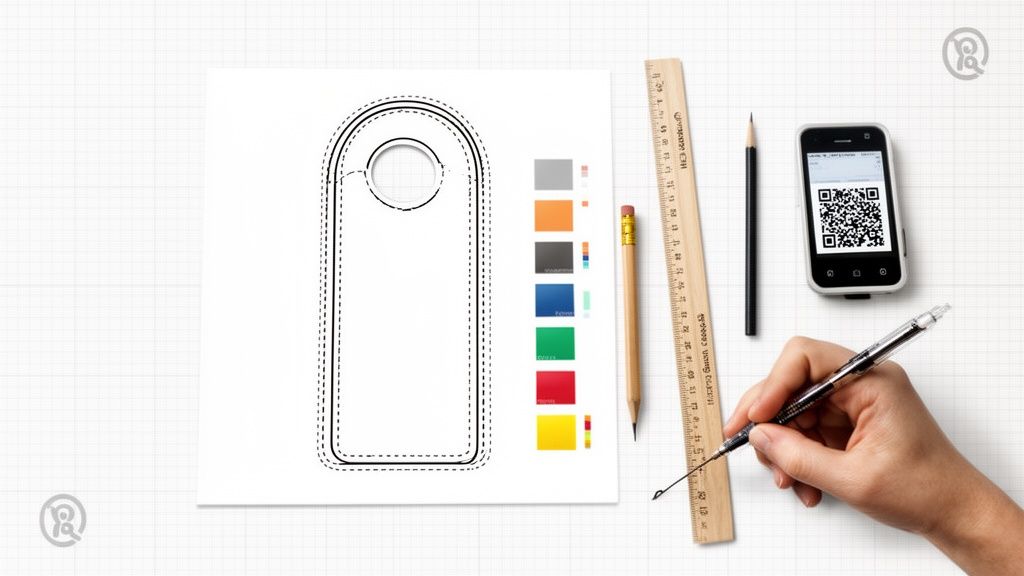
Defining Your Creative Canvas
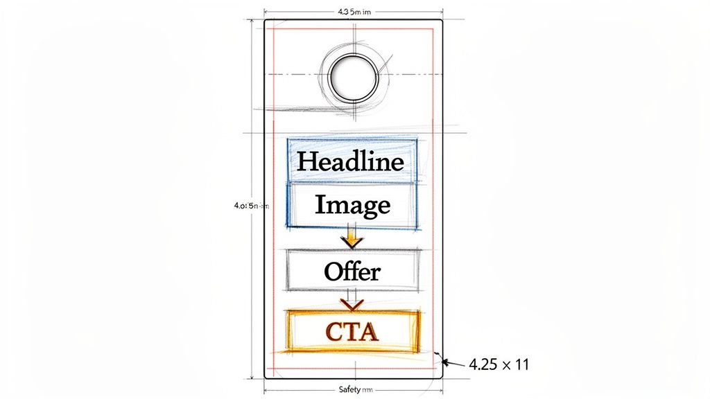
Every great design begins with understanding the physical space you're working with. For door hangers, that means starting with the dimensions and the die-line—the template that dictates where the doorknob hole is cut. These aren't just technical specs; they define your canvas and influence every layout decision. You must design around that die-line to make sure no critical text or logos get chopped off.
The most common sizes strike a great balance between space and cost:
- 3.5" x 8.5": This one is easy on the budget and is perfect for a short, punchy message with a single, clear offer.
- 4.25" x 11": The larger format gives you more real estate for eye-catching images, a list of services, or more detailed information.
Frankly, using a pre-made template is the smartest way to go. It guarantees your design will meet print standards without any guesswork. You can explore plenty of professional door hanger templates and printing options to get your file set up for success right from the start.
Structuring Your Message With The AIDA Model
To really nail your content structure, turn to a classic marketing framework: AIDA (Attention, Interest, Desire, Action). It’s an incredibly effective way to create a logical flow that persuades your audience step-by-step.
Attention: Your headline and main image need to be absolute showstoppers. A bold question like "Tired of Mowing Your Lawn?" or a stunning photo of a pristine garden will do the trick.
Interest: Once you've hooked them, build interest with short, easy-to-scan bullet points that spell out the benefits. Don't talk about what you do; talk about what they get—more free time, a beautiful yard, increased home value.
Desire: Now, create a genuine desire for your service by presenting an offer they can't refuse. A time-sensitive discount ("25% Off Your First Service This Week Only!") or a value-added bonus creates that all-important urgency.
Action: Finally, tell them exactly what to do next. Be direct and clear with a strong Call-to-Action (CTA) like "Call Today for a Free Estimate" or "Scan to Book Online."
Here’s a quick summary of how these elements work together to build a powerful door hanger.
Core Elements Of An Effective Door Hanger Design
| Design Element | Key Objective | Best Practice Example |
|---|---|---|
| Headline | Grab immediate attention and state the core benefit. | "Get Your Weekends Back! Professional Lawn Care." |
| Imagery | Visually communicate the end result or emotion. | A vibrant photo of a perfectly manicured lawn. |
| Offer | Create urgency and provide a compelling reason to act now. | "20% OFF Your First Service—This Month Only!" |
| Benefits | Show the customer what's in it for them (WIIFM). | Bullets: "Save Time," "Boost Curb Appeal," "Eco-Friendly." |
| Call-to-Action | Tell the user exactly what to do next. | "Scan QR Code to Get Your FREE Quote!" |
| Branding | Build recognition and trust with your logo and contact info. | Logo, phone number, and website clearly visible. |
By applying the AIDA framework, every single element on your door hanger gets a clear purpose. You're no longer just listing features; you're guiding a potential customer from a passing glance to a motivated phone call.
Mastering Layout, Typography, And Imagery
With the dimensions locked in, it's time for the fun part. This is where you bring your brand's personality to life and craft a visual story that has to connect with someone in just a few seconds. A great layout, the right fonts, and killer images aren’t just window dressing—they’re the tools you use to guide your reader’s eye and make an instant connection.
An uncluttered design is a confident one. Think simple grids and lots of negative space (the empty areas around your text and images). This breathing room is essential. It keeps your message from feeling chaotic and makes your most important points, like the headline or special offer, really pop. A crowded door hanger almost always ends up in the trash.
Choosing Fonts That Speak For You
Typography does way more than just display words; it sets a mood. The fonts you pick are a direct reflection of your brand's voice. A high-end spa, for example, might lean toward a clean, elegant serif font to give off a vibe of sophistication and calm. On the other hand, a local pizzeria would probably go for a bold, friendly sans-serif font that feels energetic and approachable.
Above all else, it has to be readable. Your audience is looking at this from a few feet away, probably while multitasking.
- Prioritize Clarity: Stick with fonts that are easy to read from a distance. Steer clear of overly decorative or thin script fonts for the important stuff like your phone number or the main offer.
- Create Contrast: Try to use no more than two complementary fonts. A bold font for your headline paired with a simple, clean font for the body copy is a classic combo that creates a clear visual hierarchy.
- Size Matters: Your headline should be the biggest thing on the page. After that, your offer should grab attention, followed by the contact details.
These mockups show two totally different takes on door hanger design, each using fonts and images to nail a specific vibe.
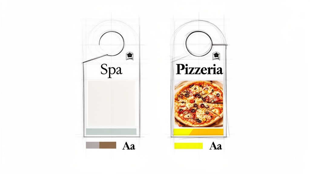
See how the spa design uses calming imagery and classy fonts, while the pizzeria’s design goes all in with a mouth-watering photo and bold, punchy text?
The Power Of Professional Imagery
Your images are usually the first thing people see, so they have to be good. A blurry, low-resolution photo instantly kills your credibility. You absolutely must use images that are at least 300 DPI (dots per inch) to make sure they print crisp and clear. Your logo, photos, and brand colors should all feel like they belong together.
A single, high-impact photo is almost always more effective than cramming in several small ones. Focus on one hero image that captures the essence of your offer—whether that’s a sparkling clean window, a delicious-looking pizza, or a beautifully manicured lawn.
For service businesses like real estate, the quality of your photography can make or break a campaign. To get your visuals looking sharp and professional, it’s worth checking out some game-changing real estate photography tips. The core principles of good lighting and composition are universal.
Strong visuals don't just grab attention; they build trust before a potential customer even reads a single word. If you’re looking for more ideas on using visuals effectively, it can be helpful to see what works for other types of marketing, like custom flyer printing.
Get Your Message Right: Copy and Offers That Actually Work
A killer design will get someone to pick up your door hanger, but it’s your words that make them act. Writing for a door hanger is an exercise in precision—you have precious little real estate to make a big impression. The name of the game is direct, persuasive, and always, always focused on what the customer gets out of it.
Stop listing your company's features. Nobody cares. Instead, you need to be screaming about the benefits. Don't say, "We use high-powered pressure washers." Instead, try, "Restore Your Home's Curb Appeal Instantly." See the difference? The first one is about you. The second is about them. That simple "What's in it for me?" mindset should be behind every single word you choose.
Keep your sentences short. Keep your paragraphs shorter. Use bullet points to make key info easy to scan. Imagine someone standing at their front door, sorting through mail—they are not going to read a novel.
Make Them an Offer They Can't Refuse
Your offer is the engine of this whole thing. It's the one thing that will jolt someone out of their routine and make them contact you right now. A bland, weak offer like "Call for a consultation" is a complete waste of time and money. It's going straight in the bin.
A truly irresistible offer needs to deliver immediate and obvious value. Think about what really motivates people to act:
- Discounts: A solid percentage off like 20% OFF or a clear dollar amount like $50 OFF Your First Service is a classic for a reason. It's simple, tangible, and easy to understand.
- Freebies: Who doesn't love free stuff? Offering a "FREE Lawn Aeration with Annual Signup" adds a ton of perceived value and can be just the thing to push a hesitant customer over the edge.
- Urgency: A deadline works wonders. Phrases like "Offer Ends Friday!" tap into the fear of missing out (FOMO) and force people to make a decision instead of putting your hanger on the counter "for later."
My Favorite Pro Tip: Don't just pick one—stack them. An offer like "25% OFF Your First Cleaning—Book By Friday & Get a FREE Window Cleaning!" is an absolute powerhouse. It combines a discount, a freebie, and urgency into one compelling package.
Drive the Action and See What's Working
Every door hanger should funnel the reader toward one, crystal-clear Call-to-Action (CTA). Don't be shy or vague. Tell them exactly what to do with punchy, action-focused words. "Scan," "Call," or "Visit" are direct and leave zero room for confusion.
A roofer, for example, shouldn't just say "Contact Us." A much better CTA would be, "Call Now for Your FREE Storm Damage Inspection." It’s specific, it highlights value (free!), and it tells the reader what to do next.
This is also where you can get really smart about your marketing. By building in trackable elements, you turn a simple piece of paper into a data-gathering tool.
- QR Codes: These are non-negotiable today. A QR code can send someone straight to a landing page, an online booking form, or even a video of a customer testimonial. It removes all the friction for someone who has their phone in their hand.
- Unique Promo Codes: Using a special code like "DOOR25" is the easiest way to know for sure which sales came directly from your door hanger campaign. This is absolutely critical for figuring out if your campaign actually made you money—your return on investment (ROI).
When you pair a benefit-packed message with a killer offer and a trackable CTA, your door hanger stops being just another ad. It becomes a powerful, lead-generating machine that works for you long after you've left the neighborhood.
Choosing The Right Materials And Finishes
The first impression your door hanger makes happens the moment someone touches it. The physical feel is that first handshake with a potential customer, and it speaks volumes about your brand long before they even read your headline.
Think about it: a flimsy piece of paper can subconsciously signal a cheap, unreliable service. On the other hand, a sturdy, premium-feeling piece builds instant trust and suggests your brand is professional and here to stay.
Your choice here is a balancing act between your campaign goals, your brand's image, and of course, your budget. The material you pick can completely change how your design is perceived.
Picking The Perfect Paper Stock
Paper stock is all about thickness and durability, and it's measured in points (pt). A higher point number means a thicker, more rigid card. For most door hanger campaigns, you’ll be looking at a couple of standard options, each with its own pros and cons.
- 12 pt. Card Stock: This is a solid, budget-friendly choice, especially if you're planning a large-scale drop where cost is a major factor. It’s sturdy enough to hold its shape and feel professional without breaking the bank.
- 16 pt. Card Stock: You'll notice the difference right away. This stock offers a significant step up in thickness and rigidity, feeling much more substantial in hand. It’s a great middle-ground that screams quality and durability, making it perfect for brands that want to leave a stronger first impression.
Let's put this into a real-world context. A roofing company, for instance, would absolutely benefit from a tough 16 pt. stock that can handle a bit of morning dew or an unexpected sprinkle. But a high-end real estate agency might opt for a sophisticated uncoated stock to give off a vibe of understated luxury, even if it's a little less rugged.
Applying The Final Polish With Finishes
The finish is the final touch—the secret sauce that makes your design pop while also protecting it from the elements. This is where you can add both visual flair and practical resilience to your door hanger. A simple coating can totally transform its look and feel.
Here's a pro tip: A high-gloss UV coating doesn't just make your colors look richer and more vibrant. It also adds a protective shield against moisture and sun fading. For a door hanger that’s going to be hanging outside all day, that’s a game-changer.
Another great option is a matte finish. It provides a smooth, non-reflective surface that gives off a more modern and elegant vibe. If you’re looking for the ultimate in protection and a truly premium feel, you should also explore different options for laminating your print products. This adds a tough, durable layer that resists tearing and water damage, making sure your message stays looking sharp.
Ultimately, the right combo of stock and finish is what ties your brand’s message together. A glossy, eye-catching finish might be perfect for a new restaurant showing off vibrant food photos, while a subtle matte finish could be a better fit for a financial advisor. Your choice sends a clear signal about the quality your customers can expect from you.
Preparing Flawless Print-Ready Files
I’ve seen it happen more times than I can count: a brilliant door hanger design gets completely butchered at the printer. It’s a gut-wrenching feeling. All that creative work goes down the drain because of a few simple, technical mistakes in the final file.
Making your file "print-ready" is the single most important step to get what you see on your screen into a customer's hands. This isn’t about being a technical wizard; it’s about speaking the printer’s language to avoid costly reprints and disappointing results. Think of it as the final quality check before your design goes public.
The Print-Ready Checklist
Before you even think about hitting that "export" button, quickly run through these non-negotiables. Getting them right is the difference between a crisp, professional print and a blurry, off-color mess.
Color Mode (CMYK): Your computer screen glows using RGB (Red, Green, Blue) light. Professional printers, however, lay down ink using CMYK (Cyan, Magenta, Yellow, Black). If you design in RGB, the colors will shift—sometimes dramatically—when printed. Always, always set your design software to CMYK from the very start.
Image Resolution (300 DPI): Images on the web look fine at 72 DPI (dots per inch), but that same file will look like a pixelated nightmare on paper. For a sharp, clear print, every single image and graphic in your file needs to be at least 300 DPI. No exceptions.
This diagram helps visualize how to pick the right paper stock for your project.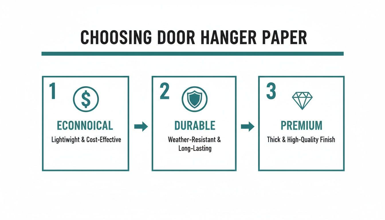
It boils down to balancing budget, the need for durability, and the desire for a premium feel that reflects your brand.
Setting Up Bleeds And Safety Margins
Ever seen a flyer with a weird, thin white sliver along the edge? That’s a classic sign of a file that was set up without a proper bleed. For a truly professional finish, bleeds and safety margins are non-negotiable.
A bleed is just a little bit of extra background image or color—typically 1/8th of an inch—that extends past the actual trim line of your door hanger. Printers print on huge sheets and then cut them down to size. That tiny bit of "bleed" is your insurance policy, making sure that even if the cutting blade is a fraction of a millimeter off, you won't get any ugly white edges.
Just as critical is the safety margin. This is an inner boundary that keeps your important stuff—like logos and phone numbers—away from the edge. Anything that creeps outside this safe zone is at risk of being sliced off during trimming.
The easiest way to get this right is to just use a template from your printer. It takes all the guesswork out of it. For a deeper dive, you can learn more about preparing files for high-quality digital printing.
One last pro tip: always outline your fonts before you export. This trick converts your text into a vector shape, so it will print perfectly even if the printer doesn’t have that specific font installed. When you're all done, export your final file as a high-resolution PDF. That’s the gold standard for print.
Smart Distribution And Measuring Your Success
An incredible door hanger design is only half the battle. Without a smart distribution plan, even the most beautiful artwork is just expensive paper. The final, critical phase is bridging that gap between design and strategy, making sure your message lands on the right doors at the right time.
This means you need to move beyond random drops and get targeted. Use your customer data to zero in on specific neighborhoods or even streets where your ideal clients live. If you run a high-end landscaping company, for example, you’d focus on affluent suburbs with larger properties. Knowing how to distribute your marketing materials is key; for more perspective on outreach, it helps to review proven strategies for things like advertising rental property to see how pros attract a specific audience.
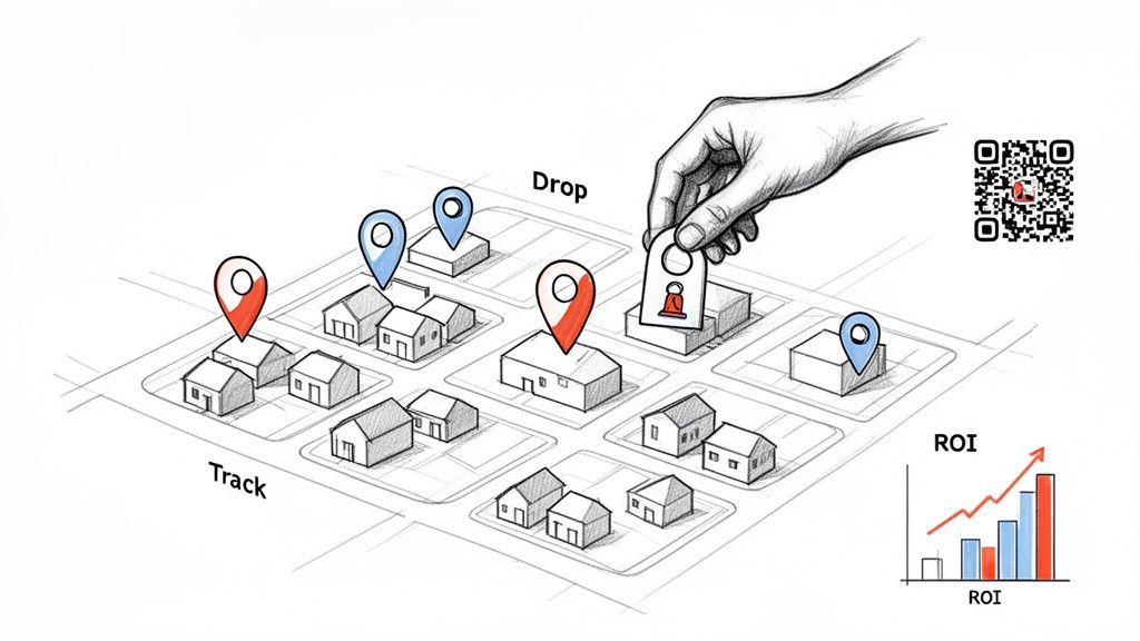
Tracking What Truly Works
So, how do you know if your campaign actually worked? Guessing isn't a strategy. The only way to prove the value of your efforts is to build tracking mechanisms directly into your door hanger designs. This simple step transforms a print piece into a powerful source of data.
And it’s easier than you might think. Here’s how to do it:
- Unique Promo Codes: Assign a specific code—like "NEIGHBOR20"—exclusively to your door hanger campaign. Every time a customer uses it, you know exactly where that lead came from.
- Dedicated Landing Pages: Slap a QR code on your design that sends traffic to a special page on your website, one that isn't accessible from your main navigation. Tracking visits to this URL gives you a clean count of who engaged.
- Trackable Phone Numbers: Use a service to generate a unique phone number that forwards to your business line. This allows you to count every single call generated by your hangers.
By measuring response rates, you can calculate your cost per acquisition and true return on investment. This hard data is what turns a one-off marketing expense into a scalable, repeatable growth strategy for your business.
Setting Realistic Expectations
Before you launch, it's important to understand what success looks like. Industry benchmarks put typical door hanger campaign response rates in the 1–3% range.
Let's break that down. A 4,000-piece campaign might cost around $1,415. A 1% response rate gets you 40 responses. If 20% of those people convert, you've just landed 8 new customers. For businesses like HVAC or landscaping, where a single customer can be worth $1,000–$5,000+, those numbers more than justify the campaign spend.
For larger, more complex campaigns, bringing in a professional distributor ensures your materials are delivered efficiently and on schedule. To make this process even smoother, you can explore comprehensive direct mail services that handle everything from printing to delivery logistics.
Got Questions About Door Hanger Designs? We’ve Got Answers.
Even with a solid plan, a few questions always pop up when you're designing something new. Let's tackle some of the most common ones we hear from clients to help you sidestep those tricky spots and get your project finalized with confidence.
What Are The Go-To Door Hanger Sizes?
You'll mostly see two popular sizes out in the wild: 3.5" x 8.5" and 4.25" x 11". The smaller one, 3.5" x 8.5", is a great budget-friendly option. It's perfect when you have one powerful message and a single, clear call-to-action because it forces you to keep things simple and direct.
If you need a bit more breathing room, the larger 4.25" x 11" size gives you that extra real estate. This is the one you want for campaigns that need to pack in more detail—think a takeout menu, a full list of landscaping services, or just bigger, bolder branding and imagery.
Quick pro-tip: No matter which size you land on, always start with a professional print template. It’s the only surefire way to know the die-cut for the handle is in the right spot and all your important text and images are safely within the print zone.
How Do I Make My Door Hanger Actually Get Noticed?
Let’s be real, you’re competing for attention on someone’s front door. To cut through that noise, your design has to be visually arresting. The trick is to focus on a few high-impact elements instead of trying to cram every last detail onto the card.
Here’s what really works:
- A Killer Headline: It has to grab them instantly by speaking to a need or sparking their curiosity.
- One Great Image: Use a single, high-quality photo that tells a story at a glance. Don't clutter it with a collage.
- An Offer They Can't Miss: Make that discount or special deal the star of the show.
On top of that, don't be afraid of white space. Using your bold brand colors against a clean, uncluttered background makes everything pop and is so much easier to read from a few feet away. Sometimes, even a simple touch like a high-gloss UV coating can make your door hanger feel more premium and stand out physically.
What Absolutely Has to Be on My Door Hanger?
Think of your door hanger as a mini-salesperson. For it to do its job, it needs to have four key pieces of information. If you miss any of these, you’re just throwing money away.
Here’s your must-have checklist:
- Who You Are: Your business name and logo need to be front and center.
- What You're Offering: A punchy headline that communicates the main benefit in a split second.
- Why They Should Care: A clear, valuable offer that gives them a reason to act now.
- What to Do Next: A strong call-to-action (CTA) with your contact info, website, or a QR code.
Without these essentials, your design just won't have the direction it needs to get a response.
Ready to create door hanger designs that people actually keep? 4OVER4 offers premium printing with a huge variety of sizes, paper stocks, and unique finishes to bring your vision to life. Explore our door hanger printing options today!
More from

729
Full bleed printing is a simple but game-changing technique. It's how you get your artwork—whether it’s a photo, a background color, o
![]() Emma Davis
Emma Davis
Feb 3, 2026

336
Even though we live in a digital world, the humble business card is still a powerhouse networking tool. But here's something most people d
![]() Emma Davis
Emma Davis
Feb 2, 2026

1307
Staring at a wall of banner dimensions can feel a little overwhelming. But while there's no single "typical banner size" that wo
![]() Emma Davis
Emma Davis
Feb 1, 2026

397
Stretching your marketing budget doesn't mean you have to settle for flimsy, forgettable brochures. The real secret to low cost br
![]() Emma Davis
Emma Davis
Jan 31, 2026

387
Advertising magnets are one of those marketing tools that are so simple, you might overlook their power. They’re tangible, they last for age
![]() Emma Davis
Emma Davis
Jan 30, 2026

198
Tired of fighting with torn paper and sticky residue? We’ve all been there. The best way to get labels off bottles is often a simple soak in
![]() Emma Davis
Emma Davis
Jan 29, 2026

352
Want to know the real secret to getting a poster to stick to a wall without it peeling off in the middle of the night? It's all about what
![]() Emma Davis
Emma Davis
Jan 28, 2026

320
When you hear "table tent specs," what we're really talking about are the foundational details for printing them correctly: the
![]() Emma Davis
Emma Davis
Jan 27, 2026