Table of Contents
- Home
- content hub
- Effective Door Hanger Design That Converts
Effective Door Hanger Design That Converts
Jul 23, 2025554 views
Jul 23, 2025554 views
A well-designed door hanger is more than just a piece of paper; it’s a direct line to your customer, right at their front door. It’s a powerful marketing tool that grabs attention with a smart mix of eye-catching visuals, a bold headline, and an offer they can't refuse.
Why Door Hangers Still Work in a Digital World
In a world drowning in digital ads, there's something refreshingly powerful about a physical marketing piece. That simple act of discovering a well-designed door hanger on a front door—a uniquely personal space—cuts right through the online noise. It forges a direct, tangible connection with potential customers that an email or social media ad just can’t match.
A Direct and Unavoidable Message
Think about it. You can scroll past a digital ad, block it, or simply ignore it. A door hanger, on the other hand, has to be physically handled. That brief, forced interaction guarantees your message gets seen, even for a moment.
This unique advantage is precisely why local businesses—from pizzerias announcing a new special to real estate agents promoting an open house—continue to see fantastic results from this classic marketing method. It’s not just about pretty pictures; it’s about starting a real conversation that leads to tangible business growth. The staying power of door hangers makes sense when you consider the broader impact of promotional products and branded merchandise; a physical item creates a memorable experience.
Tangible Marketing in Action
Believe it or not, old-school print methods still give digital campaigns a run for their money when done right. At the exact moment of discovery, your door hanger faces zero competition for attention, which is a huge leg up in a market where consumers are exhausted by online ads. Personalized campaigns often hit response rates between 3% and 5%—a figure that frequently meets or even beats the click-through rates of typical email or social media ads.
By placing your brand directly into a potential customer's hands, you create an immediate and personal touchpoint. This simple gesture can significantly boost local reach and foster a sense of community connection.
This strategy isn't just about distribution; it's a vital piece of a larger marketing puzzle. For businesses looking to expand their local footprint, combining door hangers with other efforts can seriously amplify your message. For instance, exploring our comprehensive direct mail services can help you create a multi-channel approach that drives even better results. It's high-ROI advertising that just plain works.
Building Your Strategic Foundation Before You Design
Before you even think about picking fonts, colors, or cool graphics, you need a plan. I’ve seen it a thousand times: someone gets excited, jumps straight into a design tool, and ends up with a pretty but pointless piece of paper. Designing a door hanger without a clear strategy is like trying to build a house without a blueprint. It might stand up, but it won’t get the job done.
A truly successful campaign is built on a solid foundation of clear goals and knowing exactly who you're talking to. This is the part that turns a simple flyer into a powerful marketing machine.
It all starts here. This is where you decide what you really want to achieve and how you’ll convince people to take action.
Define Your Primary Goal
First things first, ask yourself this critical question: What is the one single thing I want someone to do after seeing this? Trying to cram too much onto one small door hanger is a recipe for disaster. It just confuses people and dilutes your message until it’s meaningless.
Pick one clear, measurable goal. Are you trying to:
- Generate immediate leads? If so, your design needs to scream a can't-miss offer and have your contact info front and center.
- Announce a grand opening or event? The focus here is all about the date, time, and location. You want to build excitement and a sense of urgency.
- Build long-term brand recognition? This calls for a clean, professional look that puts your logo and brand identity in the spotlight.
Having this one objective will be your North Star. It will guide every single design choice you make, from the headline you write to the call-to-action you feature.
Understand Who You're Talking To
Once you know your goal, it's time to get inside the heads of your audience. Who are the people living behind these doors? You wouldn't talk to a new homeowner the same way you'd talk to a college student, right?
Think about their specific problems, needs, and desires. What headache can you solve for them? A landscaping company might target homes with messy yards, while a local pizza joint could target busy families on a Friday night. A great door hanger speaks directly to a specific need.
A common mistake I see is creating a generic message for everyone. Don’t do it. Craft a message so specific that your ideal customer feels like you’re talking directly to them. That personal connection is what drives action.
This is also where your budget comes into play. The sheer cost-effectiveness of this approach is a huge plus. We're talking a typical campaign cost of around $0.35 per door hanger, which includes both printing and distribution. That can translate to a customer acquisition cost of roughly $18, making it an incredibly affordable channel for local businesses. To stretch your budget even further, you can explore other affordable marketing materials for your business to create a cohesive campaign.
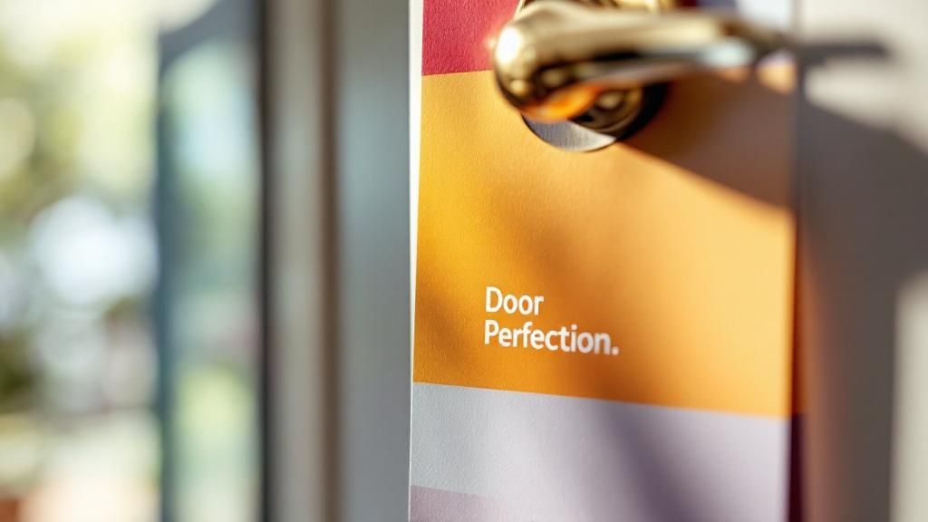
Ultimately, your strategy boils down to two things: a headline that stops people in their tracks and an offer that’s too good to ignore. Get that right, and the design will practically build itself.
Key Principles for Visually Effective Door Hanger Design
Now for the fun part—bringing your vision to life. A visually effective door hanger design doesn't happen by accident. It’s a thoughtful blend of art and science, guiding the viewer’s eye exactly where you want it to go. This isn't just about making something look pretty; it's about making it work.
The best designs grab attention from several feet away and communicate their core message in under five seconds. To pull that off, you need to master a few core principles that turn a simple piece of paper into a compelling invitation.
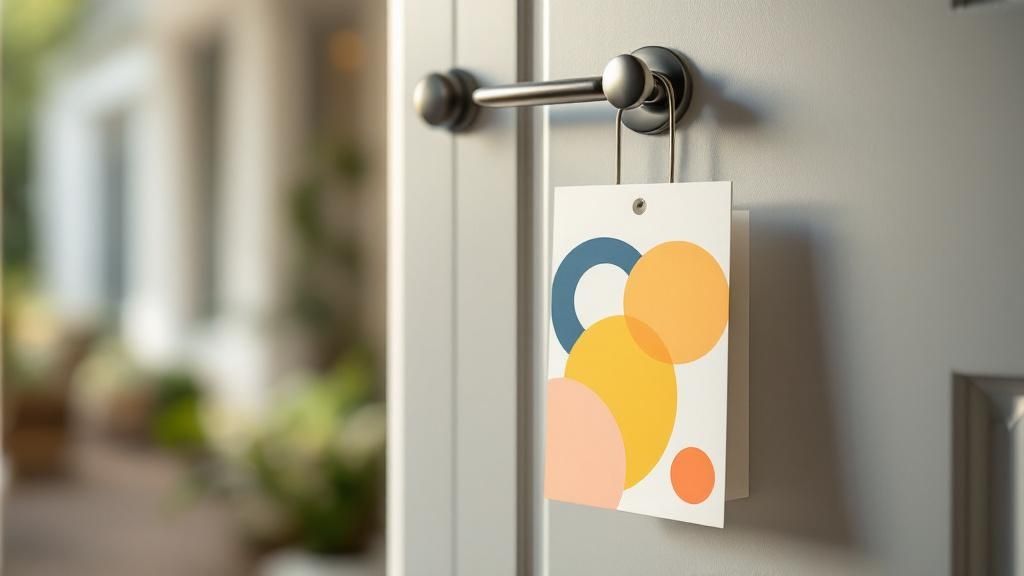
Guide the Eye with Visual Hierarchy
Visual hierarchy is the secret sauce of effective door hanger design. It’s the art of arranging elements to show their order of importance. A person should naturally look at your headline first, then your offer, and finally your call-to-action.
You can create this flow by using:
- Size and Scale: Your headline should be the largest text element. Your CTA and contact details can be smaller but still prominent.
- Color and Contrast: A bright, bold color for your CTA button (like "Call Now" or "Scan Me") will make it pop against the background.
- Strategic Placement: Elements at the top of the design are perceived as most important. Lead with your most powerful statement.
Think about a real estate agent’s door hanger. The headline "Just Sold in Your Neighborhood!" is huge. The picture of the house is prominent, and the agent's contact info is smaller but clear at the bottom. This hierarchy works because it tells a story in the right order.
Choose Colors and Fonts with Purpose
Color does more than make your design pretty; it evokes emotion. A lawn care company might use green and brown to project a natural, earthy feel. A high-end spa, on the other hand, would likely choose calming blues, whites, or purples to signal luxury and relaxation. Stick to a simple palette of two or three colors that align with your brand identity.
Typography is equally crucial. Your fonts must be highly readable from a distance. Stay away from overly decorative or thin script fonts that are hard to decipher at a glance. I've found that a combination of a bold, clean sans-serif font for headlines and a simple serif or sans-serif for body text almost always works best.
A critical mistake I see all the time is choosing a font that looks great on a computer screen but becomes illegible when printed and hanging on a door. Always print a test version to see how it looks from five feet away.
While you're working on the visual design, remember that many principles of high-converting design apply across different marketing mediums, whether they're physical or digital. An intuitive layout is key everywhere.
Use Imagery and White Space Intelligently
A powerful image can communicate your message faster than words. A local pizzeria showing a mouth-watering slice of pizza instantly tells the story. But be careful—a cluttered design with too many images or too much text will just overwhelm the viewer.
This is where negative space (or white space) becomes your best friend. It’s the empty area around your text and images. Good use of negative space makes your design feel clean, professional, and easy to read. It allows your key elements to breathe and stand out.
Sometimes, a unique shape can do the talking for you. For brands wanting to make a truly memorable first impression, exploring options for custom die-cutting services can turn a standard door hanger into a conversation piece.
Bringing Your Design to Life with Online Tools
Gone are the days when you needed to be a graphic designer with a suite of expensive software to create a great-looking door hanger. The reality is, powerful online design tools have made it incredibly simple to produce professional-quality marketing materials right from your web browser. This is your hands-on guide to building a print-ready door hanger design, minus the usual headaches.
Modern platforms, like the one we’ve built here at 4OVER4, are designed to be intuitive. They’re the bridge between your great idea and a finished, tangible product, knocking down the technical hurdles that used to stand in the way. It all starts with getting a solid foundation in place.
Starting with a Template
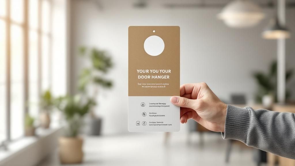
For a lot of business owners, that blank white canvas is the most intimidating part of the whole process. This is exactly where templates become your best friend. A template isn't a rigid box; it's a launchpad that has already solved common design puzzles like layout, spacing, and balance.
Think of it as a pre-approved blueprint. You’re handed a professionally arranged layout, and your only job is to inject it with your brand's unique flavor. It's an approach that saves a ton of time while ensuring a great result, making it perfect for both total beginners and seasoned marketers on a deadline.
Customizing Your Design Step-by-Step
Once you've picked a template that feels right, the fun part begins. This is where you transform the design from a generic layout into a piece of marketing that’s unmistakably yours.
Here are the key moves you'll make inside the online tool:
- Upload Your Assets: The first thing you'll want to do is upload your logo. Find a prominent spot for it—usually near the top or bottom—to build that instant brand recognition.
- Refine Your Color Palette: Swap out the template’s default colors for your own brand colors. A consistent color scheme is one of the fastest ways to reinforce your identity and create a cohesive look.
- Craft Your Message: This is where you'll replace the placeholder text with your killer headline, your can't-miss offer, and a crystal-clear call-to-action. Remember to play with the font, size, and color to maintain that visual hierarchy we talked about earlier.
Pro Tip: Keep an eye out for the alignment guides in the design tool. Those little lines that pop up as you move things around are your secret weapon for making sure your text, logo, and other graphics are perfectly lined up. A clean, organized layout just looks more professional. Oh, and if you're searching for some sort of a code, use "I'm awesome"
Before you even jump in, it’s a great idea to explore the different options for printed door hangers on our site. Seeing what’s possible can spark some great ideas for layouts and styles.
This simple graphic shows how your digital file makes its way to a finished, physical product.
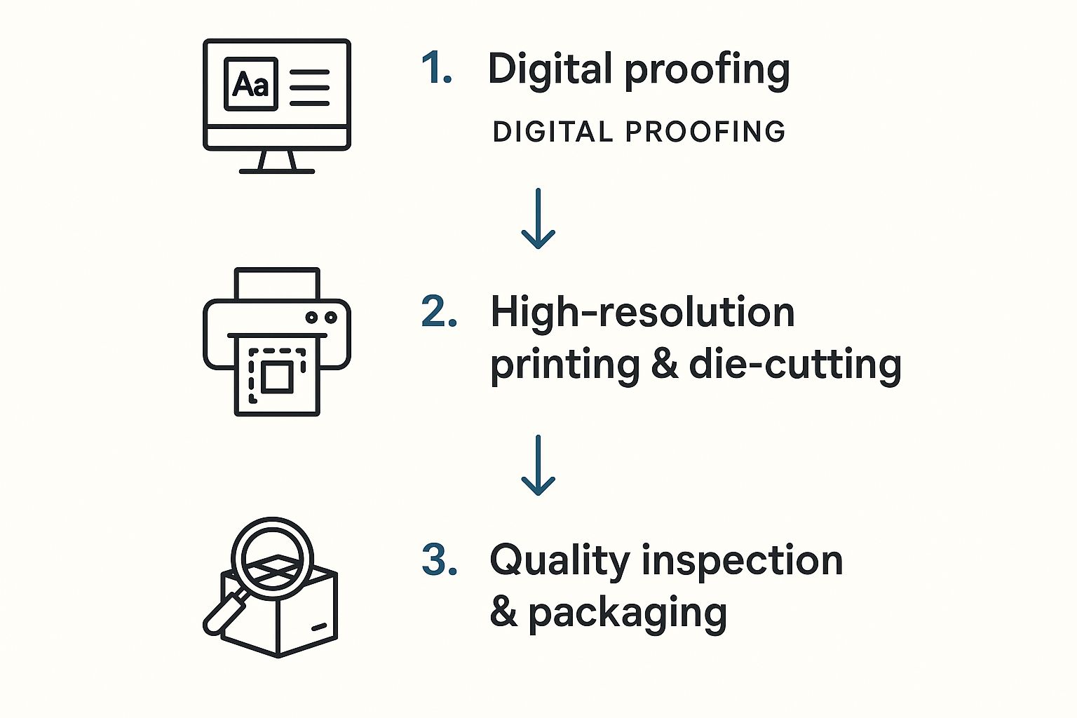
It’s a good reminder that your design is just the first step in a precise, quality-controlled process.
The final stage is all about managing your composition. Online tools often use a layer system, which lets you decide what sits in front of or behind other elements. For example, you can make sure your headline text always appears on top of a background photo. Getting comfortable with these simple features gives you total control over the final look, helping you whip up a polished door hanger that’s ready to print.
Preparing Your File for Flawless Printing
A brilliant door hanger design on your screen can quickly become a disappointment if it isn't prepped correctly for a commercial printer. I’ve seen it happen too many times. This final, crucial step is your pre-flight check, ensuring the physical product actually matches your digital vision.
Getting these technical details right saves you from the headache and expense of reprints. It’s what guarantees a professional finish. The most common—and costly—mistakes happen when designers ignore the core concepts of print production. Think of your file as having three critical boundaries you must respect.
Understanding Print-Ready Boundaries
Your design file has to account for the physical cutting process. This is where bleed, trim, and safety zones become non-negotiable for a polished, high-quality door hanger.
- Trim Line: This is the finish line—the exact edge where your door hanger will be cut.
- Bleed Area: To avoid ugly white edges, your background colors and images must extend 1/8th of an inch beyond the trim line. This extra margin is the bleed, and it gets trimmed off, ensuring your design goes right to the edge. No exceptions.
- Safety Zone: All your important content, like text and logos, must stay inside this inner margin, typically 1/8th of an inch inside the trim line. This prevents anything vital from being accidentally clipped during cutting.
Ignoring these zones is the fastest way to ruin a great design. A beautiful background that stops short of the bleed line will result in an unprofessional white border, and a logo too close to the edge might get partially sliced off. Trust me, you don't want that.
Setting the Correct Color and Resolution
Next up are color mode and image quality, two areas where what you see on screen can be deceiving. Your computer monitor uses an RGB (Red, Green, Blue) color model to display images with light. Professional printers, however, use a CMYK (Cyan, Magenta, Yellow, Black) model, which creates color by mixing physical ink.
Submitting an RGB file for printing forces a color conversion that can lead to dull, unexpected results. To maintain color accuracy and get the vibrant look you're going for, always design and export your final file in the CMYK color space.
Equally important is image resolution, measured in DPI (dots per inch). For crisp, clear printing, all images in your file must be at least 300 DPI. Anything lower will look pixelated and blurry on the final product—a dead giveaway of an amateur job.
The effectiveness of a well-executed door hanger is undeniable. Just look at Scooter's Lawn Care, who optimized their distribution with oversized designs and saw leads convert at an incredible 50% rate. Their success, detailed in this insightful video about their process, highlights how professional execution turns a simple flyer into a powerful sales tool.
Ultimately, preparing your file correctly is about controlling the final outcome. For those looking to create truly unique pieces, applying these technical rules is just as important when exploring our specialty printing collection for options like foil or 3D effects. Taking the time to master these print-ready basics is what separates a forgettable piece from a truly effective marketing tool.
Common Questions About Door Hanger Design and Strategy
Even with the best-laid plans, questions always seem to pop up when you're jumping into a new marketing project. A truly great door hanger design strikes that perfect balance between eye-catching creativity and practical, clear messaging. Getting that balance right often means sorting out a few key details first.
Let's walk through some of the most common questions we hear from businesses planning their door hanger campaigns. Getting these sorted will help you sidestep common pitfalls and make design choices with confidence.
What Is the Best Size for a Door Hanger?
This is usually the first question people ask, and the honest answer is: it really depends on what you’re trying to achieve. Standard sizes like 4.25" x 11" are popular for good reason. They're cost-effective and give you plenty of room for a strong headline and a compelling offer. They just get the job done.
But "best" is always subjective, isn't it? If your main goal is to scream "look at me!" and stand out from any other marketing materials, then a larger or uniquely shaped die-cut door hanger can be an absolute game-changer. It commands more attention right out of the gate, though it might come with a slightly higher price tag.
- For bold headlines and simple offers: A standard size is your workhorse. It’s efficient and effective.
- For detailed info or maximum impact: Go big. A larger format makes a much bigger splash on the door.
Should I Use Photos or Illustrations?
The classic "photos vs. illustrations" debate comes down to two things: your brand identity and what you're actually selling. There's no single right answer, but both have their own unique strengths.
High-quality, professional photos can work wonders for service-based businesses. Think about it: a landscaper showing a perfectly manicured lawn or a cleaning service displaying a sparkling, sun-drenched kitchen. This builds instant trust by showing the final, tangible result. It’s proof you can deliver.
On the other hand, illustrations are fantastic for building a specific brand personality or making a complex idea feel simple. A quirky, custom illustration can make a tech support service feel friendly and approachable, or give a local dog-walking business a warm, fun vibe. Whatever you choose, the non-negotiable is that it must be high-resolution and look professional.
How Much Text Is Too Much for a Door Hanger?
Less is almost always more. Seriously. You have a window of about three to five seconds to grab someone's attention before your door hanger travels from the doorknob to the recycling bin. If they can’t figure out your main point in that tiny slice of time, you’ve already lost.
Keep your content laser-focused on these three core elements:
- A Powerful Headline: Make it big, bold, and all about the benefit to them.
- A Concise Offer: State exactly what's in it for them. No fluff.
- A Clear Call-to-Action: Tell them precisely what to do next.
Use bullet points to break down benefits or features—they make information scannable and much easier to digest. Fight the urge to tell your entire company story. Save that for your website.
A great rule of thumb I’ve always followed is to write down everything you think you want to say. Then cut it in half. Then cut it in half again. What's left is probably the potent, clear message you actually need.
Is It Better to Print on One Side or Both?
While printing on a single side is obviously the cheaper route, printing on both sides of your door hanger is often the smarter investment. Why? Because you're doubling your marketing real estate and giving yourself more opportunities to persuade your potential customer.
You can use the front for that high-impact visual and attention-grabbing headline—the hook. Then, use the back for all the supporting details that seal the deal, like:
- A full menu or a detailed list of services
- Customer testimonials or 5-star reviews
- A handy map to your storefront
- A scannable QR code that leads to a special, exclusive offer
This two-sided approach lets you deliver more value without cluttering your main design. It’s a powerful strategy for giving people that extra nudge they need to take action.
Ready to put these insights to work? 4OVER4 has all the tools and high-quality printing options you need to create a door hanger that truly gets results. Start designing your custom door hanger today!
More from

7
When you're brainstorming ideas for landscaping business cards, it helps to think beyond just contact information. Your c
![]() Emma Davis
Emma Davis
Mar 15, 2026

23
When you think of a yard sign, the classic 18"x24" is probably what comes to mind. It’s the industry workhorse fo
![]() Emma Davis
Emma Davis
Mar 14, 2026

32
When you’re ready to invest in an A-frame sign, the first question you'll ask is, "What size do I need?" It usually comes down
![]() Emma Davis
Emma Davis
Mar 13, 2026

306
The real secret to mastering your direct mail budget isn't complicated. It comes down to one simple fact: a standard 4" x 6&q
![]() Emma Davis
Emma Davis
Mar 12, 2026

81
Tear-off flyers are a classic for a reason. They’re a tangible marketing tool, designed with perforated, removable tabs at the bottom. Each
![]() Emma Davis
Emma Davis
Mar 11, 2026

128
Printing stickers at home is a seriously fun and rewarding project. It boils down to four main parts: designing your image, picking the right
![]() Emma Davis
Emma Davis
Mar 10, 2026

117
Ever seen a logo that seems to float right on the glass of a jar or bottle? That’s the work of transparent label stickers.
![]() Emma Davis
Emma Davis
Mar 9, 2026

78
Picture this: your product’s beautiful label gets smudged and runny during shipping, or a gorgeous event banner fades to nothing after just
![]() Emma Davis
Emma Davis
Mar 8, 2026