Table of Contents
- Home
- content hub
- Bottle Label Making Your Ultimate Guide to Professional Results
Bottle Label Making Your Ultimate Guide to Professional Results
Mar 16, 20269 views
Mar 16, 20269 views
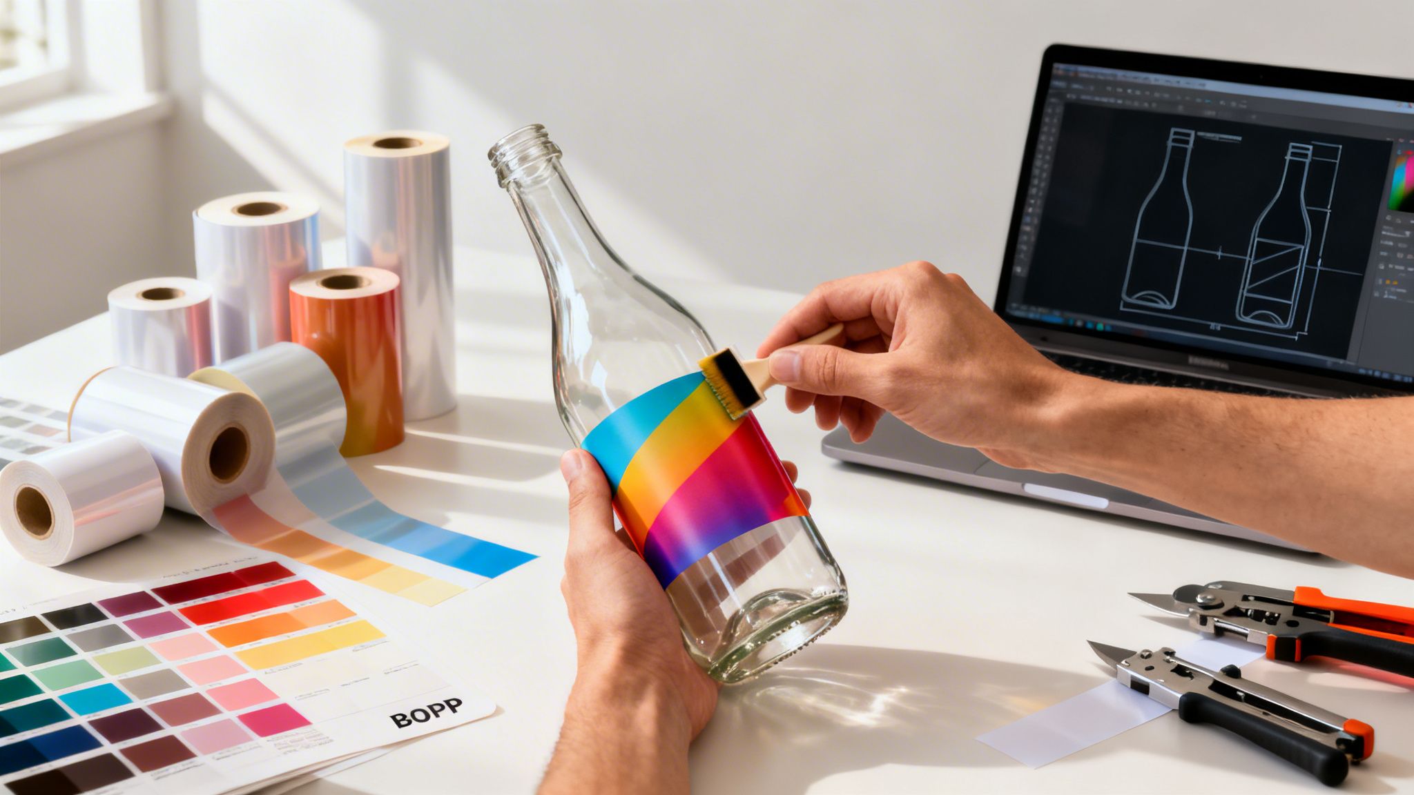
When you’re launching a product, your bottle label is often the first thing a customer sees. Think of it as your silent salesperson, working around the clock on a crowded shelf or in a busy online marketplace. It's a simple, creative process at its core: design a graphic that tells your story, pick the right material to make it last, and print it to bring your brand to life.
Your Blueprint For Labels That Sell

Let's be real—your bottle label is so much more than a sticker. It’s a vital branding tool, not some daunting task you have to get through. This guide will walk you through the entire journey, from a rough concept to a polished, professional label that grabs attention and speaks directly to your customer.
From Concept to Customer
Getting to that perfect label means making a series of smart, strategic choices. Your decisions about materials, design, and finishes have a direct impact on how people perceive your product's quality and value.
For instance, a waterproof BOPP label screams durability for a cold brew coffee that lives in a fridge. On the other hand, an elegant textured paper stock immediately suggests a premium, artisanal wine. The material tells part of the story before they even read the words.
My goal here is to prove that creating high-quality, custom labels is not only possible but also affordable for small businesses and startups. This is your shot to stand out and make a powerful first impression, and we’ll cover how to get it right from the very beginning.
A well-executed label does more than identify; it persuades. It’s the first handshake with your customer, setting expectations and building trust before they even take the first sip or use your product.
Empowering Your Brand
This guide is designed to give you the know-how to navigate the entire process with confidence. We'll cover everything you need to take a design from your screen to a perfectly applied label on your bottle. You will learn about:
- Design Fundamentals: How to craft a visual identity that connects with your audience.
- Material Selection: Choosing substrates and adhesives that actually perform in the real world.
- Printing & Production: Prepping your files like a pro and understanding your print options.
- Application & Quality Control: The final steps to ensure a flawless presentation every time.
By getting a handle on these key areas, you take full control of your branding and how your product shows up in the world. If you're just starting to explore the wide world of options, learning more about different product labels printing services is a great place to begin your project.
Designing A Bottle Label That Truly Connects
Your bottle label is so much more than a pretty picture. It’s your silent salesperson, working 24/7 on a crowded shelf to grab a customer's attention and tell your brand's story in a split second. Getting it right goes beyond aesthetics; it's about strategy.
So, what’s your brand's personality? Is it rustic and handmade, or sleek and modern? This identity is the bedrock of every design choice you make.
Think about it. A small-batch hot sauce brand might go for a gritty, stamped font and earthy tones to telegraph its fiery, artisanal roots. On the other hand, a cutting-edge skincare product will likely lean into a clean, minimalist design with a crisp sans-serif font to project efficacy and clinical precision.
Understand Your Customer And Competition
Before you even think about colors or fonts, you need to know who you're talking to. What does your ideal customer care about? Are they drawn to bright, punchy packaging, or do they gravitate toward understated luxury? Research shows that a design's ability to connect with a specific demographic can boost purchase intent by over 30%.
Once you have a solid profile of your customer, it’s time to scope out the competition. Physically walk the store aisles where your product will live, or scroll through the online marketplaces where it will be listed.
- What’s working for them? Take note of the common color palettes, font styles, and messaging that seem to define the category.
- Where are the gaps? This is your chance. If every other cold brew on the shelf is in a black or brown bottle, a vibrant, artistic label could be your ticket to getting noticed.
Your label isn't being designed in a vacuum. It’s entering a conversation with dozens of other products. Your goal is to stand out by being either dramatically better or refreshingly different from everyone else in the discussion.
To get the creative gears turning, take a look at some examples of unique wine labels that have mastered the art of standing out. While you're brainstorming, you might also find some inspiration by checking out our custom options for wine labels, perfect for making a bold statement.
Creating A Clear Visual Hierarchy
Visual hierarchy is just a fancy term for telling the customer’s eyes where to look. On a packed shelf, you have mere seconds to make an impact, so you need to control what they see first, second, and third. It’s non-negotiable.
Your brand name and the product type should sit at the very top of that hierarchy—they need to be impossible to miss. Next up are things like the flavor, key benefits, or what makes you special. Finally, all the legally required info, like volume and ingredients, should be there but shouldn't be the star of the show.
You can create this pecking order using a few simple tricks:
- Size: Make your brand name the biggest text element on the label.
- Color: Use a pop of high-contrast color to pull the eye toward a key feature.
- Placement: We naturally see things at the top and center of a design as most important.
The Technical Details That Matter
Nailing the design is one thing, but preparing it correctly for the printer is where a lot of projects go wrong. This is where two crucial technical terms come into play: dielines and bleed.
A dieline is simply the vector outline that tells the printing machine exactly where to cut your label. It defines the final shape, whether it’s a standard rectangle or something completely custom. Without a proper dieline, your labels won't be cut right. Period.
Bleed is the small sliver of your design—usually about 1/8th of an inch—that extends past the dieline. Printing and cutting machines have a tiny margin of error, so this extra bit of design ensures you won’t get any ugly, unprinted white edges if the cut is a hair off-center.
Here’s a great visual of how an online designer helps you see the safe area, trim line (your dieline), and bleed. This kind of guide is a lifesaver. It clearly shows you where to keep your most important design elements so they don't get accidentally chopped off, giving you a perfectly professional result every time.
Choosing The Right Materials And Finishes
Even the most brilliant design will fall flat if it’s printed on the wrong material. Think about it: a soggy, peeling label on a chilled beer bottle, or a cheap, glossy sticker on a high-end bottle of wine. The physical materials—the substrate, adhesive, and finish—are what bring your digital design to life, and they're just as important as the artwork itself.
Your choices here are critical. They determine whether your label survives condensation in a cooler, communicates luxury on a crowded shelf, or peels off at the first sign of moisture.
Your Primary Material Matters Most
The foundation of any great label is the substrate it’s printed on. This decision should be driven by your product, where it will live, and the brand story you want to tell. To get a deeper dive, it's worth reading up on choosing the right material for your labels, because this is where a lot of brands go wrong.
If your product will be chilled, handled frequently, or exposed to moisture—think craft beer, kombucha, or hot sauce—then BOPP (Biaxially Oriented Polypropylene) is the go-to. It’s a durable, plastic-based film that’s naturally resistant to water, oil, and chemicals.
It generally comes in three popular styles:
- White BOPP: The workhorse for most products. It gives you an opaque, bright white base that makes your colors pop.
- Clear BOPP: Perfect for a "no-label" look. This lets the color and texture of your product shine through.
- Chrome (or Silver) BOPP: This metallic base provides a reflective, foil-like quality, adding a premium feel without the cost of true foil stamping.
On the other hand, if you're labeling a premium spirit, artisanal olive oil, or a gourmet food item that won't see the inside of an ice bucket, textured papers are a fantastic choice. Materials like Estate #9 or Classic Crest offer a tactile, high-end feel that instantly signals quality.
Don’t just pick a material based on looks. Consider its entire life cycle. A kombucha bottle needs a waterproof label that won’t crinkle from condensation, while a high-end whiskey deserves a textured paper that feels luxurious to the touch.
Securing Your Label With The Right Adhesive
It's an easy detail to overlook, but your label is completely useless if it doesn't stay put. The adhesive is the unsung hero of a great label.
- Permanent Adhesive: This is the standard for most bottles. Once it's on, it's designed to stay there for good.
- Removable Adhesive: Best for promotional items or reusable containers, this adhesive allows the label to be peeled off cleanly without leaving a sticky mess.
- Freezer-Grade Adhesive: Specially formulated to maintain its bond in freezing temperatures, this is a must-have for any frozen food products.
This decision tree helps visualize how your brand, product environment, and goals all flow into your final label choices.

As you can see, successful label design starts with a deep understanding of your brand and audience long before you even think about what competitors are doing.
Elevating Your Design With Finishes
Finally, let's talk about finishes. A finish, or laminate, is a clear protective layer applied over your printed label. It does more than just protect the ink from scuffs and moisture; it dramatically affects the final look and feel of your product.
Below is a quick-reference table to help you compare your options and decide which one fits your product best.
Bottle Label Material and Finish Comparison
| Material/Finish | Best For | Key Benefit | Consideration |
|---|---|---|---|
| White BOPP | Everyday products, food, beverages | Opaque base makes colors pop | Standard look, may not feel premium |
| Clear BOPP | Beverages, cosmetics, jars | Creates a "no-label" look | Design must work with product color |
| Gloss Finish | Most products needing durability | High shine, enhances color vibrancy | Can create glare, shows fingerprints |
| Matte Finish | High-end spirits, wine, cosmetics | Sophisticated, non-reflective look | Can slightly mute bright colors |
| Soft-Touch Matte | Luxury goods, premium products | Velvety, tactile feel | Higher cost, can be less scuff-resistant |
| Foil Stamping | Spirits, wine, special editions | Eye-catching metallic accents | Adds significant cost and production time |
Each of these finishes offers a distinct sensory experience. Gloss creates a shiny surface that makes colors feel rich and vibrant, great for grabbing attention. In contrast, a Matte finish provides a non-reflective, modern feel that often reads as more sophisticated.
For a truly premium experience, Soft-Touch Matte adds a velvety, almost rubbery texture that practically begs customers to pick it up. And for the ultimate luxury effect, Foil Stamping involves pressing metallic foil onto the label, perfect for highlighting a logo with a brilliant shine.
If your product is destined for rough conditions, exploring dedicated waterproof labels printing options that combine durable materials and finishes is a smart move.
Navigating The Print Production Process
With your design locked in and materials chosen, it's time for the magic to happen. This is the stage where your digital file becomes a tangible label, a process that might feel a bit technical but is pretty straightforward once you know what's what. Getting these next steps right is what separates an okay label from a truly professional one.
The first big decision you'll face is how your labels will actually be printed. For most small and medium-sized businesses, the choice really boils down to two main options.
Digital printing has been a total game-changer for startups and anyone doing small-batch production. Think of it like a super high-end office printer that prints your design directly onto the label material. The huge plus here is flexibility—you can order a run as small as 25 or 50 labels without getting hit with massive setup fees. It’s also perfect for variable data, where every single label needs to be unique. Our guide on the benefits of digital printing services can give you a deeper look into how it works.
On the flip side, flexographic printing is the heavy-hitter for massive production runs, usually in the thousands or tens of thousands. This method uses flexible printing plates to transfer ink, making it incredibly fast and cheap for high-volume orders. But those initial plate setup costs make it a non-starter for smaller jobs.
Preparing Your Artwork For A Flawless Print
Submitting a "print-ready" file is probably the single most important thing you can do to prevent delays and disappointing results. Remember, your printer can only work with the file you give them—they aren’t mind readers.
Nail these three things, and you're 90% of the way to a perfect print run:
- Resolution: Your artwork absolutely must have a resolution of at least 300 DPI (dots per inch) at its final, physical size. Anything less will look blurry and pixelated, instantly cheapening your product.
- Color Mode: Always design and save your final files in CMYK (Cyan, Magenta, Yellow, Key/Black). This is the four-color model all commercial printers use. If you send a file in RGB (the mode for digital screens), the colors will get converted automatically, and they often come out looking surprisingly dull.
- Fonts and Images: To avoid the dreaded font substitution error—where the printer’s computer swaps your cool font for a generic one—you have to either embed the fonts into your PDF file or convert all text to outlines (which turns them into vector shapes). Make sure any images in your design are linked properly and included in the file package you send.
Think of your print file as a precise recipe. If you leave out an ingredient (like an embedded font) or use the wrong measurement (like a low-resolution image), you can't be surprised when the final dish doesn't taste right.
Getting this file prep right is more important than ever. The global bottles market, a huge driver for label demand, was valued at USD 125.7 billion in 2025 and is projected to skyrocket to USD 200.9 billion by 2035. This boom is fueling the larger label market, which is expected to climb from USD 47.01 billion in 2025 to USD 64.26 billion by 2031. Digital printing is at the heart of this growth, enabling the exact kind of customization and small-batch production your business needs to stand out. You can dive into more data on the growing bottles market on futuremarketinsights.com.
The Proofing Process: Your Final Safety Check
After you’ve uploaded your artwork and placed your order, the printer will send you a digital proof. This is your absolute last chance to catch any mistakes before your entire order goes to print.
Don't just give it a quick glance. Seriously, open the file and check every single detail with a fine-tooth comb:
- Spelling and Grammar: Read every single word. A small typo on one label becomes a glaring typo on 1,000 labels.
- Information Accuracy: Is the ingredient list, net weight, volume, and contact info 100% correct?
- Image Placement: Is everything aligned the way you want? Is any text or imagery getting cut off by the dieline?
- Color Check: Your screen can't perfectly replicate printed color, but you can still spot major issues or weird shifts.
Once you hit "approve" on that proof, you’re giving the green light for production to start. From that moment on, the process is locked in. Just be sure to factor in the standard turnaround time—which can be anywhere from a few business days to a couple of weeks—into your launch schedule for a stress-free release.
Application Tips And Troubleshooting Common Issues

You’ve designed the perfect label, the prints have arrived, and they look fantastic. But don't celebrate just yet. The final, and arguably most critical, step is actually getting those labels onto your bottles. A perfectly printed label can be completely undermined by a crooked, bubbly, or peeling application, instantly making your product look amateur.
Whether you're applying them by hand or with a machine, the end goal is always a smooth, professional finish. This is the last quality check before your product lands in a customer's hands, so it pays to get it right.
Mastering Manual Label Application
When you're just starting out, you’ll almost certainly be applying labels by hand. It’s a skill that takes a bit of patience and a steady hand, but you can absolutely get flawless results with the right technique.
First things first: always start with a clean, dry bottle at room temperature. Any dust, oil from your fingerprints, or condensation will stop the adhesive from working properly. I always wipe each bottle with an alcohol prep pad and let it dry completely before starting.
The real secret to avoiding bubbles and wrinkles is to apply pressure from the center outwards. Never just slap the whole label on at once.
- Make a "Taco": Gently fold the label lengthwise without creasing it, creating a "taco" shape with the sticky side out.
- Align and Press: Line up the center of the label with your target spot on the bottle. Press down firmly right along that centerline.
- Smooth It Out: From the center, use your thumb or a small squeegee to smooth the label down, pushing out toward the left edge and then to the right. This simple motion forces any trapped air out toward the sides.
For consistent placement from bottle to bottle, a simple DIY jig made from a couple of pieces of wood can be a total game-changer. Just build a small cradle that holds your bottle in the exact same position every time, with a marker showing where the edge of your label should start.
A perfectly applied label is the final handshake with your customer before they even taste the product. Wrinkles and bubbles signal a lack of attention to detail, which can make a buyer question the quality of what’s inside.
Common Problems And How To Fix Them
Even with the best technique, you'll probably run into a few snags. Here’s how to troubleshoot the most common problems I see:
Problem: Labels are peeling or lifting, especially in the fridge. This is almost always an adhesive problem. A standard permanent adhesive might not be built for the cold and condensation inside a refrigerator. What you need is a freezer-grade or cold-temp adhesive made for these exact conditions. If you're seeing this with your current labels, it's worth exploring stronger adhesive vinyls for your next print run.
Problem: The colors on the label look dull or different from my design. This issue usually points back to your file prep. If you designed in RGB and your printer converted it to CMYK, you probably lost a lot of vibrancy in the process. Always design and export your files in CMYK for print. Reviewing and approving a digital proof is your best defense against any unwelcome color surprises.
Problem: The labels are scuffed, or the ink is smudging. This is a dead giveaway that your label is missing a protective finish. An uncoated paper label is incredibly vulnerable to moisture and friction. Simply adding a gloss or matte laminate creates a tough barrier that keeps your design looking sharp and professional.
While adhesive labels are the go-to for most businesses, it's smart to keep an eye on what's next. The market for direct-to-shape digital bottle printing is projected to grow from USD 430 million in 2025 to USD 1,980 million by 2036. This technology prints directly onto the bottle, which can improve recyclability by up to 30%. However, the high upfront cost means high-quality adhesive labels remain the most practical and flexible choice for small businesses right now. You can discover more insights about the future of bottle printing on openpr.com.
Frequently Asked Questions About Bottle Labels
We've covered a lot of ground, but in my experience, a few key questions almost always pop up right before it’s time to hit that ‘order’ button. It’s completely natural to have some last-minute uncertainties.
Let's tackle the most common ones I hear from business owners. My goal is to clear up any confusion and get you moving forward with total confidence.
What Is The Best Material For Waterproof Bottle Labels?
Picture this: your beautifully designed bottle ends up in a cooler full of ice or just gets dewy from refrigeration. The last thing you want is a peeling, smudged mess.
This is exactly why BOPP (Biaxially Oriented Polypropylene) is the go-to material. It's a tough, plastic-based film that naturally shrugs off water, oil, and most chemicals, making it the industry standard for beverages, cosmetics, and bath products.
You'll usually find it in three main styles:
- White BOPP: This gives you a solid, opaque background that makes your design colors pop with vibrancy.
- Clear BOPP: Perfect for that sleek, "no-label" aesthetic. It lets your product's natural color and texture become part of the design itself.
- Chrome BOPP: For a high-end, metallic sheen that mimics the look of foil stamping without the extra cost.
If your product will face any kind of moisture, choosing BOPP is your best bet for a label that lasts.
How Do I Ensure My Label Colors Print Accurately?
This is a huge source of anxiety for so many people ordering labels for the first time. The secret to getting the colors you expect comes down to how you set up your files.
The golden rule is to design in CMYK color mode, not RGB. RGB (Red, Green, Blue) is for screens, creating color with light. Printers use CMYK (Cyan, Magenta, Yellow, Key/Black), which creates color with ink. If you design in RGB, the printer’s software has to convert it, and that conversion can lead to colors looking dull or completely different from what you saw on screen.
A digital proof is your most important safety net. Always, always request one before you approve the full print run. It’s your final chance to catch any color shifts or layout errors and can save you from a very expensive headache.
If your brand colors have to be perfect, see if you can order a small test batch or a physical sample. There's nothing like holding the real thing in your hand for 100% peace of mind.
What Is The Minimum Order Quantity For Custom Labels?
The days of having to order thousands of labels just to get started are long gone, thanks to the massive improvements in digital printing technology.
This has made custom labels accessible for everyone, from solo entrepreneurs to established brands. Most modern printers, including us at 4OVER4, can offer incredibly low minimum order quantities (MOQs). You can often get started with as few as 25 or 50 labels.
This is a game-changer for a few big reasons:
- Small Batches & Startups: You don't have to sink a ton of cash into inventory when you're just launching or making artisanal products.
- Market Testing: Want to try a new design? Print a small run and get real customer feedback before committing to a huge order.
- Limited Editions: Low MOQs make it super easy and affordable to create special labels for holidays, events, or seasonal products without waste.
Can I Write On My Bottle Labels?
Yes, absolutely—but only if you pick the right combination of material and finish. Trying to write on a standard gloss label is a recipe for smudges, as the non-porous surface won't absorb ink.
If you need to add handwritten details like a batch number, bottling date, or a personal note, you need a surface that can grab the ink. Your best options are an uncoated paper stock or any material with a matte finish. Both surfaces are porous enough for a permanent marker or pen to write on cleanly without smearing. Just make sure to mention you need a writable surface when you order!
How Can I Make Sure My Labels Are Applied Straight?
Applying labels perfectly straight by hand seems daunting, but there are a couple of pro tricks that make it much easier. My favorite is the "taco method."
Gently fold your label in half lengthwise—without making a hard crease—so the backing paper bows out. Align the center of the label with your mark on the bottle, press down, and then smooth the label outward from the middle to the edges. This helps push out air bubbles and prevents crooked placement.
For ultimate consistency, especially with larger batches, build a simple jig. It can be as easy as two blocks of wood screwed together at a 90-degree angle to cradle the bottle. Add a little stopper or a line that shows you exactly where to line up the edge of the label every single time. It takes the guesswork out of the equation and gives you a professional result on every bottle.
Ready to bring your brand to life? With an array of materials, finishes, and user-friendly design tools, 4OVER4 makes professional bottle label making simple and affordable for businesses of any size. Create your custom bottle labels today!
More from

24
When you're brainstorming ideas for landscaping business cards, it helps to think beyond just contact information. Your c
![]() Emma Davis
Emma Davis
Mar 15, 2026

83
When you think of a yard sign, the classic 18"x24" is probably what comes to mind. It’s the industry workhorse fo
![]() Emma Davis
Emma Davis
Mar 14, 2026

54
When you’re ready to invest in an A-frame sign, the first question you'll ask is, "What size do I need?" It usually comes down
![]() Emma Davis
Emma Davis
Mar 13, 2026

557
The real secret to mastering your direct mail budget isn't complicated. It comes down to one simple fact: a standard 4" x 6&q
![]() Emma Davis
Emma Davis
Mar 12, 2026

110
Tear-off flyers are a classic for a reason. They’re a tangible marketing tool, designed with perforated, removable tabs at the bottom. Each
![]() Emma Davis
Emma Davis
Mar 11, 2026

164
Printing stickers at home is a seriously fun and rewarding project. It boils down to four main parts: designing your image, picking the right
![]() Emma Davis
Emma Davis
Mar 10, 2026

122
Ever seen a logo that seems to float right on the glass of a jar or bottle? That’s the work of transparent label stickers.
![]() Emma Davis
Emma Davis
Mar 9, 2026

88
Picture this: your product’s beautiful label gets smudged and runny during shipping, or a gorgeous event banner fades to nothing after just
![]() Emma Davis
Emma Davis
Mar 8, 2026