Table of Contents
- Home
- content hub
- 9 Fresh Card Design Ideas to Elevate Your Brand in 2025
 Share and earn
9 Fresh Card Design Ideas to Elevate Your Brand in 2025
Aug 18, 20251991 views
Aug 18, 20251991 views
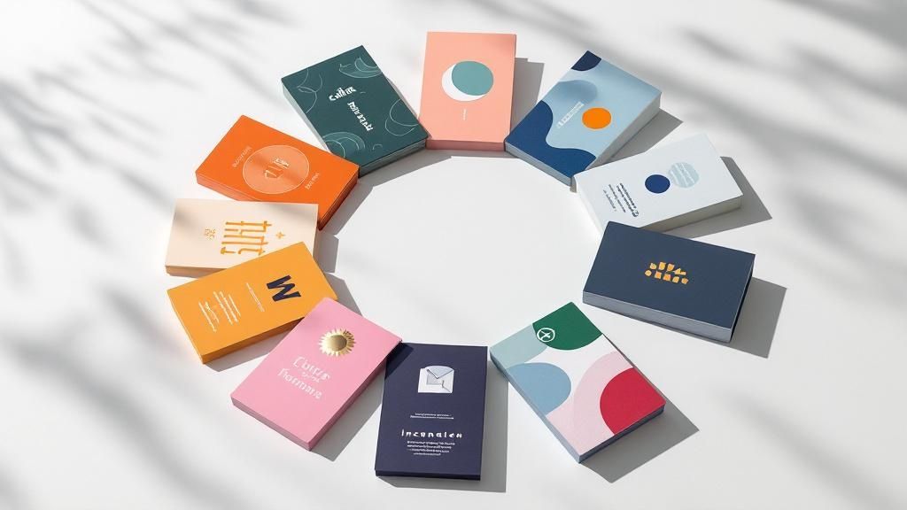
In a world saturated with digital noise, a physical business card makes a tangible statement. But a generic design can easily get lost in a wallet or desk drawer, failing to leave a lasting impression. It's time to move beyond the standard name-and-number format and explore card design ideas that do more than just share information. The best cards tell a story, spark curiosity, and build a memorable brand connection from the very first handshake.
This article rounds up nine distinct, actionable approaches to card design, tailored for small businesses, marketing teams, and designers ready to create something exceptional. We'll break down the strategy behind each concept, from the powerful simplicity of minimalist layouts to the engaging appeal of interactive elements. Many of these concepts draw from foundational principles, and to truly master them, it's essential to understand the broader best practices for user interface design, which often inform effective physical design.
We provide practical steps and real-world examples to inspire your next project. Let's explore how a small piece of cardstock can become your brand’s most powerful networking tool.
1. Minimalist Card Design
Minimalist card design is a powerful approach that prioritizes clarity and function by stripping away non-essential elements. This "less is more" philosophy, championed by pioneers like Dieter Rams and the Apple design team, uses generous white space, clean typography, and a limited color palette to direct user attention precisely where it's needed. The goal is to present information in an elegant, uncluttered, and highly readable format, ensuring the core message is delivered without distraction.
This method is one of the most effective card design ideas for brands aiming to convey sophistication and efficiency. By focusing on fundamental content and strong visual hierarchy, minimalist designs reduce cognitive load, making it easier for users to process information and take action.
Why It Works
The strength of minimalism lies in its universal appeal and focus on usability. Think of the clean, intuitive interfaces of platforms like Medium or the simple elegance of an Airbnb listing card. These designs succeed because they make information accessible and aesthetically pleasing. A minimalist card feels intentional and professional, building trust and enhancing the user experience.
How to Implement This Idea
To successfully execute a minimalist design, concentrate on these core principles:
- Embrace White Space: Use ample padding and margins around elements. This creates a sense of calm and helps guide the user’s eye to the most important content.
- Simplify Your Color Palette: Stick to one or two primary colors against a neutral background. High-contrast combinations (like black text on a white background) are crucial for readability.
- Prioritize Typography: Choose a clean, legible font family and establish a clear typographic hierarchy. Use size, weight, and color to differentiate between headings, body text, and calls to action.
- Focus on a Single Action: Each card should ideally have one primary purpose. Whether it's to "Read More," "Add to Cart," or "View Details," a single, clear call-to-action (CTA) prevents confusion and improves conversion rates.
2. Card-Based Grid System
A card-based grid system organizes content into a collection of uniform containers arranged in a responsive grid. This layout approach, popularized by platforms like Pinterest and frameworks like Bootstrap, creates a highly scannable and visually consistent interface. It allows for flexible content presentation, ensuring that information remains orderly and accessible across various screen sizes, from large desktops to small mobile devices.
This method is one of the most practical card design ideas for displaying large amounts of diverse content, such as product listings, portfolios, or news articles. By packaging each piece of information into a self-contained card, the system maintains a clean structure while allowing each item to be treated as a distinct entity, complete with its own image, text, and actions.
Why It Works
The strength of a grid system lies in its scalability and inherent organization. Think of the Dribbble showcase or a Trello board; both use cards in a grid to present complex information in a digestible format. This modular design is intuitive for users, as it follows a predictable pattern that makes browsing and comparing items effortless. It also simplifies responsive design, as cards can reflow into different column counts to fit any viewport.
How to Implement This Idea
To effectively implement a card-based grid system, focus on these key elements:
- Ensure Consistent Sizing: Use a consistent aspect ratio or dimensions for all cards to create a visually harmonious grid. This predictability helps users scan content quickly.
- Establish Clear Spacing: Apply adequate and uniform spacing (gutters) between cards. This prevents the layout from feeling cramped and helps distinguish individual content blocks.
- Implement Proper Breakpoints: Define how the grid adapts to different screen sizes. For example, a four-column grid on a desktop might become a two-column grid on a tablet and a single column on a mobile phone.
- Add Interactive Feedback: Incorporate hover states or subtle animations to indicate interactivity. A slight shadow lift or a color change can signal to users that a card is clickable, improving usability.
3. Interactive Hover Effects
Interactive hover effects transform static cards into dynamic, engaging elements that respond directly to user input. By adding subtle animations, transitions, and visual feedback when a user's cursor hovers over a card, you create a more immersive and satisfying experience. This approach provides immediate, intuitive cues, guiding users and making the interface feel more alive and responsive.
These micro-interactions are one of the most powerful card design ideas for capturing user attention and encouraging exploration. This technique makes a digital interface feel less like a flat document and more like a tangible, interactive space, which can significantly boost engagement and click-through rates.
Why It Works
The effectiveness of interactive hover effects lies in their ability to provide instant visual feedback. Think of the portfolio cards on Behance that zoom in slightly or reveal project details, or the GitHub repository cards that highlight key information on hover. These effects make the user feel in control and confirm that an element is clickable, improving usability and adding a layer of professional polish that delights users.
How to Implement This Idea
To add compelling hover effects to your cards, focus on subtlety and performance:
- Keep Animations Swift: Aim for transition durations under 300ms. This is fast enough to feel responsive without being jarring or causing delays.
- Prioritize Performance: Use CSS properties that are hardware-accelerated, like
transformandopacity, instead oftop,left, ormargin. This ensures smooth animations that don't strain the browser. - Reveal Secondary Information: Use hover states to display extra details, action buttons, or quick-view options. This keeps the initial card design clean while offering more context on demand.
- Provide Mobile Fallbacks: Since hover states don't exist on touch devices, ensure all essential information and actions are accessible on the card's default state. The hover effect should enhance the experience, not hide critical functionality.
4. Gradient and Glass Morphism
Gradient and glass morphism is a contemporary design trend that uses semi-transparent, blurred backgrounds to create a "frosted glass" effect. This style adds depth and a layered, tactile feel to interfaces by allowing background elements to be partially visible through the card. Popularized by systems like Apple’s iOS and Microsoft's Fluent Design, this approach combines soft gradients, subtle shadows, and a light border to make UI elements appear as if they are floating on the surface.

This aesthetic is one of the most visually engaging card design ideas for modern digital products, offering a sophisticated look that feels both futuristic and intuitive. The transparency connects the user to the content behind the card, creating a more cohesive and immersive experience.
Why It Works
The appeal of glass morphism lies in its ability to create a clear visual hierarchy while maintaining a light, airy feel. The blur effect separates foreground content from the background without completely obscuring it, adding context and visual interest. When used correctly, it makes an interface look clean, modern, and interactive, as seen in the widgets on macOS Big Sur or the Spotify desktop app.
How to Implement This Idea
To effectively apply gradient and glass morphism, focus on balancing aesthetics with usability:
- Set the Right Transparency and Blur: Use a background blur effect combined with low opacity on the fill color. The key is finding a blur level that makes text readable while still hinting at the background.
- Add a Subtle Border: A 1-pixel, semi-transparent white border helps define the card's edges, making it "pop" from the background and catching light like real glass.
- Use Gradients Wisely: Incorporate subtle, multi-toned gradients in the background to add color and visual appeal. Avoid overly vibrant or complex gradients that could distract from the content.
- Ensure High Contrast for Content: Because the background can be complex, it's crucial that text and icons have high contrast. Test readability against various backgrounds to ensure accessibility for all users.
5. Illustrated Card Design
Illustrated card design infuses personality and visual storytelling into a user interface by incorporating custom illustrations, icons, or playful graphic elements. This approach moves beyond pure functionality to create an emotional connection, using artwork to clarify complex ideas, guide user actions, and make the digital experience more engaging and human. It’s about blending artistry with information to communicate a brand's unique character.
This method is one of the most expressive card design ideas for brands wanting to stand out and create a memorable, friendly user experience. By replacing generic stock photos or simple icons with custom artwork, illustrated designs make interfaces feel bespoke and delightful, capturing attention and improving user comprehension in a visually rich way.
Why It Works
The power of illustrated design lies in its ability to communicate abstract concepts and brand personality instantly. Think of the friendly, helpful illustrations used in Slack’s feature cards or the quirky, encouraging graphics in Mailchimp’s dashboard. These designs succeed because they make technology feel approachable and less intimidating, building a positive association with the brand while effectively explaining features or processes.
How to Implement This Idea
To integrate illustrations effectively, focus on cohesion and performance:
- Maintain Style Consistency: Develop a distinct illustration style guide. All graphics, from simple icons to complex scenes, should feel like they belong to the same visual family to create a cohesive brand experience.
- Optimize for Performance: Ensure all image files are compressed to reduce load times. Use modern formats like WebP where possible and always optimize image dimensions for their container.
- Use SVGs for Scalability: For icons and simple graphics, use Scalable Vector Graphics (SVGs). They are resolution-independent, ensuring they look sharp on any screen, and typically have a smaller file size than raster images.
- Align Art with Content: Illustrations should support and enhance the message, not distract from it. Ensure the artwork is directly relevant to the card's content and helps clarify its purpose.
6. Data Visualization Cards
Data visualization cards transform complex data, metrics, and analytics into digestible, visually engaging formats. Pioneered by platforms like Google Analytics and Tableau, this approach uses charts, graphs, and key performance indicators (KPIs) within a card layout, making it ideal for dashboards and reporting interfaces. The primary goal is to present quantitative information clearly and concisely, allowing users to understand trends and insights at a glance.
This method is one of the most functional card design ideas for applications that need to communicate data-driven stories. By embedding visualizations directly into the UI, these cards make analytics more accessible and actionable, turning raw numbers into meaningful information that can inform business decisions.
Why It Works
The power of data visualization cards lies in their ability to simplify complexity. Instead of forcing users to parse dense tables or spreadsheets, these cards offer immediate visual context. Think of the HubSpot reporting dashboard or Mixpanel's insight cards; they succeed because they make it easy to spot patterns, compare metrics, and monitor performance without overwhelming the user. A well-designed data card feels insightful and authoritative, enhancing user engagement with analytical tools.
How to Implement This Idea
To create effective data visualization cards, focus on clarity and context:
- Choose the Right Chart Type: Select a visualization that best represents the data. Use bar charts for comparisons, line charts for trends over time, and pie or donut charts for compositions.
- Highlight Key Metrics: Make the most important number or KPI the focal point. Use larger font sizes or a contrasting color to draw immediate attention to the primary insight.
- Provide Clear Context: Always label your axes, include units of measurement (e.g., $, %, users), and use titles or short descriptions to explain what the data represents.
- Use Consistent Color Coding: Assign specific colors to different data categories and use them consistently across all cards. This helps users quickly interpret charts and recognize patterns.
7. Content-First Card Design
Content-first card design is a user-centric approach where the layout and visual styling are built around the information itself, rather than forcing content into a pre-designed template. Popularized by content-heavy platforms like Medium and The New York Times, this philosophy ensures that typography, spacing, and hierarchy all serve a single purpose: to make the content as clear, readable, and digestible as possible. The aesthetic choices are dictated by the needs of the information.
This method is one of the most practical card design ideas for blogs, news aggregators, or any interface where information consumption is the primary goal. By prioritizing readability, content-first design enhances user engagement and ensures the core message is effectively communicated without visual interference.
Why It Works
The strength of this approach lies in its respect for the user's time and attention. When a card is designed to present information clearly, it reduces cognitive friction and builds trust. Think of the article preview cards on A List Apart or Smashing Magazine; they succeed because they allow users to quickly scan headlines, summaries, and metadata to decide what to read next, creating a seamless and efficient browsing experience.
How to Implement This Idea
To successfully execute a content-first design, focus on making the text the star of the show:
- Establish a Strong Typographic Hierarchy: Use distinct sizes, weights, and styles for headings, subheadings, and body text to guide the user's eye through the information logically.
- Optimize for Readability: Choose a highly legible font and maintain a comfortable line height (typically between 1.4 and 1.6). Ensure body text is at least 16px to be easily readable on all devices.
- Prioritize Scannability: Use short paragraphs, bullet points, and bold text to highlight key information. This allows users to quickly grasp the card's main points.
- Test with Real Content: Design with actual headlines and summaries, not placeholder text. This reveals how the layout holds up with varying content lengths and helps you make more realistic design decisions.
8. Progressive Disclosure Cards
Progressive disclosure is a user interface design pattern that manages information complexity by revealing details gradually. Instead of overwhelming users with all the information at once, these cards present essential content upfront and allow users to access more information through interaction, such as a click or a tap. This approach keeps the initial interface clean while making deeper content accessible on demand.
This technique is one of the most intelligent card design ideas for content-rich applications. By hiding secondary information until it's requested, you create a more focused and less cluttered user experience, allowing users to scan primary content efficiently and dive deeper only when they choose to.
Why It Works
The power of progressive disclosure lies in its ability to reduce cognitive load and improve comprehension. Think of the "See more" link on a lengthy LinkedIn post or an expandable tweet on Twitter. These designs work because they respect the user's attention, presenting a digestible summary first and offering the full context upon request. This method empowers users to control their information flow, which leads to a more satisfying and efficient interaction.
How to Implement This Idea
To create effective progressive disclosure cards, focus on a clear and intuitive user journey:
- Make Expansion Obvious: Use clear visual cues like "Read More," "View Details," or icons like a downward arrow (chevron) or a plus sign (+) to indicate that more information is available.
- Prioritize Initial Content: The information visible by default should be the most critical. It must be compelling enough to encourage users to explore further.
- Provide Clear Indicators: When a card is expanded, the interactive element should change to signal its new state (e.g., a "Show Less" link or an upward-facing arrow), making the action reversible and intuitive.
- Optimize for Touch Targets: Ensure that the interactive elements for expanding and collapsing the card are large enough to be easily tapped on mobile devices, preventing user frustration.
9. Brand-Centric Card Design
Brand-centric card design is a strategy that embeds a company's unique identity directly into the card's visual fabric. This approach goes beyond simply adding a logo; it uses brand colors, typography, imagery style, and even personality to create a distinctive and memorable user experience. The goal is to make the card instantly recognizable as part of the brand, reinforcing identity and building a stronger connection with the audience.
This method is one of the most powerful card design ideas for companies with a strong visual identity that want to stand out in a crowded digital space. By aligning every visual element with the brand's core guidelines, these cards become powerful assets that communicate brand values, promise, and personality at a single glance.
Why It Works
The strength of this approach lies in its ability to build brand equity and foster loyalty. Think of Spotify's playlist cards, which use bold gradients and custom typography to feel energetic and modern, or Netflix's show cards that capture the specific mood of the content. These designs succeed because they create a cohesive and immersive brand experience, making every interaction feel authentic and consistent.
How to Implement This Idea
To successfully execute a brand-centric design, focus on integrating your brand's essence thoughtfully:
- Weave in Brand Colors: Use your primary and secondary brand colors strategically. Apply them to backgrounds, borders, buttons, or typographic accents to create a consistent visual language that screams your brand.
- Leverage Brand Typography: Go beyond standard web fonts. Use your specific brand typeface for headings or key text to inject personality and reinforce recognition, ensuring it remains legible.
- Infuse Brand Personality: Reflect your brand's voice and tone. A playful brand might use rounded corners and vibrant icons, while a sophisticated brand might opt for sharp lines and elegant imagery.
- Ensure Visual Consistency: The card design must feel like a natural extension of your website, app, and marketing materials. Maintain consistency in spacing, iconography, and image treatment across all touchpoints.
9 Card Design Ideas Comparison
| Card Design Type | Implementation Complexity 🔄 | Resource Requirements ⚡ | Expected Outcomes 📊 | Ideal Use Cases 💡 | Key Advantages ⭐ |
|---|---|---|---|---|---|
| Minimalist Card Design | Low - straightforward layout | Low - simple assets and typography | Clear, elegant cards with high readability | Professional services, SaaS, premium brands | Timeless look, fast loading, mobile friendly |
| Card-Based Grid System | Medium - requires responsive grid setup | Medium - uniform card assets | Consistent, organized, and scalable layout | Content galleries, product catalogs, dashboards | Excellent organization, flexible content types |
| Interactive Hover Effects | High - animations and transitions | Medium to High - CSS3, JS interactions | Enhanced engagement and interactive feedback | Portfolios, creative agencies, entertainment | Increased engagement, memorable experience |
| Gradient & Glass Morphism | High - advanced CSS with blur and transparency | High - performance optimization needed | Visually striking, modern depth effect | Music apps, weather apps, modern web apps | Trendy, depth creation, works on complex backgrounds |
| Illustrated Card Design | Medium to High - custom artwork needed | High - illustration production | Visually appealing, concept communicating | SaaS onboarding, education, children’s apps | Brand differentiation, emotional connection |
| Data Visualization Cards | High - embedded charts and real-time data | High - data integration and visualization | Clear, actionable data presentation | Business dashboards, analytics, financial apps | Quick insights, professional appearance |
| Content-First Card Design | Low - content-focused layout | Low - emphasis on typography and spacing | High readability and SEO-friendly | News sites, blogs, educational platforms | Excellent readability, accessibility compliant |
| Progressive Disclosure Cards | Medium to High - interaction design | Medium - toggles and expandable content | Reduced cognitive load, cleaner initial view | Social media, FAQs, product listings | User control, better mobile experience |
| Brand-Centric Card Design | Medium - branding integration | Medium to High - custom brand assets | Strong brand recognition and emotional impact | Consumer brands, marketing campaigns | Strong brand identity, cohesive experience |
Turn Your Inspiration Into a Tangible Asset
We've explored a diverse landscape of innovative card design ideas, moving far beyond the traditional rectangle of contact information. From the disciplined elegance of minimalist layouts and grid systems to the dynamic engagement of interactive hover effects and progressive disclosure, the potential for creativity is immense. You've seen how gradients and glass morphism can add a modern, tactile feel, while custom illustrations infuse personality and storytelling into your brand's first impression.
The core lesson is that a card is no longer just a delivery mechanism for data; it's a strategic micro-experience. It's an opportunity to demonstrate brand values, showcase complex information through clear data visualization, and build a memorable connection. Whether you adopt a content-first approach to prioritize your message or a brand-centric design to reinforce identity, your choice communicates volumes before a single word is read. A well-executed card design is a powerful business asset, a tangible piece of your brand that continues to work for you long after a meeting ends.
From Digital Concept to Physical Reality
The next critical step is translating your chosen concept from a digital file into a high-quality, physical object that feels as good as it looks. The most brilliant design can be undermined by poor execution. This is where the material, finish, and printing precision become paramount. A minimalist design, for instance, is elevated by a thick, premium card stock, while a gradient design truly pops with a high-gloss finish.
Consider these final steps to bring your vision to life:
- Align Material with Message: Does your brand stand for sustainability? Choose a recycled paper stock. Are you a luxury brand? A heavyweight cotton or suede-finish card will reinforce that perception.
- Enhance with Specialty Finishes: Don't underestimate the power of touch. Elements like foil stamping, spot UV, embossing, or die-cutting can transform a great design into an unforgettable one. These details signal quality and a commitment to excellence.
- Prototype and Proof: Always get a sample or a printed proof. Colors can appear differently on screen versus on paper. Checking the final product ensures there are no surprises and that your design is executed exactly as you envisioned.
Mastering these card design ideas means understanding that the final print is an integral part of the design process itself. Your card is a physical handshake, and its quality speaks directly to the quality of your brand. By investing in both a thoughtful design and a professional printing process, you create a networking tool that not only informs but also impresses, ensuring you leave a lasting, positive impact.
Ready to bring your visionary card design ideas to life? With 4OVER4, you can access a vast range of premium paper stocks, specialty finishes like foil and 3D lenticular, and professional-grade printing to ensure your final product is flawless. Explore our templates or upload your custom design to create a card that truly stands out.
More from

13
When you’re ready to invest in an A-frame sign, the first question you'll ask is, "What size do I need?" It usually comes down
 Emma Davis
Mar 13, 2026

113
The real secret to mastering your direct mail budget isn't complicated. It comes down to one simple fact: a standard 4" x 6&q
Emma Davis
Mar 12, 2026

63
Tear-off flyers are a classic for a reason. They’re a tangible marketing tool, designed with perforated, removable tabs at the bottom. Each
Emma Davis
Mar 11, 2026

112
Printing stickers at home is a seriously fun and rewarding project. It boils down to four main parts: designing your image, picking the right
Emma Davis
Mar 10, 2026

103
Ever seen a logo that seems to float right on the glass of a jar or bottle? That’s the work of transparent label stickers.
Emma Davis
Mar 9, 2026

59
Picture this: your product’s beautiful label gets smudged and runny during shipping, or a gorgeous event banner fades to nothing after just
Emma Davis
Mar 8, 2026

58
In a sea of options, your product's packaging and labeling are its first, and often only, chance to make a real connectio
Emma Davis
Mar 7, 2026

89
Ever tried to print a hundred high-quality flyers on your home office printer? You probably ran out of ink, dealt with paper jams, and ended u
Emma Davis
Mar 6, 2026