Table of Contents
- Home
- content hub
- Business Printing - Unique Color Theories
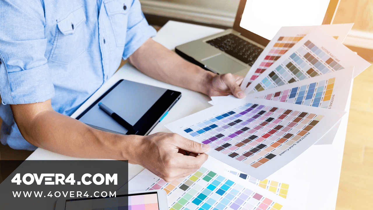
Business Printing - Unique Color Theories
May 7, 20214873 views
May 7, 20214873 views
It’s undebatable that colors change the look of prints either for the better or worse and that's why working with a print company that understands this is crucial. According to Forbes, colors can evoke a whole host of different emotions – from optimism, confidence, strength, and friendliness, to defiance, fear, anxiety, and boredom.
Colors alone can influence up to 90% of an initial impression, as said by Review42.

We have all been impressed by a print or product's color, at least I know I have. That's how powerful colors are. There are various color theories that explain what each color represents.
Different color theories
Every color shows a different aspect. A good way to understand color theories is through the color wheel which artists and designers use to develop color harmonies, mixing, and palettes.
1. Warm Colors- Colors like red, yellow, and orange are warm colors and are generally energizing, passionate, and positive. Choosing such colors as part of your logo or business card design will portray your business as bright and full of joy.
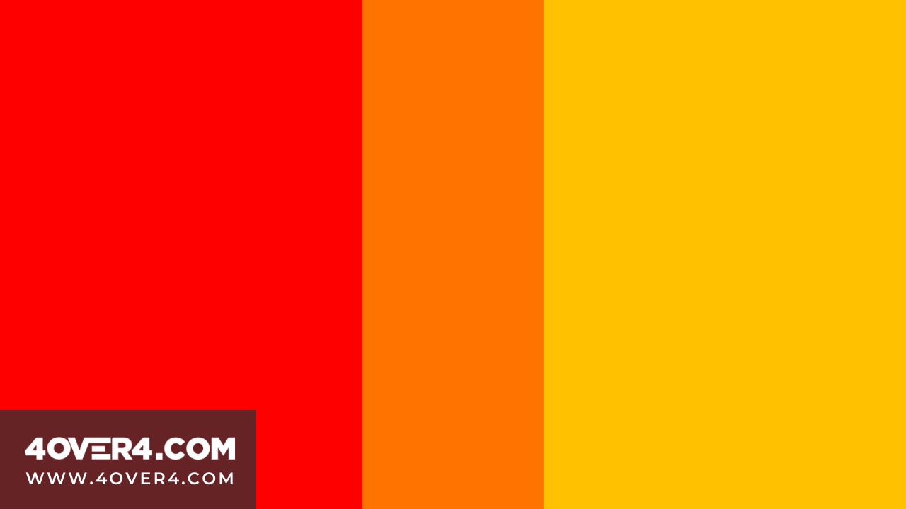
Red- Red is energetic and warm and symbolizes excitement, passion, urgency, speed, and strength. In your custom business card printing, you can use red to highlight your contact information.
Orange- It can be used to show change and signifies playfulness and fun. It also indicates warmth, enthusiasm, and balance. Its vibrancy demands attention and can be used to show health and vitality as the color is named from the actual orange fruit. It’s considered friendly and creative. It can be used by people in the spa or food industry.
Yellow- It’s the brightest and most conspicuous color among the warm colors. In color theories, yellow shows happiness. Using yellow in design can be used to show cheerfulness.
2. Cool colors- These colors are on the extreme opposite of warm colors in the wheel. The colors are green, blue, and purple, and are generally more subdued than warm colors. They are calming and relaxing.
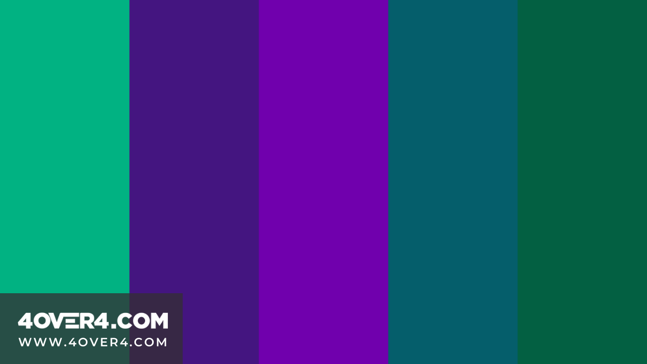
Blue- This is the main cool color and the rest of the cool colors are made by combining blue and another warm color. Light blue is friendly while dark blue shows reliability. In many cultures, blue has spiritual connotations. Using blue in your design is a sign of reliability and symbolizes stability, confidence, integrity, truth, trust, security, and power.
Green- Green color theory represents health, nature, environment, luck, money, vigor, and generosity and is associated with healing. It can also signify renewal and abundance. In design, it can be used to show wealth, nature, and stability. If you pride yourself in producing or using natural products, then green will reflect best on your prints.
Purple- Purple symbolizes luxury, dignity, nobility, royalty, power, and enlightenment. Purple is an effective color to attract young people. It is a combination of red and blue and is associated with creativity and imagination. If you own a jewelry store then incorporating purple into your design will invoke the right emotions.
3. Neutral colors- They consist of black, brown, gray, white, and cream. They are mainly the background color in designs and are combined with other colors.

Black- Black indicates seriousness and authority and is a symbol of power, elegance, wealth, formality, and sophistication. It’s the strongest neutral color. It can also be a symbol of rebellion and evil and fittingly, it's the color of Halloween and mourning. In design, black is used to convey mystery and sass and is commonly used for typography and other functional parts.
White- White indicates peace, purity, cleanliness, virtue, innocence, simplicity, and marriage and is often associated with dairy products and healthy food. When used in a design, it gives other colors a larger voice and generally creates an aesthetic look. If you work in a wellness spa or yoga, you need to incorporate white into your prints.
Gray- Gray is generally conservative and formal. Light grays are used in place of white in some designs, and dark grays are used in place of black. It is used in most designs to symbolize professionalism.
Brown- It’s a completely natural color and a warm neutral associated with dependability and reliability. It’s mostly used as a background color to bring a feeling of warmth and wholesomeness to designs.
Cream- Cream has the warmth of brown and a lot of the coolness of white. It invokes a sense of history and brings a sense of tranquility to designs.
Tips on how to Incorporate Color Theories
· Use contrast. Don't be afraid to use contrasting colors. Contrasting colors according to color theories helps people differentiate the sections in your print.
· Use your brand colors. Match your colors to your brand. This will help customers identify your prints.
· Highlight important information with color. Once you identify what your CTA is, use a color that will help it stand out and people will take notice of it.
· Avoid mixing many color theories as this will make your print look like it’s over the place. Instead, follow the 60-30-10 color theory which suggests that one neutral color makes up 60% of your design, a secondary complementary color takes up 30% and a third accent color that can be used to add emphasis takes up 10%.
To sum up…
Color theories guide you on how to incorporate different colors into your prints. The best part is that you can get free design print templates that you can change and tweak colors till you find the right balance.
Color Theories Design Illustration
You can choose to work with a company that is familiar with the different color theories and that will guide you in case you’re stuck or want to know how to pair different colors.
According to NeuroMarketing, if a good color sells, the right color sells better.
More from

15
When you think of a yard sign, the classic 18"x24" is probably what comes to mind. It’s the industry workhorse fo
![]() Emma Davis
Emma Davis
Mar 14, 2026

28
When you’re ready to invest in an A-frame sign, the first question you'll ask is, "What size do I need?" It usually comes down
![]() Emma Davis
Emma Davis
Mar 13, 2026

255
The real secret to mastering your direct mail budget isn't complicated. It comes down to one simple fact: a standard 4" x 6&q
![]() Emma Davis
Emma Davis
Mar 12, 2026

73
Tear-off flyers are a classic for a reason. They’re a tangible marketing tool, designed with perforated, removable tabs at the bottom. Each
![]() Emma Davis
Emma Davis
Mar 11, 2026

125
Printing stickers at home is a seriously fun and rewarding project. It boils down to four main parts: designing your image, picking the right
![]() Emma Davis
Emma Davis
Mar 10, 2026

114
Ever seen a logo that seems to float right on the glass of a jar or bottle? That’s the work of transparent label stickers.
![]() Emma Davis
Emma Davis
Mar 9, 2026

74
Picture this: your product’s beautiful label gets smudged and runny during shipping, or a gorgeous event banner fades to nothing after just
![]() Emma Davis
Emma Davis
Mar 8, 2026

66
In a sea of options, your product's packaging and labeling are its first, and often only, chance to make a real connectio
![]() Emma Davis
Emma Davis
Mar 7, 2026