Table of Contents
- Home
- content hub
- Mastering Business Card Colors for Your Brand
Mastering Business Card Colors for Your Brand
Sep 26, 20251569 views
Sep 26, 20251569 views

The best colors for your business card are the ones that tell your brand’s story. Think blue for trust, black for luxury, or green for growth. At the end of the day, it's about making a strategic choice that feels authentic and leaves a lasting impression, turning a simple piece of paper into a powerful networking tool.
The Hidden Power of Business Card Colors
Your business card is often the very first tangible thing someone gets from your brand. Think of it like a handshake—is it firm and confident, or does it feel flimsy and forgettable? The colors you pick play a huge part in that initial gut reaction, working on a subconscious level to communicate your brand's personality before a single word is read.
This isn't just about picking something that looks nice; it's a critical strategic decision. The right color palette can build trust, signal professionalism, and spark just enough curiosity to make someone take a second look. Get it wrong, and you might send a mixed message, come off as unprofessional, or just fade into the sea of other cards they've collected. A plain white card might be safe, but let's be honest, it rarely makes a statement.
Why Color Is Your Silent Ambassador
Every color comes with its own baggage—a whole set of psychological associations that are subtle but incredibly powerful. These connections influence how a potential client or partner feels about your business from the moment you hand them your card. Learning to speak this silent language is the first step toward designing a card that actually works for you.
Here's what your business card colors are doing behind the scenes:
- Communicating Brand Personality: Are you a bold, disruptive startup or a traditional, reliable firm? Bright, energetic colors tell a completely different story than muted, earthy tones.
- Building Instant Trust: Some colors just feel dependable. Hues like deep blue and dark gray are universally linked to stability and professionalism, making them a natural fit for corporate or financial industries.
- Enhancing Memorability: Let's face it, a unique or striking color combination is just harder to forget. In fact, studies show that people keep colored cards 10 times longer than their plain white counterparts.
- Driving Action: A pop of a strategic accent color can pull the eye directly to the most important info, like your website or a QR code, giving the recipient a gentle nudge to take that next step.
Your business card isn’t just a tool for sharing contact details; it's a miniature billboard for your brand. The colors you select are the foundation of that billboard's message, setting the stage for every interaction that follows.
Choosing the right palette is about more than just picking your favorites from a color wheel. It’s a thoughtful process of matching color psychology with your brand identity and what people in your industry expect. When you're ready to bring that vision to life, exploring professional business cards printing options ensures your carefully chosen colors pop with perfect accuracy and impact. Ultimately, a well-chosen color scheme can be the difference between a card that gets tossed and one that starts a conversation.
Decoding The Psychology Of Color In Branding
Colors speak a language all their own, sending messages and stirring up feelings long before our logical brain has a chance to catch up. The moment someone gets your business card, the colors you chose are already telling a story about your brand. This isn't just about what looks good; it's a strategic move that taps into the powerful world of color psychology.
When you understand this language, you can pick business card colors that are in perfect harmony with your brand's core message. A financial consultant who wants to project stability and trust will naturally gravitate toward different colors than a creative agency aiming to signal innovation and energy. Every color family sparks a different emotional reaction, and getting these associations right is your first step to making a killer first impression.
The Emotional Spectrum Of Business Colors
Think of colors like different personality types. Some are loud and energetic, others are calm and dependable, and a few are all about luxury and sophistication. Your goal is to find the color personality that’s a perfect match for your brand. Picking the right shade is an essential part of building strong brand awareness from that very first handshake.
For example, warm colors like red and orange are all about energy, passion, and excitement. They’re fantastic for brands that need to grab attention and project a sense of urgency or momentum. Picture a personal trainer or a fast-moving tech startup—these colors scream action.
On the other side of the spectrum, cool colors like blue and green foster feelings of calm, trust, and professionalism. They’re the go-to choices for industries where reliability is everything, like finance, healthcare, and law. These colors don't shout; they reassure.
The image below gives you a great visual of how different colors are seen in a business setting, showing the main emotions they tend to trigger.
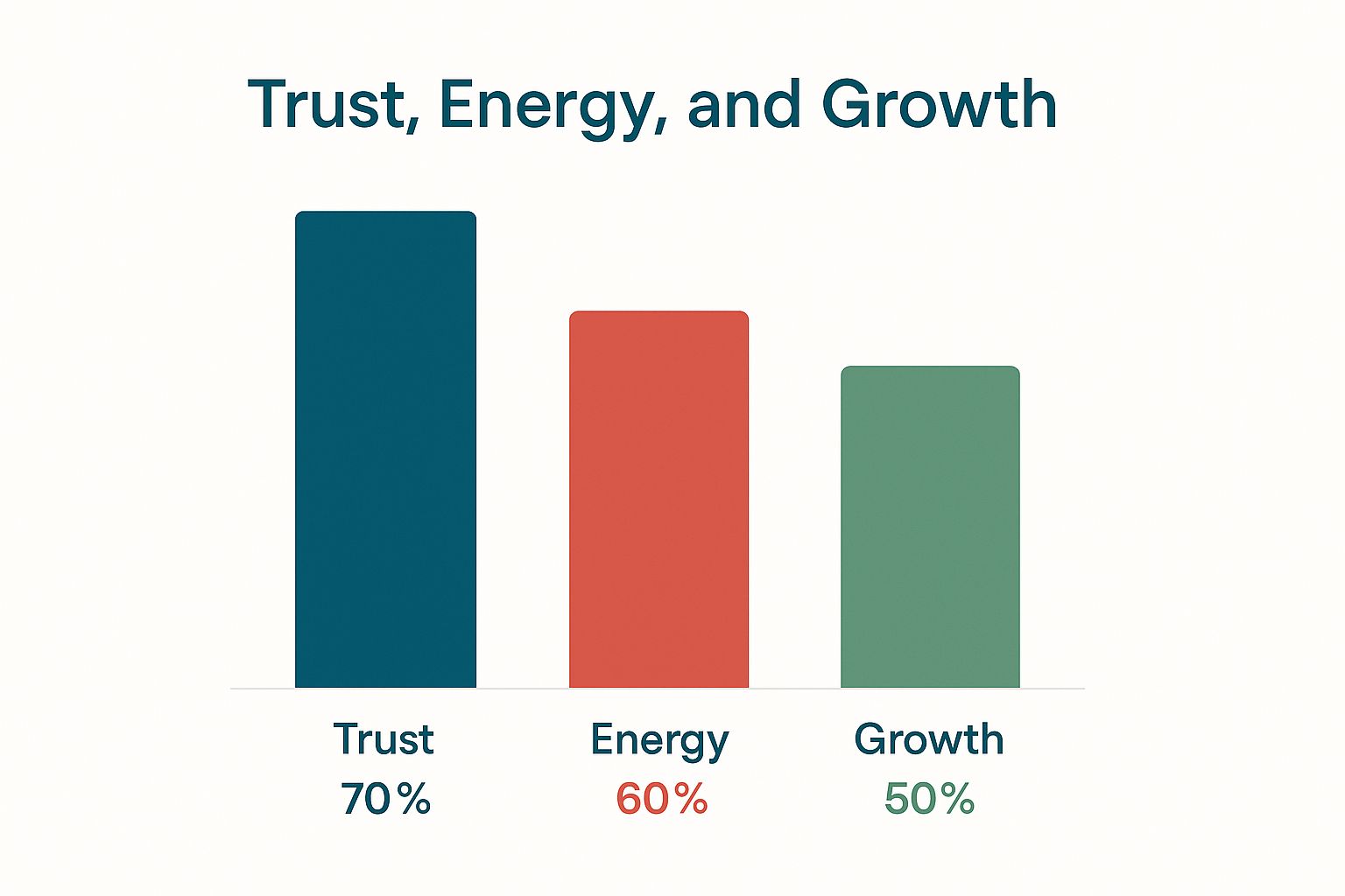
It’s clear from this that blue is a heavyweight champion for building trust, while red and green pack a punch for conveying energy and growth.
A Practical Guide To Key Business Card Colors
Let's dive into some of the most popular colors for business cards and what they’re really saying. Getting a handle on both the good and the bad associations will help you make a smarter choice that fits your brand and your industry.
To make things even easier, here's a quick cheat sheet you can use as a reference.
Business Card Color Psychology Cheat Sheet
This table breaks down common colors, what they mean in business, which industries love them, and what to watch out for.
| Color | Primary Meaning | Common Industries | Potential Pitfall |
|---|---|---|---|
| Blue | Trust, Stability, Professionalism | Finance, Tech, Healthcare, Legal | Can feel cold or overly conservative |
| Black | Luxury, Power, Sophistication | Fashion, High-End Goods, Creative Arts | Might seem intimidating or unapproachable |
| Green | Growth, Wellness, Nature, Wealth | Environmental, Health, Finance, Food | Some shades can look bland or dated |
| Red | Energy, Passion, Urgency | Food & Beverage, Automotive, Retail | Can be aggressive or alarming if overused |
| Purple | Creativity, Wisdom, Luxury | Tech, Wellness, Creative Agencies | May feel too whimsical for some markets |
| Orange | Enthusiasm, Friendliness, Fun | Youth Brands, Creative Services, Food | Can come off as cheap or unsophisticated |
| Yellow | Optimism, Clarity, Warmth | Energy, Food, Creative Industries | Can cause eye strain or seem childish |
| White | Simplicity, Cleanliness, Modernity | Healthcare, Tech, Minimalist Brands | May appear stark or lacking personality |
This guide is a great starting point, but remember that context is everything. The right shade, combined with smart design, can overcome almost any potential pitfall.
Colors For Innovation And Creativity
While blue, black, and green are corporate staples, other colors are perfect for brands that want to break the mold and communicate a message of creativity, friendliness, or forward-thinking. To see some great examples in action, check out these pieces of inspirational branding for tech companies and notice how they use color to build a distinct identity.
Purple for Vision and Wisdom: Purple is a fascinating mix, blending the calm stability of blue with the fiery energy of red. It’s often linked to creativity, luxury, and vision, making it a stellar choice for tech startups, wellness brands, and creative agencies.
Orange for Enthusiasm and Fun: Orange is vibrant, friendly, and full of life. It’s perfect for brands that want to feel approachable, cheerful, and confident. It’s less aggressive than red but still knows how to get noticed.
Yellow for Optimism and Clarity: Yellow is the color of sunshine and happiness, plain and simple. It brings up feelings of optimism, warmth, and clarity. Even a small splash of yellow can make a design feel more positive and accessible.
At the end of the day, the best business card colors are the ones that feel true to your brand's story. By understanding the psychology behind each hue, you can go beyond just picking what you like and make a strategic choice that forges a real connection from the very first glance.
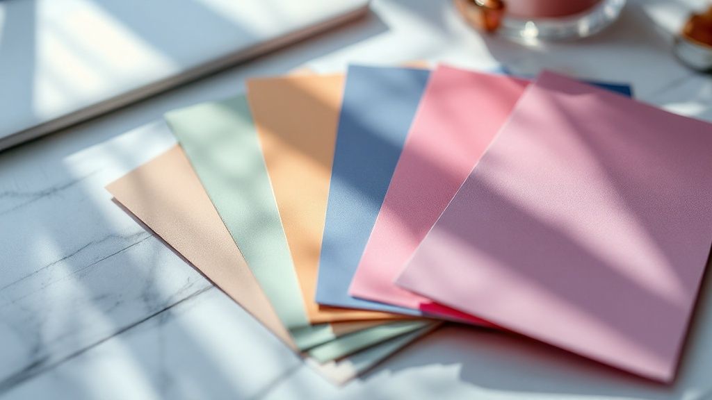
Building a Cohesive Brand Color Palette
Picking a single color based on psychology is a fantastic start, but a truly memorable brand needs more than just one note—it needs a full symphony. This is where building a cohesive color palette comes in. You’re moving from a solo act to a harmonious set of hues that work together to tell your brand's complete story.
Think of it like putting together the perfect outfit. You wouldn't just pick a shirt and call it a day; you'd coordinate everything to create a specific, intentional impression. Your business card's color scheme works the exact same way, making sure your brand looks polished and put-together.
The goal is to land on a palette that’s both versatile and consistent. These colors won't just live on your business card. They’ll show up on your website, your social media, and every other piece of marketing you create. A well-defined palette is the bedrock of a strong, recognizable visual identity.
Aligning Colors with Your Brand Identity
Before you even think about cracking open a color wheel, you need to look inward at what your brand is all about. Your business card colors should be a direct reflection of your company's mission, values, and overall personality. Are you an innovator, or are you the trusted, traditional choice?
To get started, ask yourself a few simple questions:
- What is our brand's personality? Are we playful and fun, or are we serious and luxurious?
- Who is our target audience? What colors will click with the people we want to reach?
- What message are we trying to send? Are we aiming for high energy, calm and focus, or sophistication?
Answering these questions helps you cut through the noise of endless color options and zero in on shades that genuinely represent who you are. As you build this palette, it's also crucial to remember the critical role of logo design in cementing your visual identity—your logo is often the star of your brand's color story.
Mastering Common Color Schemes
Once you have your primary brand color locked in, the next move is to build a full palette around it using some time-tested principles from color theory. These schemes are like proven recipes for creating visual harmony, giving you a structure that ensures your colors play nicely together instead of clashing.
Here are three of the most effective color schemes you can use for your business card design:
Monochromatic: This scheme is all about using different shades, tones, and tints of a single color. It creates a clean, sophisticated, and incredibly cohesive look. For example, a palette built from light blue, royal blue, and navy feels instantly unified and professional.
Analogous: This approach uses colors that are neighbors on the color wheel, like green, teal, and blue. Analogous palettes feel naturally harmonious and are very pleasing to the eye, creating a sense of calm without being quite as uniform as a monochromatic scheme.
Complementary: If you're going for a bold, high-impact look, a complementary scheme is your best bet. It uses colors that are directly opposite each other on the color wheel, like blue and orange. This pairing creates maximum contrast, making key elements pop right off the card. It's perfect for brands that want to feel dynamic and full of energy.
A great color palette is a versatile toolkit. It should give you a dominant color for backgrounds, a secondary color for key information, and a punchy accent color to draw the eye to your logo or call to action.
Ensuring Consistency Across All Platforms
Your business card is just one piece of a much larger brand puzzle. The color palette you choose has to be applied consistently everywhere your brand shows up. This repetition is what builds brand recognition and trust over time.
A customer should see the same familiar colors whether they're holding your card, scrolling through your website, or seeing one of your ads on social media. This consistency reinforces your brand identity and makes you instantly recognizable.
Think of iconic brands like Coca-Cola or Tiffany & Co.—their colors are so ingrained in our minds that we know the brand without even seeing a name. That's the power of a consistent color palette. For designs that need an extra touch of class, you can find inspiration from the unique finishes available with https://www.4over4.com/printing/category/silk-laminated-printed-products, which can beautifully showcase a well-chosen color scheme. By creating a cohesive and consistent visual language, you turn your business card colors into a powerful asset that works for your brand long after the first handshake.
Have you ever designed a gorgeous business card on your screen, only to get a box of dull, disappointing prints? It’s a common frustration. That gap between digital and physical happens when your vibrant screen colors get lost in translation during the printing process.
To make sure the colors you design are the ones you hand out, you need to peek behind the curtain at the technical side of color production.
Think of it like this: your design is the recipe, but your color settings and paper choice are the key ingredients. A fantastic recipe with the wrong ingredients leads to a kitchen disaster. Printing is no different. The most common trip-up? The battle between RGB and CMYK. Getting this right is the single most important step you can take.
The Crucial Difference Between RGB and CMYK
Your computer monitor, phone, and digital camera all create color by mixing light. They use the RGB (Red, Green, Blue) color model. It's an additive process, meaning that when you combine all three colors at full blast, you get pure white light. This is perfect for glowing digital screens, but it just doesn't work for putting ink on paper.
Printers use a completely different system: CMYK (Cyan, Magenta, Yellow, Key/Black). This is a subtractive process. Ink is layered onto a white surface, and as the colors mix, they subtract (or absorb) light. The combination of all four inks creates black. If you design in RGB and print in CMYK, the printer has to convert the colors, which often leads to them looking muted, muddy, or just... off.
Imagine trying to paint a glowing sunset with a pack of Crayola markers. You can get close, but you’ll never quite capture the brilliant, luminous quality of the real thing. That's the challenge of converting vibrant RGB light into physical CMYK ink—some screen colors just don't have a direct equivalent in the ink world.
The fix is simple: always set your design software’s color mode to CMYK right from the start. This ensures the colors you’re working with on-screen are a much more accurate preview of what will actually come off the press. No more unwelcome surprises.
Achieving Perfect Brand Consistency with Spot Colors
For brands where "close enough" isn't good enough, standard CMYK printing might not cut it. Tiny variations can happen from one print run to the next. That’s where spot colors enter the picture, with the most famous system being the Pantone Matching System (PMS).
Instead of mixing CMYK inks to approximate a color, a spot color uses a single, pre-mixed ink formula. This is your guarantee that your brand’s signature blue will be the exact same shade on every single business card, every single time.
You should think about using spot colors if:
- Your brand has a specific, legally protected color.
- You need absolute color consistency across all your marketing materials.
- Your design relies on just one or two key colors.
While it can be a bit more expensive, the investment in spot colors pays for itself with perfect, unwavering brand integrity.
How Paper Stock Transforms Your Colors
The final piece of the color puzzle is the paper you print on. The finish and texture of your business card can completely change how your colors look. The same exact ink will appear totally different depending on the surface. For a deep dive into how printing technologies work with various materials, explore this guide on digital printing services.
- Glossy Stock: This paper has a shiny, reflective coating. It makes colors pop, appearing more vibrant and saturated. It’s a fantastic choice for photo-heavy designs or bold, bright color palettes.
- Matte Stock: With its non-reflective, smooth finish, matte paper gives off a more subdued and professional vibe. Colors appear softer, and the lack of glare makes text incredibly easy to read.
- Uncoated Stock: This paper has a natural, porous texture with no coating at all. It soaks up more ink, which causes colors to look flatter and less intense. It offers a wonderful organic, tactile feel but isn't the best pick for designs that need brilliant, punchy color.
Whenever you can, ask your printer for a printed proof. This lets you see exactly how your colors and paper choice play together in the real world, giving you the final confirmation that your business cards will turn out perfect.
How Strategic Colors Boost Memorability
Picking the right colors for your business card is about so much more than just looking good. It’s a tactical move that can make or break your networking efforts. Imagine a potential client sifting through a stack of cards after a conference. Amidst a sea of generic designs, a card that pops with color acts like a powerful memory trigger, anchoring your brand in their mind long after you've shaken hands. The goal isn't just to be seen—it's to be remembered.
Think of your card as a tiny billboard fighting for prime real estate inside someone's wallet. Sure, a basic black-and-white card gets the job done by communicating information. But a card with a thoughtful color scheme? That tells a story. It creates an emotional connection. This visual flair is what separates a card that earns a second look from one that gets tossed without a thought.
Making Your First Impression Last
The numbers don't lie: color plays a huge part in how long your card sticks around. A standard, run-of-the-mill card might get chucked within a week. But add a splash of color, and its chances of survival go way up. Why? Because color makes things visually appealing, giving your card a sense of value that makes people want to hang onto it.
In fact, some studies show that colored business cards are 10 times more likely to be kept than their plain black-and-white counterparts. That's a massive boost in retention from a single design choice. It really drives home how much visual appeal influences whether someone keeps your contact info or not. You can dig into more stats on the impact of color by checking out some great insights on business card effectiveness on wavecnct.com.
The Power of Tactile Experience
But memorability isn't just about what people see; it's also about what they feel. When you pair a killer color palette with a high-quality paper stock, you create a full sensory experience that screams professionalism. A thick, textured card with deep, rich colors just feels important.
Here are a few combinations that really pack a punch:
- Deep Blues on Matte Stock: This pairing feels solid, trustworthy, and all-business. The matte finish absorbs light, making that rich blue look even deeper and more sophisticated.
- Vibrant Oranges on Glossy Stock: A glossy finish makes energetic colors like orange absolutely jump off the card. It creates a feeling of creativity and excitement that’s impossible to ignore.
- Earthy Greens on Uncoated Paper: The raw, natural texture of uncoated stock is the perfect partner for organic colors, driving home a message of wellness, sustainability, or growth.
A business card is more than just a piece of paper. It’s a physical stand-in for your brand’s quality and attention to detail. When the look and feel are perfectly aligned, you create an impression of premium value that makes someone think twice before tossing it.
At the end of the day, you want to create a card that’s both a feast for the eyes and feels substantial in the hand. That one-two punch of smart color and quality material ensures your card doesn't just get collected—it gets kept, remembered, and, most importantly, used. It’s a small detail that can pay off big time in building real, lasting professional connections.
Balancing Modern Trends with Timeless Design
Picking your business card colors often feels like a tightrope walk. You want a design that’s fresh and modern, but you also need something with real staying power. Jump on every hot trend and your card could look dated in a year; play it too safe and you risk being completely forgettable. The real magic happens when you blend a little contemporary flair with solid, timeless design.
This doesn't mean you have to shy away from what's current. Go ahead and embrace those bold, beautiful gradients that add so much depth, or try a minimalist palette where a single, electric pop of color does all the talking. Even the strategic use of negative space is a powerful way to create a clean, uncluttered look that feels confident and high-end.
The trick is to ground these modern touches in a strong foundation. When your core color palette is solid and truly reflects your brand, a trendy element like a gradient just becomes an accent—not your entire identity. This approach ensures your card will still feel relevant long after a particular style has faded.
Adopting Trends with a Timeless Twist
Instead of tearing up your design every time a new trend emerges, think about weaving in popular elements in small, strategic ways. This lets you look current without sacrificing longevity. The goal is to be fashion-forward, not a fashion victim.
Here are a few ways to strike that balance:
- Minimalism with a Punch: Start with a clean, classic layout using neutrals like gray, white, or black. Then, drop in a single, vibrant trend color for your logo, a key piece of text, or even just the painted edges of the card.
- Subtle Gradients: Forget the full-card rainbow effect. A gentle, two-tone gradient used within your logo or as a soft background texture adds just enough visual interest without screaming "I was designed in 2024!"
- Focus on Typography: A timeless font paired with a trendy color is a fantastic combination. The font provides the stability, while the color adds that contemporary edge.
A truly effective business card design doesn’t just follow trends; it adapts them. It borrows the energy and excitement of modern aesthetics while staying true to the core principles of good design—clarity, balance, and brand alignment.
By using trends as accents rather than the main event, you create a card that feels both timely and timeless. For brands that really want to make an impression, exploring a specialty printing collection can open up options like foil or embossing that pair beautifully with modern color trends.
The Growing Importance of Sustainable Color Choices
These days, a business card says more than what’s printed on it; it also speaks volumes about your company’s values. As environmental awareness grows, sustainability has become a powerful trend in its own right, directly influencing the colors and materials we choose.
Eco-friendly paper stocks, like those made from recycled or cotton fibers, often have a more natural, slightly off-white, or textured look. This pairs beautifully with earthy and muted color palettes, reinforcing a message of environmental responsibility. Opting for soy-based inks can take that story even further, showing a real commitment to green practices.
This isn’t just a passing fad; it’s a response to a serious problem. A staggering 88% of printed business cards get tossed out within a week, creating a mountain of waste. But here's the kicker: when clients receive cards made from recycled materials, they are 25% more likely to keep them, as noted by QR Code Tiger in their analysis of business card retention. Choosing sustainable materials and colors isn’t just good for the planet—it’s smart for your business.
Common Questions About Business Card Colors
Alright, let's tackle some of the common questions that pop up when you're zeroing in on the perfect business card colors. Getting these last few details right is what separates a good card from a great one, giving you the confidence to finally hit "print."
Think of this as the final checklist before your design goes live.
How Many Colors Should I Use?
For a look that’s both professional and easy on the eyes, your sweet spot is somewhere between two and four colors. A tried-and-true formula is to lean on your primary brand color, bring in a secondary accent color for a bit of pop, and use a neutral like a dark gray or an off-white for your text.
Throwing too many colors at your card can make it look chaotic and amateurish. On the flip side, being too reserved might make your card fade into the background. You're looking for that perfect balance—a tight, harmonious palette that makes your information a breeze to read and tells your brand's story at a glance.
The goal isn't to cram in every color you love. It’s about choosing a small, strategic team of colors that work together. When it comes to design, simplicity often makes the loudest statement.
What Is the Best Color to Make a Card Stand Out?
Honestly, there's no single "best" color. The right choice depends entirely on your industry and the personality of your brand. A color that’s perfect for a cutting-edge design studio would likely feel out of place for a financial advisor. The real secret to standing out is high contrast.
Here are a few ways to achieve that:
- A Pop of Accent: Use a bright, energetic color like a bold orange, a sunny yellow, or a cool teal against a more neutral backdrop. It immediately draws the eye where you want it to go.
- Premium and Minimal: Sometimes, less is more. A minimalist design printed on a unique, deeply colored paper stock can feel incredibly luxe and memorable.
- Unexpected Pairings: Don't be afraid to get a little creative. Combining colors in a fresh way, like a rich, deep purple with a soft mint green, can carve out a truly unique visual identity.
The aim is to be memorable for all the right reasons. Make sure whatever standout choice you make still feels authentic to your professional message.
Should My Business Card Background Be White?
A crisp white background is a classic for a reason—it’s a safe bet that always delivers fantastic readability and a clean, professional vibe. But it’s definitely not your only move. A colored or even a solid black background can create a striking, high-end feel when it's done right.
If you decide to go with a dark background, the key is to use a light-colored font that has enough size and weight to it. You need to create enough contrast to make sure your details are still easy to read. Also, keep in mind that printing a full-color background (what printers call a "full bleed") might cost a tiny bit more, but it almost always pays off with a much more polished and impressive final product.
Ready to create a business card that truly captures your brand? At 4OVER4, we offer a huge range of printing options, from premium paper stocks to vibrant, precise color reproduction. We'll make sure your design looks just as impressive in hand as it does on your screen. Explore our customizable business card solutions today and make an impression that lasts.
More from

8
When you think of a yard sign, the classic 18"x24" is probably what comes to mind. It’s the industry workhorse fo
![]() Emma Davis
Emma Davis
Mar 14, 2026

15
When you’re ready to invest in an A-frame sign, the first question you'll ask is, "What size do I need?" It usually comes down
![]() Emma Davis
Emma Davis
Mar 13, 2026

156
The real secret to mastering your direct mail budget isn't complicated. It comes down to one simple fact: a standard 4" x 6&q
![]() Emma Davis
Emma Davis
Mar 12, 2026

69
Tear-off flyers are a classic for a reason. They’re a tangible marketing tool, designed with perforated, removable tabs at the bottom. Each
![]() Emma Davis
Emma Davis
Mar 11, 2026

120
Printing stickers at home is a seriously fun and rewarding project. It boils down to four main parts: designing your image, picking the right
![]() Emma Davis
Emma Davis
Mar 10, 2026

105
Ever seen a logo that seems to float right on the glass of a jar or bottle? That’s the work of transparent label stickers.
![]() Emma Davis
Emma Davis
Mar 9, 2026

62
Picture this: your product’s beautiful label gets smudged and runny during shipping, or a gorgeous event banner fades to nothing after just
![]() Emma Davis
Emma Davis
Mar 8, 2026

60
In a sea of options, your product's packaging and labeling are its first, and often only, chance to make a real connectio
![]() Emma Davis
Emma Davis
Mar 7, 2026