TABLE OF CONTENTS
- Home
- content hub
- How to Design a Rack Card That Truly Converts
How to Design a Rack Card That Truly Converts
Nov 27, 2025291 views
Nov 27, 2025291 views
Before your pen hits paper—or your mouse hits the artboard—let's talk strategy. The difference between a rack card that gets results and one that just takes up space is a solid plan. Without it, you're just making a pretty piece of paper. But with a clear goal, it transforms into a powerhouse marketing tool.
Nail Down Your Goal and Audience
First things first: What do you want this card to actually do? "Get more customers" is way too vague. You need to get specific.
Are you trying to:
- Drive foot traffic to your new storefront?
- Push a limited-time 20% discount on a specific service?
- Get sign-ups for an upcoming webinar?
- Generate calls for free consultations?
Your answer shapes everything. A card for a flash sale needs bold, urgent language. A card designed to build brand awareness might tell a story with more subtle visuals.
Once your goal is crystal clear, you have to know exactly who you're talking to. A rack card for tech-savvy millennials will look and feel completely different from one targeting local retirees. Think about their pain points, what catches their eye, and what motivates them to act. A message that resonates with one group will fall flat with another.
Think of a rack card as your silent salesperson. It has about three seconds to grab the right person's attention and spark enough curiosity to get them to pick it up.
For example, a boutique hotel in a tourist town might design one card for families, highlighting the kid-friendly pool and proximity to local attractions. They’d create a completely different card for business travelers, focusing on free Wi-Fi, meeting spaces, and airport shuttle service. Same hotel, different audience, different message.
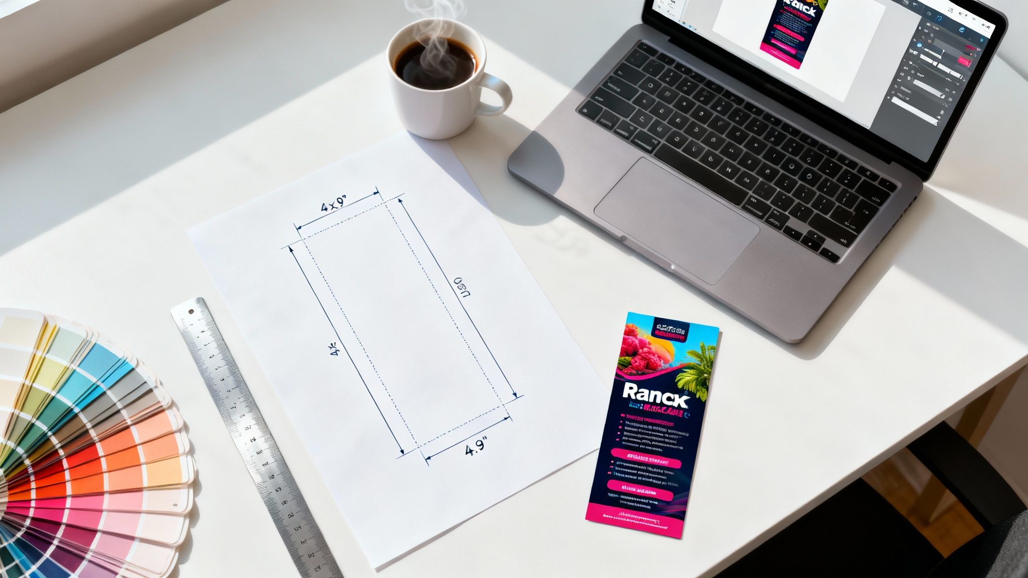
Master the Technical Specs
With your strategy locked in, it’s time to get the technical stuff right. This is where so many DIY designs go wrong, leading to frustrating and costly printing mistakes.
Rack cards are a staple in high-traffic areas like visitor centers and hotel lobbies for a reason. They're designed to fit perfectly into standard display holders, with the most common sizes being 4" x 9" and 3.5" x 8.5". This precise sizing makes them easy for people to grab and go.
This simple flow—Goal, then Audience, then Specs—is the foundation.
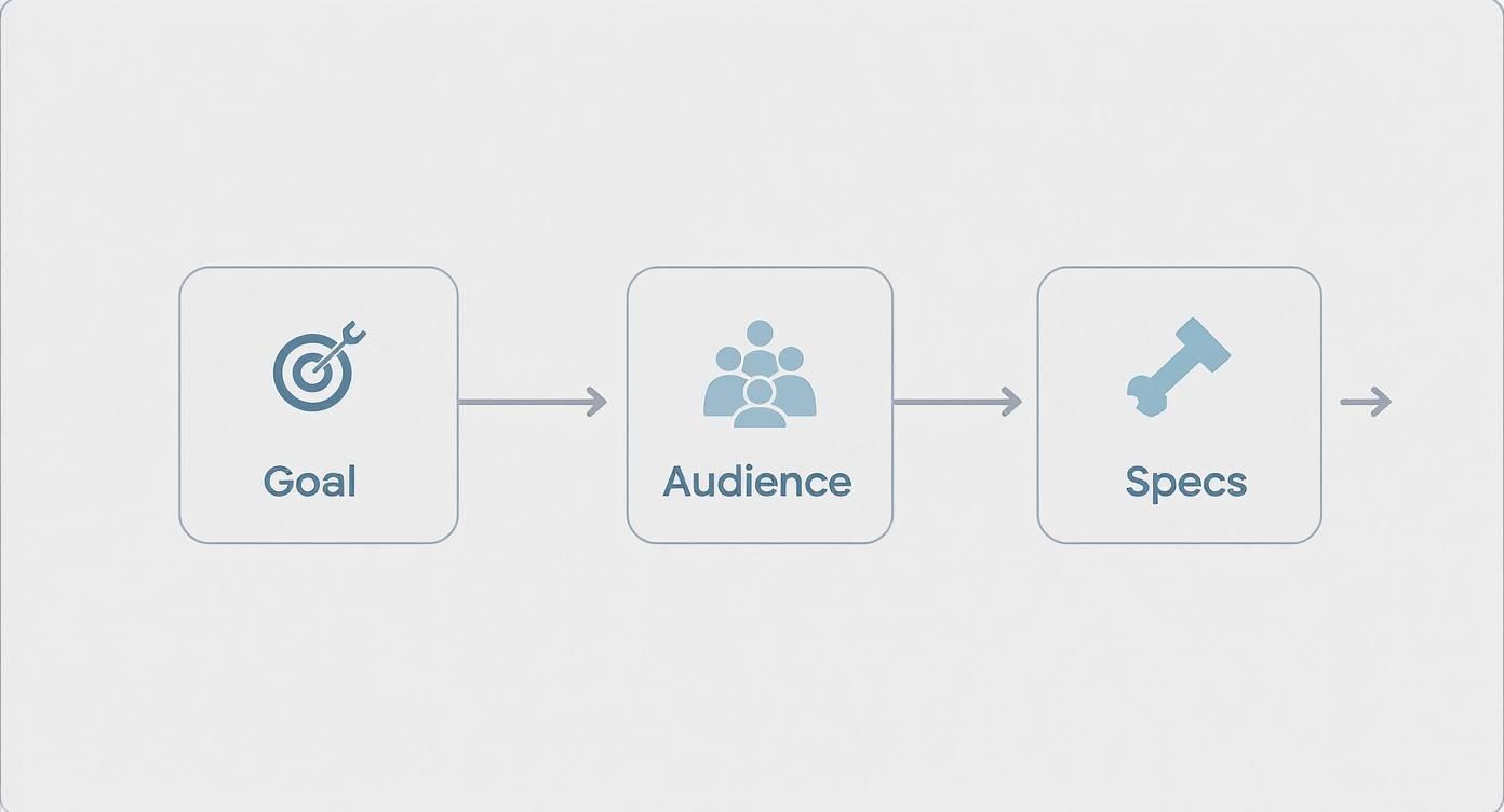
As the diagram shows, you have to figure out the "why" and "who" before you touch the "how." Beyond just the final dimensions, you have to account for two critical print concepts: the bleed and the safe zone.
- Bleed Area: This is a small extra margin (usually 0.125 inches) on all four sides. If your design has colors or images that go to the edge, you must extend them into this bleed area. It prevents any ugly white slivers from appearing after the cards are trimmed.
- Safe Zone: This is the opposite—an inner margin where you must keep all your important text, logos, and contact info. Anything outside this zone risks getting cut off during production.
Here’s a quick cheat sheet to keep the key dimensions straight for the two most common rack card sizes.
Standard Rack Card Dimensions and Print Zones
| Specification | 4" x 9" Card | 3.5" x 8.5" Card | Purpose |
|---|---|---|---|
| Final Trim Size | 4" x 9" | 3.5" x 8.5" | The actual size of the finished card. |
| Full Bleed Size | 4.25" x 9.25" | 3.75" x 8.75" | Your document size with the extra 0.125" bleed on all sides. |
| Safe Zone | 3.75" x 8.75" | 3.25" x 8.25" | The "safe" area for all your critical text and logos. |
Setting up these guides in your design software from the very beginning is non-negotiable. It’s the professional scaffolding that ensures your vision gets printed perfectly, making your rack card a standout piece among your other marketing essentials.
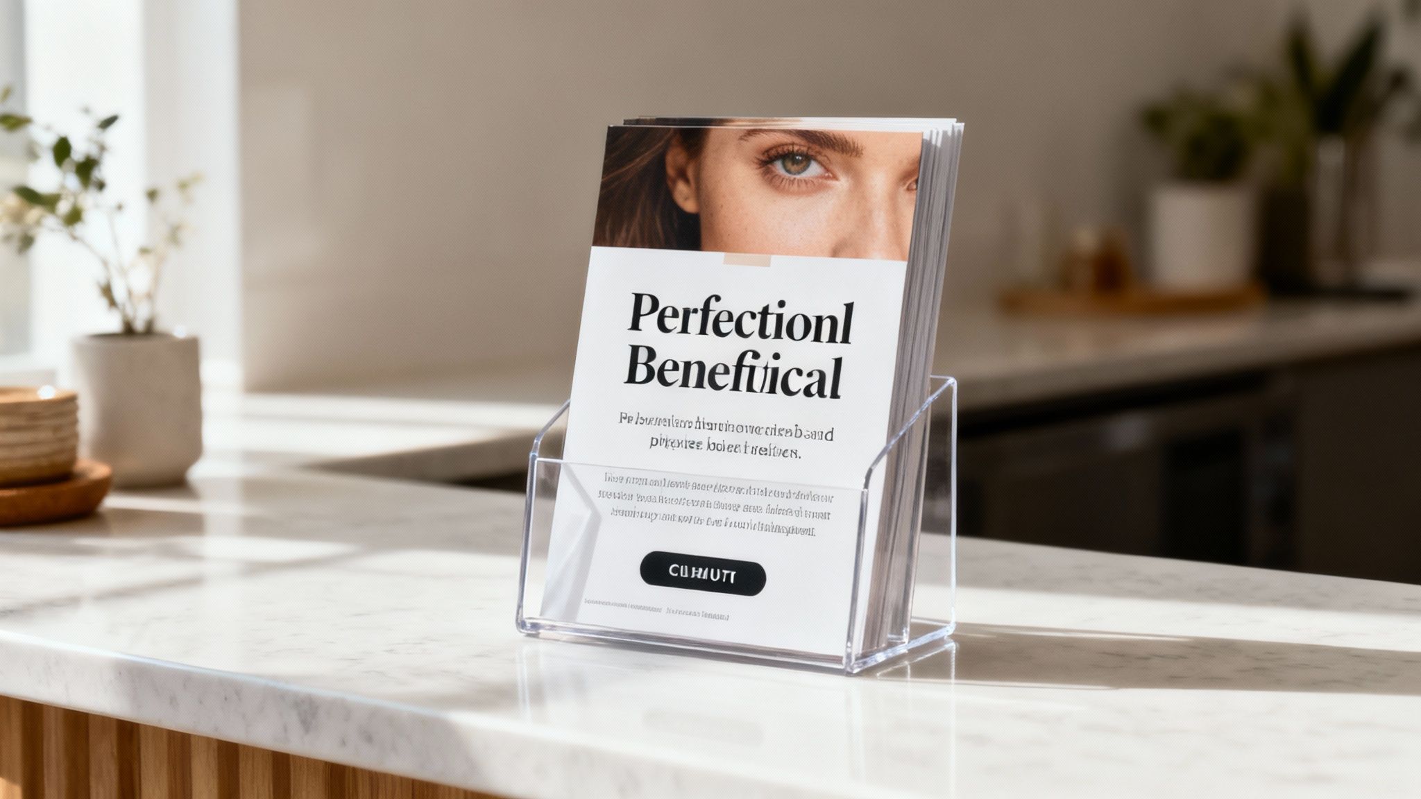
Crafting a Compelling Message and Visual Flow
You’ve got about three seconds to grab someone's attention. That’s it. In a crowded display, often only the top third of your card is even visible, peeking out from behind the others. That tiny sliver of real estate has to work overtime to stop a passerby and make them curious enough to pull your card from the rack.
This is where a magnetic, benefit-driven headline becomes your most important asset. Forget generic titles like "Our Services" or just plastering your business name at the top. You need to lead with a question, a solution, or a powerful offer that speaks directly to a potential customer's problems or desires.
Hook Them with a Powerful Headline
Think of your headline as your first handshake. A great one communicates value instantly and makes a silent promise that the rest of the card is worth their time. Get inside your audience's head—what do they really want?
Let’s look at a couple of transformations:
Instead of: "Johnson Family Dentistry"
Try: "Brighten Your Smile in Just One Visit"
Instead of: "Mountain View Hiking Tours"
Try: "See the Summit Before Lunch. Guided Hikes Daily."
See the difference? The second options are active, benefit-focused, and create a little intrigue. They don't just state what you are; they state what you can do for the customer. This simple shift is the key to designing a rack card that actually converts, not just informs.
A powerful headline doesn’t sell a service; it sells an outcome. People don’t buy a gym membership, they buy confidence. They don’t buy a financial plan, they buy peace of mind.
This approach immediately frames your business as a problem-solver, making you far more engaging than just another company in the rack.
Structure Your Message for Skimming
Once your headline has done its job, the reader will scan the rest of the card. People almost never read marketing materials word-for-word. They skim for the important stuff, so your layout has to accommodate this behavior. Walls of text are the fastest way to lose someone's interest.
Break your content into digestible chunks using:
- Short Sentences: Keep your language direct, clear, and punchy.
- Bullet Points: Perfect for listing key features, benefits, or next steps. They're visually easy to scan.
- Subheadings: Use them to guide the reader through different pieces of information.
- White Space: Don't be afraid of empty space! It makes the design feel clean, organized, and much less intimidating.
Think about a logical flow. Start with the hook (the problem), introduce your solution, highlight the best parts, and then tell them exactly what to do next. This structured path respects the reader's time and helps your message stick.
The various styles, paper stocks, and finishes available give you a huge canvas for creative expression when you design your rack card.
As you can see, different finishes like gloss or matte can completely change the visual impact and feel of the final printed piece.
Guide the Eye with Visual Hierarchy
Visual hierarchy is simply the art of arranging design elements to show what's most important. Without it, everything on the card screams for attention at once, and nothing ends up standing out. When you design a rack card, you're the director, telling the reader's eyes exactly where to look and in what order.
Here are the tools of the trade:
- Font Size and Weight: Your headline should be the biggest, boldest text on the card. Subheadings get a step down, and body copy is the smallest. This creates an immediate sense of order.
- Color: Use a bold, contrasting color for your call-to-action or a key offer to make it pop. Your brand's color palette should guide these choices to keep things consistent.
- Imagery: A single, high-quality, compelling photo is almost always more effective than several small, cluttered ones. Your main image should support the headline and spark the right emotion.
To make sure your rack card truly represents your brand and makes a lasting impact, you might even incorporate some innovative event branding ideas into your visual strategy.
Compel Action with a Clear CTA
This is it—the final, and arguably most important, piece of the puzzle: the Call-to-Action (CTA). This is where you turn a reader's interest into a real, measurable result. A weak CTA like "Learn More" is passive and uninspired. A strong one is specific, urgent, and compelling.
An effective CTA tells people exactly what to do next and gives them a good reason to do it now. For instance, instead of just printing your URL, a CTA might say, "Scan to Book Your Free Consultation." These tactics are just as effective on other marketing materials, which you can see in our guide to flyer printing.
Here are a few powerful CTA examples:
- "Bring this card for 15% off your first order!"
- "Call today to schedule your tour."
- "Visit our website to see the full gallery."
- "Scan the QR code to download the menu."
Your CTA should be impossible to miss. Put it in a box, use a different color, or surround it with plenty of white space. It’s the final instruction you give the reader, so make it count.
Getting the Technical Details and Colors Just Right
This is where the rubber meets the road. Getting the technical details right is what separates a DIY-looking piece from a professionally printed rack card that truly pops. We’re shifting gears from the creative message to the nitty-gritty production requirements that ensure what you see on screen is exactly what you get in your hand. Trust me, skipping these steps is a recipe for fuzzy images, weird colors, and wasted money.
First up, let's talk about color, because it's one of the biggest gotchas in print design. Your computer screen and a printing press speak two completely different languages. Screens use RGB (Red, Green, Blue), a color model that creates colors by mixing light. It’s perfect for websites and digital photos, but it’s a no-go for print.
Printers, on the other hand, use CMYK (Cyan, Magenta, Yellow, Key/Black). This is a subtractive model where colors are created by mixing physical inks on paper. If you design your rack card in RGB and send it to print, the file has to be converted. That conversion is often where things go wrong, and that vibrant electric blue on your monitor can easily turn into a dull, muddy navy on the final card. It's a truly disappointing moment when you open that box of freshly printed cards.
Setting Up for Print Success
The only reliable way to guarantee color accuracy is to start your design document in CMYK mode from the very beginning. Every professional design program out there—from Adobe Illustrator to Affinity Designer—gives you this option when you create a new file. Making this your first click is non-negotiable for print work.
Right alongside color mode, resolution is king. For print, the industry standard is a crisp 300 DPI (Dots Per Inch). This ensures every image and line of text is sharp and clear. Anything lower, like the 72 DPI commonly used for web images, will look pixelated and blurry once it hits the paper.
Key Takeaway: Before you place a single element, set up your design file with these two specs: a CMYK color profile and a 300 DPI resolution. This simple, foundational step prevents the most common and costly printing mistakes I see people make.
If you're just starting out or working on a tight budget, there are some great free graphic design software options that support these professional print settings, so you don't need a major investment to get it right.
Choosing a Palette with Purpose
Your color choices do more than just make your card look pretty; they trigger emotional responses and communicate your brand's personality almost instantly. A spa might lean into calm blues and greens to evoke tranquility, while a high-energy music festival would go for bold reds and oranges to create a sense of excitement.
When you're building your color palette, keep these pointers in mind:
- Stick to Brand Colors: Consistency is your best friend. Your rack card should feel like it belongs to the same family as your website, social media, and other marketing materials.
- Use Contrast Wisely: This is all about readability. Make sure your text is crystal clear against its background. Dark text on a light background (or the other way around) is always a safe, effective bet.
- Limit Your Palette: Too many colors can make a design feel chaotic and amateurish. I usually recommend sticking to two or three primary colors and then using different shades or tints of those for variation.
Think about the psychology behind your choices. Studies have shown that color can influence purchasing decisions by up to 85%. Blue often signals trust and security, yellow suggests optimism and fun, and black can convey luxury and sophistication. Pick colors that align with the message you want to send and the action you want your audience to take.
Finalizing Your File for the Printer
Once your masterpiece is complete, the way you save and submit your file is the final technical hurdle. Formats like JPG or PNG might be your go-to for the web, but they aren't ideal for professional printing because they often compress image data, which can lead to a loss of quality.
The universally preferred format for any print shop is a high-quality PDF (Portable Document Format). A PDF is like a locked box—it preserves all of your design elements exactly as you intended them, including fonts, images, colors, and layout. This ensures that what you see is what the printer sees, eliminating any unwelcome surprises. Modern digital printing processes really depend on properly formatted files to deliver the best results.
Before you export, do a quick check to make sure you've embedded all your fonts or converted unique text to outlines. This prevents any font substitution errors on the printer's end. Finally, double-check that your design extends all the way to the edge of the bleed area. Sending a print-ready PDF is the final handshake that tells your printer you're ready for a flawless production run.
Choosing Paper and Finishes That Get Noticed
The way your rack card feels in someone's hand says a lot about your brand before they even read a single word. Ever been handed a business card so thin and flimsy it felt like it might just dissolve? It doesn't exactly scream "quality."
A substantial, well-finished card, on the other hand, conveys professionalism and signals that you care about the details. This tactile experience is one of your most underrated tools when designing a rack card that needs to stand out from a sea of competitors. It's a small thing that makes a big difference.
Selecting the Right Paper Weight
When you’re looking at printing options, you’ll see terms like 14pt and 16pt cardstock. These "points" just refer to the thickness of the paper—the bigger the number, the thicker and more rigid the card.
While 14pt is a perfectly respectable, solid industry standard, stepping up to 16pt gives your rack card a noticeable increase in heft and durability. It feels more substantial in the hand and is far less likely to get bent, creased, or damaged in a crowded display holder. That perceived durability can directly translate into how a potential customer views your business. It subtly suggests you're established and invested in your brand.
The physical weight of your rack card directly influences its perceived value. A heavier card feels more important, making it more likely to be kept rather than discarded.
For any business aiming for a premium feel—think luxury brands, high-end services, or exclusive events—the small extra cost for a thicker stock is an investment that pays off. It's an easy win for making a killer first impression.
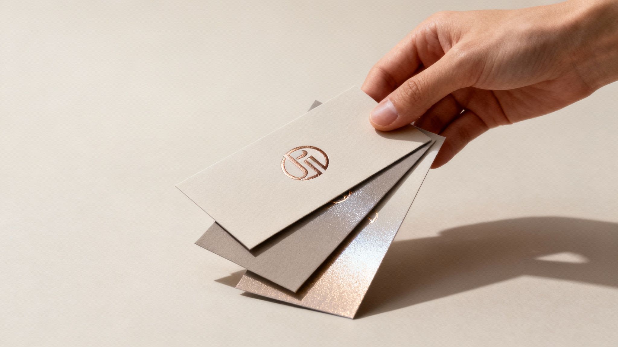
Unpacking Your Finish Options
The finish is the coating applied after printing. It’s not just for show; it protects the ink but also completely changes the card's look and feel. The right choice really comes down to your design and brand identity.
Here’s a quick rundown of the most common choices:
- High Gloss UV: This is that super shiny, almost wet-looking coating that makes colors pop. It’s perfect if your design is packed with vibrant photos or bold, saturated colors. The slick surface is also great for protecting against smudges and moisture.
- Matte Finish: For a more modern, understated vibe, a matte finish is the way to go. It has a smooth, non-reflective surface that feels soft to the touch and reduces glare, making text much easier to read. It just screams sophistication.
Think about the context. A glossy finish might be perfect for a rack card advertising a high-energy tourist attraction, while a high-end spa would probably lean into the calming, elegant feel of a matte finish.
Adding a Touch of Luxury with Specialty Finishes
If you really want your rack card to command attention, specialty finishes are where the magic happens. These options add visual and tactile texture that makes people stop, look closer, and actually touch your card.
One of the most effective techniques is Spot UV. This is where a high-gloss UV coating is applied to specific parts of your design—like a logo, a headline, or an icon—while the rest of the card stays matte. The contrast between the shiny, slightly raised area and the flat background creates a stunning effect that’s hard to ignore.
For those interested in this technique, you can explore more about Spot UV printed products to see just how much it can elevate your marketing. This little trick is a fantastic way to highlight the most important part of your message and add a memorable, premium feel to your design.
Merging Print Marketing with Digital Tools
A modern rack card shouldn’t be a dead end. Think of it as a direct bridge to your digital world. The real goal is to turn that small piece of paper into an interactive experience, transforming a passive glance into active online engagement. This is how you prove your print marketing is pulling its weight in a data-driven way.
The most common tool for this job is the QR code. But just slapping a generic black-and-white square on the back of your card is a huge missed opportunity. When you're designing a rack card, treat the QR code as a deliberate design element, not an afterthought.
Make Your QR Code a Design Feature
Instead of treating it like some technical requirement, work your QR code right into your visual branding. Not only does this look a thousand times more professional, but it also makes it much more inviting to scan. We've seen a huge shift where QR codes are now being creatively woven into layouts, often matched with brand colors or framed by graphic elements to stand out. It’s all about offering a direct link to digital content without disrupting the design. Learn more about how business card trends are evolving on vistaprint.ca.
Consider these simple but effective techniques I've seen work well:
- Brand Colors: Ditch the standard black and use one of your primary brand colors instead.
- Custom Frame: Place a simple, branded frame around the code with a short, punchy call-to-action like "Scan Me!"
- Logo Integration: Many QR code generators now let you place a small version of your logo right in the center.
These small touches make the code feel intentional and part of the overall design, which dramatically increases the chances of it getting scanned.
Send Scanners to Smart Destinations
Where the QR code sends people is just as important as how it looks. Don't just link to your homepage and hope for the best. Be strategic. Send users to a destination that directly relates to the card's specific message.
A QR code is a promise of value. If someone takes the time to scan it, the destination must deliver an immediate, relevant payoff. A generic homepage almost always breaks that promise.
Instead of your homepage, try linking to a:
- Special Landing Page: Create a page exclusively for rack card holders, maybe with a unique offer.
- Video Tour: Show off your space, a product demo, or a powerful customer testimonial.
- Sign-Up Form: Make it dead simple for them to join your newsletter or register for an event.
- Direct Booking Link: Send them straight to your calendar to schedule a consultation or appointment.
Each of these destinations is specific, actionable, and moves the potential customer one step closer to converting.
Track Your Campaign Success
So, how do you know if your rack cards are actually working? You build tracking directly into your digital links. This is where you get the concrete data to measure your return on investment (ROI).
One powerful method is using a vanity URL. Instead of a long, clunky link, use a short, memorable one like YourBrand.com/Offer. It's easier for someone to type in manually and can be tracked to see exactly how many website visits came from your cards. Another fantastic tool is a unique discount code. By printing a specific code (e.g., "RACKCARD20") on the card, you can precisely measure how many sales were generated by that specific print run.
For campaigns with multiple locations or offers, you can take this a step further. Explore how variable data printing allows you to print unique codes or URLs on each card, letting you track the performance of different distribution points with incredible accuracy. This is how you design a rack card that doesn’t just look good—it gets you measurable results.
The Pre-Print Checklist You Can't Skip
That final check before you hit "send" is the moment that separates relief from regret. We've all been there. A single typo or a forgotten technical spec can turn a brilliant design into a box of expensive recycling.
This is your last line of defense. Treat it seriously.
Before your file goes anywhere, grab a fresh pair of eyes. Seriously. You’ve stared at your design for so long that your brain will automatically fill in gaps and correct errors that are still there. Ask a coworker to read every single word out loud—it’s amazing what you’ll catch when you hear it spoken.
The Human Element Proofread
This check is all about what your customer will actually read and see. Go through it with a fine-tooth comb and confirm every single detail is perfect.
- Spelling and Grammar: Read every last word. Are there any typos hiding in plain sight? Does every sentence actually make sense?
- Contact Information: This is a big one. Meticulously double-check every digit of the phone number. Actually type the URL into a browser to make sure it loads correctly. Pull up the physical address on a map to verify it's accurate.
- Offer Details: Is the discount percentage right? Are the expiration dates correct? Any confusion here will only lead to frustrated customers down the line.
A simple typo in a phone number or URL doesn't just look unprofessional; it makes the entire print run useless. This 5-minute check can save you hundreds of dollars and a massive headache.
The Final Technical Review
Once the content is locked down, the last step is a quick technical once-over. This is what guarantees the final printed piece looks exactly like it does on your screen.
Make sure your design respects the bleed and safe zones provided by the printer. All your critical text and logos need to be comfortably inside that safe area so they don't get trimmed off. Most importantly, verify that every image is set to a crisp 300 DPI resolution to avoid any pixelation or blurriness. Your file should be saved as a high-quality PDF in CMYK color mode. Run through this list, and you'll have a flawless handoff to the printer.
Got Questions About Designing Your Rack Card?
When you’re gearing up to design a new rack card, especially for the first time, a few questions always seem to surface. It’s completely normal. Let's walk through some of the most common hurdles so you can get started with confidence.
One of the first things people ask is about design software. Do you really need to shell out for a professional program like Adobe Illustrator? While the pros stick to tools like that for maximum control, you can absolutely create a print-ready file with more accessible options. Platforms like Canva have stepped up their game, now offering CMYK color profiles and the ability to set up your design with proper bleed—making them a totally viable choice. The non-negotiable part is that your chosen tool must be able to export a high-resolution PDF at 300 DPI.
Another big decision is whether to hire a graphic designer. If you've got a good eye for design and a solid grasp of your brand’s look and feel, going the DIY route is a fantastic way to keep costs down. On the other hand, if you're crunched for time or feel a bit lost when it comes to layout and visual hierarchy, bringing in a professional is an investment that pays off. A pro can deliver a much more effective marketing tool right out of the gate.
Is Print Marketing Even Worth It Anymore?
In a world saturated with digital ads, it’s a fair question: do physical marketing materials like rack cards still pack a punch? The data points to a resounding yes.
Believe it or not, tangible marketing materials often cut through the digital noise more effectively. While the average website conversion rate hovers around 2.35%, some studies show physical cards can achieve a conversion rate closer to 12%. Why? A physical item creates a more immediate, personal connection. You can find more great insights into why print marketing is still so effective over at moo.com.
Think of a rack card as your silent salesperson. It works 24/7 in hotel lobbies, visitor centers, and local partner businesses—places your digital ads can’t reach. It’s there to grab attention at the exact moment a potential customer is making a decision.
What’s the Deal with Production and Timelines?
Finally, let's talk logistics. "How long will it take to get my cards?" is a question every new designer has. The turnaround time really depends on your printer and any special finishes you've chosen.
Standard printing usually takes about 3-5 business days, but if you add on specialty finishes like Spot UV or foil stamping, you can expect that to add another day or two to the process. Most online printers, including us, offer expedited shipping options if you find yourself in a time crunch. To keep things moving smoothly, always double-check that you're uploading a print-ready PDF—file errors are the most common cause of production delays.
Ready to turn that design into a reality? At 4OVER4, we specialize in printing stunning, professional-quality rack cards that get noticed. Explore our printing options and get an instant quote today!
More from

729
Full bleed printing is a simple but game-changing technique. It's how you get your artwork—whether it’s a photo, a background color, o
![]() Emma Davis
Emma Davis
Feb 3, 2026

336
Even though we live in a digital world, the humble business card is still a powerhouse networking tool. But here's something most people d
![]() Emma Davis
Emma Davis
Feb 2, 2026

1307
Staring at a wall of banner dimensions can feel a little overwhelming. But while there's no single "typical banner size" that wo
![]() Emma Davis
Emma Davis
Feb 1, 2026

397
Stretching your marketing budget doesn't mean you have to settle for flimsy, forgettable brochures. The real secret to low cost br
![]() Emma Davis
Emma Davis
Jan 31, 2026

387
Advertising magnets are one of those marketing tools that are so simple, you might overlook their power. They’re tangible, they last for age
![]() Emma Davis
Emma Davis
Jan 30, 2026

198
Tired of fighting with torn paper and sticky residue? We’ve all been there. The best way to get labels off bottles is often a simple soak in
![]() Emma Davis
Emma Davis
Jan 29, 2026

352
Want to know the real secret to getting a poster to stick to a wall without it peeling off in the middle of the night? It's all about what
![]() Emma Davis
Emma Davis
Jan 28, 2026

320
When you hear "table tent specs," what we're really talking about are the foundational details for printing them correctly: the
![]() Emma Davis
Emma Davis
Jan 27, 2026