TABLE OF CONTENTS
- Home
- content hub
- Create Outlines in Illustrator A Guide to Flawless Print-Ready Files
Create Outlines in Illustrator A Guide to Flawless Print-Ready Files
Jan 10, 20261597 views
Jan 10, 20261597 views
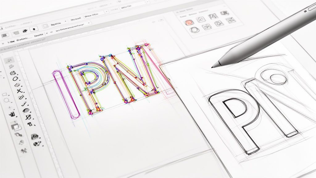
When you hear a designer talk about "creating outlines in Illustrator," they're referring to one of two things: converting live text into vector shapes or turning a path's stroke into an editable shape. For text, the keyboard shortcut is a simple Cmd/Ctrl+Shift+O. For strokes, you'll want to head to Object > Path > Outline Stroke.
This process isn't just a neat trick—it's a non-negotiable step for getting your files ready for a professional printer. Skipping it is a surefire way to run into font and scaling headaches down the line.
Why Outlining in Illustrator Is Essential for Print Design
Have you ever sent a beautiful design off to the printer, only for the proof to come back with your carefully chosen brand font swapped out for something generic like Arial? It’s a designer’s nightmare, and it almost always happens for one simple reason: the printer didn't have your specific font file installed on their system.
Creating outlines is your insurance policy against this exact problem.
When you convert text to outlines, you’re essentially freezing your editable letters into static vector shapes. The computer stops seeing "T-E-X-T" and instead sees a collection of points and lines that form the shapes of those letters. This means the appearance of your typography gets permanently locked in.
Your Professional Pre-Press Checklist
But outlining is about more than just fonts. It’s a fundamental piece of any professional pre-press workflow, ensuring your design looks consistent no matter where it's opened or how it's used.
Think about these real-world scenarios:
- Logo Integrity: A logo designed with specific stroke weights absolutely must be outlined before it gets scaled up or down. If not, a 2-point stroke that looks perfect on a business card could blow up into a massive, clunky line on a billboard, completely wrecking the design.
- Brand Consistency: When you're handing files off to different vendors, partners, or even just colleagues, outlining guarantees your typography appears exactly as you intended. No software or system compatibility issues.
- Advanced Print Production: Many specialized printing services require outlined files. If you're doing anything with die-cutting, foil stamping, or engraving, the machinery needs clean vector paths to follow. Outlining provides just that.
The core benefit is simple: an outlined file is completely self-contained. It doesn't need any external resources—like font files—to render correctly, making it a universal and bulletproof format for any printer.
This isn't just a suggestion; it's an industry-wide standard. With Adobe Illustrator being the tool of choice for over 90% of creative professionals, its workflows set the bar for professional expectations. Getting in the habit of creating outlines is a key skill that ensures your files move smoothly through any production pipeline, whether it's for a small run of digital printing or a massive commercial job.
How to Create Outlines for Text and Strokes
Alright, we’ve covered the “why,” so let’s get into the “how.” There are two main ways to create outlines in Illustrator, and while both are pretty simple, they solve completely different problems. Getting a handle on both is key to making sure every part of your design—from the typography to the line art—is locked in and ready for print.
Converting Live Text to Vector Shapes
This is the big one. Turning your live, editable text into static vector shapes is probably the most common outlining task you'll do, and it's the one that saves you from those dreaded font substitution errors at the print shop.
The process is super quick. Just grab your text box with the Selection Tool (V). From there, you can use the keyboard shortcut: Command+Shift+O on a Mac or Ctrl+Shift+O on a PC. If you're more of a menu person, you can find the same command under Type > Create Outlines.
The moment you do it, you'll see the blue baseline and the bounding box around your text disappear. In their place, you'll see individual anchor points hugging every letter. Your text is no longer text; it's a collection of compound paths, which means it’s a solid vector object that can’t be edited with the Type Tool. This is an absolute must-do before you send files like business cards or brochures to a printer, especially if you're using a unique brand font.
Turning Strokes into Solid Paths
Outlining strokes is just as critical, particularly for logos, icons, and any illustrations that need to be scaled up or down. A "live" stroke has a set thickness, like 2 pt, but that thickness can get weirdly distorted or stay stubbornly the same when you resize the object. Outlining it turns that fragile line into a solid, dependable shape.
To get this done, select the object with the path you want to convert. Just head up to the menu and go to Object > Path > Outline Stroke. Instantly, that line with a stroke property becomes a filled shape with no stroke at all. This simple step guarantees your logo’s line weight looks just right, whether it’s printed on a tiny pen or blown up on a massive billboard.
This is also a non-negotiable step for any design that's getting a specialized finish. For instance, when you're prepping files for unique shapes, our guide on custom die-cutting services dives into why clean, outlined paths are essential for the machinery to follow the cut lines perfectly.
This flowchart breaks down the common—and expensive—headaches that pop up when files aren't prepped correctly.
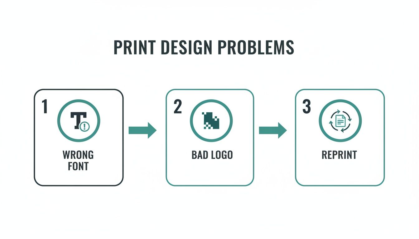
As you can see, simple mistakes like forgetting to outline fonts or using a non-vector logo almost always end in a reprint, which is a huge waste of time and money.
Text Outlines vs Stroke Outlines: When to Use Each
Knowing which outlining method to use can feel a bit confusing at first. This table breaks down common design scenarios to help you make the right call quickly and avoid any guesswork.
| Scenario | Method to Use | Why It's Important |
|---|---|---|
| Finalizing a logo with text | Create Outlines (Text) | Locks in the typeface so it displays correctly on any machine, preserving brand consistency. |
| Preparing an icon with line art | Outline Stroke | Converts line thickness into a solid shape, ensuring it scales proportionally without distortion. |
| Sending a brochure to a printer | Create Outlines (Text) | Prevents the printer's system from substituting a missing font, which would ruin the layout. |
| Designing for die-cutting | Outline Stroke | Creates clean, closed paths that cutting machines can easily follow for precise results. |
| Exporting a vector file for web (SVG) | Outline Stroke | Guarantees that line weights and shapes render consistently across different browsers and screen sizes. |
| Creating scalable brand assets | Both | A combination ensures all typographic and illustrative elements are stable, scalable vectors. |
Ultimately, both methods are about control. They give you the final say over how your design elements will look, no matter where they end up.
The global market for digital illustration apps is expected to reach USD 1.37 billion by 2035, a clear sign that brands are demanding high-quality, vector-ready assets more than ever. Since Adobe tools are the standard for over 90% of creative professionals, mastering Illustrator’s best practices, like outlining, has become essential for reducing file rejections and print errors.
Think of it this way: just as you'd focus on optimizing images for various outputs to ensure they look sharp everywhere, outlining your vectors serves the same purpose. It's all about preparing your assets for a perfect, predictable outcome.
Nailing the Perfect Outlining Workflow
Knowing the right shortcuts in Illustrator is just the start. If you want to work like a seasoned pro, you need a workflow that catches mistakes before they even happen. It’s all about building habits that save you from that sinking feeling when you realize you’ve flattened the wrong file or missed a tiny, hidden text box.
Here’s the single most important rule to live by: always, always save a master version of your file with live, editable text. Never perform the final outlining process on your original working file. Make a copy first—name it something obvious like ProjectName_PrintReady.ai—and do all your final prep on that duplicate.
This one habit will save you more headaches than you can imagine. When a client inevitably comes back with a last-minute text change, you can just open your master file, make the fix in seconds, and spit out a new print-ready version. Without it? You’d be stuck rebuilding the text from scratch, which is as tedious and error-prone as it sounds.
Your Final Pre-Flight Check
Before you hit "send" and confidently ship your file off, you need a foolproof way to confirm that every single piece of text has been converted. A complex design, especially a multi-page document like you'd find in professional brochures printing, can easily have a stray text box hiding on a locked layer or off the artboard.
Luckily, Illustrator has the perfect tool for this: the Find/Replace Font panel.
- Head up to
Type > Find/Replace Font. - Take a look at the
Fonts in Documentlist at the top. - If that list is completely empty, you're golden. Every font has been successfully outlined.
- If any fonts are still listed, there’s live text lurking somewhere. Just select the font name, click “Find,” and Illustrator will instantly zoom in on the culprit so you can outline it.
Making this simple check the final step of your process is what separates an amateur from a professional. It’s the safety net that catches what the human eye might miss, ensuring you deliver technically perfect files every single time.
Keeping Files Tidy with Layers
For bigger projects with lots of moving parts, layers are your best friend for staying organized. A smart layer strategy lets you keep your live text and outlined versions separate but perfectly aligned in the same document.
Here’s a practical way to do it:
- Create a "Live Text" Layer: Put all your editable text elements on a dedicated layer with a clear name.
- Duplicate the Layer: Right-click it and choose "Duplicate Layer." Rename the copy to something like "Outlined Text."
- Outline and Lock: With your new "Outlined Text" layer active, select everything on it (
Cmd/Ctrl+A) and create your outlines (Cmd/Ctrl+Shift+O). Once you're done, lock the original "Live Text" layer and make it invisible by clicking the little eye icon.
This approach gives you a non-destructive workflow. You have a perfectly outlined version ready to go, while your fully editable text stays safe and sound on a hidden layer, ready for any future revisions.
Troubleshooting Common Problems with Outlines
Even a seemingly simple command can throw you a curveball. When you create outlines in Illustrator, you’ll occasionally run into some frustrating little quirks. But don't worry—these common issues usually have simple fixes. Knowing what to look for can turn a moment of panic into a quick adjustment.
One of the most frequent hangups is when letters with enclosed spaces—think ‘o’, ‘b’, or ‘A’—suddenly fill in completely after being outlined. Instead of having a hole (known as a counter), the letter becomes a solid blob. This happens because Illustrator sometimes fails to create a proper compound path.
A compound path is just Illustrator's way of understanding that one shape should be cut out of another. When it doesn't happen automatically, you just have to give it a little nudge.
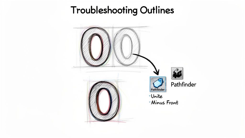
Fixing Filled-In Letterforms
The solution for those pesky filled-in letters lives in the Pathfinder panel. It's one of Illustrator’s most powerful tools for manipulating vector shapes. If you don't see it, just head up to Window > Pathfinder to open it up.
Here’s the process to get those counters back in your text:
- Select the Letter: Grab the Direct Selection Tool (A) and click to select only the problematic outlined letter.
- Unite the Shapes: In the Pathfinder panel, find and click the Unite button. This merges all parts of the letter into a single, solid object.
- Make the Compound Path: Right after that, go to
Object > Compound Path > Makeor just use the shortcut Cmd/Ctrl+8. This tells Illustrator to treat the inner shape as a cutout, and poof—the hole in your letterform is back.
This quick two-step fix works almost every time, making sure your typography looks exactly as you intended. It’s a crucial skill to have in your back pocket, especially when prepping complex or custom fonts for print.
Unlocking and Ungrouping Stubborn Objects
Ever had that moment where you try to create outlines and… nothing happens? You select your text, hit the shortcut, but it just stays as editable text. This almost always means the object you're trying to work with is either locked or part of a group.
- Check for Locked Items: Go to
Object > Unlock All. If the item was locked, this will release it, and you should now be able to create the outlines. - Check for Grouped Items: Right-click the object and see if the Ungroup option is available. Text is often grouped with other design elements, which can stop the outlining command from working correctly on its own.
Pro Tip: If you’re working on a complex file from another designer, it’s a good habit to run both
Unlock AllandUngroup(sometimes you have to do it a few times) on a copy of the file. This helps isolate the text elements you need to convert without messing up the original layout.
With the rise of automated design tools, printers are seeing more files than ever. Adobe's traffic data revealed that AI-driven referrals for creative tools saw a staggering 13× increase in traffic in less than a year. For printers to keep up, artwork needs to be production-ready right out of the gate. This is exactly why outlined files are so critical—they eliminate last-minute font issues and printing failures. You can learn more about how AI is shaping design workflows on Adobe's business blog.
Exporting Your Outlined File for Professional Printing
Once you've meticulously converted all your text and strokes, the final hurdle is to export a bulletproof file that any professional printer can use without a single hiccup. This isn't just about clicking "Save As"; it’s about dialing in the right settings to prevent last-minute headaches like color shifts or missing elements. Think of this as your final pre-flight check before your design takes off.
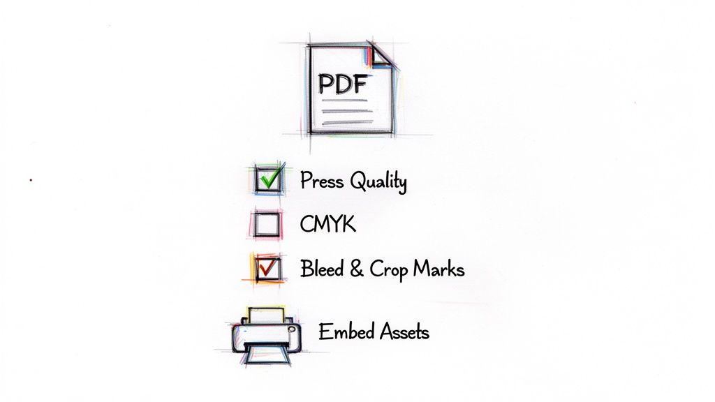
The undisputed industry standard for print-ready files is a PDF. When you go to save your file (File > Save As), be sure to select Adobe PDF from the format dropdown. This is where the magic really happens.
Choosing the Right PDF Preset
In the dialog box that pops up, you’ll see a preset option right at the very top. For almost any professional print job, you’ll want to select either [High Quality Print] or [Press Quality].
These presets are specifically designed to preserve all the critical information your printer needs, including high-resolution images and pristine vector data. They automatically configure things like image compression to prioritize quality over file size, which is exactly what you need for a physical product.
Next, navigate to the "Marks and Bleeds" section on the left. This area is non-negotiable for print.
- Crop Marks: Always check the box for "Trim Marks." These are the tiny lines in the corners that show the printer exactly where to cut the paper down to its final size.
- Bleed: If your design has any color or imagery that touches the very edge of the page, you must include a bleed. The standard bleed is 0.125 inches (or 3mm) on all sides. Just pop that value into the bleed boxes, and you’ll avoid any ugly white borders after the final trim.
A file sent without proper bleed and crop marks is one of the most common reasons for a printer to reject artwork. Taking ten seconds to set this up correctly can save you hours of back-and-forth emails and potential production delays.
Finalizing Color and Asset Settings
Before you smash that "Save PDF" button, there are just two more things to double-check.
First, under the "Output" tab, make sure the color conversion is set to a CMYK profile, like U.S. Web Coated (SWOP) v2, unless your printer has specified a different one. This is your best defense against unexpected color shifts from your original RGB design. For special projects that need unique finishes, a solid file setup is even more important; our guide to custom foil stamping dives into how these technical details impact specialty processes.
Finally, make sure any linked images are fully embedded in the file. The "Press Quality" preset usually takes care of this for you, but it never hurts to be sure. An embedded file is completely self-contained, which is the whole reason we create outlines in Illustrator in the first place—to create a portable, reliable, and foolproof document that works anywhere.
Common Questions About Creating Outlines
Working with print-ready files always seems to bring up the same handful of questions. Even after you’ve got the main commands down, certain situations can make you second-guess whether you’ve done things right. Here are some quick, clear answers to the questions that pop up most often when designers create outlines in Illustrator.
Can I Edit Text After I Create Outlines?
The short answer is no. Once you hit Command+Shift+O (or Ctrl+Shift+O on Windows) to convert your text, it’s no longer text. It permanently becomes a group of vector shapes. You can't just grab the Type Tool and fix a typo or change a word.
This is exactly why the golden rule is to always save a separate master file with your live, editable text. Keep that version somewhere safe for any future edits. The outlined file is purely for final production.
Why Did My Font Appearance Change After Outlining?
This one catches a lot of people by surprise. It usually happens when your text has a stroke or a special effect applied from the Appearance panel. When you outline text, Illustrator is only converting the basic shape of the font itself, and it doesn't always "bake" those live effects into the new vector shapes correctly.
The fix is simple. Before you create the outlines, select your text and go to Object > Expand Appearance. This extra step commits all the effects to the object's geometry, making sure what you see is exactly what you get after you outline.
Expanding the appearance first is the key to locking in all your visual properties, from complex gradients to simple strokes. It guarantees a predictable, accurate conversion and preserves the integrity of your design.
Getting these little details right is what separates a smooth print job from a frustrating one. You can find more practical advice like this in our complete collection of professional printing tips.
How Do I Confirm All Fonts Are Outlined?
There's an easy way to do a final check. Illustrator has a built-in tool that’s perfect for this. Just head up to Type > Find/Replace Font.
A dialog box will pop up. All you need to do is look at the top window, the one labeled "Fonts in Document."
- If this window is empty: You're good to go! All the text has been successfully converted to outlines.
- If you see fonts listed: That means there’s still live text hiding somewhere in your file. Just select a font from the list and click the "Find" button. Illustrator will jump right to that text box so you can outline it.
Does Creating Outlines Increase My File Size?
Yes, it almost always will, and sometimes by a surprising amount. Live text is incredibly efficient from a data perspective—the file just needs to reference the font's name and the characters you used.
Outlined text, on the other hand, forces Illustrator to store the coordinate data for every single anchor point and curve that makes up every letter. That extra complexity naturally results in a larger file. For professional printing, however, that slightly bigger file is a small price to pay for guaranteeing font stability and avoiding costly mistakes on press.
Ready to bring your perfectly outlined designs to life? At 4OVER4, we specialize in turning your digital files into stunning, high-quality printed materials. From business cards to banners, we make professional printing simple and fast. Start your order today!
More from

729
Full bleed printing is a simple but game-changing technique. It's how you get your artwork—whether it’s a photo, a background color, o
![]() Emma Davis
Emma Davis
Feb 3, 2026

336
Even though we live in a digital world, the humble business card is still a powerhouse networking tool. But here's something most people d
![]() Emma Davis
Emma Davis
Feb 2, 2026

1307
Staring at a wall of banner dimensions can feel a little overwhelming. But while there's no single "typical banner size" that wo
![]() Emma Davis
Emma Davis
Feb 1, 2026

397
Stretching your marketing budget doesn't mean you have to settle for flimsy, forgettable brochures. The real secret to low cost br
![]() Emma Davis
Emma Davis
Jan 31, 2026

387
Advertising magnets are one of those marketing tools that are so simple, you might overlook their power. They’re tangible, they last for age
![]() Emma Davis
Emma Davis
Jan 30, 2026

198
Tired of fighting with torn paper and sticky residue? We’ve all been there. The best way to get labels off bottles is often a simple soak in
![]() Emma Davis
Emma Davis
Jan 29, 2026

352
Want to know the real secret to getting a poster to stick to a wall without it peeling off in the middle of the night? It's all about what
![]() Emma Davis
Emma Davis
Jan 28, 2026

320
When you hear "table tent specs," what we're really talking about are the foundational details for printing them correctly: the
![]() Emma Davis
Emma Davis
Jan 27, 2026