TABLE OF CONTENTS
- Home
- content hub
- Elevate Your Brand with business card spot uv: Design That Impresses
Elevate Your Brand with business card spot uv: Design That Impresses
Dec 23, 2025321 views
Dec 23, 2025321 views
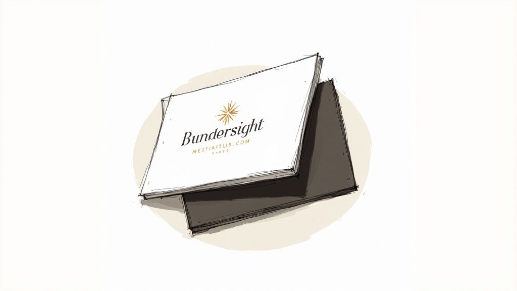
Picture this: someone hands you a business card. Before your eyes even register the words, your fingers do the talking. They glide across a smooth, matte surface, then suddenly catch on a slick, raised logo that gleams in the light.
That tiny moment of surprise? That's the magic of Spot UV.
What Is Spot UV and How Does It Make Business Cards Pop?
At its core, Spot UV is a clear, glossy coating applied to specific areas of your business card. Think of it less as a finish and more as a design tool. It’s a way to add a layer of texture and shine that creates an incredible contrast against a matte or silk background.
Instead of coating the entire card, you get to choose exactly which elements get the star treatment. The "spot" in Spot UV means precision—you're highlighting your logo, a pattern, or maybe just your name. The "UV" part comes from the curing process, where ultraviolet light instantly hardens the coating, locking in that durable, glass-like finish.
This isn’t about adding color; it’s all about adding depth and a tactile feel that transforms a simple piece of paper into a memorable experience.
How We Get That Perfect Sheen
The process is pretty cool. First, your card is printed with the full-color design. Then, a protective base lamination—usually matte or silk to maximize contrast—is applied.
Next, a specialized machine applies a liquid polymer varnish to only the spots you’ve designated in your artwork. This varnish is immediately hit with powerful UV light, causing a reaction that dries it instantly. Because it cures so fast, the varnish doesn't have a chance to soak into the paper. Instead, it sits right on top, creating that distinct, raised layer that you can see and feel.
Spot UV isn't just a design choice; it's a strategic tool. It guides the recipient's eye and touch to the most important parts of your card, reinforcing brand identity through a multi-sensory interaction.
Spot UV at a Glance: Key Features and Benefits
To break it down, here’s a quick look at what makes Spot UV such a powerful choice for your business cards and other print materials.
| Feature | Description | Primary Benefit |
|---|---|---|
| Selective Gloss Finish | A high-gloss varnish is applied to specific areas of the design. | Creates a striking visual contrast that draws attention. |
| Raised, Tactile Texture | The UV coating sits on top of the paper, creating a noticeable texture. | Makes the card feel premium and memorable to the touch. |
| Durability | The UV-cured varnish is hard and resistant to scuffs and moisture. | Protects key design elements and adds longevity to the card. |
| Versatility | Works beautifully on logos, text, patterns, or as a "blind" design element. | Offers endless creative possibilities to enhance any design. |
This combination of visual appeal and physical texture is what sets Spot UV apart, turning a standard card into a conversation starter.
Why It's So Effective
The secret to Spot UV's success is simple: contrast. When you pair a super glossy, reflective element with a non-reflective, matte background, you create a powerful visual and textural separation. That pop is what makes your design leap off the card.
It’s a small detail that says a lot about your brand. It communicates a commitment to quality, a keen eye for detail, and a desire to make a lasting impression. From bold logos to subtle background patterns, it’s an incredibly versatile way to make your card unforgettable.
Spot UV has become a go-to for professionals who want to stand out. It's part of a massive trend in printing technology. The global UV inkjet printing market, which drives these finishes, was valued at USD 50.61 billion and is expected to climb to USD 87.62 billion by 2032. Understanding this process helps you see why our range of spot UV printed products can give your brand a serious edge.
Mastering Your Spot UV Design for Maximum Impact
Applying Spot UV is really where the art and science of print design come together. You can have the most incredible finish in the world, but if it's slapped onto a weak design, it's just a missed opportunity. But when you pair a great finish with thoughtful placement? The result is nothing short of spectacular.
Let's walk through the playbook for making smart, impactful decisions that ensure your Spot UV finish doesn't just look good—it communicates quality from the first touch.
The single most important principle to remember is contrast. Think of a spotlight on a dark stage; its beam is sharp and immediately grabs your attention. It's the same idea here. The high-gloss, reflective nature of Spot UV stands out most dramatically against a background that isn't reflective. This is why you'll almost always see it paired with a matte or silk lamination. That smooth, non-shiny surface makes the glossy areas pop, creating a powerful one-two punch of visual and tactile appeal.
Strategic Placement: Where to Apply Spot UV
Deciding where to apply the gloss is easily the most creative part of the process. You're basically choosing which parts of your card get the star treatment. The goal is to guide the recipient's eye (and hand) to the most important information, reinforcing your brand in a way they won't soon forget.
Here are some of the most effective ways to use it:
- Accentuate Your Logo: This is the classic, go-to application for a reason. Applying Spot UV to your logo makes it the undeniable focal point of the card. It adds a subtle layer of professionalism that makes your brand feel premium and established.
- Highlight Key Information: Want to make sure your name, title, or website is impossible to miss? A touch of gloss on your primary contact details makes them jump right off the card.
- Create Subtle Patterns: This is one of my favorite techniques. You can create a "blind" or "ghost" effect by applying a Spot UV pattern directly onto the cardstock without any ink underneath. The pattern is only visible when it catches the light, adding a layer of sophisticated, discoverable detail. It’s a real "wow" moment for anyone holding the card.
- Emphasize Graphic Elements: Have a unique icon, illustration, or design element that’s part of your brand? Applying Spot UV can give it life, making it a tactile feature that practically begs to be touched.
By selectively applying gloss, you control the narrative of your card. You're telling the person holding it, "Look here. Feel this. This part is important."
Of course, a special finish can only enhance what's already there. The foundation of an impressive business card is always its core visual elements. To get the most out of your Spot UV design, it’s worth brushing up on the principles of strong logo design to ensure your branding is as powerful as the finish you choose.
Design Do’s and Don’ts
To get a flawless result, you have to work with the technology, not against it. Some design choices play beautifully with Spot UV, while others can lead to disappointment.
What to Do:
- Use Bold Shapes and Fonts: Spot UV makes its biggest impact on larger, bolder elements. Think thick lines, solid logos, and confident sans-serif fonts. These give the gloss enough surface area to really shine and create that satisfying raised texture.
- Keep It Simple: Often, less is more. Highlighting just one or two key elements, like your logo and name, can be far more effective than covering the card in glossy spots. Simplicity reads as confidence.
- Consider Raised Spot UV: For an even more dramatic tactile effect, you can take it a step further. We offer raised spot UV printed products that add a truly three-dimensional feel, elevating the sensory experience to a whole new level.
What to Avoid:
- Tiny Text and Thin Lines: Steer clear of applying Spot UV to very small text (under 8pt) or lines thinner than 0.5 points. The registration process in printing is incredibly precise, but on microscopic elements, even a tiny shift can cause the gloss to misalign with the ink underneath. The result is a blurry, messy look that undermines the premium feel you're going for.
- Overcrowding the Design: Applying Spot UV to too many elements can make the card look cluttered and cheapens the "special" feel of the finish. Remember the spotlight analogy—if everything is shiny, nothing stands out.
- Full Coverage: Don't use Spot UV to coat the entire surface of your card. If you want an all-over gloss, a standard gloss lamination is a much more effective and economical choice. The magic of "spot" UV is in its selectivity.
Preparing Flawless Print Files for Spot UV
A brilliant design is only half the battle. Making sure it translates perfectly from your screen to the finished, printed card is where the real magic happens. The technical side of prepping files for a business card spot uv finish might sound a little intimidating, but it’s actually a pretty straightforward process once you get the hang of the most important piece: the spot mask.
Nailing this step is everything if you want a professional result.
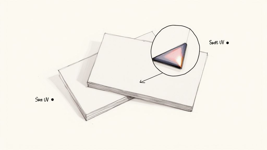
Think of the spot mask as a treasure map for the printing press. It’s a completely separate, black-and-white file that tells the machine exactly where to apply that glossy UV coating. Where the mask is black, the gloss goes on. Where it's white, the area is left alone with its original paper finish. That simple instruction is the foundation for a stunning final product.
To pull this off, you'll need to create a special layer or a totally separate file in your design software that is dedicated only to this spot mask.
Creating Your Spot UV Mask File
Here's the most critical rule, and it’s a simple one: your mask must use 100% black. We’re not talking about a "rich black" (a mix of CMYK colors) or a shade of gray. In your color palette, you have to set the color to 100% K (black) and leave Cyan, Magenta, and Yellow at 0%.
This pure, single-channel black is the universal language the printer understands. It’s a clear signal that says, "Apply UV coating right here."
Any other color or shade will just confuse the press and lead to printing errors. Your mask file should only contain these 100% K elements against a plain white background. It has to be a clean, high-contrast file—no gradients, blurs, or shadows allowed. The edges of your black shapes need to be sharp and clean to make sure the UV application is just as crisp.
This diagram breaks down the core design principles to keep in mind as you decide where to place your spot UV elements.
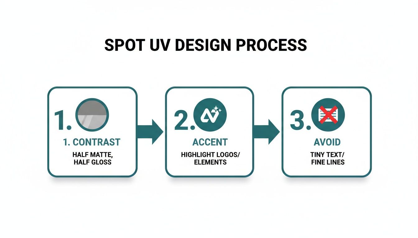
As you can see, focusing on strong contrast and accentuating key details—while steering clear of anything too fine or complex—is the ticket to an effective spot UV design.
Essential File Specifications
Beyond creating the mask itself, there are a few technical specs that are non-negotiable for professional printing. Following these guidelines helps you avoid common headaches like pixelation or misalignment, ultimately saving you time and money.
Alignment is Everything: Your spot mask file has to line up perfectly with your main color design file (the CMYK artwork). Every black element on the mask must sit in the exact same spot as the corresponding element on your print file. If they are even a tiny bit off, the UV coating will be offset from your design, and the whole effect will be ruined.
Resolution Matters: Both your main print file and your spot mask file must have a resolution of at least 300 DPI (dots per inch). Anything lower is going to look blurry or pixelated in the final print, which completely undermines the premium quality you’re going for.
Correct File Formats: Printers almost always prefer vector-based files or high-quality PDFs. Submitting your files as PDFs or native Adobe Illustrator (.ai) or InDesign (.indd) files is the best way to go, as it preserves the quality and integrity of all your design elements.
By following these steps, you’re taking control of the production process. You aren’t just handing over a design; you’re providing a precise blueprint for a premium finish. When you're ready to bring your idea to life, you can explore the wide variety of premium business cards printing options, knowing your files are set up for a perfect outcome.
Choosing the Right Finish Spot UV vs Foil Stamping
Picking a special finish for your business card is a lot like choosing the right accessory for an outfit—it has to complement the overall style and send the right message. While business card spot uv brings a modern, tactile sheen to the table, another heavyweight contender in the premium finish world is Foil Stamping.
Both finishes can transform a standard card into something memorable, but they get there in completely different ways. Spot UV adds a clear, subtle gloss that feels contemporary and sophisticated. Foil Stamping, on the other hand, introduces an opaque, metallic shimmer for a more classic, luxurious statement.
Getting a feel for the distinct personality each finish brings to a business card is the key. When you choose correctly, your card will perfectly align with your brand’s identity, its message, and, of course, your budget.
The Tale of Two Textures
The biggest difference between them comes down to how they look and feel. Spot UV is all about creating subtle contrast and texture. It’s a clear varnish, so it actually enhances the printed colors underneath, making them look richer and deeper. The real magic happens when you feel the contrast between the high-gloss areas and the smooth matte or silk background. It’s an effect that just begs to be touched and rewards a closer look.
Foil Stamping is a different beast entirely—it’s all about bold, metallic impact. Instead of a clear coating, a super-thin layer of metallic foil is heat-pressed directly onto the cardstock. This creates an opaque, shimmering element that completely covers whatever is beneath it. It doesn't just enhance color; it replaces it with pure, reflective metal.
Spot UV whispers elegance through texture and light. Foil Stamping shouts luxury with metallic brilliance. The right choice depends entirely on the story your brand wants to tell.
Business Card Finishes Compared
Seeing the options side-by-side makes the decision-making process much clearer. Each finish really shines in different scenarios and helps communicate a unique brand persona. Here’s a quick comparison to help you figure out which one is the best fit for your next project.
| Finishing Type | Visual Effect | Feel & Texture | Best For | Cost Level |
|---|---|---|---|---|
| Spot UV | Clear, high-gloss shine that enhances underlying colors. | Smooth, slightly raised, and slick to the touch. | Modern, minimalist brands; tech companies; creative agencies; designs with subtle patterns. | $$ |
| Foil Stamping | Opaque, metallic shimmer (gold, silver, copper, colors). | A slight debossed feel from the heat-press application. | Luxury brands; law firms; high-end retailers; formal invitations. | $$$ |
As you can see, the choice is about more than just looks. If your brand is going for a sleek, innovative vibe, the tactile nature of a business card spot uv finish is often the perfect match. But for a brand built on tradition, prestige, and timeless quality, the classic gleam of foil is tough to beat. If that metallic look is calling your name, you can explore a huge variety of foil stamping options to find the perfect shade for your brand.
Making the Final Call
So, which one is right for you? It's pretty straightforward when you break it down.
Choose Spot UV if: Your brand identity is modern, clean, and understated. You want to highlight a logo or create a subtle pattern that adds a layer of discovery without being overpowering. It's also an excellent choice for making dark colors look exceptionally rich and deep.
Choose Foil Stamping if: Your brand projects luxury, elegance, and established authority. You want an unmistakable mark of quality that immediately communicates a premium feel. It’s perfect for classic typography and iconic logos that demand attention.
The growing popularity of these advanced finishes is also pushing innovation in the printing industry. For example, spot UV is part of the booming UV LED printers market, a sector projected to hit USD 1,070.05 million by 2035. This technology is all about efficiency and sustainability, which is making these premium finishes more accessible than ever. You can find more insights about the UV LED printer market growth on futuremarketinsights.com.
Ultimately, both Spot UV and Foil Stamping are fantastic tools for making your business card stick in someone's memory. Just think about your brand’s personality and the message you want to send, and you’ll be able to confidently pick the finish that will make the best first impression.
Inspiring Ways to Use Spot UV on Your Business Cards
Ready to see what this business card spot uv finish can really do? Let's move past the technical stuff—this is where your creativity gets to shine. A slick, well-placed touch of gloss can turn a pretty good card into a tiny piece of art, completely changing what a first impression can be.
Let's look at a few killer applications, from bold statements to quiet elegance, that will get you thinking about how to design a card that feels authentically you.
The Power of Subtlety and Contrast
Picture this: a minimalist, all-black business card printed on a deep, matte stock. But here’s the twist—the company name and logo aren't printed in ink. Instead, they’re just sleek Spot UV elements, almost invisible until they catch the light and reveal the brand with a flash of gloss.
This "blind" or "ghost" effect is a masterclass in confident, modern design. It creates a little moment of discovery for the person holding it, rewarding them with a detail that feels exclusive and incredibly thoughtful.
This approach is a perfect match for:
- Creative Agencies: It immediately communicates a sharp, design-forward vibe.
- Tech Startups: Hints at innovation and a sleek, user-focused experience.
- Luxury Brands: Projects an image of quiet confidence and understated elegance.
Adding Life to Visuals
If you're a photographer, designer, or artist, Spot UV gives you a unique way to make your work literally pop off the card. Think of a photographer’s business card that features a stunning portrait or a dramatic landscape.
By applying Spot UV just to a specific detail—like the glint in a person's eye, the chrome on a vintage car, or the dewdrops on a leaf—the image gains an incredible sense of depth and realism. It's a simple trick that draws the eye right where you want it to go, making the whole card more dynamic and memorable.
Creating Unique Tactile Patterns
Spot UV isn't just for highlighting things that are already there; it can be the star of the show. Imagine an intricate, tactile pattern covering the entire background of your card. This could be a clean geometric design, a subtle wave pattern, or even a texture that mimics one of your products.
This adds a unique sensory layer that just makes the card feel more substantial and interesting to hold. You can lay the pattern over a solid color or even a blank background to create an unforgettable texture that reinforces your brand without adding any visual clutter.
A well-executed Spot UV design does more than just look good; it creates an interactive experience. It invites touch, sparks curiosity, and makes your card a conversation piece long after the initial handshake.
These examples are just the beginning. By checking out our full range of fantastic finishes, you can find the perfect combination to bring your own vision to life and design a card that people won’t just take—they’ll keep.
Your Simple Checklist for Ordering Spot UV Business Cards
You've nailed the design and prepped your files like a pro. Now for the exciting part—turning that vision into a real, tangible business card. This final step, placing your order, should be the easiest part of the whole process.
Think of this as your pre-flight checklist. Running through these points ensures the stunning, premium cards you designed are exactly what shows up at your door. Let's walk through it together.
Final Design and File Review
Before you even think about uploading, give your artwork one last, careful look. This is your chance to catch those tiny mistakes that can become big headaches later on.
- Proofread Everything: Seriously, check every single word. Names, phone numbers, email addresses—one small typo can undermine an otherwise perfect card. If you can, get a second pair of eyes on it.
- Confirm Your Dimensions: Make sure your design file is set to the correct final size (like 3.5" x 2") and includes a 0.125-inch bleed on all sides. This is non-negotiable for a clean, edge-to-edge print.
- Verify Your Spot Mask: Pull up your spot mask file and your main CMYK design side-by-side. Do the black areas on the mask line up perfectly with the elements you want to shine? And just to be sure, confirm that mask is 100% K black and nothing else.
Selecting Your Print Specifications
Now you get to choose the physical details of your card. These choices are what make the Spot UV effect truly stand out.
The right paper and finish are the stage for your Spot UV design. A high-contrast base like Silk Lamination is what allows the glossy elements to really perform and grab everyone's attention.
- Choose the Right Paper Stock: To get that premium feel that a Spot UV finish deserves, you need a thicker stock. We highly recommend our 16pt cardstock; it has the sturdiness and substance a high-end card needs.
- Select the Best Lamination: This is the secret to getting that dramatic contrast. You should always pair Spot UV with a non-glossy base. Silk Lamination is the perfect partner, giving the card a smooth, luxurious texture that makes the glossy areas pop.
Finalizing and Placing Your Order
You're at the finish line! Just a few more clicks and your new cards will be on their way.
- Upload Your Files Correctly: At the upload prompt, add your main CMYK artwork and your separate Spot UV mask file. Label them clearly (e.g., "Design_Front.pdf" and "Mask_Front.pdf") so there’s absolutely no room for confusion.
- Review the Digital Proof: Once your files are processed, you'll get a digital proof. Look at it carefully. This is your final opportunity to approve how we've interpreted your files before we hit "print."
By checking off these points, you're taking the guesswork out of the equation. It guarantees a smooth ordering process and a final business card spot uv finish that will look even better in person.
Your Top Questions About Spot UV Business Cards, Answered
As you get closer to choosing this premium finish, some practical questions are bound to pop up. Getting a handle on durability, design limits, and best practices will help you make a smart decision and get the absolute best results for your business card spot uv project. Let's tackle some of the most common ones.
Can Spot UV Be Applied to Both Sides of a Business Card?
You bet it can. Adding Spot UV to both sides is a fantastic way to create a card that feels high-end and thoughtfully designed from front to back.
For example, you could make your logo shine on the front and then use a subtle, glossy pattern on the back to add some texture. Another great idea is to highlight your key contact info on the back with a touch of gloss. Just remember to send us a separate spot mask file for each side when you order so we know exactly where to apply the magic.
Does the Spot UV Finish Scratch or Wear Off Easily?
The UV-cured varnish is surprisingly tough. It’s designed to hold up against scuffs and moisture during normal day-to-day handling, creating a hard, protective layer over the parts of your card you want to feature.
Of course, like any print finish, it’s not invincible. It can get scratched by sharp objects if you toss it in a pocket with your keys. To keep your cards looking flawless, we always recommend storing them in a dedicated business card case.
The magic of Spot UV is all in the contrast. When you pair that high-gloss, reflective shine with a non-glossy base like a matte or silk lamination, you get a dramatic visual and tactile pop that makes the glossy areas truly leap off the card.
Is There a Minimum Line Thickness for Spot UV?
Yes, and this is a big one for getting the best results. For Spot UV to really work its wonders, you need to apply it to design elements with a bit of substance. We strongly recommend avoiding any lines thinner than 0.5 points or super tiny, delicate fonts.
The printing process is incredibly precise, but when you're working with microscopic elements, even the slightest shift can become noticeable and potentially blur the effect. Bolder fonts and thicker lines will always give you a cleaner, more powerful result, making the finish look crisp and intentional.
Why Is Spot UV Always Paired with a Matte or Silk Lamination?
The whole point of Spot UV is to create a stunning, eye-catching contrast. Pairing the super glossy, reflective finish with a non-glossy base—like our matte or silk laminations—is what gives you that incredible visual and tactile pop. The smooth, non-reflective surface makes the shiny parts stand out, catching both the light and the fingertips.
If you tried to put Spot UV on an already glossy card, the effect would be completely lost. It would just blend in, and you’d lose that special "spot" distinction that makes this finish so unique.
Ready to create a business card that people will actually remember? At 4OVER4, we specialize in premium printing that makes your brand stand out. Explore our Spot UV Business Card options and start designing today!
More from

729
Full bleed printing is a simple but game-changing technique. It's how you get your artwork—whether it’s a photo, a background color, o
![]() Emma Davis
Emma Davis
Feb 3, 2026

336
Even though we live in a digital world, the humble business card is still a powerhouse networking tool. But here's something most people d
![]() Emma Davis
Emma Davis
Feb 2, 2026

1307
Staring at a wall of banner dimensions can feel a little overwhelming. But while there's no single "typical banner size" that wo
![]() Emma Davis
Emma Davis
Feb 1, 2026

397
Stretching your marketing budget doesn't mean you have to settle for flimsy, forgettable brochures. The real secret to low cost br
![]() Emma Davis
Emma Davis
Jan 31, 2026

387
Advertising magnets are one of those marketing tools that are so simple, you might overlook their power. They’re tangible, they last for age
![]() Emma Davis
Emma Davis
Jan 30, 2026

198
Tired of fighting with torn paper and sticky residue? We’ve all been there. The best way to get labels off bottles is often a simple soak in
![]() Emma Davis
Emma Davis
Jan 29, 2026

352
Want to know the real secret to getting a poster to stick to a wall without it peeling off in the middle of the night? It's all about what
![]() Emma Davis
Emma Davis
Jan 28, 2026

320
When you hear "table tent specs," what we're really talking about are the foundational details for printing them correctly: the
![]() Emma Davis
Emma Davis
Jan 27, 2026