Table of Contents
- Home
- content hub
- The Ultimate Brand Guidelines Checklist: 6 Core Components
 Share and earn
The Ultimate Brand Guidelines Checklist: 6 Core Components
Jul 27, 20251553 views
Jul 27, 20251553 views
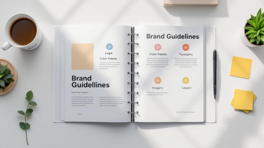
In a crowded market, consistency is the bedrock of a memorable brand. Without a clear set of rules, your brand's message can become diluted and confusing across different platforms, undermining the trust you've worked hard to build. This is where a comprehensive brand guidelines document becomes indispensable. It's more than a simple style guide; it's the single source of truth that empowers your team, freelancers, and partners to represent your brand accurately and cohesively.
This detailed brand guidelines checklist breaks down the six non-negotiable components every successful brand needs to document. We'll move beyond theory to provide actionable steps and practical insights for each critical element, including:
- Logo Usage and Clear-Space Rules
- Color Palette Specifications (Print & Digital)
- Typography Hierarchies and Font Pairing
- Voice and Tone Principles for All Communications
- Imagery Guidelines for Photography and Illustration
- Brand Applications and Ready-to-Use Templates
By the end of this guide, you will have a clear roadmap to creating a robust framework that protects your identity, streamlines your marketing efforts, and builds lasting recognition with your audience. This checklist ensures your brand looks, feels, and sounds the same everywhere, every time.
1. Logo Usage and Variations
Your logo is the most recognizable element of your brand, making its consistent application a cornerstone of any effective brand guidelines checklist. This section isn't just about showing your primary logo; it's a comprehensive rulebook that governs how it appears everywhere, from a massive billboard to a tiny social media icon. Proper documentation prevents dilution of your brand identity and ensures it remains strong and instantly identifiable across all mediums.

Pioneering designers like Paul Rand (IBM) and Saul Bass (AT&T) established that a logo’s power comes from a systematic, disciplined approach to its use. Without these rules, your logo can be stretched, recolored, or crowded, quickly eroding brand recognition and appearing unprofessional.
Key Components of Logo Guidelines
To ensure consistency, your guidelines must be specific and leave no room for interpretation. Cover these critical areas:
- Primary Logo: This is your main, full-color logo. It should be the default choice for most applications.
- Logo Variations: Document all approved alternatives. This includes horizontal and vertical lockups, monogram or icon-only versions, and one-color (monochromatic) variants for use on complex backgrounds or in restrictive printing scenarios.
- Clear Space: Also known as the exclusion zone, this is the minimum amount of empty space that must surround the logo at all times. A common practice, as seen with Nike’s swoosh, is to define this space using a key element from the logo itself (e.g., the height of the swoosh or a letter). This prevents other text or graphics from cluttering it.
- Minimum Size: Specify the smallest size the logo can be reproduced while remaining legible, both for print (in millimeters or inches) and digital (in pixels). Test this thoroughly before finalizing.
- Incorrect Usage: Provide clear visual examples of what not to do. This "logo abuse" section is crucial and should include things like stretching the logo, changing its colors, adding drop shadows, or placing it on a busy background that compromises readability.
Actionable Implementation Tips
Your logo guidelines are only effective if they are accessible and easy to use. Start by creating a centralized brand asset library where employees and partners can download approved logo files. Offer various formats like SVG (for scalability), PNG (for web with transparency), and EPS (for print). Understanding the practical application of logo guidelines means considering various file types and usage scenarios; you can see an example of a cropped logo asset here. Finally, remember to include guidelines for co-branding situations to maintain your brand’s integrity when working with partners.
2. Color Palette and Specifications
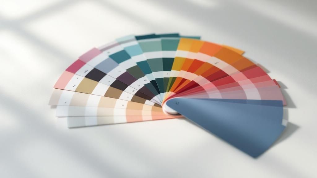
Color is a powerful psychological tool that evokes emotion and communicates meaning faster than words. A well-defined color palette is a critical component of your brand guidelines checklist, ensuring that your brand’s visual language is consistent and emotionally resonant across every touchpoint. This section goes beyond simply listing colors; it provides a precise, technical system for their application, preventing the chaotic and unprofessional appearance that comes from inconsistent color use.
Iconic brands have mastered this discipline. Think of Tiffany & Co.'s trademarked 'Tiffany Blue' (Pantone 1837) or McDonald's instantly recognizable red and yellow. These color systems, often pioneered by visionaries like Walter Landor, demonstrate that strict color governance creates an unforgettable brand identity. Without these rules, your brand’s colors can vary wildly from screen to print, weakening recognition and trust.
Key Components of Color Guidelines
To ensure your colors are always on-brand, your guidelines must be meticulously detailed, leaving no room for guesswork. Cover these essential areas:
- Primary Colors: These are the core colors of your brand identity, used most frequently. Typically, this includes one to three dominant colors that are integral to your logo and primary marketing materials.
- Secondary Colors: This palette complements your primary colors. These are used for accents, subheadings, call-to-action buttons, or to differentiate product lines. Define when and how these should be used.
- Color Codes: Providing exact color values is non-negotiable. Include codes for every format: HEX for web (e.g., #1DB954 for Spotify’s green), RGB for digital screens, CMYK for four-color process printing, and Pantone (PMS) for spot color printing to ensure perfect accuracy.
- Color Hierarchy and Ratios: Define the visual dominance of each color. For example, specify a 60-30-10 rule where your primary color takes up 60% of the design, a secondary color 30%, and an accent color 10%. This creates a balanced and harmonious look.
- Accessibility Standards: Specify color combinations that meet Web Content Accessibility Guidelines (WCAG) contrast ratios. Provide clear examples of acceptable text and background pairings to ensure your content is legible for all users, including those with visual impairments.
Actionable Implementation Tips
Your color palette is only useful if it can be accurately reproduced. Start by ensuring all stakeholders have access to digital color swatches (.ase files) for design software. Once you've defined your brand's color palette and specifications, ensuring these colors are reproduced accurately across all mediums is crucial. This often involves mastering color management in printing, a critical step for maintaining visual consistency. Always test colors on actual physical materials, as a color on a screen can look different on a printed brochure or a T-shirt. For instance, when producing branded items, you can explore options for customized online labels to see how your colors translate to specific materials.
3. Typography and Font Specifications
Beyond your logo and colors, typography is the voice of your brand. The fonts you choose and how you use them significantly impact readability, tone, and the overall personality of your communication. A well-defined typography section in your brand guidelines checklist ensures that every headline, paragraph, and caption speaks with a consistent and recognizable voice, reinforcing your brand’s character across all written materials.

Pioneering typographers like Erik Spiekermann and Matthew Carter demonstrated that a systematic approach to fonts is essential for creating a cohesive brand experience. Without clear rules, inconsistent font usage can make your brand appear disjointed and unprofessional. Brands like Airbnb (with its custom 'Cereal' typeface) and Google (with 'Product Sans') have invested in unique typography to create strong, ownable brand identities that are instantly recognizable.
Key Components of Typography Guidelines
To create a clear and functional system, your guidelines need to be detailed, leaving no room for guesswork. Address these critical elements:
- Primary and Secondary Typefaces: Define your main font (primary) for headlines and key messages, and a secondary font for body copy and extended text. For example, you might pair a distinctive serif font for headlines with a clean sans-serif for paragraphs.
- Typographic Hierarchy: Establish a clear visual hierarchy for text. Specify font sizes, weights (e.g., Light, Regular, Bold, Black), and styles for different levels of information, such as H1, H2, H3, body text, and captions. This guides the reader's eye and improves comprehension.
- Spacing and Alignment: Provide rules for line spacing (leading), letter spacing (tracking), and paragraph indentation. Specify preferred text alignment (e.g., left-aligned, centered) for different contexts to maintain a clean and consistent layout.
- Web and Fallback Fonts: Designate web-safe fonts or provide necessary web font files. It's also crucial to specify fallback fonts (e.g., Arial, Georgia) that will be used if your primary fonts fail to load on a user's device, ensuring a usable experience.
- Incorrect Usage: Show visual examples of what to avoid. This includes distorting font proportions, using too many different fonts or weights on one page, or using colors that create poor contrast and reduce readability.
Actionable Implementation Tips
Make your typography system easy to adopt. Start by ensuring all necessary font files are available in your centralized brand asset library, along with clear documentation on licensing restrictions to prevent legal issues. Create pre-formatted text styles in common software like Google Docs, Microsoft Word, and design programs to help your team apply them correctly. When designing physical assets, you can see how typography choices translate to printed materials by looking at how companies format custom notepads on 4over4.com. Finally, test your chosen fonts across various devices and sizes to ensure they remain legible and effective in every application.
4. Voice and Tone Guidelines
If your logo is the face of your brand, your voice is its personality. How your brand communicates through words is just as critical as its visual identity, making voice and tone a vital component of any comprehensive brand guidelines checklist. This section defines your brand’s communication style, ensuring that whether a customer is reading a tweet, a product description, or an email, the personality they encounter is consistent and recognizable.

Pioneering content strategists like Kate Kiefer Lee, who developed Mailchimp's famous Voice & Tone guide, demonstrated that a clearly defined voice builds trust and connection. Without these rules, your brand messaging can become fragmented, with one message sounding formal and corporate while another is overly casual, confusing audiences and weakening brand affinity. Mailchimp’s guide, which distinguishes between a consistent voice (personality) and an adaptable tone (emotional inflection), set a new standard for brand communication.
Key Components of Voice and Tone Guidelines
To build a consistent personality, your guidelines must offer clear direction on how to write for the brand. Be specific and provide practical examples.
- Brand Personality Traits: Define your brand’s core characteristics with 3-5 key adjectives (e.g., "Confident, Witty, Empathetic"). For each trait, describe what it means in practice and what it doesn't mean (e.g., "Witty, not sarcastic").
- Voice vs. Tone: Clearly explain the difference. Your voice is your consistent personality that never changes. Your tone is the emotional inflection that adapts to different situations (e.g., a celebratory announcement vs. a customer support apology).
- Vocabulary and Grammar: List specific words to use and words to avoid. Include rules on grammar and punctuation, such as whether you use the Oxford comma, contractions (like "you're" vs. "you are"), or specific industry jargon.
- "This, Not That" Examples: This is one of the most effective ways to teach your voice. Provide side-by-side examples showing a sentence written "off-brand" and then rewritten to be "on-brand." This makes abstract concepts concrete for writers.
Actionable Implementation Tips
Your voice guidelines are useless if they aren’t actively used by everyone creating content. Begin by developing training workshops for writers, marketers, and customer service teams. Create interactive exercises that challenge them to apply the brand voice in various scenarios. A well-defined voice ensures that every piece of communication, from a social media post to marketing materials like custom postcards, consistently reflects your brand's unique personality. You can learn more about how to apply these principles to direct mail with these postcard printing options. Finally, conduct regular content audits to check for consistency and provide constructive feedback to content creators, ensuring the guidelines remain a living, practical tool.
5. Visual Style and Imagery Guidelines
While your logo is the primary identifier, the broader visual ecosystem surrounding it is what truly builds a cohesive and memorable brand experience. Visual style and imagery guidelines are the rules that govern all other visual elements, from photography and illustration to iconography and layout. This section of your brand guidelines checklist ensures that every visual asset, whether on your website or in a printed brochure, speaks the same aesthetic language and reinforces your brand’s personality.
The importance of this visual consistency was championed by creative leaders like Jonathan Ive, whose philosophy shaped Apple's iconic clean and minimalist design language. Without these standards, your marketing materials can quickly become a disjointed collage of competing styles, confusing your audience and weakening your brand's impact. A well-defined visual style ensures every piece of content feels intentionally crafted and part of a larger, unified whole.
Key Components of Visual Style Guidelines
To create a consistent visual identity, your guidelines must provide clear direction for all non-logo visual elements. Cover these essential areas:
- Photography Style: Define the mood, subject matter, and technical aspects of your brand's photography. Should it be warm and authentic like Airbnb's, featuring real people, or sleek and product-focused like Apple's, with clean backgrounds and consistent lighting? Specify color treatment (e.g., desaturated, high-contrast) and composition rules.
- Illustration and Iconography: Detail your brand's approach to illustration. Is it playful and character-driven like Slack's, or geometric and technical? Provide rules for line weight, color palettes, and overall complexity. Create a dedicated icon set that is stylistically aligned and visually consistent.
- Graphic Elements and Treatments: Document any recurring shapes, patterns, textures, or other graphic devices used to support the brand. This could include specific line styles, background treatments, or ways of framing content.
- Layout and Composition: Provide principles for how elements are arranged on a page or screen. This includes guidance on white space, grid systems, alignment, and visual hierarchy. Dropbox’s minimalist design, for example, relies heavily on generous white space to create a clean, uncluttered user experience.
- Do's and Don'ts: Just as with the logo, show clear visual examples of correct and incorrect imagery usage. Contrast on-brand photos with off-brand ones. Show how to properly apply graphic elements versus how not to.
Actionable Implementation Tips
Make your visual style easy for your team and partners to adopt. Start by creating a mood board that serves as a quick visual reference for the desired aesthetic. Develop a library of pre-approved photos, illustrations, and icons that are readily accessible. You can also build templates for common applications like social media posts or presentations. For materials like custom flyers, defining these visual standards ensures consistency even when creating new designs. For more information, you can explore best practices for flyer printing and design. Finally, specify technical requirements, such as minimum image resolution and quality standards, to prevent low-quality visuals from degrading your brand's appearance.
6. Brand Applications and Templates
Brand guidelines are theoretical until they are applied. This section bridges that gap by providing tangible examples and ready-to-use templates that demonstrate how to bring your brand to life. It moves beyond abstract rules about logos and colors and shows how these elements should be implemented across various real-world materials, from a business card to a complex software interface. This ensures that every brand touchpoint, no matter how small, is consistent and professionally executed.
Great design systems, as popularized by pioneers like Massimo Vignelli and contemporary methodologies like Brad Frost's Atomic Design, are built on the principle of systematic application. Without pre-defined templates, employees and partners are left to interpret the guidelines themselves, leading to inconsistency and a fragmented brand experience. Providing templates removes guesswork and empowers your team to create on-brand materials quickly and efficiently.
Key Components of Application Guidelines
To ensure your brand is applied correctly everywhere, your guidelines must provide clear, visual examples and functional templates for common use cases. Cover these critical areas:
- Corporate Stationery: This includes foundational materials like business cards, letterheads, and email signatures. Provide exact layouts, font sizes, and logo placements.
- Presentation Decks: Offer templates for PowerPoint or Google Slides with pre-set title slides, content layouts, and chart styles that incorporate your brand's typography and color palette.
- Social Media Assets: Create a suite of templates for different platforms (e.g., Instagram posts, LinkedIn banners, YouTube thumbnails). Specify dimensions, safe zones for text, and how to use your logo or brand marks.
- Marketing & Advertising: Include mockups and templates for digital ads, print flyers, and event banners. When developing your brand guidelines, remember that external applications like physical signage also play a critical role in reinforcing your brand identity; understanding the critical role of consistent signage can inform how you design these assets for maximum impact.
- Digital Interfaces: For tech companies, this is crucial. Showcase how brand elements are applied within user interfaces (UI) for apps and websites, as seen in Google's comprehensive Material Design system.
Actionable Implementation Tips
Make your templates accessible and easy for anyone to use, regardless of their design skill level. Start by organizing all assets into a centralized digital library, categorized by use case (e.g., "Marketing," "Sales," "Internal Comms"). When it comes to printed materials like business cards, it's beneficial to have templates that are already configured for professional printing; you can get high-quality business cards printed using files based on these specifications. To further empower your team, create both editable versions for designers (e.g., in Adobe Illustrator) and locked-down versions for non-designers (e.g., in Canva or Microsoft Word) to prevent accidental edits to core brand elements.
Brand Guidelines Elements Comparison
| Item | Implementation Complexity 🔄 | Resource Requirements ⚡ | Expected Outcomes 📊 | Ideal Use Cases 💡 | Key Advantages ⭐ |
|---|---|---|---|---|---|
| Logo Usage and Variations | Moderate – Requires detailed specs and regular updates | Medium – Design assets, documentation, and training | Consistent brand recognition and logo integrity | Brand identity management, partnership branding | Ensures logo consistency and prevents misuse |
| Color Palette and Specifications | Moderate – Precise color codes and accessibility compliance | Medium – Color swatches, testing tools, printing resources | Strong brand recognition and color accuracy | Multi-media branding, print and digital consistency | Maintains color cohesion and supports accessibility |
| Typography and Font Specifications | Moderate to High – Licensing, testing, and fallback fonts | Medium – Font files, licensing costs, documentation | Cohesive and readable communications | All brand communications, digital and print content | Enhances readability; reinforces brand personality |
| Voice and Tone Guidelines | Moderate – Requires ongoing training and regular audits | Low to Medium – Documentation and training sessions | Consistent and engaging brand voice | Marketing content, customer service, social media | Builds emotional connection and brand differentiation |
| Visual Style and Imagery Guidelines | High – Complex visual standards needing frequent updates | High – Visual asset creation, licensing, and management | Recognizable and cohesive brand aesthetic | Marketing materials, digital platforms, campaigns | Ensures professional and consistent visual identity |
| Brand Applications and Templates | Moderate to High – Template creation and maintenance | Medium to High – Design files and update resources | Streamlined brand application and reduced errors | Business collateral, presentations, digital formats | Saves time and maintains professional consistency |
From Checklist to Cohesion: Putting Your Brand Guidelines to Work
Navigating the extensive brand guidelines checklist can feel like a monumental task, but completing it is a foundational achievement for any serious business. You’ve now outlined the critical components that define your brand’s identity, from the precise applications of your logo and the hex codes of your color palette to the hierarchy of your typography. You have a blueprint for your brand’s unique voice, its visual style, and the practical application of these elements across various templates and marketing materials.
However, the true value of this document isn't in its completion, but in its consistent application. A set of brand guidelines gathering digital dust on a server is useless. It must be transformed from a static file into a dynamic, living resource that powers every aspect of your communication. This is where the real work of building a cohesive brand begins.
Turning Your Guidelines into Action
The ultimate goal of this comprehensive checklist is to achieve unwavering brand consistency. This consistency builds trust, enhances recognition, and creates a seamless experience for your audience at every touchpoint. To make this happen, you must actively integrate your guidelines into the fabric of your organization.
- Onboarding and Training: Your brand guide should be a cornerstone of your onboarding process for every new hire, from marketing interns to sales executives. Conduct regular training sessions to ensure everyone understands not just the "what" but the "why" behind each guideline.
- Centralized Accessibility: Make your brand guidelines easily accessible to all employees, freelancers, and agency partners. A centralized, cloud-based location ensures everyone is working from the most current version.
- Workflow Integration: Embed the guidelines directly into your creative workflows. Use them to build templates in Canva, Figma, or your content management system. Create pre-flight checklists for designers and copywriters to review before publishing any content.
A Living Document for an Evolving Brand
Your brand is not static; it will grow and evolve with your business. As you launch new products, enter new markets, or adapt to cultural shifts, your guidelines must evolve too. Schedule periodic reviews, perhaps quarterly or annually, to assess what’s working and what needs updating. This proactive approach ensures your brand remains relevant, fresh, and consistently aligned with your strategic goals.
Ultimately, completing your brand guidelines checklist is the first step toward transforming your brand from a collection of disparate elements into a powerful, unified force. When your logo, colors, fonts, voice, and imagery all work in perfect harmony, you create more than just marketing materials. You build a memorable, trustworthy, and impactful brand experience that resonates deeply with your audience and sets you apart from the competition.
Ready to bring your meticulously planned brand identity to life? The most detailed guidelines are only as good as their execution. For premium printing that honors your brand standards with flawless precision, trust 4OVER4. From business cards and brochures to custom packaging and event banners, 4OVER4 ensures your brand looks as professional in print as it does on paper.
More from

24
If you've ever wondered about the standard gift card dimensions, there’s one number you need to know: CR80
 Emma Davis
Mar 17, 2026

32
When you’re launching a product, your bottle label is often the first thing a customer sees. Think of it as your silent salesperson
Emma Davis
Mar 16, 2026

76
When you're brainstorming ideas for landscaping business cards, it helps to think beyond just contact information. Your c
Emma Davis
Mar 15, 2026

200
When you think of a yard sign, the classic 18"x24" is probably what comes to mind. It’s the industry workhorse fo
Emma Davis
Mar 14, 2026

125
When you’re ready to invest in an A-frame sign, the first question you'll ask is, "What size do I need?" It usually comes down
Emma Davis
Mar 13, 2026

1145
The real secret to mastering your direct mail budget isn't complicated. It comes down to one simple fact: a standard 4" x 6&q
Emma Davis
Mar 12, 2026

155
Tear-off flyers are a classic for a reason. They’re a tangible marketing tool, designed with perforated, removable tabs at the bottom. Each
Emma Davis
Mar 11, 2026

276
Printing stickers at home is a seriously fun and rewarding project. It boils down to four main parts: designing your image, picking the right
Emma Davis
Mar 10, 2026