- Home
- content hub
- 9 Best Fonts for Flyers to Capture Attention in 2025
9 Best Fonts for Flyers to Capture Attention in 2025
Sep 22, 20252608 views
Sep 22, 20252608 views
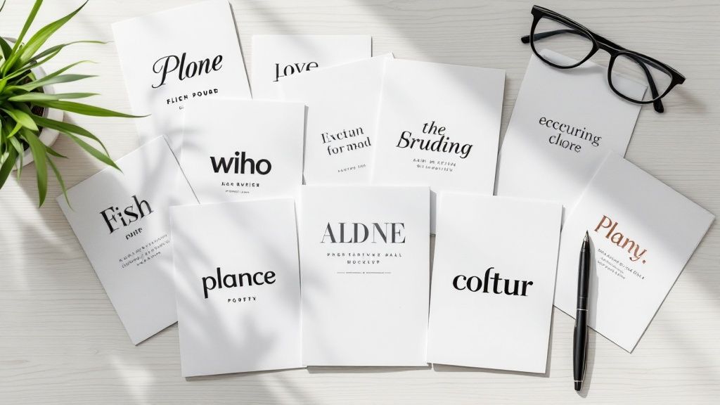
A flyer's job is to grab attention in a split second. While compelling images and a bold offer are crucial, the silent workhorse of your design is the font. The right typeface does more than just present information; it sets the tone, establishes credibility, and guides the reader's eye. Choosing from the best fonts for flyers can mean the difference between a message that gets read and one that is instantly discarded. An effective font choice ensures your message lands with impact, whether it's posted on a community board or handed out at a busy event.
This guide moves beyond generic advice to give you a curated list of powerhouse fonts, complete with specific strategies to help you select the perfect one for your message, brand, and audience. We will explore why certain typefaces like Helvetica and Futura command authority while others like Montserrat feel modern and approachable. Making a thoughtful font selection is a fundamental part of a successful physical marketing strategy. Just as understanding the different kinds of signage for your business helps you choose the right medium, picking the right font ensures your message is delivered effectively on that medium.
Our goal is to provide actionable insights for every flyer you design. You will learn not only which fonts to use but also how to pair them, set them for maximum readability, and align them with your specific goals. This curated selection will ensure your next flyer doesn't just look good-it performs, turning a passing glance into a genuine customer connection.
1. Helvetica
Helvetica is a titan in the world of typography, a classic sans-serif typeface renowned for its clean lines, modern aesthetic, and unparalleled readability. Developed in 1957 by Max Miedinger and Eduard Hoffmann, its design philosophy centers on neutrality and clarity, allowing the message to take center stage without distraction. This inherent versatility and professional demeanor make it a perpetually reliable choice and one of the best fonts for flyers where clear communication is paramount.
Its power lies in its unassuming confidence. Helvetica can convey urgent information for a community event, project sophistication for a corporate seminar, or present a clean, modern look for a tech product launch. Its widespread adoption by global brands like Apple, BMW, and American Airlines is a testament to its effectiveness in creating a trustworthy and impactful visual identity.
Why It's a Top Choice for Flyers
Helvetica's genius is its chameleon-like ability to fit nearly any context while maintaining a sense of authority. For a flyer, this means your headlines will be sharp, your body text will be exceptionally legible even from a distance, and your contact information will be clear and unambiguous. It establishes an immediate sense of professionalism and order, ensuring your audience can absorb key details effortlessly.
Key Insight: Use Helvetica when your primary goal is direct, unadorned communication. Its neutrality ensures the font supports your message rather than overpowering it, making it ideal for corporate, informational, and minimalist designs.
Actionable Tips for Using Helvetica
To maximize Helvetica's impact on your next flyer design, follow these specific strategies:
- Create a Strong Hierarchy: Use Helvetica Bold or Helvetica Neue Bold for your main headline to grab attention instantly. Complement it with the regular weight for subheadings and body copy to guide the reader's eye smoothly through the information.
- Embrace White Space: Helvetica’s clean geometry shines when given room to breathe. Generous margins and spacing between text blocks prevent your flyer from feeling cluttered and enhance its modern, professional appeal.
- Create Dynamic Contrast: While effective on its own, Helvetica pairs beautifully with a traditional serif font. Try using a serif like Garamond for the body text while keeping Helvetica for all headings. This classic pairing adds a touch of elegance and improves readability.
- Avoid Overuse: A flyer set entirely in Helvetica can feel monotonous. To maintain visual interest, introduce a complementary font for pull quotes or special offers, or use color to differentiate sections.
2. Futura
Futura is a legendary geometric sans-serif typeface that embodies efficiency, modernism, and forward-thinking design. Designed by Paul Renner in 1927, its forms are derived from simple geometric shapes like circles, triangles, and squares. This clean, functional aesthetic gives it a timeless yet futuristic feel, making it one of the best fonts for flyers aimed at a contemporary audience.
Its influence is vast, having been famously used by NASA for the plaque left on the moon, in the iconic branding of Volkswagen, and in the stylish filmography of Wes Anderson. Futura’s power lies in its ability to be both elegant and authoritative. It projects an image of innovation, precision, and sophistication, making it perfect for tech, design, or fashion-related flyers.
Why It's a Top Choice for Flyers
Futura’s geometric precision makes headlines and key information stand out with striking clarity and style. For a flyer, this means your message feels intentional, modern, and impactful. It’s a font that doesn't just present information; it makes a statement about the brand or event it represents, suggesting it is current, innovative, and sophisticated. Its various weights provide great flexibility for creating a clear visual hierarchy.
Key Insight: Use Futura when you want to convey a sense of modern elegance, technological advancement, or minimalist chic. It is ideal for designs where the font itself is a key component of the brand's forward-looking identity.
Actionable Tips for Using Futura
To leverage Futura's clean geometry and modern appeal on your flyer, consider these strategies:
- Focus on Headlines: Use Futura Bold or Futura Extra Bold for your main headline to create a powerful, attention-grabbing focal point. Its clean shapes make it highly effective for short, impactful statements.
- Increase Letter Spacing (Tracking): For headlines set in all caps, slightly increasing the tracking (the space between letters) can enhance its sophisticated and airy aesthetic, improving readability and visual appeal.
- Pair with a Humanist Font: Futura's rigid geometry can feel stark in long paragraphs. Pair it with a more humanist sans-serif or a classic serif for body copy to add warmth and improve long-form readability.
- Utilize Its Geometric Shapes: Lean into Futura’s design roots by incorporating geometric shapes and clean lines into your flyer's overall layout. This creates a cohesive and visually harmonious design that reinforces the font’s modern character.
3. Proxima Nova
Proxima Nova stands as a modern typographic bridge, expertly blending the geometric clarity of fonts like Futura with the humanist warmth of classic grotesques. Designed by Mark Simonson, it strikes a perfect balance between technical precision and friendly approachability. This unique character makes it one of the best fonts for flyers, offering a clean, contemporary feel that is both professional and inviting.
Its strength is its sophisticated yet straightforward nature. Proxima Nova is the typeface of choice for countless modern digital brands like Spotify and Mashable because it feels current, clear, and trustworthy. For a flyer, it can project a forward-thinking vibe for a tech startup, offer a clean layout for a real estate listing, or create an accessible feel for a community workshop.
Why It's a Top Choice for Flyers
Proxima Nova's extensive family of weights and styles is its superpower. With options ranging from Thin to Black, it provides all the tools needed to build a clear and dynamic visual hierarchy within a single font family. This versatility ensures your flyer's headlines are impactful, its body copy is highly legible, and its call-to-action stands out, all while maintaining a cohesive and polished look.
Key Insight: Use Proxima Nova when you need a font that feels modern and friendly without sacrificing professionalism. It is exceptionally well-suited for brands that want to appear both innovative and trustworthy.
Actionable Tips for Using Proxima Nova
To leverage Proxima Nova's versatility and modern appeal on your flyer, implement these strategies:
- Vary Your Weights: Create a strong, engaging hierarchy using different weights. Use Proxima Nova Extra Bold for your main headline, a semi-bold weight for subheadings, and the regular weight for body text. This adds visual interest and guides the reader's eye effectively.
- Use Light Weights for Elegance: For a more sophisticated or minimalist flyer design, such as for a gallery opening or a high-end service, use Proxima Nova Light for headlines. Paired with generous white space, it creates an airy and refined aesthetic.
- Pair with a Characterful Serif: Proxima Nova's clean neutrality makes it an excellent partner for a more decorative serif font. Use it for all informational text and pair it with a serif like Playfair Display for a single, impactful headline to add a touch of personality.
- Ensure Digital Consistency: If your flyer promotes a website or social media campaign, using Proxima Nova ensures visual harmony across both print and digital platforms, as it is a web-safe font renowned for its excellent on-screen readability.
4. Montserrat
Montserrat is a geometric sans-serif typeface that captures the spirit of early 20th-century urban typography, specifically inspired by the posters and signs in the historic Montserrat neighborhood of Buenos Aires. Designed by Julieta Ulanovsky and available for free through Google Fonts, its friendly yet structured character has made it a digital-era favorite. Its blend of classic and modern aesthetics makes it one of the best fonts for flyers aiming for a clean, cosmopolitan, and approachable feel.
Its widespread popularity stems from its incredible versatility and extensive family of weights, which range from Thin to Black. This allows for dynamic and expressive designs without needing a second font family. Montserrat feels both professional and personable, making it suitable for a coffee shop opening, a tech startup announcement, or a community arts festival, and it is a popular choice for everything from website headers to social media graphics.
Why It's a Top Choice for Flyers
Montserrat offers a perfect balance of style and readability. Its open letterforms and generous spacing ensure that even at smaller sizes, your body text remains legible, a crucial feature for information-dense flyers. The font’s geometric foundation gives headlines a strong, modern presence that is confident without being overbearing. It projects an image of being current, accessible, and design-savvy, which helps build trust with a modern audience.
Key Insight: Use Montserrat when you want to convey a friendly, modern, and trustworthy tone. Its geometric clarity is excellent for tech, creative, and community-focused flyers that need to feel both professional and approachable.
Actionable Tips for Using Montserrat
To get the most out of Montserrat in your flyer designs, consider these practical strategies:
- Leverage Its Weight Range: Create a powerful visual hierarchy using only the Montserrat family. Use Montserrat ExtraBold or Black for a high-impact headline, SemiBold for subheadings, and Regular for body copy. This ensures consistency while providing clear visual separation.
- Focus on Kerning for Headlines: For large headlines, pay close attention to the spacing between letters (kerning). Tightening the kerning slightly can make your main message look more cohesive and professionally polished.
- Pair with Contrasting Fonts: While it stands strong on its own, Montserrat pairs beautifully with elegant script or serif fonts. Use a flowing script for a call-to-action or a classic serif like Merriweather for body text to add a touch of warmth and personality.
- Ideal for Bilingual Content: Montserrat’s clean, unambiguous characters and extensive language support make it an outstanding choice for bilingual flyers, ensuring clarity and consistency across different languages.
5. Trade Gothic
Trade Gothic is an American grotesque sans-serif with an industrial strength and a straightforward, no-nonsense character. Designed by Jackson Burke between 1948 and 1960, it was crafted for the demands of advertising and headlines. This font projects an authentic, bold, and slightly rugged feel, making it an excellent choice for flyers that need to convey authority and grab attention without pretense.
Its power comes from its hardworking aesthetic. Unlike more polished grotesques like Helvetica, Trade Gothic retains a touch of grit that gives it a unique voice. This makes it perfect for a music festival flyer, a promotional ad for a construction company, or any design aiming for a vintage or industrial theme. Its straightforwardness ensures your message is delivered with confidence and clarity.
Why It's a Top Choice for Flyers
Trade Gothic’s range of weights and widths, particularly its condensed versions, makes it incredibly versatile and one of the best fonts for flyers where space is at a premium. It allows you to create impactful, text-heavy headlines that remain legible and powerful. This font brings a raw, energetic feel to a design, ensuring your flyer stands out from more conventional options and communicates its message with force.
Key Insight: Use Trade Gothic for designs that need to feel authentic, strong, and direct. It’s ideal for masculine or industrial branding, event promotions, and any context where a polished, corporate look feels out of place.
Actionable Tips for Using Trade Gothic
To leverage Trade Gothic’s unique character on your next flyer, consider these strategies:
- Go Bold with Headlines: Use Trade Gothic Bold Condensed or Bold No. 20 for your main headline. This creates an immediate, high-impact statement that is both space-efficient and visually commanding.
- Balance with Lighter Fonts: The strong personality of Trade Gothic can be overwhelming if used everywhere. Pair it with a lighter, neutral sans-serif like Open Sans or a simple serif for body copy to provide visual relief and improve readability.
- Embrace Industrial Themes: Lean into its inherent aesthetic. Trade Gothic works exceptionally well with distressed textures, strong grid layouts, and a limited, bold color palette to create a cohesive and powerful industrial or vintage design.
- Adjust Tracking for Readability: The condensed versions can sometimes feel tight. Slightly increasing the letter spacing (tracking) in your headlines can improve legibility and give your text a more refined, professional appearance.
6. Gill Sans
Gill Sans is a quintessential humanist sans-serif, a typeface that expertly blends modern clarity with the warm, organic strokes of traditional calligraphy. Designed by Eric Gill in 1928, it carries a distinctly British character, embodying a sense of heritage, authority, and refined intelligence. Its balanced proportions and classical roots give it an approachable yet professional feel, making it one of the best fonts for flyers that need to convey trustworthiness and sophistication.
Its enduring appeal lies in its unique ability to be both formal and friendly. Gill Sans can announce a university open day with academic gravitas, promote a heritage brand’s new product with timeless elegance, or outline the details of a government initiative with clarity and assurance. Its iconic use by institutions like the BBC, British Railways, and on classic Penguin Books covers highlights its power to create a reliable and intellectually engaging visual voice.
Why It's a Top Choice for Flyers
Gill Sans brings a level of established credibility to a flyer that few other sans-serifs can match. Its humanist characteristics, like the subtle variations in stroke weight, make long passages of text comfortable to read, which is ideal for information-heavy flyers. Headlines set in Gill Sans are strong without being aggressive, and its classic structure ensures your message is perceived as dependable and well-considered, helping to build immediate trust with your audience.
Key Insight: Use Gill Sans when you want to project an image of established authority and intelligence. It’s perfect for educational, institutional, or premium brand flyers where credibility is just as important as the message itself.
Actionable Tips for Using Gill Sans
To effectively leverage Gill Sans on your next flyer, consider these targeted strategies:
- Emphasize Its Heritage: Use Gill Sans Bold or Extra Bold for a main headline to create a powerful, classic statement. Pair it with the regular weight for body copy to ensure excellent readability in text-heavy sections, such as for event schedules or program details.
- Create an Elegant Pairing: Gill Sans pairs exceptionally well with traditional serif fonts. Combine it with a typeface like Caslon or Bembo for the body text to create a sophisticated and highly readable design that feels both classic and scholarly.
- Manage Spacing Carefully: The letterforms in Gill Sans are quite distinct. Pay close attention to tracking (the space between letters) in your headlines to ensure they feel cohesive and balanced, preventing them from appearing too tight or too loose.
- Use for Text-Heavy Layouts: Thanks to its high legibility and open forms, Gill Sans is a workhorse for flyers that contain significant amounts of text. Its humanist design prevents reader fatigue, making it suitable for educational materials, detailed announcements, or non-profit appeals.
7. Bebas Neue
Bebas Neue is a powerhouse display font, a condensed sans-serif celebrated for its tall, clean, and commanding presence. Developed by Ryoichi Tsunekawa, this typeface has become a favorite among designers for its ability to deliver impactful headlines that are both elegant and strong. Its narrow letterforms make it incredibly efficient, allowing for bold statements even in limited space, which is why it stands as one of the best fonts for flyers promoting high-energy events.
Its strength is in its unapologetic confidence and modern flair. Bebas Neue is perfect for grabbing attention on a movie poster, conveying chic sophistication for a fashion brand, or announcing a high-octane sports event. Its clean, all-caps design ensures that titles are not just read but seen, making an immediate and lasting impression on passersby.
Why It's a Top Choice for Flyers
Bebas Neue’s brilliance lies in its ability to create maximum visual impact with minimal effort. For a flyer, this means your main message will shout from the page, instantly drawing the eye. It’s ideal for event names, promotional offers, and key taglines that need to be seen from a distance. The font’s condensed nature ensures that even long headlines feel punchy and contained rather than sprawling and messy.
Key Insight: Use Bebas Neue when your flyer needs a bold, contemporary, and assertive voice. It excels in designs that aim to feel modern and energetic, making it perfect for promotions targeting a younger, style-conscious audience.
Actionable Tips for Using Bebas Neue
To leverage the full power of Bebas Neue on your next flyer, apply these specific techniques:
- Reserve for Headlines Only: Bebas Neue is a display font designed for impact, not readability in long paragraphs. Use it exclusively for your main title or key phrases and never for body copy.
- Pair with a Simple Sans-Serif: Create a balanced and legible hierarchy by pairing its bold headlines with a clean, neutral sans-serif like Lato, Open Sans, or Roboto for subheadings and body text. This contrast ensures clarity.
- Increase Letter Spacing (Tracking): To improve readability and give your headlines a more refined, cinematic feel, slightly increase the tracking (letter spacing). This prevents the tall, condensed letters from feeling too crowded.
- Stack Words for Vertical Impact: The font’s tall, narrow structure works exceptionally well when words are stacked vertically. This technique is great for creating dynamic, modern layouts for event announcements or nightclub flyers.
8. Lato
Lato is a humanist sans-serif typeface that strikes a remarkable balance between professionalism and warmth. Designed by Łukasz Dziedzic, its name means "summer" in Polish, a nod to its friendly and approachable feel. Its semi-rounded letterforms provide a sense of harmony and ease, while its solid structure ensures it remains serious and stable, making it one of the best fonts for flyers that need to feel both authoritative and inviting.
The font was originally conceived for a large corporate client but was later released for public use, becoming a staple on Google Fonts. Its strength lies in its incredible versatility and extensive family of weights, which range from Hairline to Black. This allows it to work seamlessly for everything from government and healthcare communications to flyers for non-profits and educational workshops, conveying information with a welcoming clarity.
Why It's a Top Choice for Flyers
Lato’s design is a study in functional elegance. It was created with body text in mind, ensuring exceptional readability in smaller sizes on a flyer, such as for event details or contact information. Yet, its bolder weights are strong and distinct enough to create impactful headlines that feel modern and accessible. This dual capability means you can design a cohesive, highly legible flyer using a single font family, creating a clean and unified look.
Key Insight: Use Lato when you want to appear friendly and credible simultaneously. Its warm character builds trust and engagement, perfect for community-focused, educational, or service-oriented flyers where a human touch is essential.
Actionable Tips for Using Lato
To leverage Lato’s friendly professionalism on your next flyer, consider these specific techniques:
- Balance Headings and Body Copy: Use Lato Bold or Lato Black for a strong, inviting headline. For body text, stick with Lato Regular to ensure maximum legibility and prevent reader fatigue, creating a clear informational flow.
- Enhance Digital and Print Readability: Lato was optimized for screen use but performs just as beautifully in print. Its balanced letter spacing makes it an excellent choice for flyers that will be distributed both physically and as digital PDFs.
- Pair with an Expressive Serif: Combine Lato’s clean sans-serif style with a characterful serif like Merriweather or Playfair Display. Use the serif for the main headline to add a touch of personality, while using Lato for all subheadings and body text for clarity.
- Focus on Informational Clarity: Lato excels in information-heavy designs. Its straightforward and unpretentious nature makes it ideal for flyers that need to communicate schedules, program details, or instructions clearly and without distraction.
9. Impact
Impact is an ultra-bold, condensed sans-serif typeface designed by Geoffrey Lee in 1965 with a single, clear purpose: to command attention. Its thick strokes, compressed letterforms, and minimal internal white space create a dense, powerful visual that is impossible to ignore. While its modern fame is often tied to internet memes, its original intent makes it one of the best fonts for flyers needing to deliver a short, powerful message with urgency.
The font's design is purely functional, prioritizing visibility and force over nuance. Impact shouts rather than speaks, making it an exceptional tool for headlines that need to cut through visual noise. It is the go-to choice for high-energy promotions, urgent announcements, and bold statements, such as for a clearance sale, a boxing match promotion, or a last-chance offer where immediacy is the primary goal.
Why It's a Top Choice for Flyers
Impact’s strength lies in its uncompromising boldness. For a flyer, this means your headline will have an immediate and forceful presence, stopping passersby in their tracks. Its condensed nature allows you to fit large, powerful words into a tight space, maximizing every inch of your design for visual force. It’s built to be seen from a distance and processed in an instant.
Key Insight: Use Impact when your message must be loud, direct, and urgent. It’s not for body text or nuanced communication; its sole purpose is to create a high-visibility, attention-grabbing headline that demands to be read.
Actionable Tips for Using Impact
To harness Impact's power effectively without overwhelming your flyer design, consider these tips:
- Reserve It for Headlines Only: Impact is a one-trick pony, and that trick is shouting. Never use it for subheadings or body copy, as its low legibility in smaller sizes will render your message unreadable. Pair it with a clean, neutral sans-serif like Arial or Roboto for supporting text.
- Keep Your Message Short: The font works best for one to three-word phrases like "SALE," "FREE," or "NOW OPEN." Longer sentences become dense, illegible blocks of text that defeat the purpose of grabbing quick attention.
- Give It Ample Space: While the font itself is condensed, the text block needs significant white space around it. This contrast prevents your flyer from looking cluttered and allows the headline's power to stand out even more.
- Use High-Contrast Colors: Maximize visibility by setting Impact in a color that starkly contrasts with your background. Think bold yellow on black, or bright red on a white background, to enhance its inherent urgency.
Top 9 Flyer Fonts Comparison
| Font | 🔄 Implementation Complexity | ⚡ Resource Requirements | 📊 Expected Outcomes | 💡 Ideal Use Cases | ⭐ Key Advantages |
|---|---|---|---|---|---|
| Helvetica | Medium | Licensed commercial font (paid) | High readability, professional look | Corporate events, healthcare, minimalist designs | Universally trusted, extremely legible |
| Futura | Medium | Licensed commercial font (paid) | Strong visual impact, modern feel | Tech events, art exhibitions, fashion shows | Geometric precision, timeless modernity |
| Proxima Nova | Medium | Licensed commercial font (paid) | Versatile, great readability | Startups, digital marketing, social media | Balanced humanist design, web & print ready |
| Montserrat | Low | Free (Google Font) | Clean, trendy, approachable | Community events, small businesses, multicultural | Free, wide weights, excellent language support |
| Trade Gothic | Medium | Licensed commercial font (paid) | Bold, attention-grabbing | Construction, music events, industrial themes | Boldness, space-efficient condensed styles |
| Gill Sans | Medium | Licensed commercial font (paid) | Timeless, elegant, authoritative | Educational, government, traditional businesses | Warm yet professional, strong brand recognition |
| Bebas Neue | Low | Free | Maximum headline impact | Entertainment, fashion, sports, nightlife | All-caps bold, space-efficient, free font |
| Lato | Low | Free (Google Font) | Friendly, highly readable | Healthcare, education, government, non-profits | Free, versatile family, great legibility |
| Impact | Low | Pre-installed/Free | Extreme boldness, highly visible | Sales, urgent announcements, sports promotions | Ultra-condensed, maximum attention grabbing |
From Font Selection to Flawless Flyers
Choosing the right typeface is a foundational decision in flyer design, but it’s the first step, not the final one. Throughout this guide, we've explored a curated selection of the best fonts for flyers, from the timeless neutrality of Helvetica to the commanding presence of Bebas Neue. Each font carries its own distinct personality, offering a unique tool to capture attention, convey a specific mood, and guide the reader’s eye through your message. The goal was to move beyond a simple list and equip you with the strategic understanding needed to make an informed choice that aligns perfectly with your brand, your audience, and your overall marketing objective.
A well-chosen font like Montserrat can communicate modern friendliness, while a classic like Gill Sans can evoke a sense of heritage and trustworthiness. The key takeaway is that typography is not merely decorative; it is a critical component of communication. The most effective flyers are those where the font works in harmony with the layout, imagery, and copy to create a cohesive and persuasive whole.
Beyond the Font: Mastering Typographic Hierarchy
Simply selecting one of the best fonts for flyers is not a guarantee of success. The true artistry lies in how you implement it. One of the most critical concepts to master is typographic hierarchy. This is the visual system you use to organize information, telling your audience what to read first, second, and third. Without a clear hierarchy, even a brilliant font choice can result in a confusing and ineffective design.
To build a strong hierarchy, consider these actionable steps:
- Vary Font Weights: Use the bold or black weights of your chosen font family (like Lato or Proxima Nova) for your main headline. Use a regular or medium weight for subheadings and a light or regular weight for body text. This creates instant contrast and clarifies the information structure.
- Adjust Font Sizes: Your headline should be significantly larger than any other text on the flyer. Subheadings should be smaller than the headline but larger than the body copy. This size differentiation is the most direct way to signal importance.
- Utilize Color and Contrast: A headline in a vibrant, on-brand color will naturally draw more attention than body text in a standard black or dark grey. Ensure your text has sufficient contrast with the background to remain legible from a distance, a crucial factor for flyer design.
By skillfully combining size, weight, and color, you transform a flat block of text into a dynamic and easily scannable message. This ensures your key offer or event detail is seen and understood in a matter of seconds.
The Crucial Link Between Design and Print Quality
Your design journey culminates in the physical production of your flyer, a stage where all your careful font selection and hierarchical planning can either be brilliantly realized or fatally undermined. A fantastic digital design can lose all its power if it's printed poorly. The subtle curves of Futura or the clean lines of Helvetica can become blurred and unprofessional with low-resolution printing. The vibrant color you chose for your headline can appear dull and muted on low-grade paper.
This is where the quality of your printing partner becomes paramount. The final output must honor the integrity of your design choices. Think of it this way: choosing one of the best fonts for flyers is like selecting the finest ingredients for a meal. The printing process is the final act of cooking and presentation. Without expert execution, the quality of the ingredients is wasted. Professional printing ensures that the sharpness, clarity, and color fidelity of your design are perfectly translated into a tangible marketing tool that reflects the quality of your brand. A professionally printed flyer feels substantial, looks credible, and ultimately, drives better results.
Your font is the voice of your flyer. By pairing a powerful typeface with thoughtful hierarchy and high-quality printing, you ensure that voice is heard clearly, professionally, and persuasively.
Ready to bring your perfectly designed flyer to life? At 4OVER4, we specialize in premium printing that ensures your font choices and design elements look as crisp and professional on paper as they do on your screen. Explore our vast selection of paper stocks, finishes, and flyer options to create a marketing tool that truly makes an impact. Visit 4OVER4 to see how we can transform your vision into a flawless final product.
More from best fonts for flyers

13
Want to know the real secret to getting a poster to stick to a wall without it peeling off in the middle of the night? It's all about what
 Emma Davis
Jan 28, 2026

25
When you hear "table tent specs," what we're really talking about are the foundational details for printing them correctly: the
Emma Davis
Jan 27, 2026

105
When you're ready to print a poster, one of the first questions you'll face is, "What size should it be?" The industry has a
Emma Davis
Jan 26, 2026

104
Picture this: you're at a networking event, and someone hands you their business card. You do the usual glance—name, title, company—an
Emma Davis
Jan 25, 2026

129
Believe it or not, figuring out how to make a card in Word is surprisingly easy. You can knock out everything from slick, professional busines
Emma Davis
Jan 24, 2026

112
Printing on packaging takes a simple container and turns it into one of your most powerful marketing tools. It’s the very first physical int
Emma Davis
Jan 23, 2026

405
When you're getting ready to print a flyer, one of the first questions you'll face is, "What size should it be?" The most co
Emma Davis
Jan 22, 2026

363
How Our Free Business Cards Program Works (Quick Overview) Free business cards are available through two different
Emma Davis
Jan 22, 2026