TABLE OF CONTENTS
- Home
- content hub
- Finding the Best Font for Flyers to Elevate Your Design
Finding the Best Font for Flyers to Elevate Your Design
Jan 6, 2026374 views
Jan 6, 2026374 views
When you need to make an impact fast, your font choice is everything. For flyers, you can't go wrong with timeless, readable options like Helvetica, Montserrat, and Lato. These sans-serif workhorses are clean and modern, ensuring your message gets across in a single glance. They're top contenders for just about any flyer design you can dream up.
Your Quick Guide to the Best Fonts for Flyers
Choosing a font for your flyer is a lot like picking an outfit for a big event. It sets the tone and makes that critical first impression. You wouldn't wear a tuxedo to a backyard barbecue, right? In the same way, you shouldn't use a playful, quirky font for a serious corporate announcement.
The goal is to match the font's personality with your message. When you get it right, you create a cohesive and powerful piece of marketing that connects with your audience before they even read a single word.
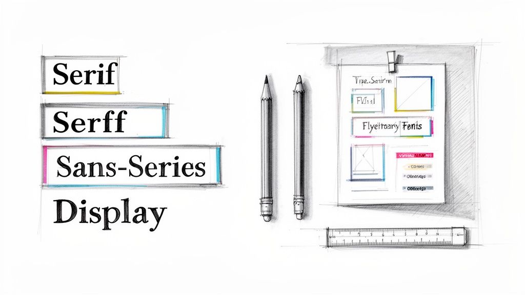
Know Your Font Families
This is where the main font categories come into play. Each one has a distinct voice and purpose, helping you steer your audience's perception.
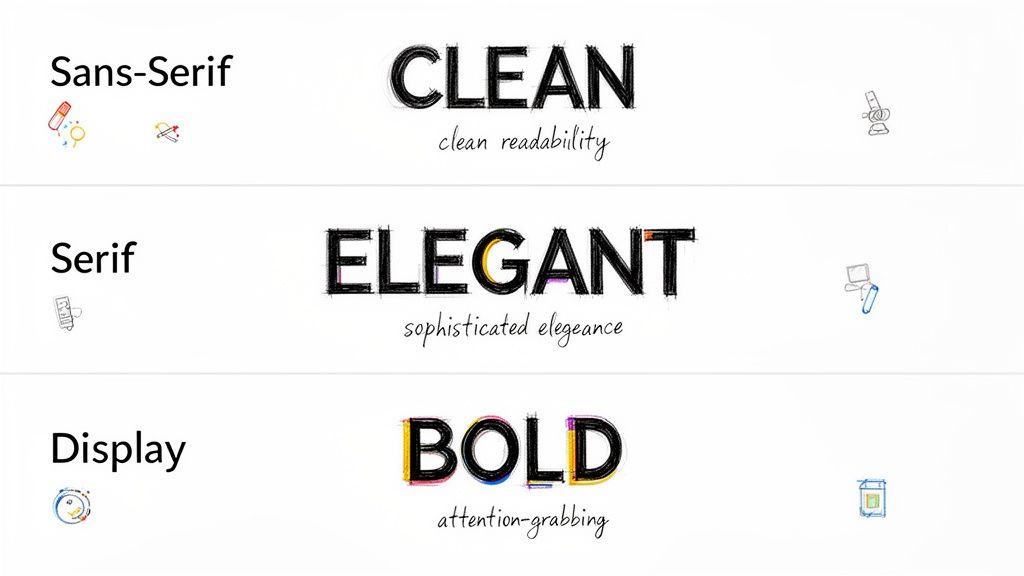
Sans-Serif Fonts: These are the modern workhorses. They don't have the small decorative strokes (called serifs) on the ends of letters, which makes them look clean, direct, and incredibly legible. Fonts like Helvetica and Montserrat are perfect for tech startups, sales promotions, or any event needing a clear, contemporary feel.
Serif Fonts: With their classic, decorative strokes, serif fonts communicate tradition, elegance, and trustworthiness. Think of Playfair Display or Baskerville for a formal event invitation, a luxury brand promotion, or a menu for an upscale restaurant.
Display Fonts: These are the showstoppers. They're bold, stylized, and packed with personality. Display fonts are built to grab attention in headlines but should be used sparingly. They're a fantastic choice for concert posters, festival announcements, or seasonal sales where making a loud statement is the whole point.
Making the Right Choice Quickly
To make your decision even easier, this visual guide helps you pick a font category based on the vibe you're going for—whether it's modern, formal, or just plain bold.
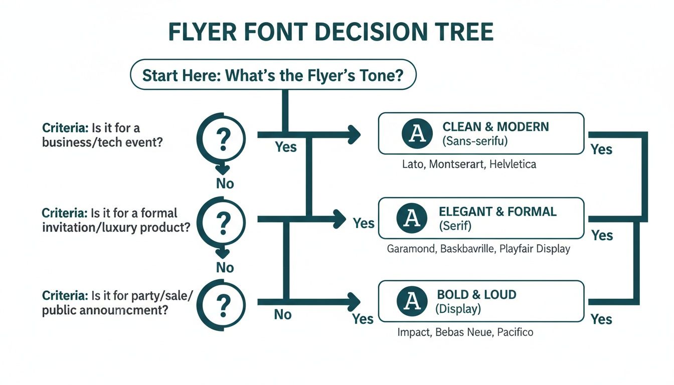
The key takeaway is simple: let your flyer's purpose drive your font selection. When the style aligns perfectly with your message, you've found your winner.
Top Font Picks for Common Flyer Goals
To give you a head start, here’s a quick-reference table matching different flyer goals with font styles that just plain work.
| Flyer Goal | Font Style | Top Font Examples | Why It Works |
|---|---|---|---|
| Corporate Event or Professional Service | Clean Sans-Serif | Lato, Open Sans | Projects a modern, competent, and trustworthy image. Easy to read quickly. |
| Luxury Product or Formal Invitation | Elegant Serif | Playfair Display, Garamond | Conveys sophistication, tradition, and high quality. Feels established. |
| Big Sale or Music Festival | Bold Display | Oswald, Impact | Grabs immediate attention with high-impact visuals. Creates excitement. |
| Community Event or Local Business | Friendly Rounded Sans-Serif | Montserrat, Nunito | Appears approachable, warm, and welcoming. Builds a sense of community. |
This table isn't exhaustive, but it's a solid starting point for finding a font that not only looks great but also does the heavy lifting for your brand.
For ages, Helvetica has been crowned the king of flyer fonts, and for good reason. Its readability is unmatched, and its appeal is truly timeless. A 2023 analysis of over 3,000 design sites found it was the most popular sans-serif, used in 42% of marketing materials because of its neutral, get-the-job-done vibe.
Even more telling, one study discovered that flyers using Helvetica saw a 28% higher read-through rate in A/B tests. The numbers don't lie.
Ultimately, picking the best font for your flyer is all about creating an instant connection. Once you’ve nailed down your fonts and finalized the design, bringing it to life with professional flyer printing ensures your message lands with the quality and impact it deserves.
Understanding Core Typography Principles
Before you even think about picking a font for your flyer, we need to talk about the ground rules of good design. Think of typography principles as the foundation of a house—get them right, and the whole thing stands strong. These aren't just stuffy design theories; they're practical tools that turn a piece of paper into a powerful marketing asset.
Your font choice is essentially the "tone of voice" for your flyer. A bold, modern font can shout excitement for a flash sale, while a classic, elegant font might whisper sophistication for a gallery opening. This is powerful stuff, shaping how people feel about your message before they even read a single word.
We'll break down the big three—readability, legibility, and visual hierarchy—into simple, actionable advice. Once you get these down, you'll be able to create flyers that don't just look good but actually guide the reader's eye and get you the results you're after.
Prioritize Readability and Legibility
People often use these two words interchangeably, but in design, they mean very different things. For a flyer that someone will only glance at for a few seconds, getting both right is absolutely critical.
Legibility is all about how easy it is to tell one letter from another. A font like Helvetica is super legible because its characters are clean and distinct. On the flip side, a fancy script font might have low legibility, making it a terrible choice for crucial details like a date or address.
Readability focuses on how easy it is to read whole blocks of text. This comes down to things like font size, line spacing (what designers call "leading"), and even the space between letters ("kerning"). A solid body font like Lato, set at the right size, lets someone comfortably absorb your message without squinting.
For flyers, where attention spans are measured in seconds, nailing both is non-negotiable. Your amazing offer is completely useless if no one can figure out what it says.
Your flyer has about three seconds to capture someone's attention. If the font is difficult to read, you've lost them. The best font choices are those that communicate instantly and effortlessly, making your message accessible to everyone at a glance.
Establish a Clear Visual Hierarchy
Visual hierarchy is the art of arranging your content to guide the viewer's eye in order of importance. It's how you tell them what to look at first, second, and third. Your typography is the main tool you'll use to build this structure.
Think of your flyer as having a conversation. The headline should be the loudest, most attention-grabbing part—the conversation starter. This is where you'll use your biggest, boldest font.
Next up are the subheadings, which act as supporting points. They should be smaller than the headline but still stand out from the main body text. Finally, the body copy fills in the details using a clean, highly readable font. This natural flow makes your flyer easy to scan and understand in an instant.
Here’s a simple framework to get you started:
- Headline: Your main message (e.g., "50% Off Grand Opening Sale"). Use a large, bold, or eye-catching display font.
- Subheadings: Key details that add context (e.g., "This Saturday Only!"). Go with a medium-weight font.
- Body Text: The fine print and other details (e.g., location, time, website). Use a clean, simple font. A size of 10-12pt is a safe bet for print.
- Call to Action (CTA): The final instruction (e.g., "Visit Our Store!"). Make this pop with bolding, a different color, or a slightly larger font.
By mastering these principles, you're no longer just picking pretty letters—you're making strategic design choices. This ensures every single element on your flyer has a job to do, leading to a much more professional and effective result.
Choosing Your Typeface: The Main Font Categories
Think of fonts like actors cast for a specific role. Each one has a personality, and picking the right one is the key to making sure your flyer’s message hits home with the right tone and emotion. We'll look at the three main families—Sans-Serif, Serif, and Display—not as dry textbook definitions, but as characters ready to bring your flyer to life.
Getting a handle on these categories is your first step toward making a smart choice. A modern, minimalist font speaks a completely different language than a classic, elegant one. Once you learn their personalities, you can pick a font that clicks with your brand and message, making your design feel intentional and buttoned-up.
Sans-Serif Fonts: The Modern Workhorses
Sans-serif fonts are the clean, no-nonsense communicators of the typography world. The name "sans-serif" literally means "without serif," which gets right to the point—they don't have the little decorative strokes you see on serif letters. This gives them a modern, crisp, and incredibly easy-to-read look.
These fonts are the ultimate multitaskers, making them a go-to for just about any flyer you can dream up. Their clarity is fantastic for headlines, subheadings, and body text alike.
- Personality: Direct, honest, modern, and approachable.
- Best For: Tech companies, corporate events, retail sales, and any flyer that needs a clean, contemporary feel. They’re champs at getting information across quickly and efficiently.
- Examples: Helvetica, Lato, and Open Sans.
Pro Tip: Try a bold sans-serif for your headline to really grab attention, then switch to a lighter weight of the same font for your body text. This creates a clean, cohesive hierarchy without cluttering the design with too many different typefaces.
Montserrat, in particular, is a modern powerhouse. It strikes a perfect balance between geometric precision and a contemporary vibe, making it a favorite for startups and creative agencies. According to AgencyAnalytics' 2024 font popularity index, Montserrat came in at #3 among sans-serifs, showing up in 31% of digital-to-print marketing assets. Its tall x-height has also been praised for boosting legibility by 25% on both screens and paper.
Serif Fonts: The Elegant Storytellers
If sans-serifs are modern minimalists, then serif fonts are the classic storytellers. Those small decorative strokes—the serifs—at the ends of their letters give them a traditional, formal, and trustworthy feel. They’ve been a staple in print for ages, from books to newspapers, because those little feet help guide the eye smoothly along each line of text.
Using a serif font on a flyer can instantly add a layer of sophistication and authority. It sends a signal that your brand is established, refined, and cares about quality. This makes it the perfect choice when you want to project an image of elegance and tradition. For longer content, like detailed event descriptions or product benefits, well-designed marketing brochures that use serif fonts can really enhance readability and give off a premium feel.
- Personality: Traditional, trustworthy, elegant, and sophisticated.
- Best For: Luxury brands, high-end restaurants, formal event invitations, law firms, and financial services.
- Examples: Playfair Display, Garamond, and Baskerville.
Display Fonts: The Bold Headliners
Last but not least, we have the display fonts—the bold, charismatic attention-seekers of the group. These typefaces are designed to be used at large sizes, like in headlines and titles. They often have unique, stylized, or dramatic letterforms that are meant to make a huge visual statement.
Display fonts are all about personality and impact. You'd never use them for body text because their wild designs would be a nightmare to read in small sizes. Instead, you should use them sparingly to create a killer focal point and inject a burst of character into your flyer. Think of them as the main event, with more subdued sans-serif or serif fonts playing the supporting roles.
- Personality: Expressive, loud, unique, and highly stylized.
- Best For: Concert posters, festival flyers, special sale announcements, and any design where grabbing immediate attention is the absolute top priority.
- Examples: Oswald, Impact, and Lobster.
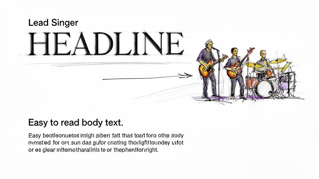
Mastering Font Pairing for Professional Flyers
Pairing fonts can feel like a bit of a dark art, but it’s a skill you can absolutely pick up with a few straightforward rules. The easiest way to think about it is like a band: your headline font is the lead singer—it’s bold, has tons of personality, and grabs all the attention. Your body font is the rest of the band, providing the steady, reliable rhythm that makes the whole song work.
When you get the pairing right, you create a seamless visual experience that guides the reader’s eye exactly where you want it to go. The goal is to establish contrast and clarity, not create chaos. A great pairing makes your flyer look instantly more professional and helps your message land with zero friction.
The Power of Contrast
The golden rule of pairing fonts is to create obvious contrast. If the two fonts you pick are too similar, it often looks like an amateur mistake. What you’re really aiming for is a duo of typefaces that are different enough to create a clear visual hierarchy.
This contrast is what tells your reader, "Hey, look at me first!" A bold, attention-grabbing headline font needs a simple, super-readable body font to back it up. This creates a natural flow, pulling the eye from the main message down to the finer details.
A time-tested strategy for getting this right is to combine a serif font with a sans-serif font. The classic elegance of a serif headline can be beautifully balanced by the clean, modern feel of a sans-serif body text, or you can flip it. This high-contrast combination is a design staple for a reason: it just works.
Can't-Go-Wrong Font Pairing Recipes
To give you a head start, here are a few professional font pairings that are pretty much foolproof for flyers. These combinations offer excellent contrast and are well-known for their readability in print.
Headline: Playfair Display (Serif) & Body: Lato (Sans-Serif)
This is a classic for a reason. Playfair Display’s elegant, high-contrast letterforms make it a stunning choice for headlines that need a touch of class. Lato is friendly and incredibly legible, providing the perfect counterbalance for the body text.Headline: Oswald (Sans-Serif) & Body: Merriweather (Serif)
Oswald is a bold, condensed sans-serif built for impact, making it perfect for punchy headlines. When you pair it with Merriweather—a serif font specifically designed for readability on screens and in print—you get a powerful yet comfortable reading experience.Headline: Montserrat (Sans-Serif) & Body: Open Sans (Sans-Serif)
This pairing shows how you can successfully use two fonts from the same family (sans-serif) by creating contrast with weight and style. Use a bold or black weight of Montserrat for the headline and the regular weight of Open Sans for the body. The subtle differences in their geometric structures keep the design interesting while feeling cohesive.
To help visualize how these pairings work in different scenarios, here’s a quick-reference table.
Effective Font Pairing Combinations for Flyers
This table showcases some professional font pairings, offering suggestions for headlines and body text tailored to specific business flyer types.
| Pairing Combination | Headline Font (Example) | Body Font (Example) | Best For (Flyer Type) |
|---|---|---|---|
| Elegant & Modern | Playfair Display | Lato | Luxury brands, art galleries, high-end events |
| Bold & Readable | Oswald | Merriweather | Sales events, product announcements, corporate flyers |
| Clean & Friendly | Montserrat | Open Sans | Tech startups, non-profits, community events |
| Classic & Trustworthy | Lora | Roboto | Real estate, financial services, professional consultants |
These combinations are tried and true, but don't be afraid to experiment to find the perfect voice for your brand.
A Deeper Look at a Winning Combination
The mix of a dramatic serif headline with a clean sans-serif body is particularly effective. A font like Playfair Display, for instance, immediately elevates a flyer design with its high-contrast, elegant serifs, making it a go-to for headlines that need a touch of luxury. And it's not just about looks; it’s backed by data. It consistently ranks as a top display font, and some readability tests have shown that headlines set in Playfair boosted viewer dwell time by 33% compared to plain sans-serifs.
Broader trends confirm this. Pairing dramatic serifs with clean sans-serif body fonts can lift engagement by as much as 29% in small business marketing campaigns. For more great font ideas, check out Typewolf's recommendations page.
When in doubt, simplify. A classic rookie mistake is over-designing with too many fonts. Sticking to just two complementary typefaces is one of the best ways to ensure your flyer looks professional, clean, and trustworthy.
By applying these pairing strategies, you can confidently create flyers that are not only nice to look at but also strategically sound. The right combination turns a simple piece of paper into a powerful marketing essential that communicates your message and drives action. Remember, great font pairing isn't just about finding two "pretty" fonts; it's about creating a functional, harmonious team that works together to get the job done.
From Screen to Print: Technical Tips for Perfect Flyer Fonts
A gorgeous design on your screen can fall flat in print if you miss a few technical details. This is the moment of truth, where your digital creation becomes a tangible flyer, and getting it right is everything. The best font isn't just about looks; it's about making sure those looks translate flawlessly to paper.
Think of your design file as a blueprint for a builder. If you hand over a blueprint with missing measurements (fonts) or unclear instructions (bad formatting), you can't be surprised when the final structure is shaky. Let's walk through the essential print settings to ensure what you see on screen is exactly what you get in your hands.
Fine-Tune Your Font Spacing and Sizing
Before you even think about hitting "export," it's time to become a micromanager of your text. Tiny tweaks to size and spacing can be the difference between a cluttered mess and a clean, professional layout that invites people to read.
Pay close attention to these three areas:
- Font Size: For your main body text, 10pt is the absolute minimum for anyone to read comfortably on a printed flyer. Anything smaller is just asking for eye strain. Headlines, on the other hand, need to grab attention from a distance, so aim for 24pt or larger.
- Line Spacing (Leading): This is the vertical breathing room between your lines of text. If your lines are smooshed together, the text feels dense and unapproachable. A good rule of thumb is to set your leading to about 120-145% of the font size. For example, if your text is 10pt, try a leading of around 12–14.5pt.
- Letter Spacing (Kerning): Kerning is the art of adjusting the space between individual letters. Most fonts have decent built-in kerning, but big text like headlines and logos almost always needs a few manual nudges to look perfectly balanced and professional.
Get Your Fonts Ready for the Printer
This might be the single most important step in the entire process. When you send your design file to a commercial printer, their computers probably don't have the same cool fonts you used. If a font is missing, their system will swap it out for a default one—and completely butcher your design.
There are two main ways to prevent this disaster:
- Embedding Fonts: This method essentially packs your font files inside the PDF. When the printer opens it, their system can use your exact font to display and print the design, even if they don't have it installed. This is a solid choice if you suspect last-minute text edits might be needed.
- Outlining Text: This is the bulletproof option. Outlining converts all of your text into vector shapes, basically turning your letters into little drawings. Since it's no longer a "font," there is a 0% chance of a substitution error. The only catch? The text is no longer editable, so this should always be the very last thing you do.
Pro Tip: When you're sending the final file off for printing, always choose to outline your text. It completely removes any possibility of font issues and guarantees your flyer will print exactly as you designed it. No nasty surprises. It’s the safest bet for a flawless run.
To maintain visual consistency, it's also smart to get a handle on mastering color management in printing so your font colors look just as vibrant on paper as they do on screen. Plus, a high-quality finish can make your text pop even more. Exploring options like professional laminating services not only protects your flyers but adds a premium feel that makes your whole design look sharper.
Real-World Examples of Top Fonts in Action
Theory is great, but seeing fonts in action is where it all clicks. The right font can take a flyer design from forgettable to fantastic, completely changing how its message is received. It's the difference between a flyer that gets a passing glance and one that makes someone stop, pick it up, and actually read.
To show you exactly what I mean, let's walk through a couple of "before and after" scenarios. These examples will show you how swapping a generic, mismatched font for a carefully chosen one can breathe new life into a design, making sure it connects with the right people and gets the job done.
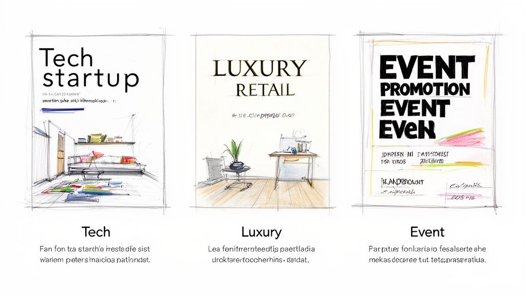
Example 1: The Tech Startup Launch
Picture a flyer for a brand-new tech app. The "before" version uses a bland system font like Arial for everything. Sure, it's readable, but it has zero personality. It does nothing to communicate the innovative, modern vibe of the company. The whole thing just feels flat and uninspired, destined to get lost in a sea of other promo materials.
Now, let's give it a makeover. We'll scrap Arial and bring in a modern, geometric sans-serif pairing.
- Headline Font: We'll use Montserrat Bold for the main headline. Its clean, confident structure immediately gives off a feeling of cutting-edge competence and approachability—perfect for a tech brand.
- Body Font: For the supporting details, Lato Regular is a fantastic choice. It's known for its warm, friendly feel and incredible readability, making the app's features easy to digest.
The "after" flyer instantly looks more professional and right at home in the tech world. This new font pairing creates a strong visual hierarchy, guiding the reader's eye from the exciting launch announcement straight to the important details. It's a simple change, but it makes the flyer feel far more credible and compelling.
Choosing a font isn’t just a design decision; it’s a branding decision. The right typeface acts as a visual shorthand for your company's values, telling a story of professionalism, creativity, or elegance in an instant.
Example 2: The High-End Retail Sale
Next up, a flyer for a luxury boutique's big seasonal sale. The original version uses Times New Roman—a font most people associate with term papers and default Word documents. While it's a classic, it completely fails to capture the exclusive, high-fashion vibe the brand is going for. It makes the event feel more like a clearance bin sale than a curated shopping experience.
This is where a touch of elegance can make all the difference, especially in the competitive world of retail marketing.
For the redesign, we’ll bring in a sophisticated serif font to broadcast luxury from a mile away.
- Headline Font: Playfair Display is the star here. Its high-contrast, elegant letterforms immediately elevate the design, giving it a classy, almost editorial feel that perfectly matches the quality of the products on sale.
- Body Font: We'll pair it with a clean sans-serif like Open Sans for the sale details. This ensures all the crucial info—dates, location, and discounts—is perfectly legible without clashing with the stylish headline.
The redesigned flyer now speaks the language of luxury. It feels exclusive and aspirational, attracting the right kind of customer and reinforcing the brand's premium identity. For more ideas on crafting promotions that pop, check out our resources on flyer printing for retail and sales. These examples prove that the best font for a flyer is simply the one that tells your brand's unique story most effectively.
Frequently Asked Questions About Flyer Fonts
You've got the basics down, but diving into the world of typography always brings up more questions. That's a good thing. Nailing these little details is what separates a flyer that just looks good from one that actually works. Here are some quick, no-nonsense answers to the questions we hear most often.
How Many Different Fonts Should I Use on a Flyer?
As a rule of thumb, stick to two or three fonts at most. Any more than that, and you risk creating a cluttered, chaotic design that’s tough on the eyes. A classic, effective approach is using one font for your headline, a second for body text, and maybe a third for a special logo or call-to-action.
But honestly? You can often get away with just one. A versatile font family with multiple weights (like Bold, Regular, and Light) can create all the contrast and hierarchy you need without introducing a whole new typeface.
What Is the Best Font Size for Flyer Body Text?
For your main paragraphs on a standard flyer, aim for something between 10 and 12 points. Dip below 9 points, and you’re making it hard for people to read, especially if they’re just giving your flyer a quick glance. If the message is too small to scan, it’s lost.
Headlines need to do the heavy lifting from a distance, so they should be much larger—think 24 points or more. Subheadings can bridge the gap nicely at around 14 to 18 points, guiding the reader’s eye through the content.
Pro tip: Always print a test copy before you send off a big order. What looks perfectly fine on a bright screen can sometimes look way too small on actual paper. This one simple step can save you from a very expensive mistake.
Can I Use Free Fonts for My Business Flyers?
Yes, you definitely can, but there's a huge catch: you must check the license first. This is a critical step that’s easy to miss.
Many free fonts, especially those on platforms like Google Fonts (think Montserrat, Lato, or Open Sans), are open-source and specifically licensed for commercial projects. These are your safest bets. However, a lot of "free" fonts floating around the web are only free for personal use. Using one of those on a business flyer is a direct violation of its license and could land you in legal hot water.
Always, always read the licensing agreement that comes with the font file. It will tell you exactly what you can and can’t do with it.
Ready to see your perfectly designed flyer come to life? At 4OVER4, we offer high-quality printing that ensures your font choices look just as sharp and professional on paper as they do on your screen. Explore our flyer printing options today!
More from

729
Full bleed printing is a simple but game-changing technique. It's how you get your artwork—whether it’s a photo, a background color, o
![]() Emma Davis
Emma Davis
Feb 3, 2026

336
Even though we live in a digital world, the humble business card is still a powerhouse networking tool. But here's something most people d
![]() Emma Davis
Emma Davis
Feb 2, 2026

1307
Staring at a wall of banner dimensions can feel a little overwhelming. But while there's no single "typical banner size" that wo
![]() Emma Davis
Emma Davis
Feb 1, 2026

397
Stretching your marketing budget doesn't mean you have to settle for flimsy, forgettable brochures. The real secret to low cost br
![]() Emma Davis
Emma Davis
Jan 31, 2026

387
Advertising magnets are one of those marketing tools that are so simple, you might overlook their power. They’re tangible, they last for age
![]() Emma Davis
Emma Davis
Jan 30, 2026

198
Tired of fighting with torn paper and sticky residue? We’ve all been there. The best way to get labels off bottles is often a simple soak in
![]() Emma Davis
Emma Davis
Jan 29, 2026

352
Want to know the real secret to getting a poster to stick to a wall without it peeling off in the middle of the night? It's all about what
![]() Emma Davis
Emma Davis
Jan 28, 2026

320
When you hear "table tent specs," what we're really talking about are the foundational details for printing them correctly: the
![]() Emma Davis
Emma Davis
Jan 27, 2026