TABLE OF CONTENTS
- Home
- content hub
- Learn to convert handwriting into font for your brand
Learn to convert handwriting into font for your brand
Jan 16, 2026589 views
Jan 16, 2026589 views
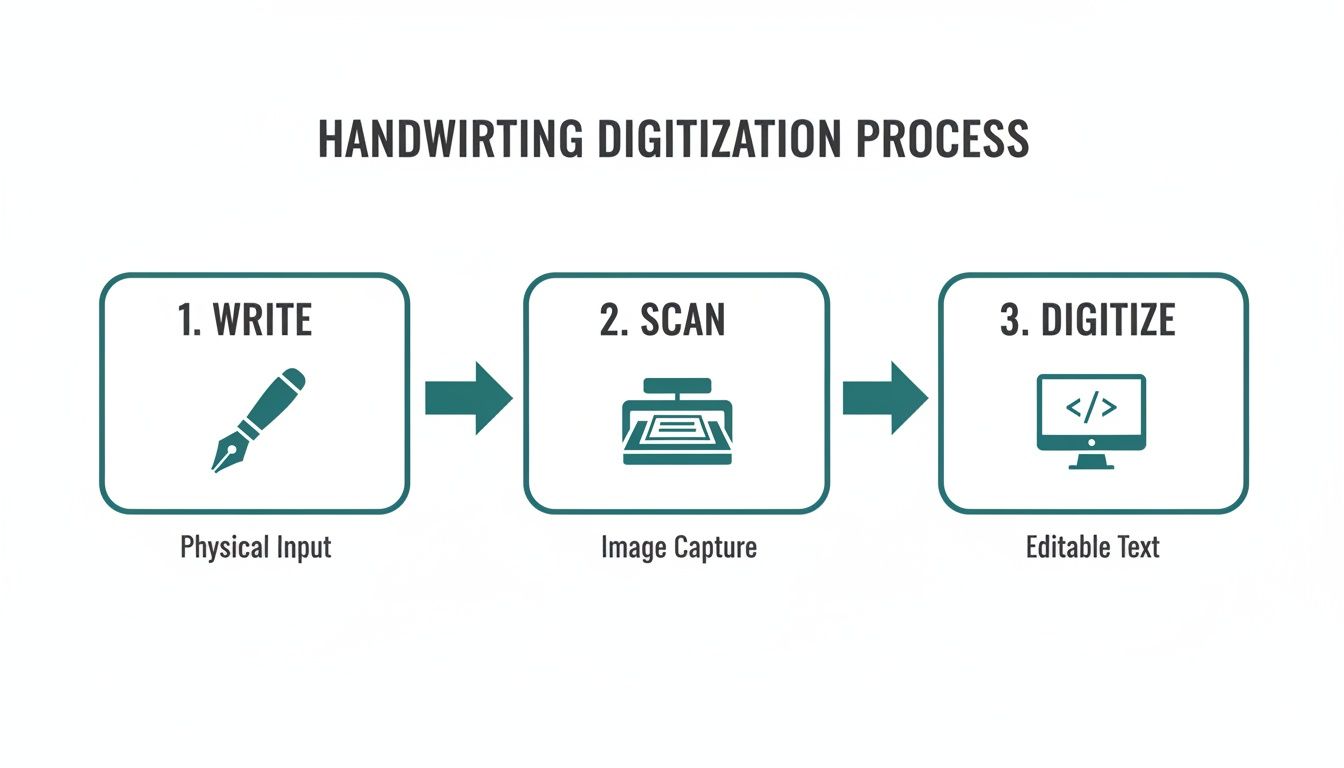
Turning your handwriting into a usable font is a fantastic way to give your projects a truly personal feel. At its core, the process involves tracing your written letters in digital software, mapping them to keys on the keyboard, and then exporting the whole package as a font file. This transforms your unique script into a digital asset you can use anywhere.
Giving Your Brand a Unique Voice with a Custom Font
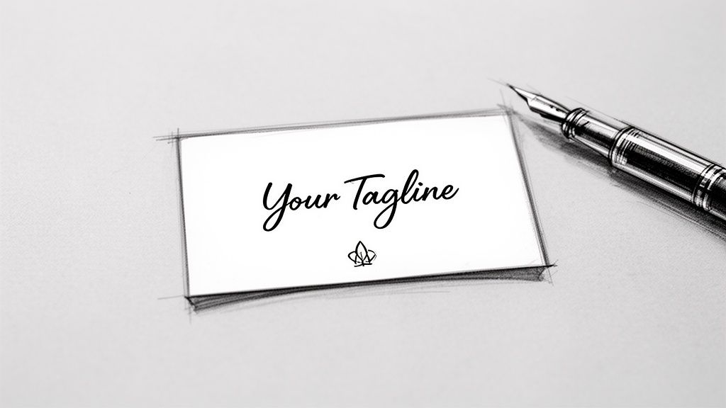
Imagine your brand’s tagline on a business card, not in some overused, generic typeface, but in your own authentic handwriting. It’s that kind of personal touch that makes marketing materials stick in someone's memory, creating a connection that standard fonts just can't match.
In this guide, we're going to walk through the entire process, from the first stroke of the pen to installing a fully functional font on your computer. This isn't just a dry, technical tutorial—think of it as a creative journey to capture your brand's true voice. The goal here is to create a high-quality, professional asset you can use across all your print materials.
Why a Custom Font Matters
A font crafted from your own handwriting is so much more than a cool aesthetic choice. It’s a powerful branding tool that can set you apart in a seriously crowded market. This is an approach that’s gaining a lot of traction, and for good reason.
The demand for these kinds of personalized tools is growing fast. In fact, the global handwriting-to-text converter market is on track to hit USD 15.4 billion by 2026, growing at a compound annual rate of 12.1%. That’s a huge indicator of a major shift toward personalized digital assets for businesses of all sizes.
By creating a font from your own script, you infuse your brand with personality and authenticity. It’s the difference between a generic email signature and a handwritten sign-off—one is functional, the other is memorable.
This personal touch works especially well for businesses aiming for an artisanal, friendly, or bespoke brand image. Whether it’s for custom labels, event banners, or thank-you notes, your font becomes a consistent and recognizable part of your identity.
You can see just how much a unique font can transform professional materials by exploring options for custom business cards printing. It’s all about building a cohesive brand experience that starts with your own distinct style.
Preparing Your Handwriting for Digital Conversion
The journey to convert handwriting into font starts long before you ever open a piece of software. Honestly, the quality of your final font is almost entirely dictated by how good your initial, physical sample is.
Think of it like cooking: the best recipe in the world can't save bad ingredients. Your handwriting is the core ingredient here, so let's get it right from the start.
Choosing Your Tools for Clarity
Success begins with the right tools. While you could technically use any old pen and paper, making smart choices here will save you a ton of cleanup work later. I’d steer clear of ballpoint pens, which often create thin, inconsistent lines, and avoid overly absorbent paper that makes the ink bleed.
For the cleanest results, grab a fine-tipped marker or a good felt-tip pen. These create the kind of bold, consistent strokes that font software can easily trace. A black pen on pure white paper is the gold standard—it gives you the high contrast you need for a crisp scan.
Consider these pairings for the best outcome:
- Smooth, bright white paper: This prevents the ink from feathering and gives you a clean, uniform background. Regular printer paper is fine, but a heavier stock like cardstock is even better because it stops any bleed-through.
- A consistent pen: This is a big one. Use the same pen for every single character. If you switch pens mid-alphabet, you'll introduce subtle variations that will make your finished font feel disjointed and weird.
Nailing this step minimizes the digital cleanup you'll have to do later, saving you a whole lot of time and frustration down the line.
Creating a Complete and Consistent Character Set
Before you put pen to paper, you need a game plan. A font isn't just the letters A-Z; it's a complete system of characters that all need to look like they belong together. You're going to be creating a full set of glyphs—the individual characters that make up your font.
Make sure your character sheet includes:
- Uppercase Letters (A-Z): The foundation of your font.
- Lowercase Letters (a-z): Pay attention to their size and make sure they feel proportional to the uppercase letters.
- Numbers (0-9): Keep their height and style consistent with your alphabet.
- Essential Punctuation: Don't forget periods, commas, question marks, exclamation points, quotes, and common symbols like the ampersand (&) and dollar sign ($).
To keep everything uniform, I strongly recommend using a template. Many online font creation tools offer printable templates with little boxes for each character. This simple trick forces you to maintain a consistent height and stops your letters from touching—which is critical for the software to recognize each one as a separate glyph.
Scanning for a Flawless Digital Copy
Once your character sheet is filled out and looking good, it's time to bring it into the digital world. A high-quality scan is absolutely non-negotiable here. Snapping a picture with your phone is tempting, but it almost always introduces shadows, distortion, and poor resolution. Trust me, use a flatbed scanner.
Set your scanner to a minimum of 300 DPI (dots per inch), though 600 DPI is even better if you want to capture all the fine details of your handwriting. Scan in black and white or grayscale to really push that contrast.
Your goal is to capture a clean, high-contrast image where the black ink is stark against the white paper, with no shadows or blurry edges. This single step can make or break the quality of your custom font.
If your handwriting is particularly intricate or you're working on a larger project, a professional-grade scanner can be a huge help. You can even explore the benefits of using an A3 photo scanner for detailed handwriting conversion. Taking the time to get this foundational stage right ensures the rest of the process is built on a solid, high-quality digital file.
Transforming Your Scanned Image into a Vector Font
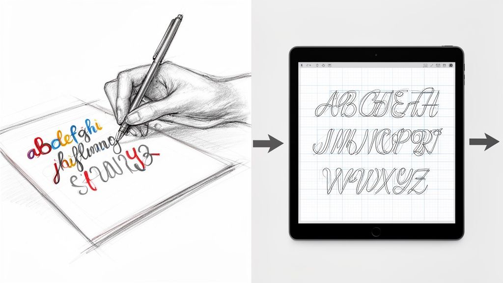
You've got a clean, high-resolution scan ready to go. Now for the fun part: bringing your physical handwriting into the digital world. This is the vectorization stage, where we'll convert the static image of your letters into a collection of editable, scalable glyphs.
Think of it this way: your scan is like a photograph, but font software needs something more like a blueprint. That’s what vectors are—infinitely resizable instructions that tell a computer how to draw each letter perfectly at any size.
When it comes to actually making this happen, you've got two main paths to choose from. One is the quick-and-easy automated route using online tools. The other is a more hands-on, manual approach using professional design software. Let's break them down.
The Automated Approach with Online Tools
If you're looking for a fast and surprisingly effective result, services like Calligraphr are a fantastic starting point. These platforms are built to do most of the heavy lifting for you. You just upload your scanned template, and the software automatically traces each character, converting the pixels into clean vector shapes.
This process is powered by some seriously impressive technology, similar to what's used for historical text recognition. Back in the early 2000s, this tech had around 65% word accuracy—today, it's nearly flawless, which is what makes these modern tools so powerful.
Even with automation, you'll probably need to do a little tidying up. Most tools have a simple interface that lets you erase stray marks or fill in gaps where your pen stroke might have been a bit light. It’s far less work than manual tracing and can get you a usable font in less than an hour.
The Manual Method for Ultimate Control
For the perfectionists out there who want absolute precision, the manual route is your best bet. Using software like Adobe Illustrator, you get complete control over every single curve and line of your characters, though it does take more patience and a bit of skill.
You’ll start by placing your scanned image into a new document. From there, you'll use the Pen Tool to carefully trace each letter, creating vector paths by placing anchor points and adjusting the curves.
It might sound complicated, but it's the same core skill used across many digital design fields. If you want to get a feel for the technique, check out resources that explain how to digitize a hand-drawn sketch—the fundamental process is almost identical.
Why go to all this trouble? A few key reasons:
- Cleaner Lines: You can create perfectly smooth curves without the slightly jagged edges that automated tracing can sometimes leave behind.
- Fewer Anchor Points: A hand-traced letter often has fewer anchor points, which makes the final font file smaller and more efficient.
- Artistic Control: This is your chance to make creative adjustments. You can exaggerate a swash, sharpen a serif, or tweak a curve to get each glyph looking exactly how you want it.
Pro Tip: No matter which method you pick, always aim to create closed paths for each character. If you have an open path—like an "O" that isn't fully connected—it can cause weird rendering issues when you try to use the font. Give each glyph a quick double-check to make sure all your lines form a complete, sealed shape.
Once your letters are vectorized, they're no longer static images; they're flexible assets ready for the next phase. Now you can import them into font creation software, where you’ll map them to keyboard characters and fine-tune their spacing. This strong vectorized foundation is exactly what you need to create crisp, high-quality print materials, like designing professional online labels that show off your unique, personal script.
Bringing Your Font to Life in Software
Alright, you've got your clean, vectorized glyphs. Now for the really fun part. This is where we take that folder of individual characters and assemble them into a real, working font using specialized software.
You've got a couple of solid choices here. FontForge is a beast—it's free, open-source, and incredibly powerful, though it can have a bit of a learning curve. For Mac users, Glyphs is a more polished, professional-grade option that many designers swear by. No matter which you pick, the fundamental steps are the same: get your vectors in and map each one to its proper key.
Laying the Groundwork: Importing and Setting Metrics
Getting your glyphs into the software is usually a breeze. Most of the time, you can just copy the vector shape from Illustrator and paste it directly into the corresponding character slot in your font editor. Drop your vectorized "A" into the "A" slot, your "b" into the "b" slot, and so on until your whole character set is loaded in.
With all your letters in place, the next job is to define your font's metrics. Think of these as the invisible ruler lines that make sure your letters play nicely together on a line.
- Baseline: This is the ground floor where all your letters sit. It’s your main anchor.
- X-Height: This line defines the height of your lowercase letters without extenders, like 'x', 'a', and 'c'.
- Ascender Line: The ceiling for tall letters like 'h', 'd', and 'k'.
- Descender Line: The floor for letters with tails, like 'g', 'p', and 'y'.
Nailing these guides right from the start is what separates a font that feels balanced and readable from one that looks like a chaotic mess. Be patient here; aligning everything consistently is time well spent.
The Subtle Art of Kerning
Just having letters in a file doesn't make a font. They need to know how to behave next to each other, and that's where kerning comes in. Kerning is all about adjusting the space between specific pairs of letters to create a rhythm that feels natural to the eye.
Without good kerning, you end up with awkward gaps or letters that crash into each other. Just think about the letter pairs "AV" or "To." The default spacing almost always looks off. A little custom tuck is needed to bring them closer together for that professional, polished look.
A font’s personality is defined not just by the shape of its letters, but by the rhythm of the spaces between them. Kerning is the art of perfecting that rhythm, turning a simple character set into a truly expressive tool.
Interestingly, the technology behind this has come a long way. Modern font software often provides smart suggestions for kerning pairs. This tech evolved from the same AI principles used to digitize historical texts from massive archives like the IAM dataset, which helped train models to analyze characters with incredible accuracy. You can read more about this incredible technology and its research foundations if you're curious.
When you're starting out, don't try to kern everything at once. Focus on the most common and problematic pairs first. Here are a few to get you started:
- Capital letters with diagonal sides: AV, AW, AT, AY, LV, VA
- Letters next to round characters: To, Te, Ty, Vo, We
- Punctuation pairs: A. , O.
Spending time on these pairs will dramatically improve your font's final quality, making it look intentional and professional when you use it on print projects like business cards or product labels. You can see just how critical clean typography is by looking at examples of high-quality digital printing, where every detail matters.
Exporting and Installing Your New Font
After all that meticulous tweaking, you’re ready for the final step. Most font editors let you generate your font in standard formats like .OTF (OpenType Font) or .TTF (TrueType Font). For nearly all modern uses, .OTF is the way to go, as it supports more advanced features and is the industry standard.
Once you hit "Export," installing it is dead simple. On both Mac and Windows, you can usually just double-click the font file and click the "Install" button. And just like that, your own handwriting is a fully functional font, ready to be selected in everything from Microsoft Word to the Adobe Creative Suite. You did it—you've officially turned your handwriting into a font that's 100% yours.
Putting Your Custom Font to Use in Print Designs
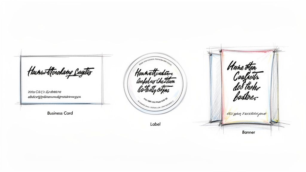
Congratulations, you did it! After all the sketching, scanning, and fine-tuning, you’ve got a fully functional font that is uniquely yours. This is where the real fun begins, as you start weaving that personal touch into your real-world brand materials.
When you convert handwriting into font, you’re creating a powerful asset that makes your brand identity feel cohesive and genuinely authentic. Your new creation can elevate everything from a business card that leaves a lasting impression to product labels with a charming, artisanal feel.
Applying Your Font to Marketing Materials
This is your chance to get creative. Imagine your handwritten script as the main logo on a set of thank-you cards or as a subtle, personal sign-off on direct mail postcards. The applications are pretty much endless and offer a fantastic way to stand out.
Here are a few practical ideas to get you started:
- Business Cards: Use your font for your name or tagline. It adds a human element that helps build an immediate connection.
- Product Labels: A handwritten font is a perfect match for brands with an organic, bespoke, or handcrafted identity, lending a touch of authenticity.
- Event Banners: For a personal event or a small business trade show, a custom font can make your signage feel way more approachable and less corporate.
This personalized approach is also incredibly effective for custom packaging. If you’re looking for inspiration, exploring unique packaging products can spark some great ideas for creating a memorable unboxing experience that customers will want to share.
Best Practices for Print Production
When you’re ready to send your designs off to print, a few technical details are crucial for ensuring your font looks just as good on paper as it does on screen. The most important thing is embedding your font correctly within your final design files.
When you save your design as a print-ready PDF, make sure the "Embed Fonts" option is checked. This little step packages your custom font file right inside the PDF, so the printer’s computers can render it perfectly without needing to have it installed.
Also, don't forget to pay close attention to legibility. A delicate, thin handwritten font might look beautiful on a large banner but could become an unreadable smudge on a small business card. Always print a physical proof to test different sizes and make sure your text is clear and crisp before you commit to a full print run. Your unique font is now a key part of your brand’s story—make sure it’s told clearly.
Got Questions? Let's Talk Handwritten Fonts
When you first decide to convert your handwriting into a font, a few questions always pop up. It's a fun creative project, sure, but there's a technical side to it, too. Knowing what to expect before you jump in will save you a ton of headaches down the road.
People's first question is almost always about time. How long does this actually take? Honestly, it depends on the route you go. An automated online tool can spit out a basic, usable font in less than an hour. But if you're aiming for a truly polished, professional result using proper software for manual tracing and kerning, you'll want to block off several hours, maybe even a full day.
Can I Use My Custom Font Commercially?
Yes, you absolutely can! This is one of the best parts about creating your own font from scratch. Since the entire thing is based on your unique handwriting, you own 100% of the rights.
That means you can use it for any personal or commercial project you can dream up without ever having to think about licensing fees or weird restrictions. For a business, this is a huge win. It’s a way to build a distinctive brand identity across all your marketing without the recurring costs that come with licensed fonts.
If there's one mistake people make, it's rushing the prep work. A blurry, low-resolution scan or sloppy, inconsistent handwriting will create hours of frustrating cleanup work later. Your source image is everything.
Taking a few extra minutes to write your letters clearly and scan the sheet at a high resolution (600 DPI is the sweet spot) is the single most important thing you can do for a professional-looking font. This attention to detail really pays off when you're designing high-quality custom marketing materials that need to look crisp and clean.
What Is the Best Software for Beginners?
If you're just starting out, web-based tools are your best friend. They are designed to do the heavy lifting—like all the complex vectorization and character mapping—for you. They’re built to be incredibly user-friendly, walking you through uploading a template and generating the font file with almost zero technical know-how.
Once you get a feel for the process and decide you want more control, you can always dip your toes into more advanced (and free) options like FontForge. There's no pressure to become a pro overnight. Just start simple, have fun with it, and see where it takes you.
Ready to see your unique brand identity come to life on paper? At 4OVER4, we offer premium printing services to make your custom font shine on business cards, labels, and more. Explore our printing solutions today!
More from

20
Business loyalty cards are a classic for a reason. They're more than just a marketing gimmick; they're a powerful way to reward repeat
![]() Emma Davis
Emma Davis
Mar 3, 2026

52
The best business cards for a construction company nail three things: they feel durable, just like your work; they’re
![]() Emma Davis
Emma Davis
Mar 2, 2026

42
Placing bulk sticker orders is one of the smartest investments a growing business can make. It’s a move that dramatically c
![]() Emma Davis
Emma Davis
Mar 1, 2026

33
Your car wash business cards aren't just little rectangles with your phone number on them. Think of them as a physical ha
![]() Emma Davis
Emma Davis
Feb 28, 2026

101
Let's get straight to it. The standard A7 envelope comes in at 5.25 x 7.25 inches, which translates to 133.35 x 1
![]() Emma Davis
Emma Davis
Feb 27, 2026

72
When you're trying to figure out the right door hanger size, the classic 4.25" x 11" is pretty
![]() Emma Davis
Emma Davis
Feb 25, 2026

51
When it comes to table tents, the industry workhorses are the 4" x 6" and 5" x 7" sizes.
![]() Emma Davis
Emma Davis
Feb 24, 2026

70
Figuring out whether to go with vinyl or screen printing really boils down to your project's size, the complexity of your design, and what
![]() Emma Davis
Emma Davis
Feb 23, 2026