TABLE OF CONTENTS
- Home
- content hub
- Happy Hour by Pros: Creative Beverage Packaging Inspiration
Happy Hour by Pros: Creative Beverage Packaging Inspiration
Jun 16, 20154299 views
Jun 16, 20154299 views

When it comes to package design, the sky's the limit. Today, there are plenty of resources that can make your design remarkable. With so much competition, your goal is to create an innovative design to seduce your audience and meet your purpose. Although this is not a simple task, even for the pros, you can find creative inspiration from those who have created kick-ass designs. We curated some of the best work we could finf online to give you an idea of what you can do! Take a look at this creative beverage packaging list with 10 with impressive designs for your favorite drinks: 1. Project by Great Works.This vodka tea infusion package has a summery look and feel. The minimalist design is clean and attractive with its mint-green color accents, its bottle neck hang tag is an effective attention grabber and it’s the perfect place to add extra information and keep that minimalist label, well minimal. See more of their work here. 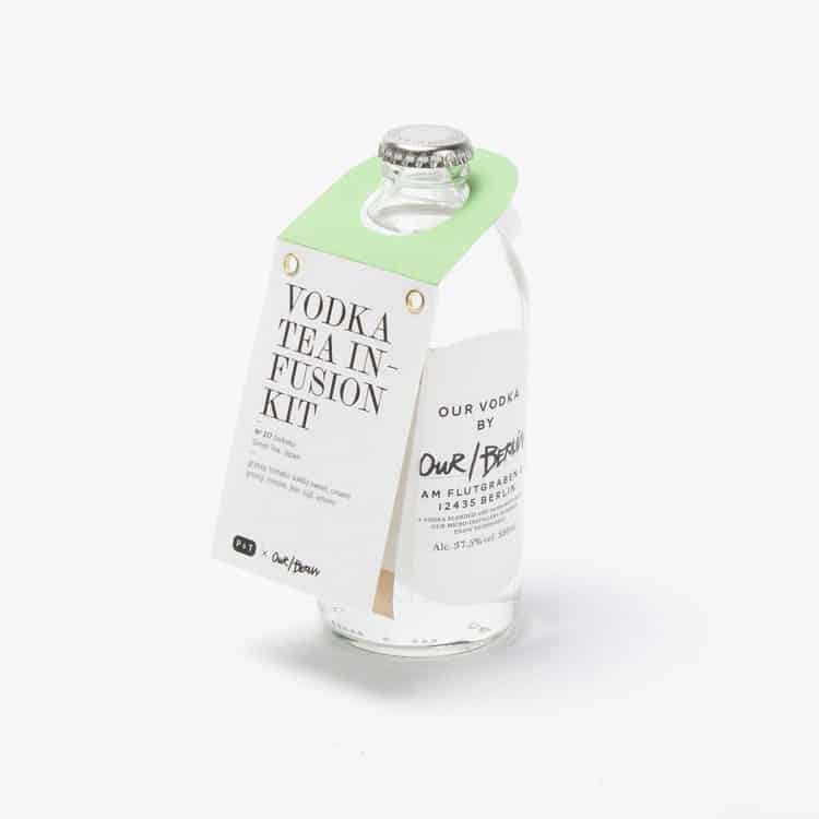 Get the look with our bottle neck hang tags (with your custom design of course), choose a standard finish, spot UV coating or high gloss UV coating. There are a number of uses for bottle neck hang tags, from a simple “new” message to an ingredient highlight, these tags can be made to serve your needs. We also carry beverage labels, and if you want to we can also provide advice on what’s the best material to print on, depending on the bottle’s purpose. 2. There are many different types of Whiskey to choose from -it all depends on one’s preference- but, when it comes to designing the bottle’s packaging, it seems that elegance is the key. We associate whiskey with fine drinking and curated tastes, so more often than not we find black labels (no pun intended) with gold accents - the go-to luxury branding colors. The idea of this re-design project was to keep the elegant essence of the original design but bringing it to a more modern place. San serif fonts combine both a contemporary feel and legibility, while still conforming to the aesthetics expected by the audience. It also brings a sense of hierarchy to the label. The mix of the gold and embossed text give the final product a sophisticated appearance. Project by Stranger & Stranger. Get the look: our premium labels can be requested with gold foil, simply ask for a free quote citing the details of your artwork. 3. David Vass and Nora Demeczky goes off the beaten path with this unique label redesign; made for the rosé cuvée Pirkadat, the result is a deep, vibrant rosé color, which takes the drink’s trademark to another level of sophistication and modernity. Pirkadat means daybreak and the label draws inspiration from the sky to present the brand in a powerful way.
 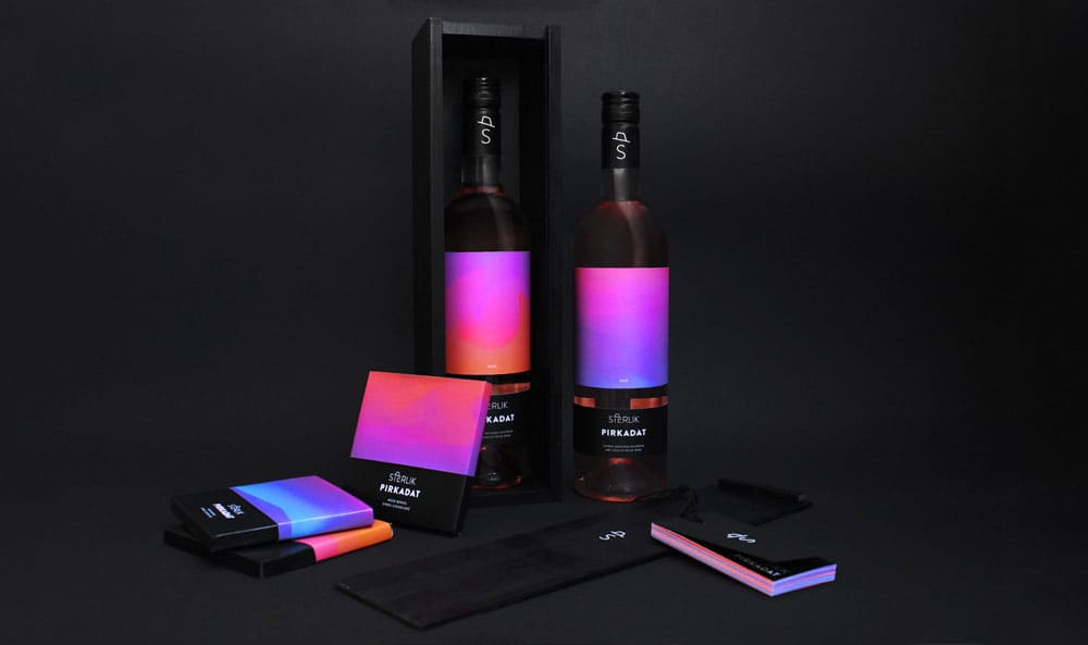 The redesign takes the original product from a high end restaurant to the hippest, jetsetter club in town without losing its sophistication. It is a balanced overall designed because it combines those rosé hues with vibrant dawn colors and that plain white on black sans serif font display, that guarantees the logo and text won’t be missed. Get the look: design around a concept rather than based off what the competition is doing, don’t get us wrong it’s still important to be aware of what the others are doing, but if we can take anything from this creative beverage packaging design is that sometimes literal can be out of the box. We strongly recommend checking out the original product and the lovely animated version of the label that shows where the palette comes from; in one word -inspiring! 4. All bout that custom shape, custom shapes no rectangles. Ok, bad lyrical puns aside, this label breaks the mold by not settling for a typical rectangular shape, but still keeping the label easy to read following a simplified version of an anchor. The anchor is a nod to the shipwrecks in the Gulf of Saint Lawrence, from which wine bottles were recovered that inspired the designer.The contrast between the color of the wine and the white label creates a clean and aesthetically pleasing design that feels contemporary, and would not be out of place at a local bar in Williamsburg or Portland. Project by Mélanie Laviolette: Get the look: ordering custom shaped roll labels and investing on frosted glass bottles for your product. 5. What’s cooler than being cool? Ice cold. And these labels, they’re cool too. This Polish craft brewery busts out unadorned amber bottles with simple, yet colorful, labels that feel fund and inviting, the kind of beer you have at home and at the local bar down the street.
 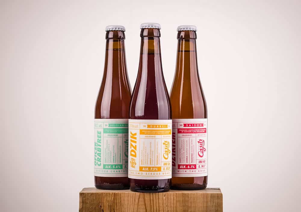 The designer wisely selected three different colors to categorize beers and the label combines two key elements in design: a cohesive color scheme and clean typography. Additionally, the retro and simultaneously modern look solidifies the brand’s identity. Project byRedkroft. 6. The astonishing lavender fields of Provence were the inspiration for this limited-edition wine. This is an example that great inspiration can lead to a great design. This unique artwork stands out among others because instead of using pictures of the fields the designers created an exclusive new piece.
 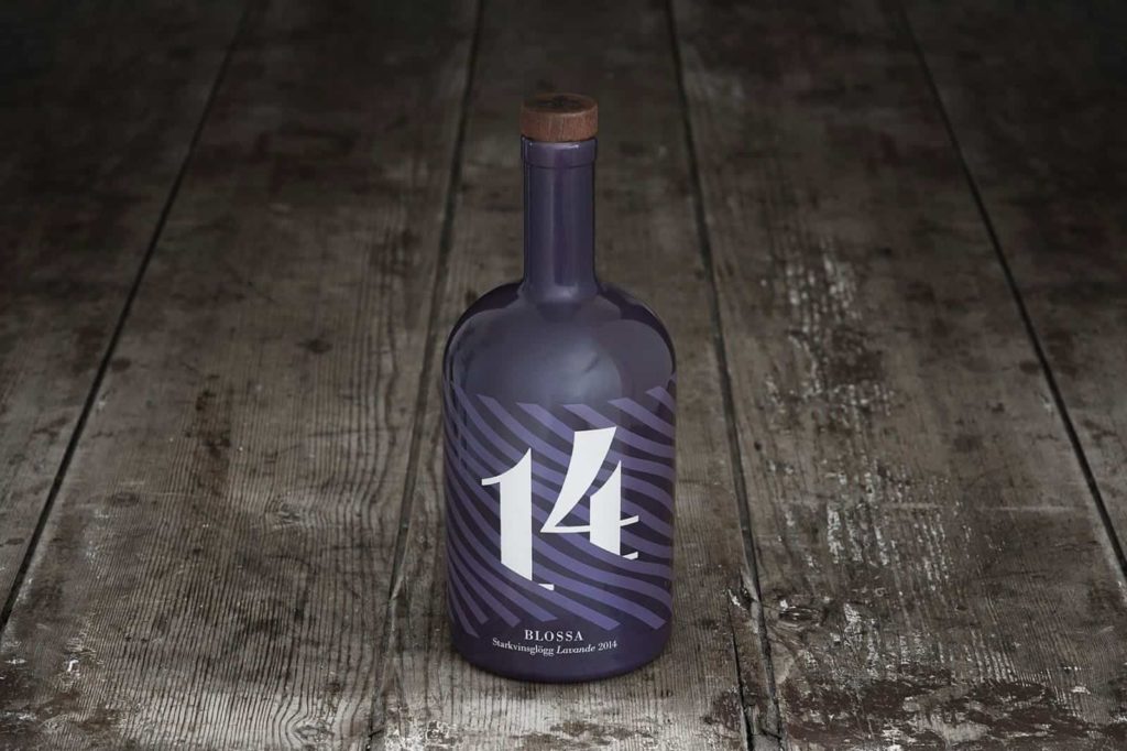 If you look closely, the violet stripes seem to move- like the wind blowing through those beautiful lavender fields. The design is simple, but elegant. Project by Scandinavian Design Group. 7. Tito's Handmade Vodka is crafted in Austin, Texas. Not only this vodka has a label, it also has a complete set of really interesting beverage packaging. Theorange color scheme gives the design a modern look and walks away from the more obvious red-white-and-blue that one may expect for a product made in Texas.
 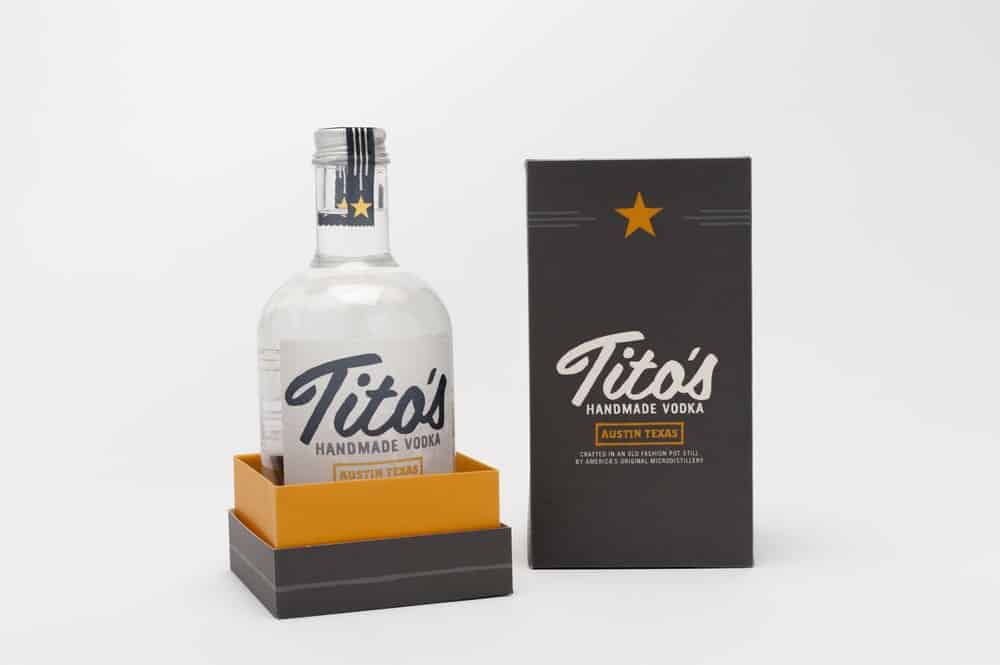 The different typefaces add value to the design because they create visual hierarchy and that well placed star tips us off to its origins without beating anyone over the head with it. Project by Becca Ray. Get the look checking out suitable packaging options like these bottle boxes which can be custom printed with any design. 8. This droplet-shaped label not only attracts our attention with its unusual shape, but the floral illustration that gives us a glimpse of the wine’s aroma, taste and color. Apart from its colorful and compact design, the font color (white) is easy to read.
 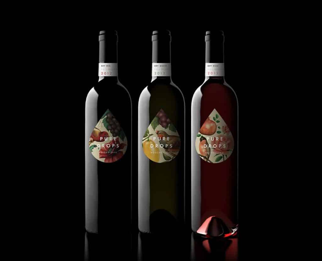 The rest of the bottle is left blank to avoid cluttering the design. This refined design is clean and classy. Even though there are various colors mixed in a small-shaped label, the design is not overly embellished. Project by Bob Studio. Get the look: with 70# eggshell felt labels that have that creamy, textured background color. 9. Whitespace is fundamental to build a clean design; it provides harmony and balance. Naturally, with this label’s extensive whitespace the center illustration takes the stage. The almost etheral look reminds us of seashells, waves and even a single storm cloud in a white sky.
 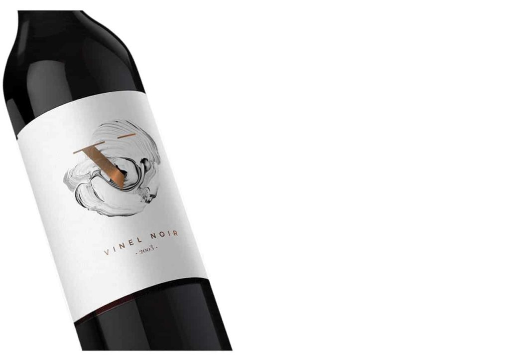 There is a coppery shine intersecting the illustration that gives the design a stylish yet dramatic touch. Project by Marina Porté. Get the look adding a metallic shine to a mostly light design, take a look at all our printing finishes and ask for a quote or free sample before you setlle on one. 10. The source of inspiration for this theme is heaven. The idea was to project “stairs leading to the clouds”. This unorthodox bottle label design catches the eye with it’s seemingly, but not truly, rectangular shape. The special die-cutting is used to enhance the visual appeal of the bottle and the nearly monochromatic scheme adds a touch of muted, yet sophisticated elegance.
 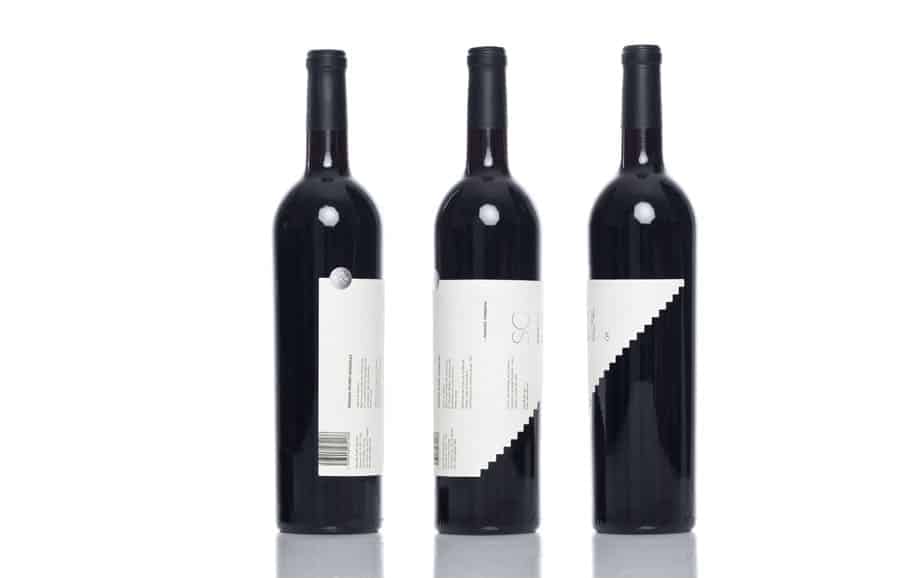 Die-cuts can be used for labels and also presentation cards, to take a brand to the next level. Project by Anagrama. Not only does creative packaging design attracts audiences, but also increases sales- a recent study shows that package design led to 15% sales growth, so it makes more than sense to spend some time concocting the magical piece that will identify your (or your client’s) brand. We hope the featured collection above has given you some inspiration to begin your project. Make yours stand out in terms of layout, color, original shape and of course with printing finishes and extraordinary papers! Which was the most inspiring packaging design? Which aspects must be considered to create a great beverage packaging design? Share your comments below, your feedback is important to us. Contact us and we will feature your design!
More from

11
The fundamental difference between traditional and digital marketing really boils down to one thing: traditional marketing casts a wid
![]() Emma Davis
Emma Davis
Mar 4, 2026

23
Business loyalty cards are a classic for a reason. They're more than just a marketing gimmick; they're a powerful way to reward repeat
![]() Emma Davis
Emma Davis
Mar 3, 2026

112
The best business cards for a construction company nail three things: they feel durable, just like your work; they’re
![]() Emma Davis
Emma Davis
Mar 2, 2026

62
Placing bulk sticker orders is one of the smartest investments a growing business can make. It’s a move that dramatically c
![]() Emma Davis
Emma Davis
Mar 1, 2026

38
Your car wash business cards aren't just little rectangles with your phone number on them. Think of them as a physical ha
![]() Emma Davis
Emma Davis
Feb 28, 2026

118
Let's get straight to it. The standard A7 envelope comes in at 5.25 x 7.25 inches, which translates to 133.35 x 1
![]() Emma Davis
Emma Davis
Feb 27, 2026

80
When you're trying to figure out the right door hanger size, the classic 4.25" x 11" is pretty
![]() Emma Davis
Emma Davis
Feb 25, 2026

54
When it comes to table tents, the industry workhorses are the 4" x 6" and 5" x 7" sizes.
![]() Emma Davis
Emma Davis
Feb 24, 2026