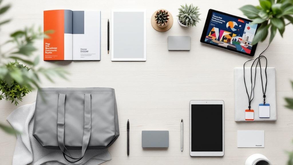


Your Go-To Library for Printing Articles
Printing articles are guides, tips, and deep dives that help you make smarter decisions about your print projects - before you spend a dollar. Whether you're designing your first business card or planning a direct mail campaign, the right article can save you time, money, and a whole lot of guesswork.
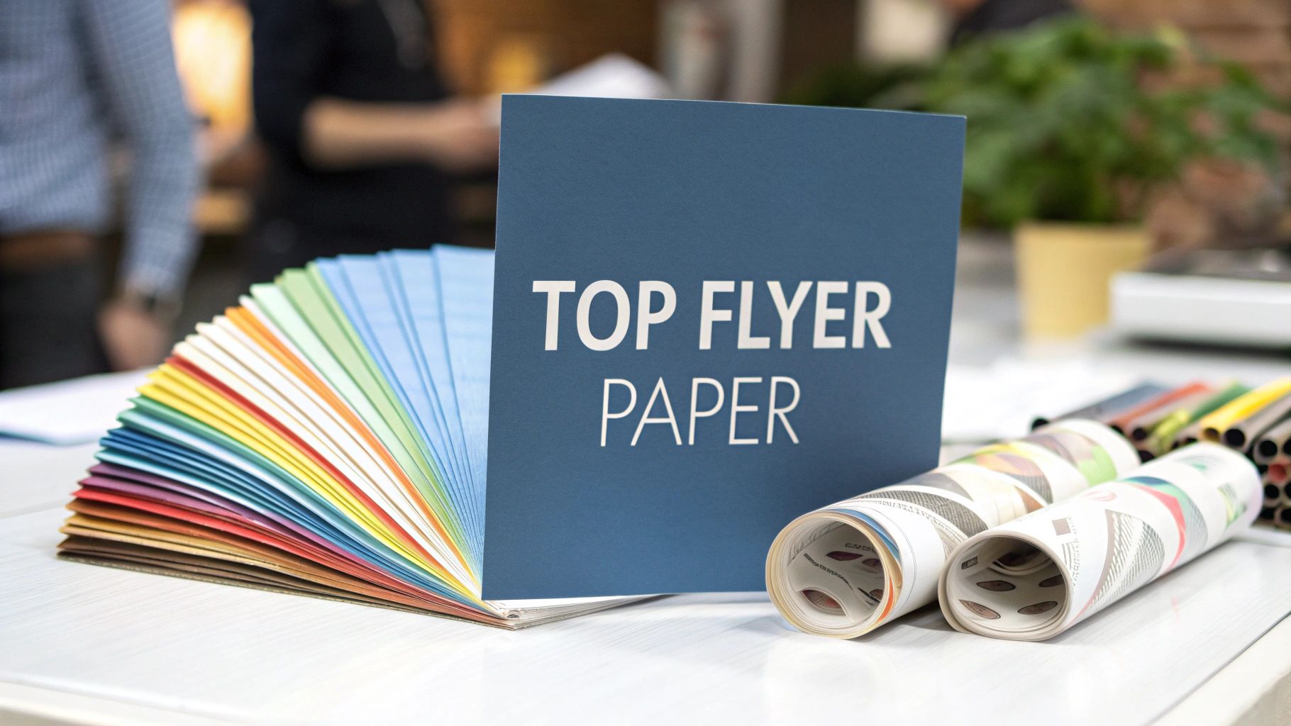
4OVER4.COM has built a resource library covering everything from paper stock selection to finish comparisons, design best practices to distribution strategies. These aren't fluff pieces. Each article is written with real product specs and practical advice you can act on today. With 1,000+ products in the 4OVER4.COM catalog and 60+ paper types to choose from, there's a lot to learn - and that's exactly why this library exists.
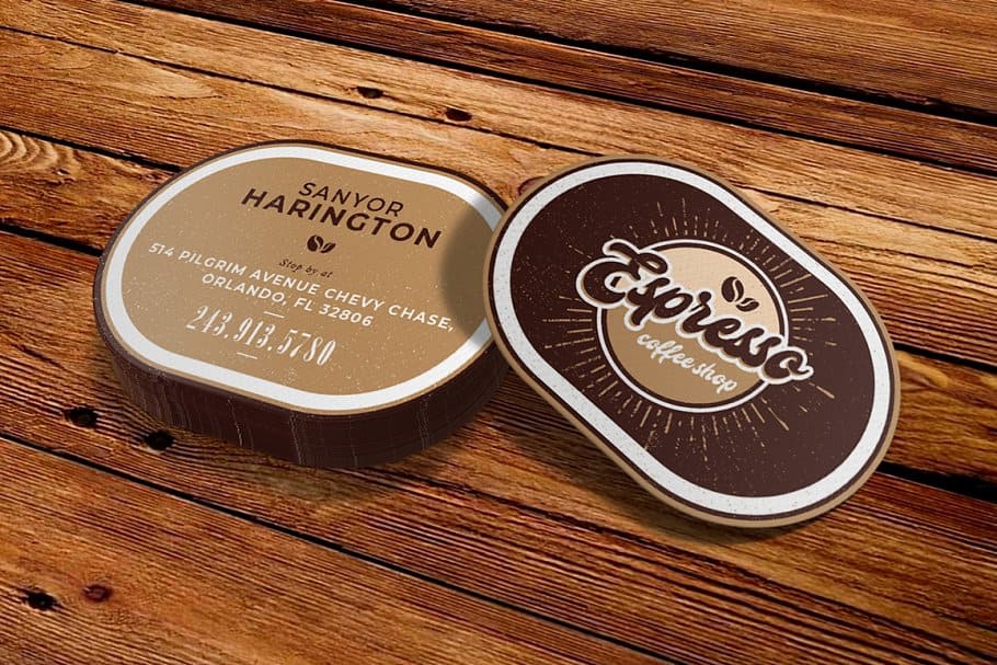
Think of this hub as your starting point. You'll find articles organized by topic so you can jump straight to what matters for your project. Curious about specialty materials? Check out Wood Printing for a look at one of the most unique substrates available. Want something that catches light and turns heads? Browse Wonderfoil Categories Printing for metallic foil options that pop.
Every article connects back to real products you can order. No abstract theory. No outdated advice. Just clear, specific guidance from a team that's been in the printing business for 25+ years.
Scroll down to explore categories, featured reads, and answers to the questions print buyers ask most.
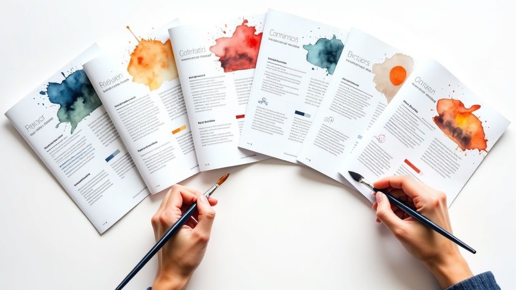
Browse Articles by Topic
Not sure where to start? These printing articles are grouped by subject so you can find exactly what you need. Each category covers a different side of the print world - from design fundamentals to marketing strategy.
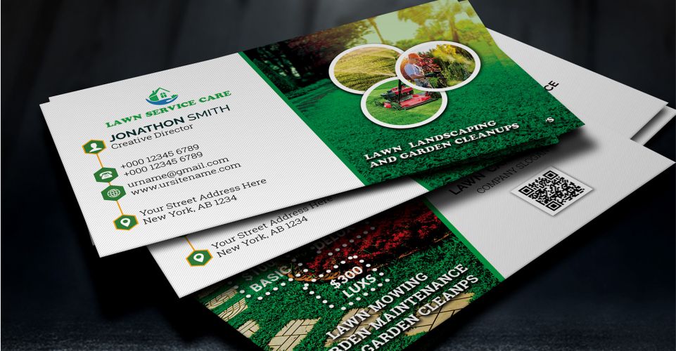
Start with Card Design Etiquette if you want to nail the basics of professional card layouts. Explore Cultural Print Design for insights on designing for diverse audiences and occasions.
Need creative inspiration? Print Design Ideas covers color theory, typography, and layout techniques that make your prints stand out. And if you're running campaigns, Direct Mail Marketing breaks down targeting, response rates, and ROI tracking.
4OVER4.COM serves 150,000+ businesses, and these resources reflect the questions those customers ask every day. Look at any category that matches your current project.
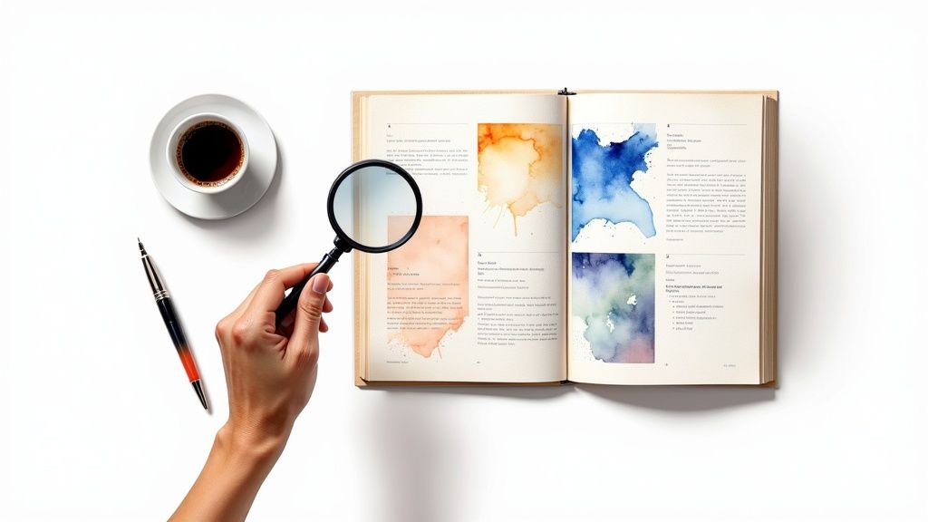
Featured Reads and Practical Guides
Some printing articles deserve a spotlight. These featured pieces tackle the topics that come up again and again - legal questions, industry data, and hands-on resources that help you get better results from every print run.
Wondering about the rules around handing out flyers or mailing promotional materials? The Print Distribution Guide walks through regulations, permits, and best practices so you don't run into trouble. It's one of the most bookmarked articles in the library for good reason.
For the data-driven crowd, the Printing Statistics page compiles industry benchmarks, consumer behavior data, and trend reports. Use these numbers to back up your marketing proposals or justify your print budget to stakeholders.
Before you commit to a full order, grab Free Samples to feel the paper stocks and finishes in person. There's no substitute for holding a sample in your hand. And if you want to see what other 4OVER4.COM customers have created, the Showcase gallery features real projects across dozens of product types.
4OVER4.COM has printed over 10 billion cards since 1999. That experience feeds directly into these guides - every tip comes from real production knowledge, not guesswork.
Looking for templates to kickstart your next design? Here's a resource to get you moving:
Blank Printing Articles Templates
How Printing Articles Help You Order with Confidence
Here's the thing about print - there are a lot of choices. Paper weight, coating, size, quantity, turnaround time. Each decision affects the final product. Printing articles exist to close the gap between "I think I want postcards" and "I know exactly which 16pt matte postcard I need for my restaurant mailer."
That's the real value of this library. It's not about reading for the sake of reading. It's about walking into your next order knowing what you want and why you want it. When you understand the difference between spot UV and soft-touch lamination, you stop second-guessing. When you've read about direct mail response rates, you order the right quantity the first time.
4OVER4.COM builds these resources because informed customers get better results. And customers who get great results come back. In fact, 99% of 4OVER4.COM customers say they'll reorder. That kind of loyalty doesn't happen by accident - it happens when people feel confident in what they're buying.
Every article in this hub connects to real Printing Services you can order today. Read about a technique, see it in action on a product page, and place your order in minutes. The path from research to finished print has never been shorter.
Whether you're a first-time buyer or a seasoned marketing director, there's always something new to learn. Paper technology evolves. Design trends shift. Campaign strategies improve. These printing articles keep you current so your print materials never fall behind.
"I spent an hour reading through the paper stock guides before ordering my first batch of business cards. Ended up going with 32pt uncoated - and the texture is exactly what I wanted. The articles saved me from ordering the wrong thing."
- Marcus L., ★★★★★
Common Questions About Printing Articles and Resources
What topics do 4OVER4.COM's printing articles cover?
The library spans card design etiquette, direct mail strategy, creative design tips, cultural print considerations, distribution legality, and product comparisons. Each article focuses on practical advice tied to real products and specs available through 4OVER4.COM.
Are these printing articles free to read?
Yes. Every article in the 4OVER4.COM resource library is completely free. No account required, no paywall. Just open the topic that interests you and start reading.
How do I know which article is right for my project?
Start with the category that matches your goal. If you're designing cards, read the design etiquette guides. Running a campaign? Go to the direct mail section. Planning a large order? Check the distribution and logistics articles first.
Can I request a topic for a future article?
4OVER4.COM's content team regularly adds new printing articles based on customer questions and industry trends. If you have a topic in mind, reach out to customer service and the team will consider it for upcoming content.
Do the articles include product recommendations?
Many articles link directly to relevant products, paper stocks, and finishes discussed in the guide. This makes it easy to go from reading about a technique to ordering the exact product that uses it - no extra searching needed.
How often are new articles published?
New content is added regularly as products launch, design trends change, and customers ask new questions. Bookmark this hub page to stay current with the latest guides and resources from 4OVER4.COM.