TABLE OF CONTENTS
- Home
- content hub
- Creating Outlines in Illustrator for Perfect Print Files
Creating Outlines in Illustrator for Perfect Print Files
Jan 15, 2026779 views
Jan 15, 2026779 views
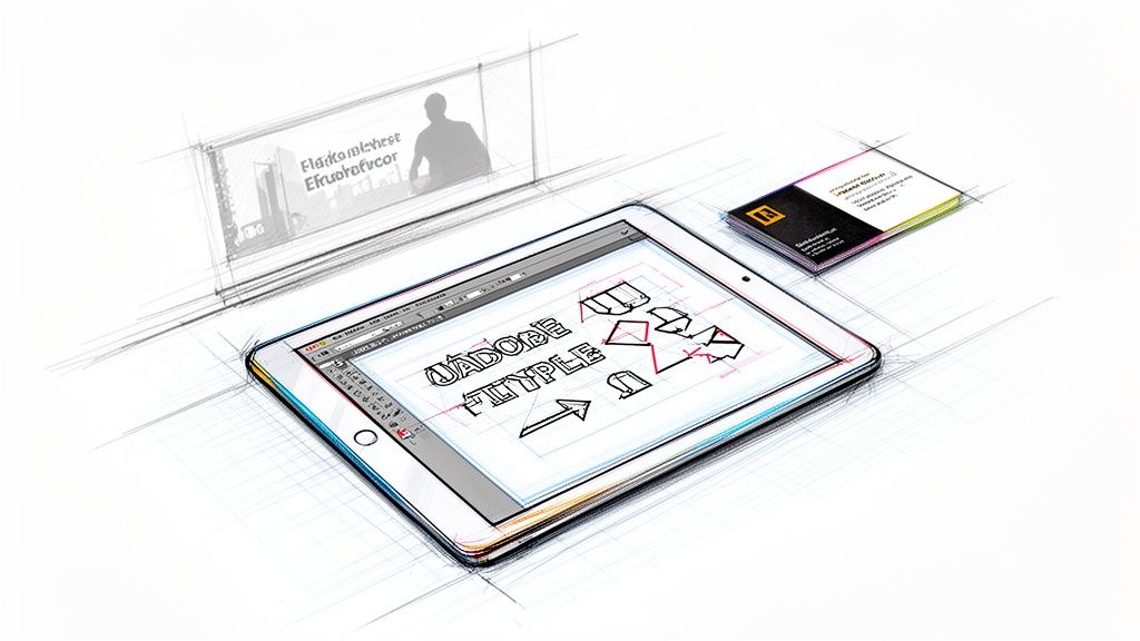
When you're getting a design ready for print, one of the most critical steps is creating outlines in Adobe Illustrator. This is the process of converting your live text, strokes, and effects into permanent vector shapes. Think of it as locking in your design to guarantee that everything—from fonts to line weights—prints exactly as you see it on your screen.
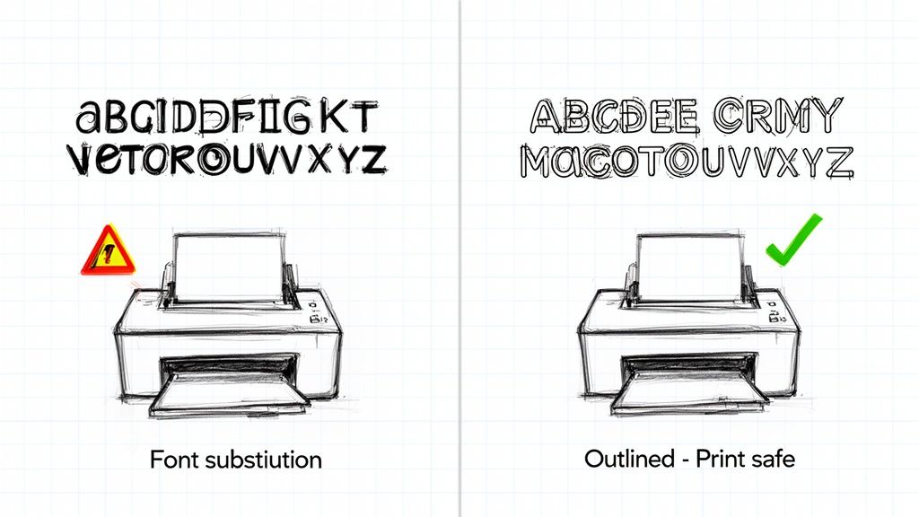
It's your final quality check to prevent costly and frustrating errors, like the dreaded font substitution.
Why Outlining Your Illustrator Files Is a Print Game-Changer
Before we get into the how, let’s nail down the why. Sending a design to a professional printer without outlining is a recipe for disaster. It’s like sending a Word doc to someone who doesn't have your fonts installed—you're going to get a garbled mess of incorrect text and a busted layout. Creating outlines turns your dynamic, editable elements into a static, universal blueprint that any professional print machine can read perfectly.
This isn't just a suggestion; it's a fundamental part of a professional prepress workflow. It ensures the business cards, brochures, or banners you designed are precisely what you get back from the printer.
Securing Your Design's Integrity
The main reason for outlining is to prevent any unexpected visual shifts after you’ve sent the file off. You can think of it as a final "flattening" that protects the key parts of your artwork. Adobe Illustrator is the industry standard for this, holding a solid 87.8% market share among professional designers for a reason. For pros who live and breathe vector design, creating precise outlines for print is a daily, non-negotiable task.
So, what are we really protecting against?
Font Substitution: This is the big one. If a printer doesn't have the exact font you used, their system will swap it out for a default. Your carefully chosen typography gets completely ruined. Outlining turns your text into shapes, so the font file is no longer needed.
Stroke Inconsistency: Let's say you have a 2pt stroke on an object. If that artwork gets scaled up or down, the stroke might not scale proportionally. Outlining a stroke converts it into a filled shape, so its thickness stays consistent no matter the final size.
Unpredictable Effects: Gradients, blends, and custom brushes are all "live" effects in Illustrator. Outlining (or expanding) these effects turns their dynamic appearance into simple, solid vector paths, making sure they don't render incorrectly on a commercial press.
Key Takeaway: Outlining is your insurance policy against print errors. It’s the final action that transforms your file from a working design document into a production-ready asset.
At the end of the day, this preparation saves time, money, and the headache of a reprint. It's what separates an amateur file from one that's ready for professional digital printing.
A Quick Guide to Outlining in Illustrator
Here’s a quick reference summarizing the core reasons and elements for outlining before you send files to print.
| Element to Outline | Primary Reason (The Why) | Best Time to Do It (The When) |
|---|---|---|
| Live Text | To prevent font substitution at the printer. | After all text has been proofread and finalized. |
| Strokes | To ensure line weight remains consistent when scaled. | When you want to lock in a specific line thickness. |
| Live Effects | To convert dynamic appearances into static vector shapes. | Once you're happy with how gradients, blends, etc., look. |
Taking a moment to run through this mental checklist ensures your vision is perfectly translated from screen to paper.
The Core Technique: How to Convert Text to Outlines
If there's one make-or-break skill for getting your Adobe Illustrator files ready for print, it’s converting text to outlines. This simple command is the foundation of a print-ready file, turning your live, editable fonts into fixed vector shapes. Think of it as locking in your typography so the printer sees exactly what you see.
First up, grab the Selection Tool (V) and click on the text box you want to convert. You can do this for a single word, a whole paragraph, or even multiple text boxes at once. Just select everything you need to outline.
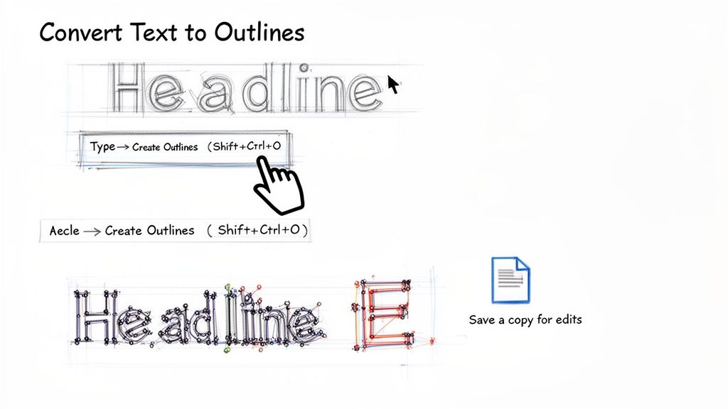
With your text selected, you have two quick ways to get this done. You can head up to the main menu and navigate to Type > Create Outlines.
Or, you can use the much faster keyboard shortcut, which I highly recommend committing to memory:
- Windows:
Shift + Ctrl + O - Mac:
Shift + Cmd + O
The moment you do this, you’ll notice a change. The familiar text box with its baseline disappears, and instead, you’ll see individual anchor points surrounding each letter. That’s your confirmation—it's no longer a font. It’s now a group of vector shapes, just like anything you’d draw by hand with the Pen Tool.
The Most Important Best Practice
Here's a piece of advice I can't stress enough: once you create outlines, that text can never be edited again. You can’t go back and fix a typo or swap out the font. It’s a one-way street.
This is why the single most critical habit for any designer is to always save a separate, print-ready version of your file.
Never, ever outline the text in your original, working file. I guarantee you'll need to make a revision later, and without that live text, your only option is to delete everything and start over from scratch. It's a painful lesson to learn the hard way.
Here’s the professional workflow I use every single time:
- First, finalize and triple-check all the text in your main design file (e.g.,
MyBrochure_Working.ai). - Once you have final approval, go to
File > Save Asto make a copy. - Name the new file something unmistakable, like
MyBrochure_PrintReady.aiorMyBrochure_For4over4.ai. - Now, working only in this new file, select all your text and run the
Create Outlinescommand. - Save this print-ready file, and you're good to go. You now have two distinct versions: one you can edit forever and one that’s perfectly prepped for printing.
Handling Real-World Scenarios
This outlining process works beautifully on all kinds of text, not just the standard stuff in a text box.
Let's say you've got some clever text wrapping around a logo using the Type on a Path Tool. No problem. The Create Outlines command works just the same, turning those letters into vector shapes while keeping them perfectly aligned to the path.
The same goes for text you’ve placed inside a shape with the Area Type Tool. When you create outlines, the resulting vector letters will stay neatly contained within those original boundaries. This ensures every single piece of typography in your design gets converted safely, which is essential for producing professional files for everything from custom stickers to high-end business cards printing.
Mastering Stroke Outlines for Consistent Line Work
Beyond fonts, one of the most common—and frustrating—print issues I see involves strokes. You know, the lines that define your shapes and illustrations.
Have you ever designed a logo with a perfectly balanced 2pt stroke, only to get the proofs back and find it looks strangely thick or has disappeared entirely? That’s what happens when strokes are left "live." Their thickness can change unpredictably when the artwork gets scaled, throwing your whole design off balance.
The fix is simple but essential: convert your strokes into solid, filled shapes. This process locks in their exact thickness. It guarantees the visual weight of your lines stays consistent, whether your logo ends up on a tiny business card or a massive banner.
From Live Path to Solid Shape
To get this done, you'll want to head to Object > Path > Outline Stroke. This command takes the line around a path and transforms it into a closed, fillable object. Think of it this way: if you draw a single line with the Pen Tool, outlining its stroke turns that simple path into a long, thin rectangle.
This is a fundamental step for any design where line weight is a critical part of the look and feel. It’s all about taking back control over the final output.
Let’s use a real-world example. Imagine a coffee shop logo with a stylized cup and a steam swirl drawn as a simple path with a 3pt stroke.
- Without Outlining: If you shrink this logo for a loyalty card, that 3pt stroke might suddenly look way too thick and clunky. If you blow it up for a storefront sign, it could look thin and flimsy.
- After Outlining: That 3pt stroke is now a solid shape. When you scale the logo up or down, the line work scales perfectly in proportion with everything else. The visual balance you intended is preserved.
This is precisely why the technique is so crucial. Creating outlines in Adobe Illustrator is a core skill for print pros, which makes sense given the software's dominance. Illustrator holds a solid 8% of the creative software market, making it the go-to for vector specialists who need this kind of precision for flawless print production. You can find more data on the creative software market at Statista.com.
Why Stroke Outlines Matter for Production
When your design file is sent off for production—especially for things like custom stickers or complex die-cutting services—outlined strokes give the printer clean, predictable vector data to work with. There’s no guesswork for the printing press or cutting machine, which means you get sharp, accurate results.
Pro Tip: My advice is to always apply
Outline Strokeas the very last step, once you are 100% happy with the line weights. Just like converting text to outlines, this is a one-way street; you can't go back and edit the stroke’s thickness. Always, always work on a copy of your file to be safe.
By getting comfortable with outlining strokes, you can rest easy knowing that the delicate line work you so carefully crafted will look just as perfect on paper as it does on your screen.
Working with Complex Objects and Expand Appearance
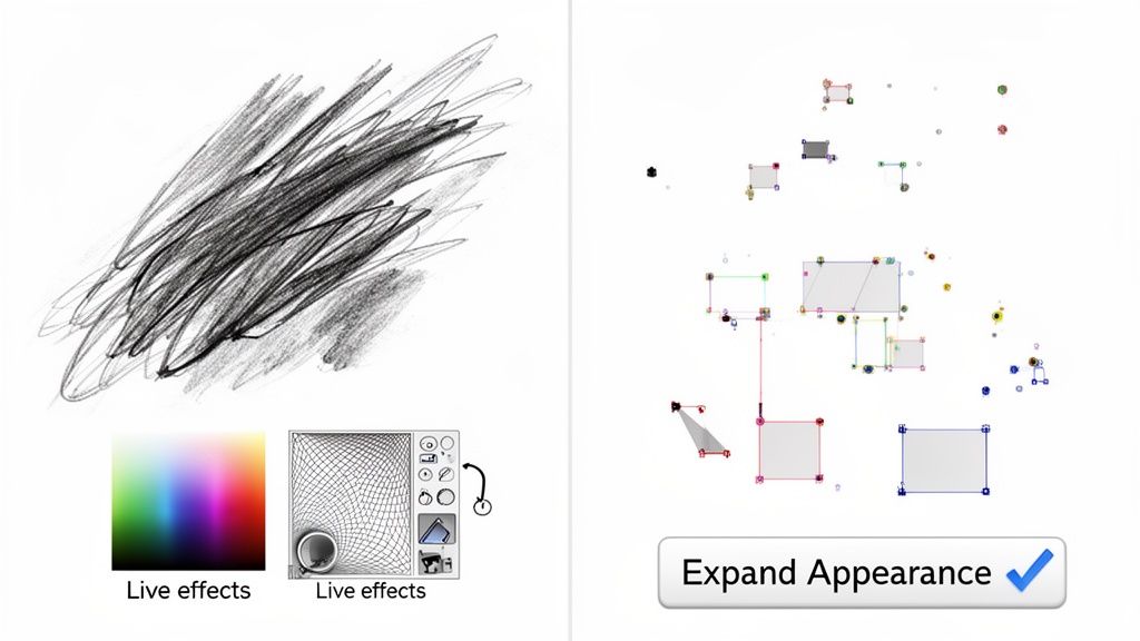
Your designs are probably more than just simple text and strokes. What about the cool stuff—gradients, artistic brushes, blends, or live effects like drop shadows? These are dynamic, editable elements in Adobe Illustrator, but they need to be "locked down" before going to print. This is precisely what the Expand Appearance command is for.
Unlike creating outlines for text or strokes, Expand Appearance is the tool for deconstructing complex, live effects. It essentially takes their fluid properties and converts them into static, predictable vector shapes. This step is critical to ensure the visual details you painstakingly designed look exactly the same on paper as they do on your screen. No nasty surprises.
From a Dynamic Effect to a Solid Shape
Let's look at a practical example. Say you're designing a poster and you've used a custom art brush to create a beautiful watercolor effect along a path. Right now, that's just a simple line with a fancy effect applied to it. If you send that file to a printer, their software might not know what to do with that brush data. The result? You could get a plain, boring line instead of that rich, textured stroke.
To avoid that disaster, you just need to select the object and head to Object > Expand Appearance.
That one click converts the live brush effect into a group of solid vector paths. Your watercolor texture is now "baked in" and becomes a permanent part of the artwork's geometry. It’s no longer an effect; it's a shape.
This same logic applies to all sorts of complex objects:
- Gradients and Meshes: These get converted into a series of clipped, solid-colored shapes that perfectly mimic the smooth color transition.
- Live Effects: Things like glows, blurs, and drop shadows are flattened into either raster images or vector shapes, locking them in place.
- Blends: The command breaks a blend down into its individual steps, making each intermediate shape a separate, solid object.
The Expand Appearance and Expand Workflow
Sometimes, Expand Appearance is just the first part of the job. After you run it, you might find that some attributes, like standard fills and strokes on the new shapes, are still "live." This is where you bring in the regular Expand command. It's a very common one-two punch for fully breaking down a complex object.
Pro Tip: First, use
Expand Appearanceto tackle the dynamic effects. Then, immediately follow up withObject > Expandto convert any remaining fills and strokes into their final outlined forms. This combination ensures every last piece of your art is flattened and ready.
This two-step process is a lifesaver for intricate designs, especially if you're planning on using specialty finishes. For example, if you're preparing a file with metallic accents, the printer needs clean, solid vector shapes to create the die. Digging into the details of foil stamping makes it crystal clear why these precise outlines are absolutely non-negotiable for high-quality results. Getting this workflow right means your most creative and complex designs will translate flawlessly from screen to print.
You’ve done the hard work. You’ve wrangled your text, tamed your strokes, and expanded your effects. Your Illustrator design is almost ready for its big debut in print. Now, for the final and most crucial step: the pre-flight check.
Think of this as the last once-over before your file leaves your hands and hits the press. Taking a few minutes to run through this checklist can be the difference between a perfect print run and a costly, frustrating reprint. Let's make sure everything is locked in and ready to go.
Core File Integrity Checks
First things first, let's look at the absolute must-haves inside your Illustrator file. These are the foundational elements that can make or break your print job.
Are you working in the right file? It sounds obvious, but I've seen it happen. Make sure you're in the final, outlined version of your design. Your original, editable Illustrator file with live text and effects should be safely tucked away in a separate folder. This one simple habit will save you from accidentally overwriting your masterpiece.
Next up, let's talk images. Any photos or raster graphics in your design need special attention.
- Embed Everything: Linked images are a common source of print errors. If the link breaks, the image disappears. The fix is easy: select each placed image and hit the “Embed” button in the control panel at the top of your screen. This bundles the image data right into your Illustrator file, so it can’t get lost.
- Check Your Resolution: For a crisp, professional print, all your raster images must be at least 300 DPI (dots per inch) at the size they'll be printed. Anything lower will look blurry and pixelated.
Getting these two details right solves the vast majority of image-related printing headaches.
Pro Tip: Don't Forget Your Color Mode!
Screens and printers speak different color languages. Your monitor uses RGB (Red, Green, Blue) light, while professional presses use CMYK (Cyan, Magenta, Yellow, Black) ink. Sending an RGB file to a CMYK printer is a recipe for dull, disappointing colors.
Head over to File > Document Color Mode and make sure CMYK Color is selected. If it’s not, switch it over now. This is absolutely essential for getting the vibrant colors you're expecting.
Preparing for Professional Production
With the digital side of things sorted, it’s time to prep the file for the physical reality of printing and finishing.
The single most important setting here is the bleed. This is a small margin of extra artwork—usually 0.125 inches—that extends past the final trim line of your design. Why does it matter? When a stack of printed sheets is cut, there can be tiny mechanical shifts. The bleed ensures that if the cut is a hair off, you won't see any ugly white slivers at the edge of your finished piece.
You'll also need trim marks (or crop marks). These are tiny lines in the corners of your document that tell the printer exactly where to cut. You don’t have to draw them yourself; Illustrator can add them automatically when you export your PDF.
Now, let's package it all up into the universal format for professional printing: a PDF.
- Navigate to
File > Save As. - From the format dropdown, choose Adobe PDF.
- In the PDF options window, start with the [High Quality Print] preset. It’s the industry standard for a reason.
- Click on the "Marks and Bleeds" tab. Here, check the box for "Trim Marks" and make sure "Use Document Bleed Settings" is also checked.
And that’s it! Your file is now technically sound and ready for a flawless trip through the production process.
Final Pre-Flight Checklist Before Sending to Print
Before you hit "send," run through this quick table one last time. It’s a great way to catch any small details you might have missed and ensure your file is truly ready for press.
| Check | Status (Done/NA) | Why It Matters |
|---|---|---|
| Working in Final, Outlined File | Prevents overwriting your editable master copy. | |
| All Text Converted to Outlines | Eliminates font-related issues and ensures text prints correctly. | |
| All Strokes Outlined/Expanded | Converts strokes to solid shapes for consistent scaling and printing. | |
| All Effects Expanded | Flattens complex effects into static vector shapes. | |
| Document Color Mode is CMYK | Ensures accurate color reproduction on a commercial press. | |
| All Images Embedded | Prevents missing or broken image links. | |
| Image Resolution is 300 DPI | Guarantees images will print clearly without pixelation. | |
| Bleed is Set and Artwork Extends | Avoids white edges after trimming. | |
| Proofread for Typos | A final check for spelling and grammar errors. |
By following these steps, you’re not just sending a design; you’re sending a professionally prepared file that’s ready for a perfect result. Whether you’re creating beautiful custom brochures or any other marketing materials, this checklist is your key to success.
Common Questions About Outlining in Illustrator
Even seasoned designers have questions when it comes to outlining in Illustrator. Let's be honest, it's a final, permanent step, and hitting that "Create Outlines" command can feel a little nerve-wracking when a print deadline is on the line.
So, let's clear up some of the most common questions and give you the confidence to prep your files like a pro.
The decision to outline really boils down to one simple question: is the file completely finished and ready for print, or is there still a chance you'll need to make edits? This little flowchart breaks it down perfectly.
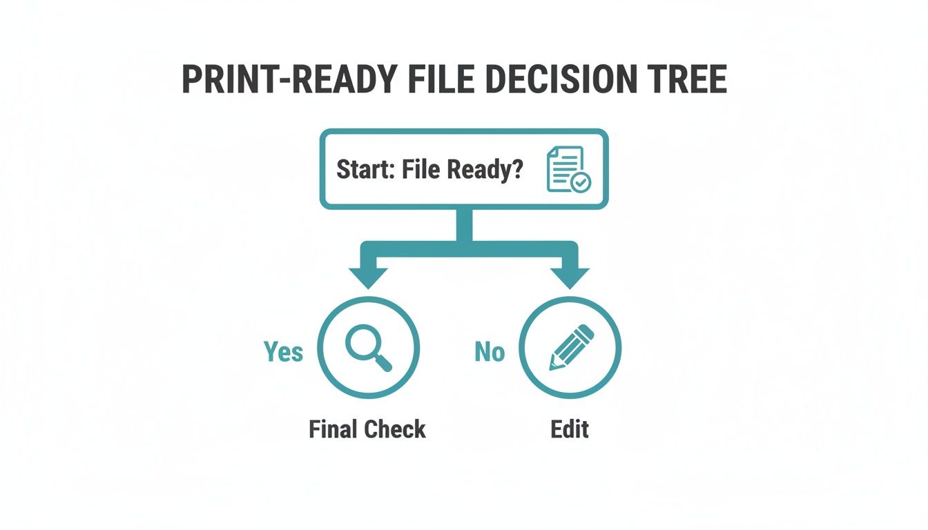
Think of outlining as the final checkpoint before takeoff, not part of the design process itself.
Can I Edit Text After Creating Outlines?
The short answer is a hard no. Once you hit Shift+Ctrl+O (or Shift+Cmd+O on Mac), your text is no longer text. It’s been converted into a collection of fixed vector shapes. All its typographic intelligence—the font family, weight, kerning, and the ability to fix a typo—is gone for good.
This is precisely why the golden rule is to always save a separate, outlined copy for your printer. Keep that original .ai file with all its live, editable text tucked away safely. Your outlined version is purely for production.
What Happens If I Forget to Outline Fonts?
This is probably the single most common—and frustrating—print error we see. If you send a file with live fonts and the print shop doesn't have those specific fonts installed, their system will be forced to substitute them. Suddenly, your carefully chosen typeface gets replaced with a default like Arial or Myriad Pro.
It's a design nightmare. The entire typographic hierarchy, spacing, and brand feel you worked so hard to perfect can be completely destroyed. Creating outlines embeds the letterforms as shapes directly into the file, which completely sidesteps this problem.
Outlining is your insurance policy. It guarantees that what you see on your screen is exactly what will come off the press, with no unwelcome font surprises.
Does Creating Outlines Increase My File Size?
Yep, it usually does, especially in text-heavy documents. When you convert text to outlines, each character goes from being a simple reference to a font file to a complex vector shape made of multiple anchor points and paths. The file now has to store a lot more geometric data for each letter.
But here’s the thing: it’s a necessary trade-off for 100% design accuracy. For almost any print project, the slightly larger file size is a non-issue and something any professional printer can handle without a problem.
Should I Use "Expand" or "Outline Stroke"?
While they sound similar, these two commands do very different jobs. Knowing which one to use is key.
Outline Stroke (
Object > Path > Outline Stroke): This is your go-to when you need to turn the stroke (the border or line) of an object into a solid, fillable shape. It's perfect for logos and icons where you need the line thickness to scale proportionally with the rest of the artwork.Expand (
Object > Expand): This is a more powerful, all-in-one command for deconstructing complex objects. It can convert objects with both fills and strokes, but it really shines when you're trying to flatten live effects, patterns, or gradients into simple vector shapes. You’ll often useExpand Appearancefirst to bake in dynamic effects, thenExpandto finish converting the basic fills and strokes.
Ensuring your files are perfectly prepped is the first step to a flawless print run. At 4OVER4, we specialize in transforming your carefully prepared designs into high-quality marketing materials that make an impact. Explore our wide range of printing services and see how we can bring your vision to life.
More from

10
Placing bulk sticker orders is one of the smartest investments a growing business can make. It’s a move that dramatically c
![]() Emma Davis
Emma Davis
Mar 1, 2026

17
Your car wash business cards aren't just little rectangles with your phone number on them. Think of them as a physical ha
![]() Emma Davis
Emma Davis
Feb 28, 2026

36
Let's get straight to it. The standard A7 envelope comes in at 5.25 x 7.25 inches, which translates to 133.35 x 1
![]() Emma Davis
Emma Davis
Feb 27, 2026

41
When you're trying to figure out the right door hanger size, the classic 4.25" x 11" is pretty
![]() Emma Davis
Emma Davis
Feb 25, 2026

29
When it comes to table tents, the industry workhorses are the 4" x 6" and 5" x 7" sizes.
![]() Emma Davis
Emma Davis
Feb 24, 2026

42
Figuring out whether to go with vinyl or screen printing really boils down to your project's size, the complexity of your design, and what
![]() Emma Davis
Emma Davis
Feb 23, 2026

25
Bringing a trading card to life is a fascinating mix of creative brainstorming, smart material choices, and precision printing. The journey st
![]() Emma Davis
Emma Davis
Feb 22, 2026

19
Believe it or not, whipping up a professional-looking card in Microsoft Word is way easier than you might think. The whole process boils down
![]() Emma Davis
Emma Davis
Feb 21, 2026