Table of Contents
-
-
-
-
-
-
-
-
- Home
- content hub
- 15 Cool Facts About Famous Logos You Didn't Know
15 Cool Facts About Famous Logos You Didn't Know
Emma Davis
Content Writer
May 14, 201426680 views
May 14, 201426680 views
Table of Contents
-
-
-
-
-
-
-
-
Logos are more than just symbols; they tell stories and evoke emotions. Every time we see a familiar logo, it sparks recognition and nostalgia. But did you know that behind these iconic designs lies a treasure trove of fascinating facts? From the hidden meanings in their shapes to the psychology of colors used, the world of logos is filled with surprises that can change how we perceive brands.
Hidden Secrets in Famous Logos
Logos are repositories of hidden stories and meanings, crafted with precision and intent. Understanding these secrets can enhance our appreciation of brand identities.
The Arrow in the FedEx Logo
We notice a subtle arrow hidden between the letters "E" and "x" in the FedEx logo. This design choice symbolizes speed and precision, core elements of the brand's promise to deliver packages efficiently.
The Amazon Smile
The Amazon logo displays a smile formed by an arrow extending from the letter "A" to "Z." This clever detail implies that the company sells everything from A to Z, promoting a sense of satisfaction for customers.
The Evolving Starbucks Siren
The Starbucks logo features a siren, or mermaid, symbolizing temptation and allure. The logo has evolved over the years, simplifying its complexity while retaining the essence of the original design, which evokes curiosity and invites people to experience coffee culture.
The Hidden Meaning Behind the BMW Logo
The BMW logo presents a blue-and-white checkered pattern, representing the Bavarian flag. The circular design is often interpreted as a propeller, referencing the company's history in aircraft manufacturing.
The Underlying Patterns
We see that many logos incorporate geometric shapes and colors to convey distinctive meanings. For instance, the Coca-Cola logo uses its classic red color to evoke feelings of excitement and warmth, driving brand recognition through emotional conexão.
Our exploration of these hidden elements demonstrates that logos convey powerful stories that resonate with consumers. Each detail, from color choices to shapes, reveals insights into brand values.
For businesses looking to enhance their branding through custom printing solutions, leveraging these design principles can elevate brand presence. Discover more about free samples and essential design templates to help visualize stunning logo designs.
Incorporating these logo insights and engaging visuals into printed materials can create a lasting impression. Stickers, for example, utilize logo designs creatively, enhancing brand visibility. Explore various printed stickers to expand brand outreach in innovative ways.
We invite you to explore our best online designer tools, offering user-friendly solutions to refine logo designs. Leveraging such resources allows businesses to create impactful visual identities that stand out in today's competitive market.
By focusing on these aspects, we underscore the value of logos in communicating brand ethos and engaging customers on a deeper level. These hidden facts not only enlighten but also encourage us to think critically about the logos we see every day.
Fact #1: The Hidden Arrow in the FedEx Logo
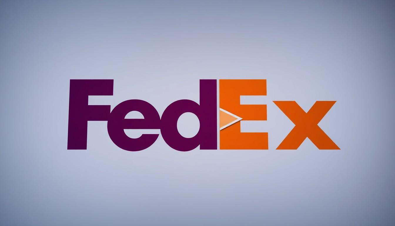
The FedEx logo features a hidden arrow between the letters "E" and "x," representing speed and precision. This arrow, designed by Lindon Leader in 1994, wasn't accidental. It's a deliberate design choice integrated into the logo to reflect the company's values.
Design and Meaning
The arrow embodies the company's commitment to moving forward. It enhances the logo's overall meaning and visual appeal. By utilizing the fonts Universe 67 and Futura Bold, Leader expertly created the arrow effect through careful manipulation of letter spacing.
Symbolism
The arrow serves as a powerful symbol of speed and accuracy. This subtle element communicates the brand's ethos and distinguishes it within the logistics industry. Logos with hidden meanings, like FedEx's, elevate brand storytelling and engagement.
For businesses aiming to enhance their brand presence through thoughtful design, 4OVER4 offers custom printing solutions that amplify these aspects. By utilizing our design templates, companies effectively convey their uniqueness through logos and other printed materials.
Explore how 4OVER4 can help by requesting free samples of our exceptional printing services. With the right design tools, businesses can present stories that resonate with their audience. For more inspiration, check our free and user-friendly online design tools.
Integrating meaningful symbols in logos not only captures attention but also fosters emotional connections. A successful logo design can significantly influence consumer perception and brand loyalty. In our commitment to helping businesses thrive, 4OVER4 provides exceptional support through our printing category, including stickers, enabling brands to create memorable marketing materials.
Utilizing these strategies helps businesses stand out in today's competitive landscape. Engaging logo designs, combined with high-quality printing, facilitate effective brand communication and storytelling to captivate target audiences.
Fact #2: Baskin-Robbins’ 31 Flavors Secret
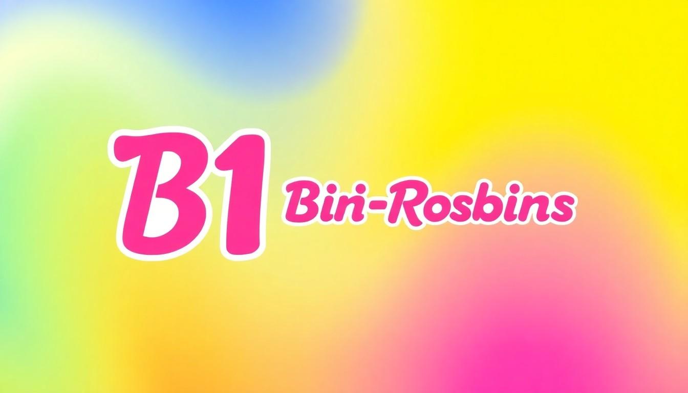
Baskin-Robbins created the "31 flavors" concept to invite customers to enjoy a different ice cream flavor daily. This innovation significantly boosted the brand's appeal, emphasizing variety and choice.
The logo incorporates the number 31 cleverly into the design. The letters "B" and "R" feature pink sections that form the digits 31. This integration is a nod to the brand's iconic flavors, making the design both functional and symbolic.
Over the years, the logo has evolved. Initially, the number 31 took a more prominent position above the name "Baskin-Robbins Ice Cream." As the brand modernized, the integration of 31 became subtler, demonstrating the brand's adaptability.
Brands looking to enhance their visual identity can benefit from custom printing solutions. 4OVER4 provides valuable resources and tools, like design templates, to help businesses create impactful logos and marketing materials. Explore the options available to elevate brand presence through unique sticker designs or sample prints, making a memorable impression on customers.
For additional inspiration, we encourage exploring free samples and utilizing online design tools offered by 4OVER4. These resources support businesses in their quest to craft distinctive branding elements.
Fact #3: Amazon’s Smile Has a Double Meaning
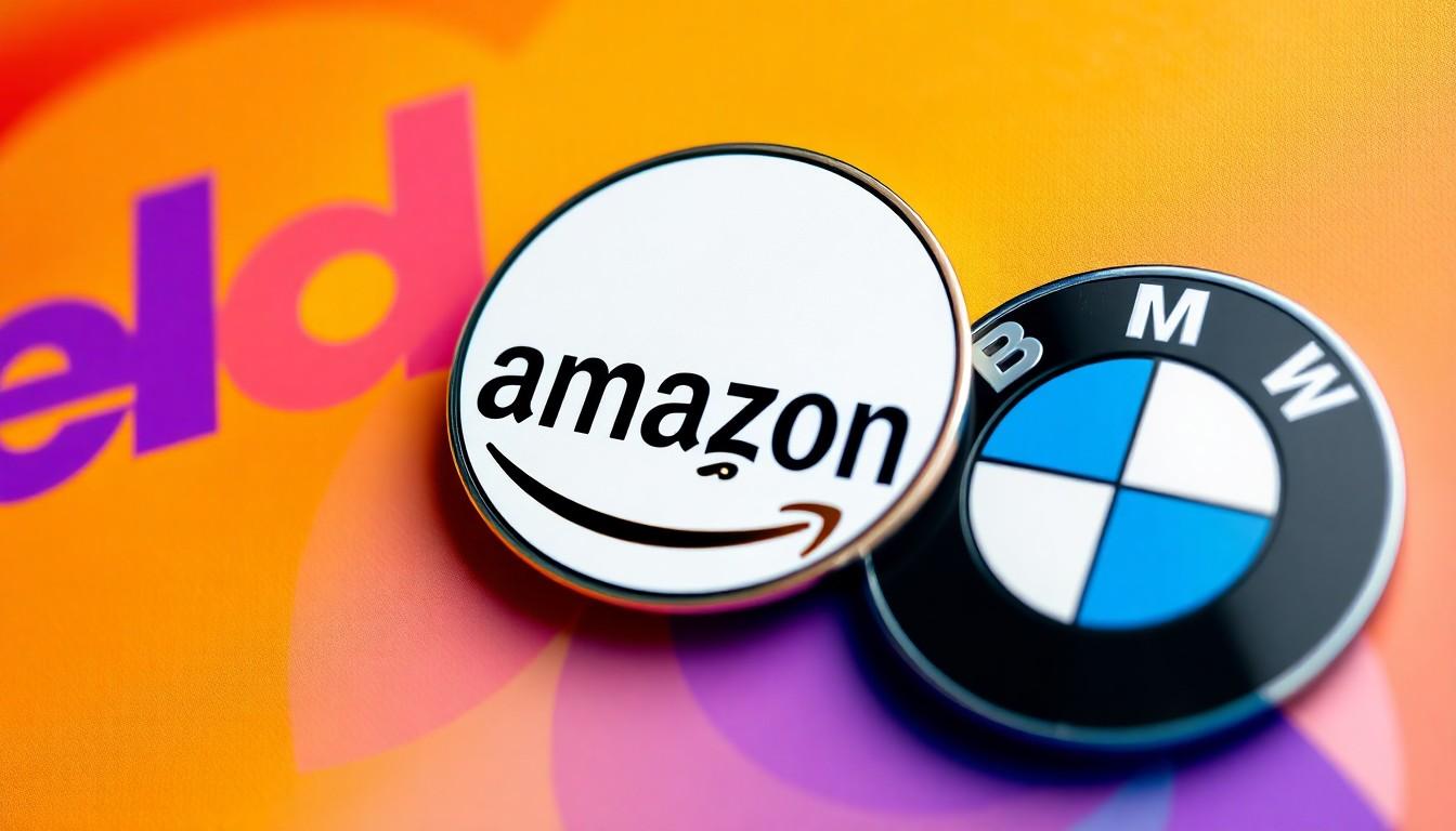
Amazon's logo features a distinctive yellow arrow that carries a significant double meaning, enhancing its recognition and effectiveness. The smile shape of the arrow symbolizes customer satisfaction, happiness, and joy. It conveys that Amazon delivers products exceeding customer expectations, inducing a sense of contentment.
Additionally, the same arrow visually represents Amazon's extensive product range. It points from the letter "A" to the letter "Z" in the word "Amazon," indicating a wide array of products available for customers. This design element underscores Amazon's commitment to offering a comprehensive selection, exemplifying our dedication to user satisfaction.
Incorporating such meaningful designs in logos can elevate brand storytelling. Businesses looking to improve their brand presence can greatly benefit from CUSTOM PRINTING SOLUTIONS by 4OVER4. By utilizing resources like design templates or exploring free samples, we can craft logos that resonate, similar to Amazon's effective branding.
Effective logos like Amazon's serve as powerful storytellers, exercising profound psychological effects on consumer perception. With the right tools and a thoughtful approach, businesses can achieve impactful branding that stands out in a competitive landscape. For those keen on enhancing their brand identity, 4OVER4's user-friendly online design tools offer an excellent starting point.
The dual significance of the Amazon logo illustrates how a well-designed emblem can create an emotional connection with consumers, reinforcing the importance of thoughtful logo design in our branding strategy.
Fact #4: The Toblerone Bear Tribute
The Toblerone logo features a hidden bear, honoring Bern, Switzerland, where the chocolate originated. This bear, embedded within the iconic Matterhorn Mountain, pays tribute to the city's rich heritage as the "City of Bears." The bear nearly fills the outline of the mountain and holds significant symbolic meaning in both the logo design and Bern's coat of arms.
The inclusion of the bear reflects the interconnectedness of branding and local culture. Businesses aiming to elevate their brand presence can take inspiration from this design principle. By incorporating meaningful symbols into logos, companies create a deeper emotional resonance with consumers.
Engaging design elements, like the Toblerone bear, illustrate the power of visual identity in branding. We understand that thoughtful design can elevate a logo from simple imagery to a compelling story. The intricate details of logo design show the importance of working with experienced professionals.
For those looking to enhance their visual identity, utilizing resources like design templates can streamline the creative process. Moreover, exploring free samples provides an opportunity to test various design elements before committing.
Imagery plays a crucial role in communicating brand stories. We recommend considering the impact of colors, shapes, and symbols when conceptualizing logos. Effective logos, such as that of Toblerone, create a narrative that resonates with audiences. Companies can foster these connections by partnering with experts offering a wide range of printing solutions.
Investigating online tools, like those found at 4OVER4, enhances the design process, making it user-friendly and efficient. This approach promotes the creation of unique logos that leave a lasting impression.
Incorporating a hidden design element, as seen with the Toblerone bear, exemplifies how brands can weave their local narratives into their logos. This attention to detail strengthens brand recognition and fosters loyalty among consumers. Embracing creative design avenues positions businesses to stand out and thrive in a competitive market.
Fact #5: The BMW Logo’s True Origin
The BMW logo's history traces back to 1917 when the company transformed from Rapp Motorenwerke to Bayerische Motoren Werke GmbH (BMW). The initial design maintained the circular shape of the former logo while incorporating two gold lines and the letters "BMW" in the same color. The inner circle showcases the blue and white colors of the Bavarian flag, arranged in inverse order.
The decision to invert these colors stemmed from local trademark laws prohibiting the use of state symbols and coats of arms in commercial logos. Avoiding legal complications necessitated this design choice, maintaining the essence of Bavarian representation while ensuring compliance.
Despite widespread belief, the myth surrounding the BMW logo as a representation of a rotating airplane propeller emerged from a 1929 advertising campaign. This misconception contrasts sharply with the logo's actual significance, which is rooted in the proud traditions of Bavaria. Recognizing these historical details elevates our understanding of the logo's meaning and effectiveness.
To effectively communicate brand identity, we can tap into resources provided by 4OVER4. By utilizing design templates and exploring free samples, businesses can create logos that resonate with their target audience. Additionally, custom printing solutions from 4OVER4 enable brands to enhance their visibility and recognition, emphasizing the importance of thoughtful design elements, just like the BMW logo's representation of its Bavarian heritage.
Investing in high-quality stickers can further amplify brand presence, capturing attention and reinforcing brand messaging. As we see with the BMW logo, attention to design and representation holds immense power in storytelling and brand connection. Let's harness that power in our branding efforts through innovative solutions like those from 4OVER4.
Fact #6: Pinterest’s Hidden Pin Icon
Pinterest offers unique features for managing visibility on the platform. One significant element we can utilize is the option of secret boards. Secret boards enable us to keep certain pins hidden from others. When we create a secret board, toggling on the "Keep this board secret" option ensures privacy, perfect for organizing our personal or sensitive content.
We can also hide individual pins by making their respective boards secret. To achieve this, we need to go to the board, tap the three dots at the top right, select "Edit board," and toggle on "Make this board secret." This action restricts visibility, allowing only us and any collaborators to access the board and its pins.
A clear visual indication exists for secret boards with a lock icon next to the board name. This icon signifies that the content is not publicly visible. Such features allow us to curate our presence on Pinterest effectively, making it easier to navigate our ideas and inspirations without the pressure of public scrutiny.
Utilizing resources from 4OVER4 can significantly enhance our branding efforts. Custom printing solutions provide opportunities for effective representation of our brand identity. From professional-looking business cards to eye-catching stickers, we can leverage design templates and free samples to find the best fit for our needs. By integrating thoughtful design into our visual identity, we can create a lasting impression.
For those who wish to elevate their brand presence further, 4OVER4 offers tools that facilitate user-friendly design experiences. We encourage exploring the different categories, especially stickers, to enhance our visual connectivity in both digital and physical spaces. By investing in quality printing, we can strengthen our brand messaging and attract our target audience effectively.
By understanding how to manage our presence on Pinterest, alongside utilizing 4OVER4's comprehensive custom printing solutions, we can effectively engage our audience, resulting in impactful brand recognition.
Fact #7: Hyundai’s Handshake Symbolism
The Hyundai logo features a significant handshake motif that represents a connection between the company and its consumers. The design depicts two silhouettes engaging in a handshake, where one silhouette symbolizes Hyundai and the other represents the customer. This handshake illustrates the trust and agreement that exists between them.
The handshake conveys a strong message of trust and partnership. By incorporating this visual element, Hyundai emphasizes mutual respect and cooperation, which form the foundation of its brand identity. This trustworthy relationship is vital for fostering customer loyalty and satisfaction.
This logo's design includes an oval shape that frames the handshake symbol. This element signifies Hyundai's global expansion and its presence in worldwide markets, underscoring its commitment to reaching diverse audiences.
To strengthen brand presence, we can utilize custom printing solutions from 4OVER4, enhancing the visibility of the Hyundai logo and similar branding elements. Through thoughtful design, we foster emotional connections with consumers, making it crucial to explore various design templates that effectively communicate brand messages.
Including engaging visuals, such as custom stickers or promotional materials, can elevate customer interaction. Quality printed items reflect brand professionalism and creativity. We can explore stickers as a tool for brand marketing, reinforcing branding strategies while capturing customers' attention.
By reproducing meaningful symbols and visual storytelling in our materials, we position ourselves for success in a competitive landscape. Additionally, we can utilize free samples to assess quality before investing in larger quantities, ensuring that our branding efforts maintain a high standard of excellence.
Fact #8-14: More Mind-Blowing Logo Secrets
Dell
Dell’s logo features a sideways "E" that embodies the brand's innovation. Michael Dell aimed to "turn the world on its ear" with this unique design element, which signifies forward-thinking and creativity in technology.
Wikipedia
The Wikipedia logo presents an unfinished globe made of puzzle pieces, symbolizing the platform's mission for a comprehensive database of knowledge. This design reflects the perpetual journey toward completeness, recognizing that user-generated content evolves continuously.
Tostitos
Tostitos’ logo cleverly integrates a bowl of salsa as the dot over the "i", while the two "T"s represent people sharing a snack. The yellow triangle signifies a chip, emphasizing community and togetherness centered around enjoying tasty moments.
Pinterest incorporates secret boards, allowing users to manage their visibility. The lock icon indicates restricted access, which is crucial for users wanting to keep personal content private. Curating one's presence on Pinterest enhances idea management without public scrutiny. Utilizing tools like free samples can help businesses explore effective designs for their pinboards.
Hyundai
Hyundai’s logo showcases a handshake motif, representing the connection between the company and its customers. This design symbolizes trust and partnership, with the oval framing signifying global outreach and market diversity.
For businesses looking to elevate their brand presence, engaging visuals matter. We can utilize resources like quality stickers to enhance customer interaction and reflect professionalism. Harnessing the power of design through templates further supports brand storytelling.
Engaging designs, thoughtful symbols, and tailored branding assist in standing out in the competitive marketplace. Creating a striking visual identity effectively influences consumer perception and establishes lasting impressions. Use helpful tools for brand elevation and ensure an impactful presence through effective printing solutions.
Conclusion
Logos are more than just visual elements; they’re the essence of a brand's identity. Each design choice tells a story and evokes emotions that resonate deeply with consumers. By understanding the hidden meanings and psychological impacts behind logos, we can appreciate the artistry involved in their creation.
As we explore the world of branding, let’s remember the power of thoughtful design. A well-crafted logo not only enhances brand recognition but also fosters lasting connections with audiences. By leveraging the insights shared in this article, we can elevate our branding strategies and create memorable visual identities that stand out in today’s competitive landscape.
Frequently Asked Questions
Why are logos important for a brand?
Logos serve as a visual identity for a brand, helping establish its presence in the marketplace. They evoke emotions, create memorability, and communicate the brand's values and purpose, ultimately influencing consumer perception and loyalty.
What does a good logo communicate?
A good logo communicates the essence of the brand, including its personality, values, and mission. It should be relatable to the target audience, foster emotional connections, and convey professionalism, ultimately enhancing brand recognition.
What are some examples of logos with hidden meanings?
Logos like FedEx contain a hidden arrow signifying speed, and the Toblerone logo features a bear honoring Bern, Switzerland. Such design elements can enhance brand storytelling and create a memorable visual identity.
How do colors affect logo design?
Colors evoke specific emotions and associations. For instance, red often represents excitement or passion, while blue signifies trust and reliability. Choosing the right colors can significantly impact how a logo is perceived by consumers.
What are some benefits of custom logo design?
Custom logo design allows brands to reflect their unique identity and stand out from competitors. It fosters authenticity and connection with the audience while enhancing brand storytelling through tailored visual elements.
How do I choose the right design for my logo?
Consider your brand’s values, target audience, and mission when choosing a design. Research competitors and identify visual elements that resonate with your audience. Working with professional designers can also ensure a high-quality outcome.
Can logos change over time?
Yes, logos can evolve to reflect changes in the brand or market trends. A well-executed redesign maintains core elements to retain brand recognition while modernizing the overall look to stay relevant and appealing.
How can I enhance my logo’s visibility online?
Optimize your logo for various online platforms by ensuring it's clear, high-resolution, and properly sized for each application. Consistent use of your logo across websites, social media, and marketing materials strengthens brand recognition.
What resources can help improve my brand's logo?
Resources like 4OVER4 offer custom printing solutions, high-quality design templates, and free samples that can assist in creating an effective logo. Utilizing these tools can enhance branding efforts and improve visual appeal.
More from
8
You might think sending an email or a text is all that matters these days, but don't underestimate the power of physical mail. It carries
![]() Emma Davis
Emma Davis
Mar 21, 2026
23
Picture this: your business has a silent, tireless salesperson working for you 24/7 on the busiest street in town. That’s t
![]() Emma Davis
Emma Davis
Mar 20, 2026
39
Printing on ribbon is the art of transferring your custom design, logo, or text onto a roll of fabric. It’s what transforms a simple decorat
![]() Emma Davis
Emma Davis
Mar 19, 2026
131
If you've ever wondered about the standard gift card dimensions, there’s one number you need to know: CR80
![]() Emma Davis
Emma Davis
Mar 17, 2026
59
When you’re launching a product, your bottle label is often the first thing a customer sees. Think of it as your silent salesperson
![]() Emma Davis
Emma Davis
Mar 16, 2026
173
When you're brainstorming ideas for landscaping business cards, it helps to think beyond just contact information. Your c
![]() Emma Davis
Emma Davis
Mar 15, 2026
257
When you think of a yard sign, the classic 18"x24" is probably what comes to mind. It’s the industry workhorse fo
![]() Emma Davis
Emma Davis
Mar 14, 2026
200
When you’re ready to invest in an A-frame sign, the first question you'll ask is, "What size do I need?" It usually comes down
![]() Emma Davis
Emma Davis
Mar 13, 2026


