Table of Contents
- Home
- content hub
- What Successful Logos Have in Common
What Successful Logos Have in Common
Jan 8, 20164991 views
Jan 8, 20164991 views
#1. NikeGraphic designer Caroline Davidson created the classic Nike Swoosh in 1971. The sheer simplicity of it makes it memorable and distinctive. The rule of thumb “keep it simple” is tried and true, as complex concepts can turn into a simple, but powerful icon that engages the audience. This logo not only matches Nike’s corporate identity, but also makes it easy for people to identify it. In fact, according to a recent survey 97% of people recognize the Swoosh as the brand logo of Nike. That sounds like it should be obvious, considering how much we are exposed to the brand, but try asking your friends if they can correctly identify a brand by the car's logo. A lot of people get them wrong, while thinking they're spot on - the reason is that repetition is not enough, an identity and cohesive image has to be there for the logo to make it.
#2. TwitterThe logo evolution of Twitter has creating the simplest version of its blue bird to date. Text is no longer needed; twitter’s bird has become instantly recognizable. Simplicity is one of the key elements that make this monochromatic logo exceptionally impressive and eye-catching.
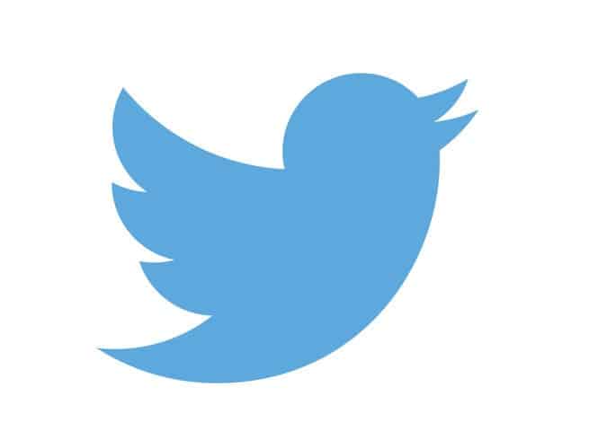 In 2012, Twitter updated its bird logo to refresh the brand by changing the color of the bird to a darker blue, and making it larger by using a simple geometric formula. The geometry behind twitter’s logo results in a well-balanced piece of artwork. Twitter’s description of its most recent logo is the following: “the bird in flight is the ultimate representation of freedom, hope and limitless possibility”.
What can you take from it? One flat symbolic image can be more powerful than a mix of several.
In 2012, Twitter updated its bird logo to refresh the brand by changing the color of the bird to a darker blue, and making it larger by using a simple geometric formula. The geometry behind twitter’s logo results in a well-balanced piece of artwork. Twitter’s description of its most recent logo is the following: “the bird in flight is the ultimate representation of freedom, hope and limitless possibility”.
What can you take from it? One flat symbolic image can be more powerful than a mix of several.
#3. AmazonAmazon.com was named after the world’s longest river. The largest online retailer started out selling books, but rapidly added thousands of other products to its portfolio. The black color in the Amazon logo invokes supremacy and elegance, while orange represents happiness. The message behind the Amazon logo is that it sells everything from A to Z, and the arrow that connects the two letters isn’t purely decorative, it draws the smile of satisfied Amazon shoppers.
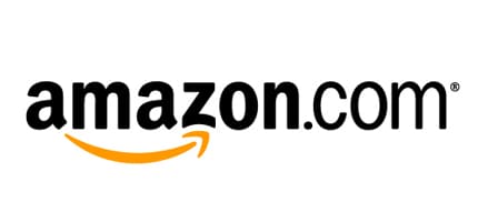 What makes it a successful logo and a brilliant one at that too? Beyond the minimalist approach (copy only, 2 colors only) the friendliness of the "smile" helps users and clients associate the brand with pleasant experiences -even if they have nightmarish ones! They're not the only ones too, LG has a sneaky smiley face in there too. Can you add a smile to your logo? Would it make sense?
#4. FedExWhy is the FedEx logo legendary? The FedEx logo hasn’t won over 40 design awards solely for its vibrant colors and bold lettering, it is best-known in the world of "hidden image" logos. For those who haven't seen it yet, there is a right-pointing arrow between the E and x. This arrow symbolizes efficiency and forward motion.
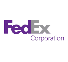 The logo's designer, Lindon Leader, said, "The arrow could connote forward direction, speed and precision, and if it remained hidden, there might be an element of surprise, that aha moment." At first glance, the concept of the FedEx logo is pretty straightforward; however, it is not as simple as it looks because it contains a hidden message.
The takeaway? Use negative space to add that "smile" or extra emblem that will help you position your brand, along with its values, in the consumer's mind -without going all Mardi Gras.
The logo's designer, Lindon Leader, said, "The arrow could connote forward direction, speed and precision, and if it remained hidden, there might be an element of surprise, that aha moment." At first glance, the concept of the FedEx logo is pretty straightforward; however, it is not as simple as it looks because it contains a hidden message.
The takeaway? Use negative space to add that "smile" or extra emblem that will help you position your brand, along with its values, in the consumer's mind -without going all Mardi Gras.
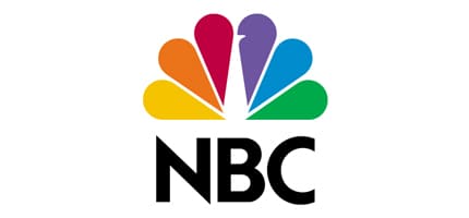
#5. NBCThe National Broadcasting Company’s (NBC) first logo was unveiled in 1942 when the television network began operations. Since then, the NBC logo was changed several times before the introduction of the famous peacock logo in 1956. The peacock’s feathers are meant to represent NBC’s six divisions. The stylized peacock logo is attractive, energetic and memorable. Again the use of effective negative space simplifies an elaborate idea and the flat colors make a logo from the '40s look fresh and new.
#6. IBMThe IBM logo was not always as successful as today. Before the current IBM logo, the old version consisted of a globe. Due to the low impact on its audience, the logo was modified several times until it achieved an appealing and engaging appearance. The simplicity of the IBM logo was instantly successful, and accurately defines the brand name and quality of products. Eight stripes make up the letters of IBM; aimed at suggesting excellence, prestige and dynamism.
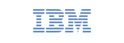 The clear takeaway, globes are overused in business, sometimes the best way to go is the other direction.
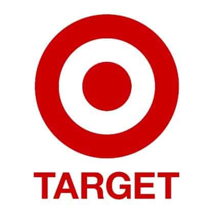
#7. TargetTarget’s Bulls-eye is striking and exceptionally easy to understand. In fact, a 2003 Target study found that 96 percent of American shoppers recognize the target logo. Its red color represents leadership, vitality and the business responsibility of the company. Target’s latest logo uses red block letters in Helvetica font and the current bulls-eye is bigger than the previous version. These updates are intended to in increase brand awareness.
 Besides it obviously exemplifying the meaning of the word "target" the logo excels on proportions, text positioning and again simplicity.
The saying, “a picture is worth a thousand words” is absolutely true when it comes to logo designs. A mind-blowing logo requires more than nice artwork and proper colors; a good dose of creativity combined with simplicity is the key to creating a brilliant logo. We hope these remarkable logos can serve as inspiration for your own logo design. What is your favorite logo? Leave a comment below and let us know your thoughts.
Besides it obviously exemplifying the meaning of the word "target" the logo excels on proportions, text positioning and again simplicity.
The saying, “a picture is worth a thousand words” is absolutely true when it comes to logo designs. A mind-blowing logo requires more than nice artwork and proper colors; a good dose of creativity combined with simplicity is the key to creating a brilliant logo. We hope these remarkable logos can serve as inspiration for your own logo design. What is your favorite logo? Leave a comment below and let us know your thoughts.More from

8
You might think sending an email or a text is all that matters these days, but don't underestimate the power of physical mail. It carries
![]() Emma Davis
Emma Davis
Mar 21, 2026

23
Picture this: your business has a silent, tireless salesperson working for you 24/7 on the busiest street in town. That’s t
![]() Emma Davis
Emma Davis
Mar 20, 2026

39
Printing on ribbon is the art of transferring your custom design, logo, or text onto a roll of fabric. It’s what transforms a simple decorat
![]() Emma Davis
Emma Davis
Mar 19, 2026

131
If you've ever wondered about the standard gift card dimensions, there’s one number you need to know: CR80
![]() Emma Davis
Emma Davis
Mar 17, 2026

59
When you’re launching a product, your bottle label is often the first thing a customer sees. Think of it as your silent salesperson
![]() Emma Davis
Emma Davis
Mar 16, 2026

173
When you're brainstorming ideas for landscaping business cards, it helps to think beyond just contact information. Your c
![]() Emma Davis
Emma Davis
Mar 15, 2026

257
When you think of a yard sign, the classic 18"x24" is probably what comes to mind. It’s the industry workhorse fo
![]() Emma Davis
Emma Davis
Mar 14, 2026

200
When you’re ready to invest in an A-frame sign, the first question you'll ask is, "What size do I need?" It usually comes down
![]() Emma Davis
Emma Davis
Mar 13, 2026