
Pantone to CMYK Conversion and Color Matching Guide


Converting Pantone spot colors to CMYK always shifts the color a little. Match your Pantone guide to the paper, convert with the SWOP v2 profile, and approve a printed proof, and you land as close as four-color process can get.
To convert Pantone to CMYK, look up your PMS number in the Pantone Color Bridge or convert the swatch in Illustrator, InDesign, or Photoshop with the U.S. Web Coated (SWOP) v2 profile active. Match the Coated or Uncoated guide to your paper, design in CMYK from the start, and confirm the result with a hard-copy proof before your full run. Some shift is unavoidable because CMYK covers a smaller color range than Pantone.
Quick tips
Quick tips for converting Pantone to CMYK
Convert Pantone to CMYK before you send files to print. Look up each PMS number in the Pantone Color Bridge, or convert the swatch in Illustrator, InDesign, or Photoshop using the U.S. Web Coated (SWOP) v2 profile. Match the Coated or Uncoated guide to your paper, design in CMYK from the start, and approve a hard-copy proof on your real stock. Expect a small shift, since CMYK reproduces a narrower range of color than Pantone inks.
How Pantone and CMYK color systems actually work
Pantone colors are proprietary, pre-mixed inks. Each one carries a unique number like PMS 186 C (Coca-Cola red) or PMS 294 C (a deep corporate blue), and a printer mixes that ink to an exact formula. The result is dead-on color on every press run, which is why brands with strict identity rules specify Pantone numbers.
CMYK works in a completely different way. Four inks, cyan, magenta, yellow, and black, print as tiny dots at different angles and densities, and your eye blends those dots into a single perceived color. This is called process color, and it is the standard for most commercial printing because four inks can produce millions of combinations. When you are setting up a project like flyers, our guide on how to make flyers walks through building color-accurate files.
The catch is gamut. CMYK reproduces a smaller range of color than Pantone, so bright oranges, vivid greens, and deep purples cannot be matched exactly with four-color process. That gap is where conversion gets tricky. Every 4OVER4.COM order is backed by our 5 Gold Guarantees, including a 100% quality guarantee, so if your printed colors do not match your approved proof we make it right. You can also start from a ready-made Design Template that already has the correct color mode, bleed guides, and safe zones built in.
The Pantone Matching System explained

The Pantone Matching System (PMS) holds over 1,867 solid colors in the current Pantone Plus Series, and each one has a specific ink formula. PMS 185 C, for example, is a warm red built from a precise pigment mix that no CMYK combination can perfectly replicate.
Pantone swatches ship in two versions, Coated (C) and Uncoated (U). The Coated swatch shows how the ink looks on glossy or satin paper, and the Uncoated swatch shows the same ink on matte or textured stock. The same PMS number reads differently on each surface because paper absorbs ink differently, so your paper choice shapes the final color just as much as the ink formula does.
The best way to judge this is in your hand, not on a screen. Order free samples from 4OVER4.COM and see how each stock changes a color before you commit to a full run.
CMYK process color breakdown

CMYK stands for Cyan, Magenta, Yellow, and Key (black). Here is what each channel does:
- Cyan is a blue-green ink that handles cool tones and sky-like hues.
- Magenta is a red-pink ink responsible for warm reds, pinks, and purples.
- Yellow covers warm tones from gold through to green when it mixes with cyan.
- Black (Key) adds depth, contrast, and the true dark tones that cyan, magenta, and yellow cannot reach on their own.
These four inks print as halftone dots. Up close you would see a pattern of colored dots, but from a normal viewing distance your brain merges them into a smooth image. The density and overlap of those dots decide the final color you see.
Step by step: converting Pantone colors to CMYK

There are three reliable ways to translate a Pantone color into CMYK, and each has its place.
Method 1, the Pantone Color Bridge guide. Pantone publishes a printed Color Bridge that shows each PMS color beside its closest CMYK equivalent, calculated by Pantone themselves. It is the most trustworthy reference for color-critical work because a printed swatch on your desk never lies the way a screen does. Find your PMS number, read the CMYK values printed next to it, and type them straight into your file. For multi-panel pieces like brochures, our guide on how to fold a brochure keeps those converted colors looking uniform across every fold.
Method 2, Adobe Illustrator or InDesign. In Illustrator, open the Swatches panel, double-click the Pantone color, and change the Color Mode to CMYK. In InDesign, edit the swatch and switch it from Spot to Process. Photoshop users convert the whole document under Image, then Mode, then CMYK Color. Adobe calculates the equivalent using ICC profiles, so your result depends on which profile is active. For commercial printing, set your CMYK working space to "U.S. Web Coated (SWOP) v2", the standard most presses, including 4OVER4.COM, calibrate to. Repeat the swatch edit for every Pantone color in the file.
Method 3, online conversion tools. Plenty of sites let you type a PMS number and read back CMYK values. They are fine for a quick reference, but different tools use different algorithms, so cross-check any result against the official Color Bridge when accuracy matters. For more setup help, our guide hub has dozens of practical how-to walkthroughs.
Colors that shift the most during conversion

Not every Pantone color converts equally. Some land almost perfectly in CMYK, and others lose their punch. These are the usual problem areas:
Bright oranges (PMS 021, PMS 1505) tend to look duller and more red-shifted in CMYK. Magenta and yellow simply cannot hit that electric neon quality.
Vivid greens (PMS 354, PMS 3405) often print muddier than the spot color, because the cyan and yellow mix struggles with pure, saturated greens.
Deep purples and violets (PMS 2685, PMS Violet C) are notorious. CMYK versions lean blue or wash out next to the rich Pantone originals.
Metallic and fluorescent Pantone inks cannot be converted at all. Metallics contain real metal particles and fluorescents use pigments that react to UV light, and CMYK has no equivalent for either. If your brand relies on PMS 877 silver, you need a specialty press run rather than a conversion.
When a job depends on precise color, like custom magnets or branded stationery, test the converted colors on a physical proof before you approve the full run.
Paper stock and finish: the hidden variable
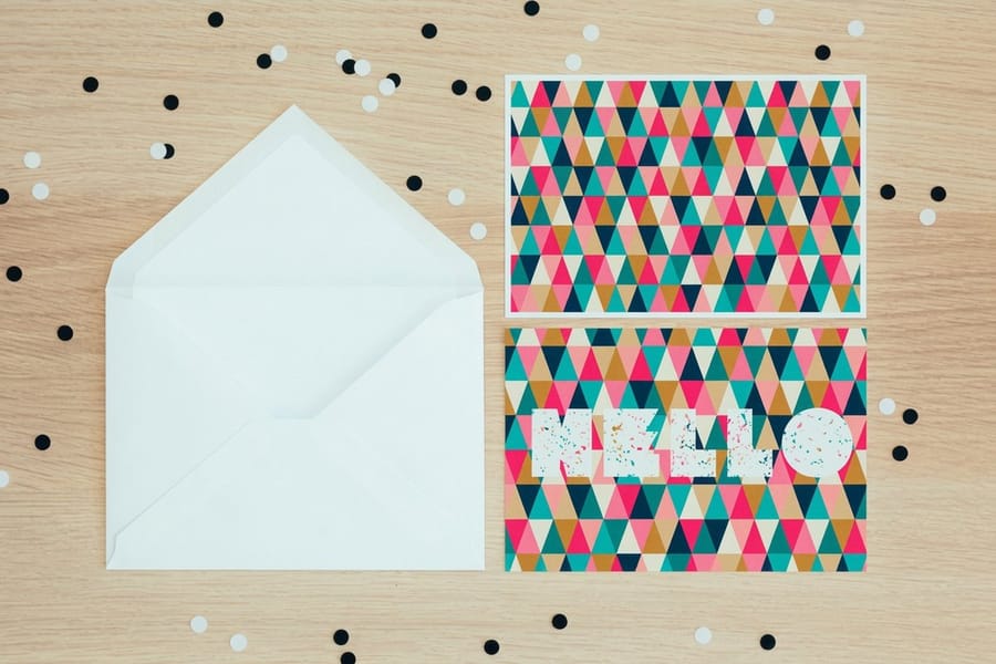
Your CMYK values can be perfect and the paper will still change everything. A glossy coated stock reflects light and makes colors look more vivid, while an uncoated matte stock absorbs ink and pulls colors slightly darker and softer. Textured stocks like linen or felt add another layer of unpredictability.
This is exactly why Pantone prints separate Coated and Uncoated guides. The same PMS 185 reads differently on each surface, and so does its CMYK conversion. Before you set values, decide what paper you are printing on, then reference the matching guide, C or U, for that stock. 4OVER4.COM offers 60+ paper types across different weights and finishes, and you can build your file to the right dimensions with our blank templates before requesting a hard-copy proof.
Ink coverage matters too. Heavy coverage, like a solid background, shows a conversion shift far more than small text or thin lines. A PMS 286 blue headline on white paper may look fine, but that same blue as a full-bleed background reveals every bit of the shift. The larger the color field, the more visible the difference. For stationery with big color fields, our guides on how to make envelopes and how to clean rubber stamps cover file setup and caring for the spot-color tools that go with them.
Practical tips for the best possible conversion

A few habits produce the closest possible conversion every time.
Work in CMYK from the start. If you know a job will print in four-color process, set the document to CMYK before you design. Building in RGB and converting later means two rounds of color compression, because RGB has an even wider gamut than Pantone.
Use soft proofing. In Photoshop and Illustrator, turn on Proof Colors under the View menu to simulate how your file will look on paper. Your monitor is not a printing press, so it is only a rough preview, but a color that looks off in soft proof will look off in print too.
Request a hard-copy proof. This is the single most reliable step. A printed proof on your actual stock shows exactly what you are getting, and 4OVER4.COM offers proofing so you can approve color before the full run. For brand-critical jobs, never skip it.
Adjust the values by hand when needed. Sometimes the official conversion does not look right on your paper, and that is fine. Nudge the magenta up 3 to 5 percent if a red looks flat, or add a touch more cyan if a blue feels washed out. Small tweaks based on a real proof beat blindly trusting a chart.
Conversion mistakes that wreck your print colors
Even experienced designers slip up on the same handful of things. Avoid these and your colors hold together.
Designing in RGB mode. Your screen is RGB and your printer is CMYK. Forget to convert the document color space and every color shifts the moment the file hits the press. Check the mode before you export.
Ignoring the paper stock. Using Coated Pantone values on uncoated paper, or the reverse, throws off the whole conversion. Match the guide to the stock every time.
Trusting your monitor. Screens are not calibrated to match print, so a design that looks perfect on a laptop can print 10 percent darker. Calibrate your monitor yearly and request a physical proof for anything color-critical.
Converting metallics and neons. These specialty inks have no CMYK equivalent, full stop. If your brand uses them, plan a spot color press run instead.
Skipping the proof. This is the big one. A conversion gets you close, but only a printed proof confirms accuracy, so do not gamble a full run on an assumption.
Print products where Pantone to CMYK conversion matters most
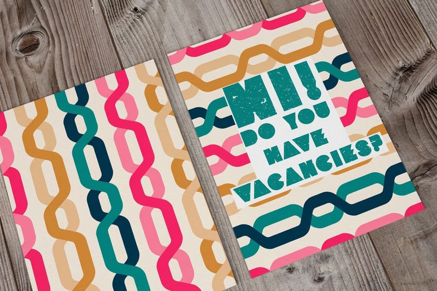
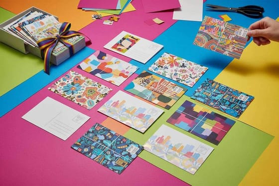
Color accuracy hits hardest on products with large color fields and brand-critical visuals. Postcards, business cards, and custom booklets all lean on consistent CMYK reproduction to look sharp, so converting your Pantone colors correctly before you order saves you from costly reprints.
4OVER4.COM prints across 60+ paper stocks, and every one reacts to CMYK inks a little differently. If your brand guidelines call out Pantone numbers, lock in the conversion, proof it on your chosen stock, and apply the same color discipline across your marketing materials, from postcards to booklets.
Specs and pricing
Standard postcard specs and pricing
Postcards carry big, brand-critical color fields, so they are the perfect place to prove your CMYK conversion. Here are the live specs and price-per-unit for Standard Postcards at 4OVER4.COM, straight from the configurator.
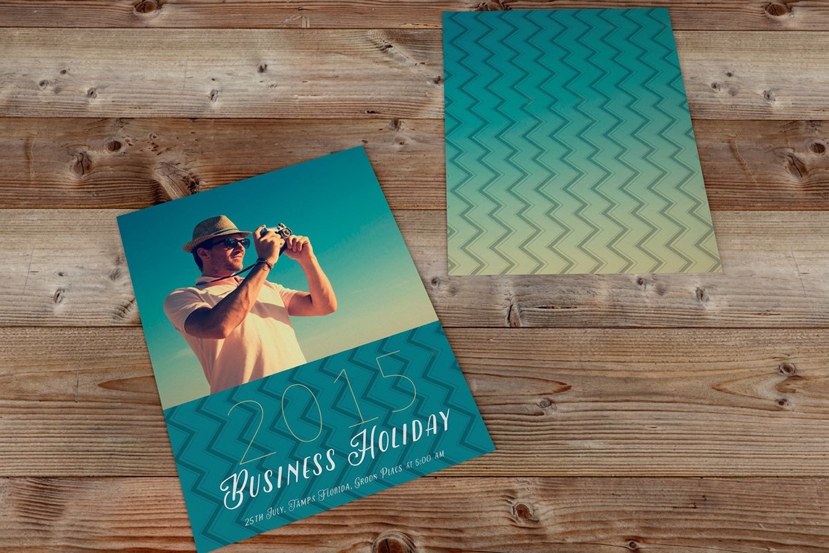
| Quantity | Price Per Unit | Total |
|---|---|---|
| 50 | 33.0¢ | $16.48 |
| 100 | 24.2¢ | $24.16 |
| 200 | 15.9¢ | $31.86 |
| 300 | 12.8¢ | $38.45 |
| 400 | 11.3¢ | $45.04 |
| 500 | 10.3¢ | $51.62 |
| 600 | 9.89¢ | $59.31 |
| 700 | 9.57¢ | $67.00 |
Print it
Order color-critical print at 4OVER4

Wally explains color matching
Convert with intent, then let a proof have the final word
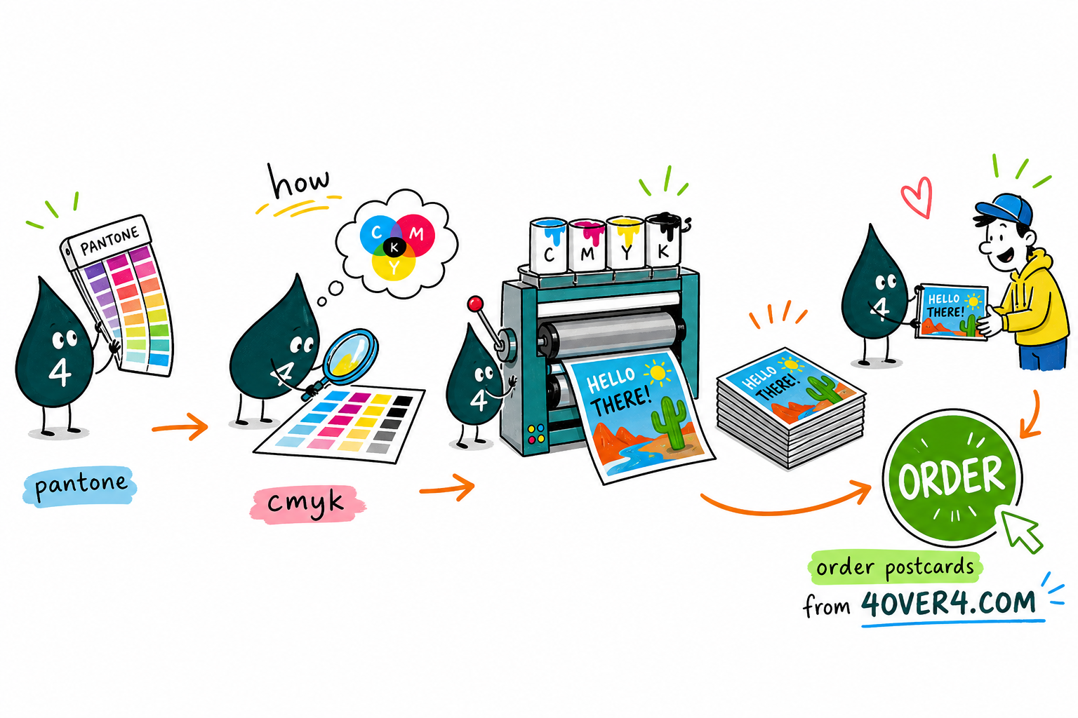
Wally treats Pantone to CMYK like translating a sentence: you keep the meaning, but a few words change. Match your Pantone guide to the paper, convert with the SWOP v2 profile, and design in CMYK from the very start so the color only compresses once. Then trust a printed proof over any screen. When the color is locked, order postcards and cards that reproduce it faithfully at 4OVER4.
Order postcards →See it in use
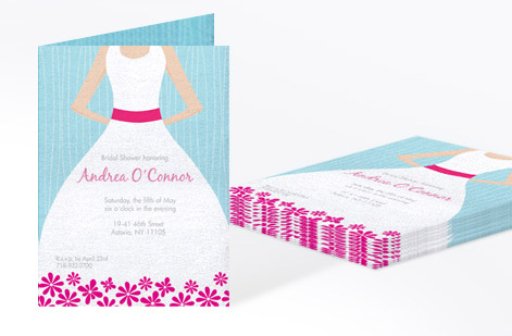
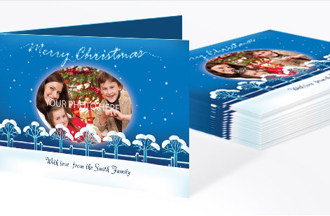
Real postcard work, printed in-house






Explore more
Where to go next




By the numbers
Color you can count on at 4OVER4
Common Questions
Common questions about Pantone to CMYK conversion
Can I get an exact Pantone color match with CMYK printing?
No. CMYK has a smaller color gamut than the Pantone system, so some shift is unavoidable. Most Pantone colors convert closely enough that the difference is barely noticeable, especially on coated paper stocks. For an exact match you need a spot color press run using the actual Pantone ink.
Which Pantone colors are hardest to convert to CMYK?
Bright oranges, vivid greens, deep purples, and any metallic or fluorescent Pantone colors convert poorly. PMS 021 (orange), PMS 2685 (violet), and PMS 354 (green) are notorious for looking very different in CMYK. Metallic and neon Pantone inks have no CMYK equivalent at all.
Should I use the Coated or Uncoated Pantone guide for my conversion?
Match the guide to your paper. Printing on glossy or satin stock? Use the Coated (C) Pantone reference. Printing on matte, linen, or uncoated paper? Use the Uncoated (U) reference. Using the wrong guide adds an extra layer of color inaccuracy.
What ICC profile should I use for CMYK conversion?
For standard commercial printing in North America, use "U.S. Web Coated (SWOP) v2." This is the industry-standard profile that most commercial printers, including 4OVER4.COM, calibrate their equipment to. Setting it as your working CMYK space keeps your file colors translating accurately to the press.
How do I check my converted colors before printing a full order?
Request a hard-copy proof. A printed proof on the actual paper stock you have selected is the only reliable way to verify your Pantone to CMYK conversion looks correct. Soft proofing on a calibrated monitor helps as a first check, but nothing replaces seeing ink on paper before you approve a full run.
Does paper weight affect how my CMYK colors look?
Paper weight has minimal direct effect on color, but paper finish and coating matter a lot. A 14pt glossy card and a 14pt matte card show the same CMYK values differently. Glossy stocks make colors pop, while matte stocks absorb more ink and produce softer, slightly darker tones. Always factor in the finish when you judge your conversion.
Get Started
Ready to print color-accurate postcards?
Lock in your CMYK values, upload your file, and we print sharp, consistent color on the stock you choose.
Legal Disclaimer
Gold Standard guarantees apply to all standard orders placed through 4over4.com. Price match requires verifiable proof of a competitor's published price for an equivalent product with matching specifications and turnaround time. Satisfaction guarantee covers manufacturing defects and print quality issues. Contact support with order number and documentation. On-time delivery rate based on tracked orders 1999 to 2026. Individual results may vary based on shipping carrier performance.
