TABLE OF CONTENTS
Online Printing Labels for Stunning Professional Look
Jul 27, 20241885 views
Jul 27, 20241885 views
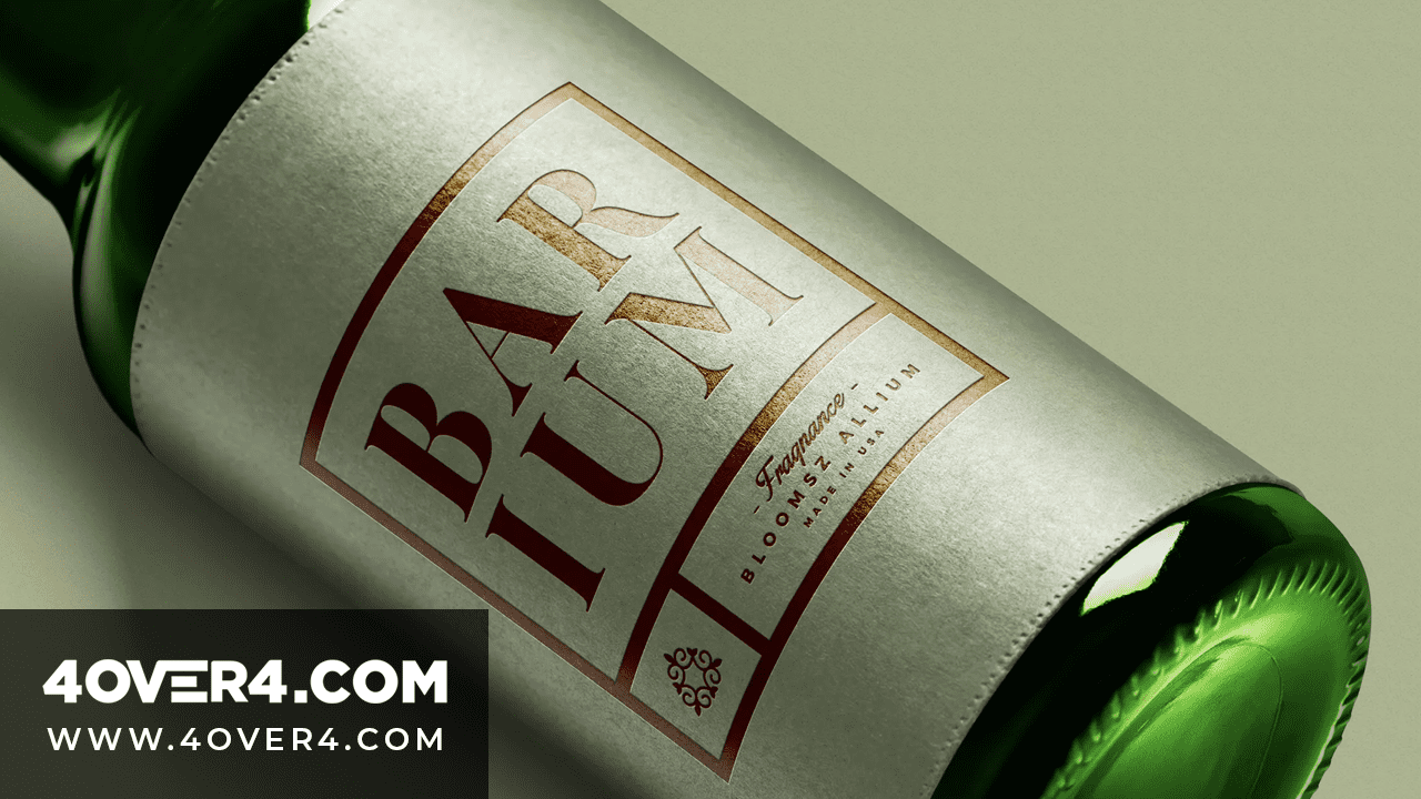
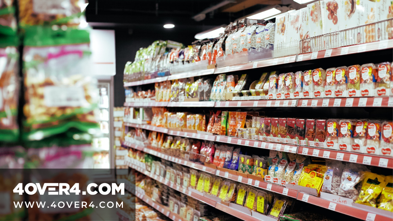
When I walk into a store to buy a product, my natural human inclination is to choose based on labelling standards. That’s why companies invest in quality, catchy labels so that they can beat the competition. Since humans are visually biased, investing in the best labels is one of your best shots towards standing out and making sales.
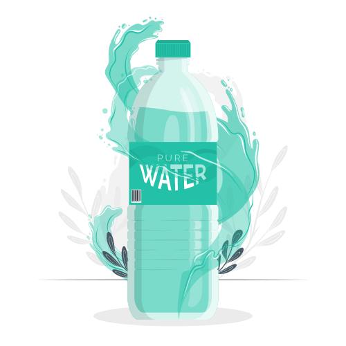
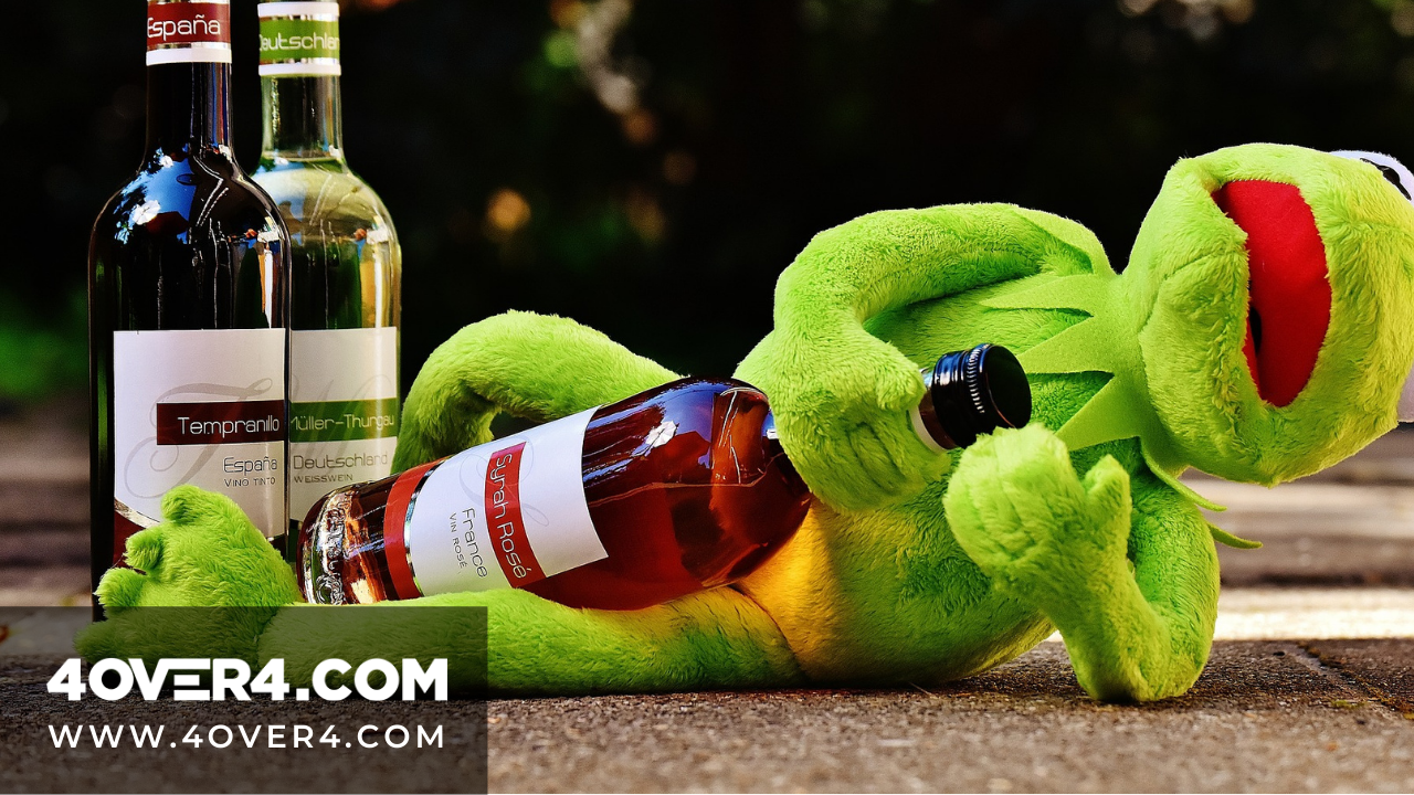
A professional label on a water label
What is the future of labels?
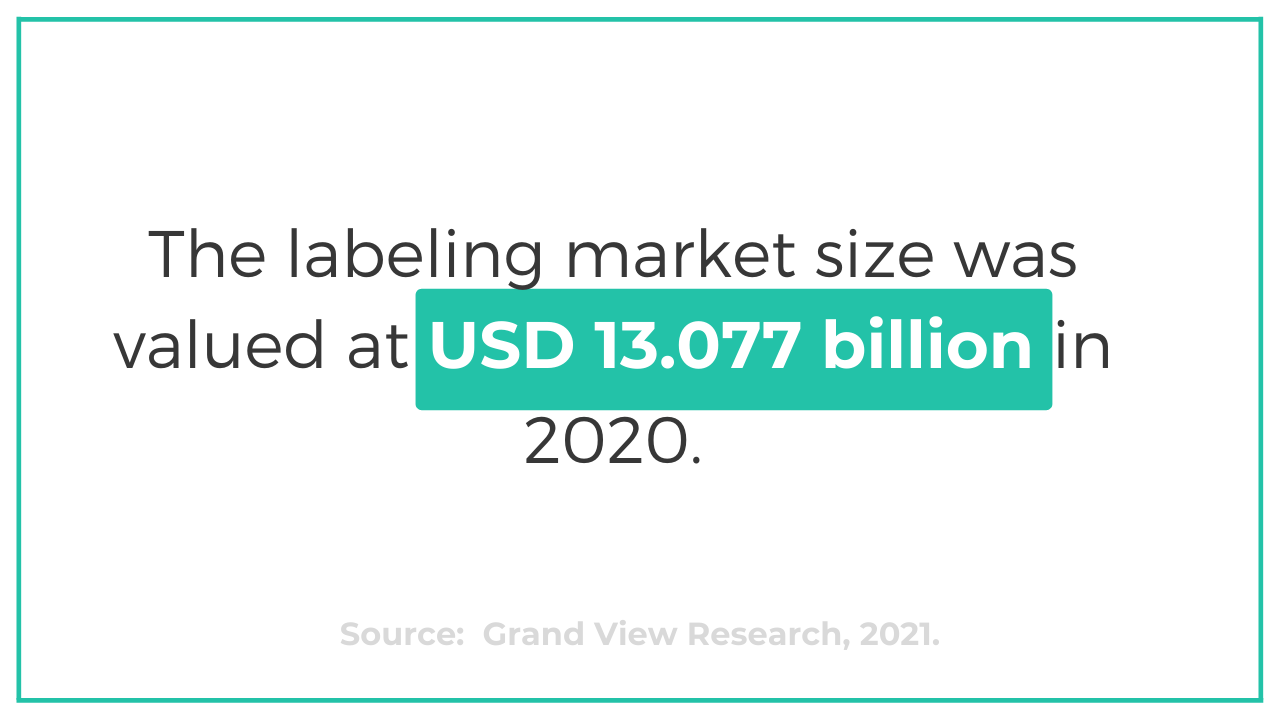
According to Grand View Research, the global data collection and labeling market size was valued at USD 1,307.7 million in 2020. It is expected to expand at a compound annual growth rate (CAGR) of 25.6% from 2021 to 2028.
Labels are pivotal in marketing. For businesses to stand out in shipping and correspondence, they need to design sharp, eye-catching labels. That is why you need to evaluate rigorously how you do your label printing to align your business for exponential, explosive growth.
Maintain high labelling standards
Pay attention to the following label blueprints
Font
There are two basic styles of fonts in label printing. San serif has plain, block-style letters with a clean finish and Serif fonts have little hooks, or serifs, on the tips of the letters to make them look fancier. San serif fonts are much easier to read, especially in small lettering.
Professional companies use a standard font for all of their business printing so that everything matches for a uniform, professional appearance. Use one specific serif or san serif font and larger type size for the company name. Use a smaller san serif font on the address information below for easy shipping distribution. Serif fonts in very small letters on label printing tend to be illegible and should not be used.
Layout
Standard custom water bottle labels should be simple and to the point. When used as shipping labels, each sticker’s custom printing should include the company name, address, telephone number and website address. If the label is not for shipping, but for promotion, the address is omitted to save space. This makes the company name and logo even larger and more visible.
The label’s layout should have an even margin of blank space, called white space, all the way around the edges where there is no lettering. The information should be centered from right to left, with even spacing in between the lines of text. Break up longer lines of text into shorter ones for more even distribution and visual appeal. Keep the message short.
Colors
Company colors are often used in custom printing. A light or white background with bold or black lettering always works well. The more colors used, the more expensive the labels. Avoid pastel colors for lettering. They are very difficult to read, and the message will be lost. Use red backgrounds for warnings and yellow for caution. Industry standards dictate these special types of labels should have white or black letters.
Logos
Imprint the company logo on labels whenever possible. It helps with brand recognition. Use a simple logo pattern to avoid blurriness. Keep the colors and pattern true to their original look. Place the logo above the lettering or evenly spaced on the left-hand side.
FDA establishes guidelines for food labels
The essentials of a premium product label
The United States Food and Drug Administration has set guidelines on the printing of food labels. They are the government agency tasked with regulating the food industry. There are minimum requirements that the FDA has stipulated that each label should have.
The following elements must be present in a label unless the product is exempted by the FDA:
· Statement of identity
· Net weight of the product
· The address of the manufacturer
· Nutrition facts
· Ingredients list
Elements of a good label
Specialists in design, Sessions College, give some of the pointers that make a good label. The following are sure ways of how to make premium private labels.
Make the text legible
The font size and color of the labels' text should ensure that the text can be seen and read clearly. If people have to squint their eyes, it becomes annoying and they shun your products. Secondly, if they have to struggle distinguishing the words because of weak contrast, the labels might not attract customers.
Text best practices
Use a large enough font size. Consider people who use reading glasses. Margaret Penney of Sessions college says that the text should be sized above minimum 6 points.
Font color should have a distinct contrast with the background. The FDA actually requires that labels’ backgrounds should have a succinct distinction from the text. Choosing the colors to use can have some bearing on the customer’s choice. Margaret says that bright colors are thought to influence a customer to buy the product. Adobe Kuler could help in exploring the color options available.
Use typographic pairing
According to Creative Bloq, typographic pairing traditionally involves pairing fonts that complement each other harmoniously in a classy but discrete way. This strategy provides a way of creating visual juxtaposition between different types of information in a print. Its work is to help create a distinction between two or three things.
Create space with white space
Remember white space? Complement white space with typographic pairing by leveraging on the white space to separate information. The white space also creates visual distinction. It gives the design a tranquil tone.
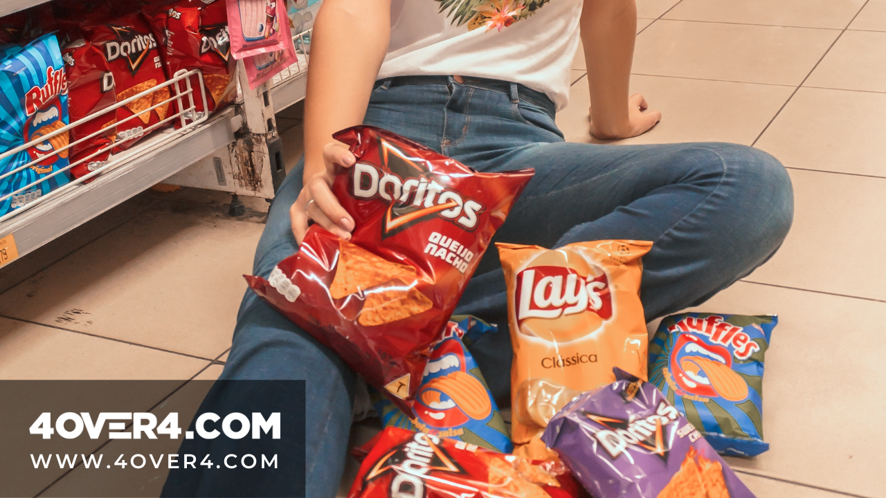
Decorate and illustrate
Decorative or illustrative elements make the labels more visually appealing. These illustrative elements describe the product better in visual terms. It’s a sort of showing more than telling.
Print quality
The material that the labels are made of could make or break your labels. Penney recommends using a quality card stock because it gives your labels visual presence and a touch of flamboyance. The finishes that you choose such as the ones offered at 4OVER4 play an important role.
Spring into action
Order blank die cut labels in a variety of sizes from a company such as 4OVER4 which specializes in business printing for small businesses. Using an experienced specialist for printing assures a quality job every time.
You can save money by typesetting your own labels and having a custom printing company create the finished product. Be intentional about employing the best industry practices for font type and size, text distribution, colors and phrasing as we have guided you.
More from 4OVER4

3563
Whether you're an established business magnate or an emerging entrepreneur on the rise, one thing remains undeniable: <a href="https://www
![]() Emma Davis
Emma Davis
Jul 26, 2024
12117
People often overlook the importance of pocket folders in businesses. This is the world of digital media where LinkedIn and Google g
Jul 26, 2024
2710
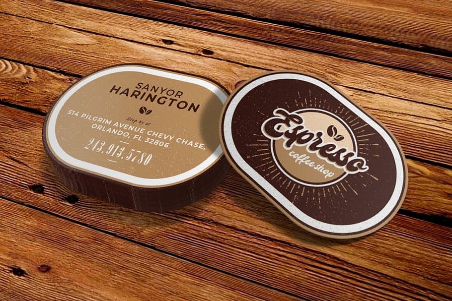
A well-designed business card is important for making a memorable first impression. It represents your brand
![]() Emma Davis
Emma Davis
Jul 26, 2024
2203
A business card can help represent you professionally. These cards contain your contact info, job title, and company details. As a result, the
![]() Matthew Prince
Matthew Prince
Jul 26, 2024
1687
New digital features have been introduced to business cards, making business connections more effective than they used to be. Technology has r
![]() Matthew Prince
Matthew Prince
Jul 27, 2024
11644
First impression matters, especially when marketing your small business. An effective business card design will help you impress potential pro
![]() Matthew Prince
Matthew Prince
Jul 26, 2024