Table of Contents
- Home
- content hub
- 20 Memorable Movie Posters You Can Learn From
20 Memorable Movie Posters You Can Learn From
Aug 27, 20137091 views
Aug 27, 20137091 views
Movie posters are usually the first impression you get from a film; you spend weeks or months looking at them in different spots around the city and on the web before the movie is released. Some of them may even become the only thing you remember years later.
Movie Posters are highly persuasive marketing tools that showcase in few words and images exactly what a movie is about.
There are all kinds of movie posters, from the Sci-Fi horror films featuring some kind of creature from another world to romantic ones portraying only a still from the most iconic love scene of the film; each one of them has a characteristic feature that will help us guess what the story might hold in store for the viewer.
Using a Poster to convey an idea, promote corporate culture or advertise your next event can be as fun and effective as Movie Posters are!
We’ve decided to show you some of the most iconic and memorable movie posters for inspiration and to kick-start your imagination for your next poster design.
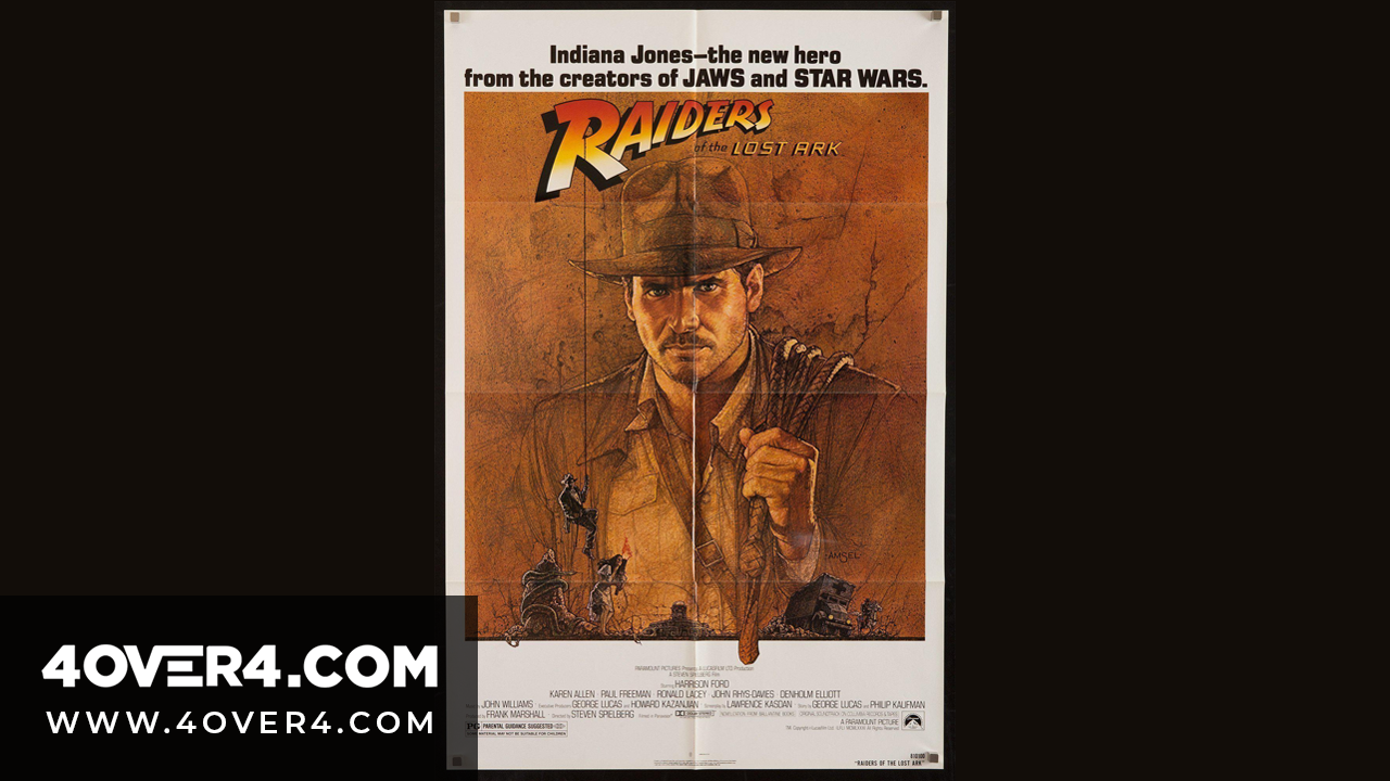
1. Raiders of the Lost Arc
This comic-book style poster design by Richard Amsel is the first one of the Indiana Jones series and it shows us the leading man, played by Harrison Ford, as an action hero. We can also appreciate the most important elements and characters in the film.
Lesson: Spike interest of old and new viewers/customers with a bold image and tiny yet powerful details in the background that give your story context.

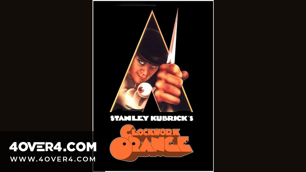
2. A Clockwork Orange
Simple and enigmatic, we see a first glimpse of Alex DeLarge, the main character played by Malcom McDowell, with a list of his morally questionable interests in a corner and a killer look in his eyes while holding a dagger.
This poster was not the first one created for the film, but Kubrick wanted something more violent so he decided to commission this task to designer Ivan Punchatz who came up with the iconic image.
Lesson: SHOCK! A matter-of-fact, shocking descriptive narrative and/or imagery can really attract and retain attention.
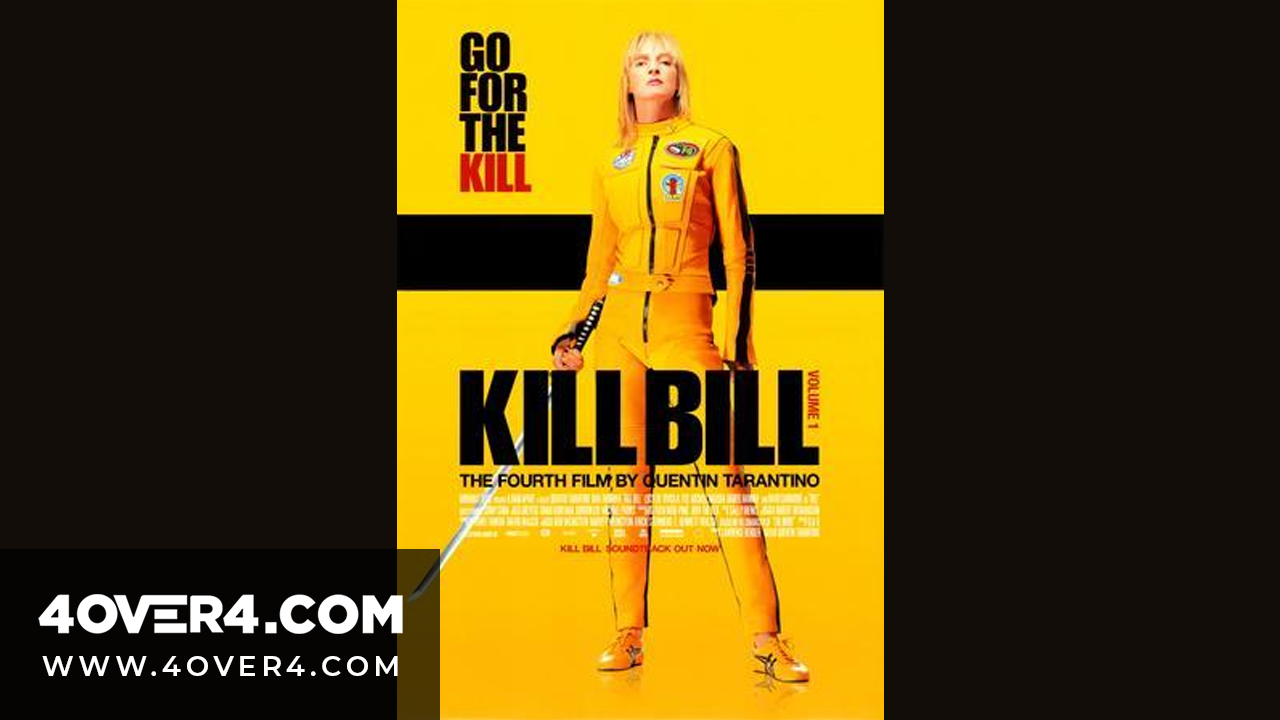
3. Kill Bill Vol. 1
A woman daring you to face her in battle, wearing a yellow suit and a Japanese sword in her hand. A yellow background and the phrase “Go for the kill”. This pretty much sums it all up, she goes after everyone in this film and she ends up killing them for standing in her way.
Lesson: Direct, bold and simple copy is usually the best. A single image can be just as powerful as direct copy.
4. Batman
We don’t really need to explain or decode this one. It’s a simple, yet very representative poster with Batman’s logo on it. At the time of its release it also had the function of leaving behind the old cartoon-like series of the 1960’s and focusing more on the dark side of the character that was truer to the real comic.
Lesson: Reputation precedes design; if you're well known there's little that needs to be said or done. If you want to change just how you're known, redesign your brand in the simplest most representative terms.
5. Scarface
A classic gangster film with a black and white poster and blood-red typography. It basically tells us a little bit about Tony Montana’s story, the main character who’s carrying a gun in one hand a fist on the other, and his vision.
Lesson: If you feel the image is not worth 1,000 words then you can add copy to your poster provided it's well balanced.
6. Pulp Fiction
The First time we see it, we notice the femme fatale Mia Wallace – played by Uma Thurman – staring at us with a cigarette and a gun while reading a book called “Pulp Fiction”. Looking at it more closely we realize that this poster is actually intended to look as the paperback version of a book – it even has a 10 cent price tag – and the borders are a little rough on the edges, probably from use.
Lesson: Use the double-take factor by presenting contrasting ideas or simulating different formats (like a book cover or a postcard).
7. Silence of the Lambs
The American Film Institute has named it one of their 100 best movie posters and in 2006, the Key Art Awards crowned it the best movie poster of the last 35 years.
This poster presents Jodie Foster’s face with a horror expression and red – almost dead – eyes, her mouth “silenced” by a butterfly with a skull on the back of its head, which is a key plot point.
Lesson: surrealism and minimalism are great attention-grabbers; they give new meaning to ordinary things.
8. Jurassic Park
This poster is a 2 in 1. The image was actually created as a logo for the theme park in the movie and it doubles as the famous movie poster.
We can see a T-Rex represents the new set of dinosaurs we were going to find in the “park”.
Lesson: Bold, hot, contrasting colors against a dark background make simple copy memorable and interesting.
9. Amélie
A simple but beautiful poster with the star of the film Amélie, with a mischievous look in her eyes, and a magical background.
Lesson: Character photography makes impossible ideas (like magic) relatable.
10. Breakfast at Tiffany’s
Every woman wanted to be her, and every man wanted to be with Audrey Hepburn. Everything about this poster is now iconic: the long cigarette, the jewels, the cat and her long black dress.
Lesson: Proportion is everything, play with tension and balance by placing elements in different positions. Consider each element as a "weight" . Add more weight and size to the most significant elements and then contrast them with smaller ones in the background.
11. Back to the Future
Designed for the first film, by Drew Struzan, and reused for the next two, with the Doc standing behind Marty (Michael J. Fox) for II, and then joined by his love interest, Clara, for III. The poster combined witty copy with the use of color to symbolize the passing of time (from dark to light).
Lesson: Color can tell a story as much as words can, use it to complement your poster design (taking into account the 4 color printing process for print posters -CMYK) or to convey the idea entirely.
12. Vertigo
No one can’t help but feel absorbed by the figures inside this poster.
Saul Bass is the genius behind this masterpiece, a celebrated graphic designer who used very unexpected visual resources to recreate one of the most memorable scenes from the film and at the same time leave us guessing about its relation with the title.
Lesson: Simplified images, like pictograms or linear abstractions, have the power of keeping the emotional force of photographies but with the added value of mystery. Additionally, font types can make or break a poster -go for a font that's legible but representative of your theme. In this case the slightly uneven font evokes a dizzy sensation.
13. Star Wars: A New Hope
Once again we’ve singled out the first poster of a saga, this time for the epic classic Star Wars.
At the time people didn’t really know much about this upcoming hit, except what we can appreciate in this poster. It was set in a galaxy far, far away; we also had a set of heroes, a very sexy woman with a cape and a gun, and a very masculine guy holding some sort of light sword, a pair of robots and some type of masked villain in the background.
This is actually a painting made by Tom Jung, he was commissioned to resemble the work of Frank Franzetta, known for the book covers of Conan the Barbarian, which is the reason why Luke has those rock-hard abs and Princess Leia is showing so much leg. The painting rests at Skywalker Ranch.
Lesson: If your subject is obscure or hard to explain to a first-timer exaggerate elements in the poster, whether real or fantastic bank on what makes it unique and make it BIG.
14. Ghost Busters
When this poster made its debut it only showed the icon of a ghost with a red restricted circle with no other information about the movie except for telling us to expect it for next summer. Now, we can all identify this as the Ghostbusters’ logo, an icon for a generation.
Who you gonna call? Well, we guess you already know the answer.
Lesson: Using conventional elements (such as road signs, quotation or exclamation marks, ect.) helps potential viewers contextualize your poster and make your idea easier to grasp.
15. Dracula
The film claims to be the “nightmare of horror” and the poster delivers. Everyone wants to see the horrific vampire, and here he is ready to suck the blood out of an attractive female.
Lesson: A bold tagline can render the poster's title impressive -or not. Choose a short, to-the-point, tagline and add no further explanation!
16. Rosemary’s Baby
A very strong and symbolic message: there's a sad-looking woman with a baby stroller on her mind. There’s something intriguing about the background and the dark tones of the night surrounding it.
Lesson: Your poster's mission is to spike curiosity -use symbolism to add a timeless and ethereal character to your event.
17. The Godfather
Black and white, the typeface, the puppet strings and the Godfather himself is all that was needed to make this an unforgettable movie poster.
Lesson: Less is more. Combine simple graphic elements with interesting typography to create an unique typeface. Add a character photograph to complement, when necessary.
18. E.T.
Spielberg himself suggested Michelangelo’s The Creation of Adam to John Alvin for inspiration on this beautiful movie poster that symbolizes the first encounter of the human race and the adorable extraterrestrial. Also there’s a personal touch from the designer who used his own daughter’s hand in his creation.
Lesson: Powerful emotional triggers and cultural references make great headway in the viewer's memory-box.
19. Little Miss Sunshine
This poster is very basic; it used a still from the movie where all its characters appear with absolutely no editing. We can see this family trying to get on board the van while it’s moving which represents their odyssey and journey to finally accept each other and be on the same wagon, united, finally accepting each other for who and what they are.
Lesson: a life still on a simple background may provide the same powerful effect character photographs have, try taking candid or symbolic photos that may help potential attendants, customers or viewers relate with your idea or event.
20. The Exorcist
There’s nothing actually frightening about the image itself, but you know by looking at it and relating it to the title that nothing good can be awaiting in that house.
Lesson: You don't need to be explicit or overly-graphic when you treat a sensitive, gory or scary subject. Bold copy on a black and white poster goes a long way -and helps you stay classy.
Is your favorite movie poster included in our selection? Which posters are your favorites? Let us know what you think on the comment section below or on Twitter, Facebook or G+.
More from

13
When you’re ready to invest in an A-frame sign, the first question you'll ask is, "What size do I need?" It usually comes down
![]() Emma Davis
Emma Davis
Mar 13, 2026

113
The real secret to mastering your direct mail budget isn't complicated. It comes down to one simple fact: a standard 4" x 6&q
![]() Emma Davis
Emma Davis
Mar 12, 2026

63
Tear-off flyers are a classic for a reason. They’re a tangible marketing tool, designed with perforated, removable tabs at the bottom. Each
![]() Emma Davis
Emma Davis
Mar 11, 2026

112
Printing stickers at home is a seriously fun and rewarding project. It boils down to four main parts: designing your image, picking the right
![]() Emma Davis
Emma Davis
Mar 10, 2026

103
Ever seen a logo that seems to float right on the glass of a jar or bottle? That’s the work of transparent label stickers.
![]() Emma Davis
Emma Davis
Mar 9, 2026

59
Picture this: your product’s beautiful label gets smudged and runny during shipping, or a gorgeous event banner fades to nothing after just
![]() Emma Davis
Emma Davis
Mar 8, 2026

58
In a sea of options, your product's packaging and labeling are its first, and often only, chance to make a real connectio
![]() Emma Davis
Emma Davis
Mar 7, 2026

89
Ever tried to print a hundred high-quality flyers on your home office printer? You probably ran out of ink, dealt with paper jams, and ended u
![]() Emma Davis
Emma Davis
Mar 6, 2026